Artopia: May 2004 Archives
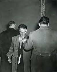
Anthony Esposito, Accused "Cop-Killer", January 16,1941
Gunman Doesn't Want His Picture Taken.
For the first time since Bruno Richard Hauptman, police today permitted photographers in the line-up room at headquarters. The subject was Anthony Esposito, under indictment with his brother, William, for the murder of a business man and a policeman in Tuesday's tragic Battle of Fifth Avenue. The detectives, manacled to Esposito, didn't want their names or picture in the papers. They obliged by turning around, holding the gunman by head and arm so he couldn't duck. The yardstick is n the line-up platform, where Esposito had stood, refusing to answer questions. "He looked like a sullen surly, snarling animal," Weegee reported. "He stumbled and sagged overt to one side like a drunk."
PM, Story and Photo by Weegee (in Miles Barth, Weegee's World, Bullfinch Press (Little, Brown), 1997.
What Photography Was
Two of Weegee's most shocking photographs have one thing in common. Someone is smiling. Drowning Victim, c. 1940, one of Weegee's many Coney Island photos, shows medics trying to revive the victim, most of the bare-chested crowd at a polite distance, hazy pier in the mid-distance parallel to the irregular line of the inquisitive but concerned faces.
But a young woman in a one-piece bathing suit (de rigueur for the time) kneels up-close, as if pressed to the left shoulder of one of the stethoscope-wearing men in white, and smiles radiantly, photographically at Weegee's 4 x 5 Speed Graphic. She is not exactly one of the fiends of Abu Ghraib, but that smile in its own way is almost as evil.
More famous (i.e., more often reproduced) is Their First Murder, October 9, 1941. Weegee, out of sight, is crouched down to the right of the unseen corpse, his camera pointed upward to the faces of the turbulent crowd. Click. But why is the blond boy on the left smiling? Most likely because...he is thrilled to be photographed. Or as Joe Pesci's Bernzie, based on Weegee, says in the 1993 The Public Eye, "Everybody likes their pictures took."
Even now. Because of our own experiences with digital imaging and what a little PhotoShop can do, we no longer believe in photography as truth. We compose ourselves for the camera. That's not me you see, but my image of me.
Nevertheless, we believe in celebrity.
Or, as Weegee himself wrote in the introduction to his first book, Naked City: "People like to be photographed and will always ask 'What paper are you from, mister, and what day will they appear.' "
Even gangsters and murderers. Even transvestites emerging from paddy-wagons. Of course, slum kids asleep on hot-weather fire escapes, corpses, dead-drunk bums, and lovers or moviegoers (photographed with infrared light) have little to say about being caught by the camera.
Drowning Victim, Their First Murder and over 220 vintage Weegee photos can be seen at the elegant Ubu Gallery ( 416 E. 59th St., through July 23). Ubu, like C&S last week, provides an anti-Chelsea high. Converted garages with concrete floors are not the only way to look at art. Converted townhouses and duplexes still have a certain cache. On top of that, Ubu specializes in the real avant-garde -- the Dadaists and the Fluxus types -- and has one of the best websites of any commercial gallery.
Leave aside for the moment Cindy Sherman's scary and wonderful clown self-portraits at Metro Pictures (519 W. 24th St, through June 26) and Andreas Gursky's tricky big photos of pseudo infinity at Matthew Marks (522 W. 22nd St, through June 26), and wait awhile for John Coplans' grizzly self-portrait nudes at Andrea Rosen (525 W. 25th St., through June 25). Weegee The Famous, as he liked to call himself, was the first postmodern photographer. In almost every picture, although invisible, both he and his camera are the stars. Trapped in photojournalism, he was able to explore deception, image manipulation, narrative, and, through captions and deep captions, was able to write himself into the picture. He also authored a wartime noir New York, peopled by waifs, corpses, lovers, bums and swells.
The Rise of the House of Usher
Usher or Arthur Fellig (1899-1968), aka Weegee, was a free-lance photojournalist, so talented that in spite of his brash, unwashed ways, his unapologetic self-promotion, his market-driven focus on tragedy and pathos, he was even in his lurid prime (probably 1935-1945) recognized as an artist. "Weegee: Murder Is My Business" was at the Photo League in 1941. He was included in "Action Photography" in 1943 at the Museum of Modern Art and in "Art in Progress" the following year. Published in 1945, Naked City, his own selection of his photos, clinched it. The book went through three printings in six months...and is still in print.
Ubu's fittingly tabloid-format, newsprint handout has a helpful essay by Virginia Heckert and a few evocative photos, Their First Murder among them. This is how a Weegee must have looked when it was first printed...
But because I am interested in Weegee as a writer, I turned to the 1998 International Center for Photography catalogue called Weegee's Worldto retrieve the full caption used in the newspaper PM, where it was published:
Pupils were leaving P.S. 143 in the Williamsburg section of Brooklyn, as of 3:15 yesterday when Peter Mancuso, 23, described by police as a small-time gambler, pulled up in a 1931 Ford at a traffic light a block from the school. Up to the car stepped a waiting gunman, who fired twice and escaped through the throng of children. Mancuso, shot through the head and heart, struggled to the running board and collapsed dead on the pavement. The older woman is Mancuso's aunt, who lives in the neighborhood, and the boy, tugging at the hair of the girl in front of him, is her son, hurrying her away.
We know Weegee wrote his own captions for PM. He kept a typewriter in the trunk of his 1938 Chevy. An anonymous photo in the ICP catalog shows him, back to camera, sitting on a stool, typing with one finger on his typewriter on a shelf of the propped-open trunk of said vehicle.
The ever-present cigar stuck in his mouth...The car... Even his name...No one is born with a name like Weegee. It was derived from either Squeegee Boy, when he "squeegee-d" wet photos in the N.Y. Times darkroom, or from Ouijii, as in Ouijii Board, since he had an highly publicized (by him) knack of arriving just in time to photograph still-warm corpses, whether dry-divers (suicide jumpers), bottom feeders (harbor jumpers) or punks.
Weegee was his own artwork, or The Persona Non-Grata Personae. He wasn't so much a self-made man as a self-made legend. A ghoul on the loose with a heart of gold...and yet...and yet at the end of Naked City he could advise: "When you find yourself beginning to feel a bond between yourself and the people you photograph, when you laugh and cry with their laughter and tears, you will know you are on the right track....Good luck."
Luck had nothing to do with it. The camera, in Weegee's hands, photographs itself. What do you think all those thousands of people are looking at in the now very famous Crowd at Coney Island, "Temperature 89 degrees. They came early, and stayed late," July 22, 1940?
This, however, is Weegee's story published below the photo of that jam-packed beach:
Saturday was very hot. So I figured Sunday ought to be a good day to make crowd shots at Coney Island. I arrived at the beach at Coney Island at 4 a.m., Sunday. The beach was crowded mostly with young couples lying on the beach covered with blankets. I took pictures of them. When I asked them their names they all said, 'It's just me and the wife,' as they pointed to the girl on the sand. I went back to the city.
Or take The Critic. During wartime, two ermine-wrapped, jewelry-sprinkled ladies arrive at the opera oblivious to the mouth-open stare (or jeer) of a humble woman in a cloth coat. According to Weegee's assistant Louis Liotta (thank you, Miles Barth, for your ICP essay), Weegee staged the photo, by planting a wine-besotted Sammy's-on-the-Bowery regular and having Liotta push her into the frame, thus allowing the LIFE caption: "The fashionable people were laden with jewels. Most bejeweled were Mrs. George W. Kavenaugh and Lady Decies whose entry was viewed with distaste by spectator." Both here and in Naked City the photo is cropped by a third to remove three spectators on the left. However,Weegee's title inhis bookbecame simply The Critic. Weegee edited; Weegee cropped. Weegee changed his captions at will.
Weegee writes his PM captions, and Naked City extended "tough guy with a heart of gold" comments to direct and sometimes even to misdirect your attention, but also to fill in what isn't there in the picture. Take I Cried When I Took This Picture. The uproar could be over a dead cat or a lost purse...but it isn't.
An anguished woman with a rag clutched over her head like a big babushka, mouth-open, head thrown back; a similarly hysterical child grabbing onto her...What is going on? If you didn't know the date, it could be Bosnia. When have you ever seen a first-person photo caption before? Is the caption meant to excuse the photographer for taking such a picture of suffering? Or is it to call attention to the photographer as witness, as author?
The Daily News extended caption (as recorded in the ICP book) goes like this: "Mrs Henrietta Torres and Her Daughter Ada watch as Another Daughter and Her Son Die in Fire, December 15, 1938. Mrs. Henrietta Torres and her daughter Ada, cry an look up hopelessly...," etc. In Naked City, Weegee pares down the extended caption to: "Mother and daughter cry and look up hopelessly as another daughter and her young baby are burning to death in the top floor of the tenement...firemen couldn't reach them in time...on account of the stairway collapsing."
We need to examine Weegee as a writer. Did he get the use of the ellipsis, signifying a long conversational pause... rather than an omission, from Celine? Doubtful. Dos Passos? Is his style strictly out of the pages of The Black Mask and pulp detective novels?
Other paths of inquiry:
Study the captions. He sometimes changed them when using the photos for different purposes. Attach different captions to the photos; they become different photos. They project new meanings.
Study photographs of Weegee. Although I maintain that because of his distinct style he is in every photograph he ever created, no other photographer until Cindy Sherman and her photo-performances has had so many photographs taken of himself or herself...
Weegee playing poker with the boys at Acme Newspapers.
Weegee and other photographers at Police Headquarters.
Weegee in his hovel near Police Headquarters.
Weegee as clown, covering circus from the inside.
Weegee and poster for Jules Dassin film The Naked City.
Weegee advertising Secrets of Flash Photography
Weegee "caught" in a paddy wagon.
Weegee photographed in various pictures with Gregory Peck, Marlene Dietrich,
Tony Curtis, Leslie Caron.
Weegee dressed up as a king, the photo inscribe "To all my subjects."
Stick a Kid on a Pony
Born in the Ukraine, Weegee at the age of 11 was dragged to the U.S. by his parents escaping the poverty caused by the withdrawal of the Austrian army. (They had been suppliers to that army). Little Weegee grew up on the make in the streets of the Lower East Side. He sawed a violin for silent movies, but sound came in. He assisted a street-photographer and then with a rented pony became presciently self-employed: find a kid in her Sunday or Saturday best, stick her on the pony, click. Then pitch the photos to the happy parents. Click, click. One click led to another.
By 1935, Weegee was a freelance photographer. He had a deal with PM, the liberal tabloid, but didn't like assignments; instead he followed the NYPD short-wave. Plus, he had an eye for what would communicate, what would sell newspapers. He worked at night, and his flash bulb made all faces dead-white and gave all eyes (that were open) the deer-caught-in-the-headlights look. His dead gangsters were graphic in more ways than one.
In any case, with a set focus and f-stop and a flash, he knew how to tell a story...fast. New York had more dailies then, newsstands and newsboys everywhere. His hard-boiled camera owed a great deal to the gangster films of the '20s and '30s; these influenced both him and the postwar film genre now celebrated as film noir.
But the biggest fiction of all, largely his own doing, is that he was some sort of cigar-chomping idiot savant, a tough guy of the camera. At some point he must have realized that as market-driven as his images were, he was making art. He hung around the left-wing Photo League, where although not a member, he often gave slide lectures built around his dark, dark photos. At the Photo League he certainly was exposed to the work of Berenice Abbott, Lewis Hine, Lisette Model, Aaron Siskind, and W. Eugene Smith. You can't tell me that he didn't know who Dashiell Hammett and Erskine Caldwell were; they were famous authors and consultants to PM.
What makes Weegee's photographs art is their blatant subjectivity. The dead gangsters, once shot to death, are framed and shot again or flash-gunned for a sorry effect, hat or gun in the foreground... This is where the sidewalk ends...
Kiss tomorrow goodbye.
Much has been made of Weegee's influence on postwar film noir, forgetting that he, like noir, was probably influenced by German Expressionist movies and then the Hollywood gangster cycle. His dead gangsters are of the Crime Does Not Pay genre; his corpses are more tightly framed than any Warner Brother sidewalk stiff -- but the lighting is suspiciously similar. The flashbulb was Weegee's biggest weapon. The usually off-center isolation of the corpse creates sorrow and horror. To weegee could be a serviceable verb, as in the sentence: He was getting weegee-ed. Where are you now, Mr. Wiseguy? You are now Mr. Anonymous. On cement, covered in newspapers until the cops arrive?
Is that woman placing the final page over your snooker, or is she lifting it because she is nosy? You must have been a hood of some sort, for Weegee hardly ever photographed the innocent dead. You are now dead meat on the street. Your hat. Where is that hat? Your gun? Or, in the final indignity, you are covered with newspaper pages, perhaps from the same newspaper that will immortalize your death, allowing Weegee, your photographer, an additional self-referring note.
Fred Wilson: Mine/Yours, 1995. Collection: Whitney Museum
How Objects Get Their Meanings
Artist Fred Wilson has worked in various museum education departments: at the Metropolitan Museum of Art, the American Craft Museum, the Whitney. Therefore it may seem only natural that his main subject appears to be museums, and most particularly how museums present, and in doing so either consciously or unintentionally interpret, the objects they put on public display. I have worked in museums too, so of course I am interested in the subject.
But why should anyone not directly connected to museums care about art that calls attention to museum practice? Aren't museums just nice places to look at art?
When I was briefly the chief curator at the Everson Museum of Art in Syracuse, N. Y., I helped to negotiate the trade of several Onondaga sacred ceremonial False Face masks for works by contemporary Iroquois artists. Although the museum had purchased the masks from a former Onondaga tribesman, they are meant to be seen only in religious rituals and were truly part of the Onondaga Nation sacred heritage. (Let us not go into how or why the woven-bead belt used to seal the dubious agreement between the seven Iroquois Nations and the U.S. has mysteriously disappeared from the N.Y. State Museum in Albany.)
At the American Craft Museum (where I was senior curator), it was a battle only half-won to get non-European and even non-New England craft traditions represented in a purported history of American Crafts.
As a student of material culture, I knew the importance of allowing objects and their makers to speak. As a poet and fiction writer I know that stories can kill as well as cure.
Wilson works with actual museum collections to expose the perhaps unconscious racist fictions employed in their gathering and display. In other, less site-specific, works he uses the trappings of museum presentation -- the cases, labels, lighting -- to reveal similar instances of injustice. A survey of his thought-provoking, but surprisingly emotional, art called "Fred Wilson: Objects of Installations," is at the Studio Museum in Harlem (144 W. 125th St.) until July 4. Since Wilson tends to work in very large and thematic exhibition formats, often inspired by specific sites and/or temporal contexts, this midcareer retrospective is out of necessity composed of fragments and set pieces from his bigger statements.
Although there had been much soul-searching in the museum field and theorizing galore about this topic, nothing fired up the field's collective imagination as much as Wilson's ground-breaking 1992 intervention, "Mining the Museum: An Installation" at the Maryland Historical Society. It took an artist to "objectify" a not exactly unknown museum critique: museums house hidden agendas and may often repress historical truths. Paradoxically, the impact of Wilson's efforts show how important museum exhibitions can be. He went through the Maryland Historical Society's permanent collection and highlighted and juxtaposed certain images and objects to bring out the story that was not being told -- thus exposing the real story that was being told.
In regard to paintings of well-to-do-households -- there were, of course, no others, the poor always in the background -- Wilson put spotlights on the black servants hovering in the shadows. More shockingly, he placed slave shackles in a case with Baltimore Repousse-style silver hollowware made in the same period. Also, very photogenically, he displayed fancy side-chairs with an actual whipping post that had also been "buried" in the permanent collection. Currently (but inadvertently more relevant to the headlines than one might like), one can get a taste of Wilson's Baltimore show at the Studio Museum, where Cabinet Making stands for his whole effort by displaying four chairs arranged as if an audience is about to look or has looked at the actions represented by the self-same whipping post.
Not all of Wilson's works are as notoriously and dramatically site-specific as "Mining the Museum." But because his work is about context and display as much as the meanings of objects, and since his work, like my own, is more interrogatory than accusatory, it will do us well to note the following questions, not all of which are rhetorical:
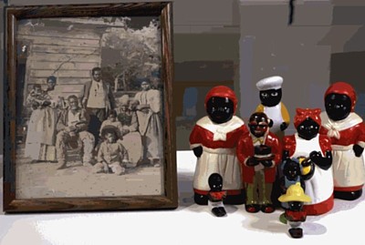
Do we have to know that Wilson is of African American and Caribbean heritage and has brown skin to understand his use of black collectibles (perhaps more correctly called Derogatory Art)? In Me & It (1995), we do see the artist in a videotape trying to imitate the facial expressions of some of the nearby derogatory figurines, while simultaneously we see a taped closeup of someone smashing similar figures. Is it important to know how much an Aunt Jemima giveaway is now worth? Why do some black people collect this Derogatory Art? Why do some white people still find racial stereotypes amusing, the way some people, including those of color, find anti-Semitic jokes and gay jokes hysterically funny?
Do the four museum-guard uniforms on dark-skinned but headless manikins (Guarded View, 1991) mean something more or something less in a museum in Harlem, where the guards, also black, are more casually dressed? Why does a spiffy uniform equal invisible? Why do we have to read the catalogue to find out that Wilson once gave a gallery lecture at the Whitney dressed as a guard? Why did people he had talked to a few hours earlier not recognize him until he began speaking? What does it mean that Guarded View is now in the permanent collection of the Whitney Museum?
Shouldn't we know that both Wilson's photo blowup of Les Demoiselles d'Avignon with an African mask implant (Picasso/Whose Rules, 1991) and his family of plastic skeletons (Friendly Natives, variously, "shockingly" labeled "Someone's Mother/Sister," "Someone's Father/Brother," "Someone's Grandfather/Uncle," and "Someone's Grandmother/Aunt") were shown in a commercial gallery as a response to the notorious Primitivism exhibition at MoMA? What other labels would be equally upsetting? "Methodist Minister," "Uncle Stanley's Lifelong Male Partner," "Republican Lesbian Grandmother," "Art Critic and Poet?" Does the ordinary viewer know that the piece refers to the once common practice of showing the bones of non-Western peoples with impunity, as if they had been animals?
Do Wilson's "beautiful" Artemis/Bast, 1992, in which a black Egyptian cat head replaces the toppled Artemis head nearby, and his white-to-black, five plaster Nefertiti busts of the following year confirm Martin Bernal's Black Athena thesis that Greece and thereby Western civilization owes more to Africa than has been acceptable? Or is the artist making fun of street-corner Egyptianism?
Do the "objects" in this exhibition, removed from their original installation contexts lose meaning? Gain other meanings? Is this rather like what happens to all non-Western or pre-modern Western art that is shown in museums, derived of context?
What about the installations that are not represented? It is understandable that only a photo in the catalog can represent Wilson's uncovering of slave tombstones under the floorboards of the historic St. Philip's Church in Old Salem, North Carolina, but why do we not have any evidence in the exhibition itself of Wilson's 1993 Capp Street project An Invisible Life: A View Into the World of a 120 Year Old Man? Is it that Wilson's fictional Baldwin Antinous Stein had too many lovingly collected photographs of his male friends?
And what about what might be called the "context of the viewer?" Do I, a white viewer, see the show differently from a nonwhite one? Furthermore, do I see the artworks differently because they are being displayed in a small museum in Harlem and not in the Whitney Biennial or at the Metro Pictures gallery?
* * *
Beyond the institutional critique he offers, Wilson makes objects speak, in a post-Duchampian way, not so much by creating new thoughts for objects and images (which is what the great Marcel liked to say he was doing), but by revealing the meanings these objects and images already have. But it isn't all analysis. Wilson now has a language through which truth pushes him beyond analysis.
A case in point is the new addition to the exhibition: four movie versions of the climactic murder scene in Othello. All the actors playing Othello (one is Orson Welles) are in "tan" makeup. The theoretically identical scenes are shown simultaneously, and backwards. Does it matter that this piece was in Wilson's Venice Biennale show last year, focused on the theme of the representation of blacks in Venetian art and culture? That Shakespeare's Othello takes place in Venice? That Wilson meant this as a response to 9/11, thus explaining why the scenes are running in reverse, as if to undo intolerable history?
Oh, Synecdoche, why are you art's middle name?
Let me explain. The Greeks had a word for it: synecdoche. Synecdoche is not exactly a symbol or a metaphor: it is a figure of speech in which, most commonly, a part stands for the whole. Wilson uses found objects synecdochically. In other words, a pair of crude slave shackles stands for slavery and the repression of its meaning and history; a tiny Aunt Jemima pancake-package figurine posed facing and dominated by a much larger, white female doll (Conversation II, 1996) not only stands for racism and class domination, but also for the commercialization and appropriation of "the other," as well as for media trivialization of servitude and oppression. Of course, some of Wilson's found objects are art objects. And when two or more synecdoches are juxtaposed, as often happens, you get explosions of meanings.
I understand why it may be appropriate for the Wilson exhibition to be at the Studio Museum. Wilson is, after all, a highly successful artist who can serve as a role model, and his subject matter might have particular resonance for Harlem residents. But here is the biggest question of all: Why wasn't an expansion of this show or a new installation simultaneously in one of the downtown museums? Does Wilson's art ask too many questions?
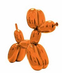
Jeff Koons: Balloon Dog (Orange), 1994-2000. Stainless steel, 10 ft x 12 ft x 45 in.
The Pre-New, The New, and the Post-New
The secret is out. A classy survey of Jeff Koons' work, covering 25 years of outrageousness at C & M Arts (45 E. 78th St., through June 5), proves that Pop Art never died. Was I the only one to call certain art of the '80s Neo-Pop? That can't be; it's so obvious now when you look at Koons' work that he was doing Pop, and still is. By using the prefix neo, I was probably referring to the fact that Pop itself at first was called Neo-Dada, thereby showing its roots. But now I have something bigger, better, and newer to say.
This is my third piece about Pop: the first, on Erro, tried to show a wider purview than is common; the second, on Indiana, is an update that readjusts some ancient proclamations; and now the Koons show gives me a chance not only to write a bit about that much-maligned artist, but also to suggest an even bigger adjustment when it comes to looking at art styles and their academically and commercially imposed tenures.
Pop is commonly thought to be the remaking, presentation or quotation of common, preexisting, mostly mass-produced objects and images. Furthermore, the artist's hand has to be fairly invisible. Koons' floating Spalding basketballs and bronze Aqualung (both 1985) qualify, as do his stainless-steel balloon Rabbit (1986), his ceramic Michael Jackson and Bubbles (1988), and certainly his recent gigantic Balloon Dog (Orange). But the dates are wrong. Wasn't Pop supposed to be replaced by Neo-Expressionism or Neo-Geo or any number of new categories?
I happen to have on hand a Koons chapbook picked up as a cheap remainder at the Strand bookstore, one of my haunts. One section in the hilarious The Jeff Koons Handbook (Thames and Hudson, 1992, o.p.) is devoted to two pre-Pure Product works, the encased and pristine cleaning products I have always loved. It's called "The Pre-New," followed by signature works labeled, of course, "The New" and then "Equilibrium," "Luxury" and "Degradation," and so forth, ending with "Puppy." Some, while agreeing Koons is and always has been a latter-day Pop artist, might prefer to call all of his work the Post-New. But when you come to think of it, what is so new about new?
Consumers even want the old (the post-new) to be new. Therefore, calling Koons' wonderful vacuum cleaners or his floating basketballs Pop or Neo-Pop or Late Pop way back when they were first put on the market could not, would not have worked. Every detergent has to be brand new, and brand new every year.
The issue is not that Pop Art went away, which it clearly didn't, but that so many wanted it to go away. It is probably really true, as stated by one of the New York Times' many reviewers, that there are some who think of "Mr. Koons as Andy Warhol's evil son." (When will the Times stop using "Mr." and "Mrs., "Miss," or "Ms." -- by request -- for living artists? I remember even Louis Nevelson being referred to as Mrs. Nevelson and Betty Parson as Mrs. Parsons, honoring long-gone husbands and relationships of little note.)
Andy Warhol's evil son? Give me a break.
It was not and is not now a question of abstraction against representation, high culture versus low, irony opposed to sincerity. It was not a question of heterosexuality versus homosexuality. Koons, like most of the Pop artists, is not gay, as proven by his highly publicized marriage to and documented sexploits with La Cicciolina, once a porn star and member of the Italian parliament.
Only two out of seven of the Pure Popsters, by my count, qualifies as gay. That the two leading Proto-Pop artists are gay (and a third was bisexual) annoyed the macho but failing abstract expressionist camp is ancient history. Irony is not necessarily gay.
Pop had to die. The acceleration of art history must be maintained for both "academic" and marketing reasons. It was not merely that all the art critics had said what they wanted to say about Pop and wanted something new to write about. New critical and curatorial and collectorial (to coin a word) reputations needed to be made. Furthermore, collectors who bought Pop the first time around might too easily say, No thank you, I already have some of that.
Well, now that we have what amounts to a small museum retrospective of Koons' work, and there are other, younger Pop artists such and Damien Hirst to avoid calling Pop, we can look at Koons more objectively.
If I remember correctly, Koons was once scheduled for a full retrospective at the Guggenheim. Could he have stood up to the space? Matthew Barney could not and now will have to direct a full-scale Hollywood musical to be redeemed. Luckily we now have a sampling of Koons masterpieces, capped off by the gigantic Balloon Dog (Orange). Koons may be uneven, but he still has many an icon up his sleeve.
Like almost everyone else, I am not enamored of the paintings. And I think there are far too many of the ceramics and carved, wooden sculptures. Michael Jackson and Bubbles (1988) is perfect and so is Ushering in Banality (cute kids guiding a hog!). I even like his Bourgeois Bust -- Jeff and Ilona (a 1991 marble sculpture) and wish I could see again some of the "pornographic" glass works he showed at Sonnebend so long ago.
However, now the truth can be told. Over the past 25 years, Koon has managed to fill in the Pop Art sculpture gap. Leaving aside Warhol's brilliant Brillo boxes and his floating silver pillows, Oldenburg is the Pop sculptor. (George Segal might also be important here if he is not more American Scene than Pop, but that is another argument.) Koons' 1986 Rabbit, the flower Puppy, and now Balloon Dog are Pop Art masterpieces.
Pop, like Realisms of various kinds, might be perennial. Realism is based on how the world looks, and because the world changes, realism is constantly renewed. There are many more images than there are ideas. Based on popular culture, which keeps changing, Pop too is bound to show changes in subject matter, whereas abstract art (totally abstract art, that is) points to what does not change. That abstract art changes may mean that it is not all that abstract.
But, my ever-present friend and enemy The Devil's Advocate might ask: Isn't Koons, with his background as a successful MoMA membership salesman and stockbroker, one of the most obnoxious artists who ever lived?
Answers: Salesmanship is part of art. MoMA is selling art to the public. And, don't forget, Gauguin was a stockbroker.
Wasn't Koons always full of himself?
Answers: All artists are obnoxious and full of themselves. If you are not, you are simply ignored. I have seen many billboard self-proclamations that X or Y is the greatest artist who has ever lived. Just this week in front of the entrance to the Gagosian de Kooning retrospective in Chelsea an artist or his designate in a pink bunny suit held a sign proclaiming Z the greatest artist of this new century. The difference is that Koons actually has talent.
But, continues The Devil's Advocate, what about his insufferable statements?
Such as?
"I have my finger on the eternal." Or: "A viewer might at first see irony in my work, but I see none at all. Irony causes too much critical contemplation."
Answer: Maybe he was being ironic.
* * *
We are in a period of art history in which even the director of the Museum of Modern Art can state that art history is not linear; hence, as reported recently, the galleries in the new MoMA building will have multiple doorways so that that the viewer will not be forced down a single path.
.
Why then cannot we admit that art styles, like Pop, might continue beyond their premature burials? Is this situation unique to Pop? I don't think so; Minimal Art and Conceptual Art (and there variants and combination) have lived beyond their reported funerals. In regard to Minimal Art, "Singular Forms (Sometimes Repeated)" at the Guggenheim, through May 19, puts Felix Gonzalez-Torres, Robert Gober and Allan McCollum, among others, in the same bed as Donald Judd and Dan Flavin.
I did write, many blogs ago, that it might be interesting to see Rosenquist (as well as de Kooning and Rauschenberg) as latter-day Cubists. We may now also need a new, expanded view of Pop. We could start, for instance, by seeing Audrey Flack and early Malcolm Morley as Pop and end, not with Koons, but some of the British artists.
Since galleries are now doing museum-quality surveys (e.g. Koons at C & M, de Kooning at Gagosian), what is left for the museums to do? Perhaps exhibitions with content? With ideas? Exhibitions that question the academically received ways of looking at art styles?
True, art history is not linear. But it is also not made up of neat little gravestones, such as Here Lies Pop Art, 1961 - 1968. Just because Warhol was shot in 1968 doesn't mean his or anyone else's Pop Art was over. Another way of looking at art is to see that it is the critical spotlight (or nowadays, the marketing spotlight) that moves about, leaving a lot of art in the dark. And when someday we turn on the houselights, what will we see?

Robert Indiana, Four Diamond Peace Diamond (2003)
The Painted Word
Let us imagine for a moment that Pop Art was more important than we thought it was. Taking its cue from, among other things, de Kooning's use of Marilyn Monroe's smile on one of his Women, Rauschenberg's and Johns' use of common imagery (some would count these two, plus Larry Rivers, as Pop), and sources as far afield as Cubist collage and Bruegel, Pop Art is generally defined as the nonpainterly depiction of images from the mass media and everyday consumerism. Surely we enjoyed it, and enjoy it now, for there is wit in reworking or appropriating the familiar. We like the clever.
But art must be more than cleverness. It must be telling. The secret is that the trick involved must produce more than surprise. This is true of the great Pop artists: Roy Lichtenstein, Claes Oldenburg, Jim Rosenquist, Andy Warhol, and...Robert Indiana.
Lichtenstein showed the anguish and anger beneath the comics, Oldenburg revealed the sexuality in our product-hunger, Rosenquist captured hair-dryer reveries, Warhol delineated mortality. Indiana celebrates the road, the sign, and language itself. I am still unconvinced of the later works of Lichtenstein and Oldenburg, but Warhol (once he got over his society portraits) produced some winners at the end. Indiana at 75 is also at his best once again. He has a knack for words.
To some, like Lucy Lippard in her 1963 Pop Art, Indiana was only on the edge of Pop because he seemed too abstract: thus Lippard forgot that words are not abstract. They are particularly not abstract when they are portrayed in Gothic and Roman type and other common fonts, including the raw stencil letters Indiana saw everywhere in the days he lived and worked at the long gone Coenties Slip on the East River in N.Y.
Indiana's paintings portray signage. They show words at work. Words like EAT and TILT tell us immediately what they represent: diners and pinball machines. And what does it mean to use the words of Melville or Whitman as if they were on a packing case or the side of a barge? The representation is a representation of what the words are telling us, but it is also a sign that literature is part of popular culture too -- or should be.
It is true, however, that two of his neighbors in the '50s in the Coenties Slip enclave, Ellsworth Kelly and Jack Youngerman, influenced Indiana's hard-edge, bright-color, straight-from-the-tube style. Agnes Martin was also there, but did not. What a time that must have been. As I write, I have Carl Weinhardt's Abrams book on Indiana open to a page of black-and-white photographs. One shows the happy tribe on a roof, business buildings looming behind them. Youngerman's wife is there too: Delphine Seyrig, whom cineaesthetes will recognize from Renais' Last Year at Marienbad.
It is also true that Indiana took a hard look at Demuth's I Saw the Number Five in Gold (inspired by a William Carlos Williams poem) and liked Marsden Hartley's German paintings and, of course, Stuart Davis. Hartley and Davis often painted words. Going further back, Picasso and Braque, in collages and in paintings, both used words in their Cubist masterpieces, so why not use words alone? That Indiana is embedded in modernism does not make him any less a Pop artist.
Robert Clark was born in Indiana, so he named himself after the Hoosier state. (Apparently it was a chance sighting of Tennessee Williams in New Orleans that gave him the idea.) Good thing Robert wasn't born in Massachusetts. Alaska and even Alabama might have worked, but Massachusetts would have been an ungainly moniker. And then we got Judy Chicago and Gary Indiana.
Indiana's official life story is about as interesting as any other artist's, which is to say not very: youthful struggles, day jobs, and then the breakthroughs. He once worked at the Cathedral of St. John the Divine when the controversial Bishop Pike was there. Pike disappeared in the California desert and was one of writer Philip K. Dick's obsessions.
Although an unofficial Indiana story or a real autobiography might be fascinating, it is the work that is important. You no longer have to cut off your ear or run away to Tahiti to be a respected artist.
I was impressed with Indiana's show at Kasmin last year. At first I thought more of the same. But weren't the paintings bigger, and weren't the colors different? The new work consists of diamond-shaped peace-sign paintings done in response to the war in Iraq. They are at the Paul Kasmin Gallery (293 10th Ave., near 27th St., to May 29) and can be seen online.
One is greeted by a banner over the gallery entrance. On a blue ground, white letters at the top proclaim PAUL KASMIN and below spell out INDIANA. The stylized composite of the semaphores for D (disarmament) and N (nuclear) that we know as the peace sign is black on a yellow circle. The red circle around the stick-figure, upside-down tree contains these words in black: WHERE OH WHERE HIDES PEACE.
And when you enter, there it is: one of the big ones. There are three, four-panel paintings but The Four Diamond Peace Diamond is the biggest at 101 x 101 inches. On a blue ground, mauve signs are circled in dark blue, inscribed with red words: (top) WHERE OH WHERE FLEES PEACE (right) WHITHER HAS PEACE GONE, (bottom) WHEREABOUTS HIDES PEACE, (left) WHY OH WHY HAS PEACE FLED.
Where does that mauve come from? Here's an idea: Apparently, the 1973 Indiana 8-cent LOVE stamp, meant to be red, blue and green on some sheets, developed a purplish tint. This was the first time Indiana used purple. (What a collectible!) The smaller four-panel pieces ask us to HOWL, SHRIEK, SCREAM, SHOUT FOR PEACE or WOOF, HOLLER, CLAMOR, HOOT FOR PEACE. In both, the peace signs point to each of the four directions.
Four of the single-sign peace-sign paintings have the sign upside-down, but this does not match the words -- none of which suggest surrender. The peace sign (which is not an anti-Christian or an occult symbol, as has been rumored since the '60s by the lunatic right) was designed by one Gerald Holm in 1958 for the Campaign for Nuclear Disarmament. "I was in despair," he recalls. "Deep despair. I drew myself: the representative of an individual in despair, with hands palm outstretched outwards and downwards in the manner of Goya's peasant before the firing squad. I formalized the drawing into a line and put a circle round it."
Why is Indiana making paintings of the peace sign?
It's all very logical if you consider that Indiana made his fame with his LOVE design: the L and the O on top of the V and the E, the L at an acute angle. This was his invention, and he made paintings and sculptures using it. It was knocked off everywhere. I bought my partner a LOVE ring at the 26th Street flea several years back, made of brass, not gold, like the official ring. And I have an officially sanctioned LOVE doormat purchased on sale at the Whitney.
Peace is right up there with LOVE. That the symbol Indiana's using already exists is neither here nor there. It is the timing that is particularly his. LOVE was hot on the heels of the "love generation." And now peace, in the form of hard-edge variations on the peace symbol, is equally appropriately timed. Because of the words, the paintings -- bright colors notwithstanding --are either mournful or are exhortations. When has that been seen in art before?
AJ Ads
AJ Blogs
AJBlogCentral | rssculture
Terry Teachout on the arts in New York City
Andrew Taylor on the business of arts & culture
rock culture approximately
Laura Collins-Hughes on arts, culture and coverage
Richard Kessler on arts education
Douglas McLennan's blog
Dalouge Smith advocates for the Arts
Art from the American Outback
For immediate release: the arts are marketable
No genre is the new genre
David Jays on theatre and dance
Paul Levy measures the Angles
Judith H. Dobrzynski on Culture
John Rockwell on the arts
Jan Herman - arts, media & culture with 'tude
dance
Apollinaire Scherr talks about dance
Tobi Tobias on dance et al...
jazz
Howard Mandel's freelance Urban Improvisation
Focus on New Orleans. Jazz and Other Sounds
Doug Ramsey on Jazz and other matters...
media
Jeff Weinstein's Cultural Mixology
Martha Bayles on Film...
classical music
Fresh ideas on building arts communities
Greg Sandow performs a book-in-progress
Exploring Orchestras w/ Henry Fogel
Harvey Sachs on music, and various digressions
Bruce Brubaker on all things Piano
Kyle Gann on music after the fact
Greg Sandow on the future of Classical Music
Norman Lebrecht on Shifting Sound Worlds
publishing
Jerome Weeks on Books
Scott McLemee on books, ideas & trash-culture ephemera
theatre
Wendy Rosenfield: covering drama, onstage and off
Chloe Veltman on how culture will save the world
visual
Public Art, Public Space
Regina Hackett takes her Art To Go
John Perreault's art diary
Lee Rosenbaum's Cultural Commentary
Tyler Green's modern & contemporary art blog
