
Robert Indiana, Four Diamond Peace Diamond (2003)
The Painted Word
Let us imagine for a moment that Pop Art was more important than we thought it was. Taking its cue from, among other things, de Kooning’s use of Marilyn Monroe’s smile on one of his Women, Rauschenberg’s and Johns’ use of common imagery (some would count these two, plus Larry Rivers, as Pop), and sources as far afield as Cubist collage and Bruegel, Pop Art is generally defined as the nonpainterly depiction of images from the mass media and everyday consumerism. Surely we enjoyed it, and enjoy it now, for there is wit in reworking or appropriating the familiar. We like the clever.
But art must be more than cleverness. It must be telling. The secret is that the trick involved must produce more than surprise. This is true of the great Pop artists: Roy Lichtenstein, Claes Oldenburg, Jim Rosenquist, Andy Warhol, and…Robert Indiana.
Lichtenstein showed the anguish and anger beneath the comics, Oldenburg revealed the sexuality in our product-hunger, Rosenquist captured hair-dryer reveries, Warhol delineated mortality. Indiana celebrates the road, the sign, and language itself. I am still unconvinced of the later works of Lichtenstein and Oldenburg, but Warhol (once he got over his society portraits) produced some winners at the end. Indiana at 75 is also at his best once again. He has a knack for words.
To some, like Lucy Lippard in her 1963 Pop Art, Indiana was only on the edge of Pop because he seemed too abstract: thus Lippard forgot that words are not abstract. They are particularly not abstract when they are portrayed in Gothic and Roman type and other common fonts, including the raw stencil letters Indiana saw everywhere in the days he lived and worked at the long gone Coenties Slip on the East River in N.Y.
Indiana’s paintings portray signage. They show words at work. Words like EAT and TILT tell us immediately what they represent: diners and pinball machines. And what does it mean to use the words of Melville or Whitman as if they were on a packing case or the side of a barge? The representation is a representation of what the words are telling us, but it is also a sign that literature is part of popular culture too — or should be.
It is true, however, that two of his neighbors in the ’50s in the Coenties Slip enclave, Ellsworth Kelly and Jack Youngerman, influenced Indiana’s hard-edge, bright-color, straight-from-the-tube style. Agnes Martin was also there, but did not. What a time that must have been. As I write, I have Carl Weinhardt’s Abrams book on Indiana open to a page of black-and-white photographs. One shows the happy tribe on a roof, business buildings looming behind them. Youngerman’s wife is there too: Delphine Seyrig, whom cineaesthetes will recognize from Renais’ Last Year at Marienbad.
It is also true that Indiana took a hard look at Demuth’s I Saw the Number Five in Gold (inspired by a William Carlos Williams poem) and liked Marsden Hartley’s German paintings and, of course, Stuart Davis. Hartley and Davis often painted words. Going further back, Picasso and Braque, in collages and in paintings, both used words in their Cubist masterpieces, so why not use words alone? That Indiana is embedded in modernism does not make him any less a Pop artist.
Robert Clark was born in Indiana, so he named himself after the Hoosier state. (Apparently it was a chance sighting of Tennessee Williams in New Orleans that gave him the idea.) Good thing Robert wasn’t born in Massachusetts. Alaska and even Alabama might have worked, but Massachusetts would have been an ungainly moniker. And then we got Judy Chicago and Gary Indiana.
Indiana’s official life story is about as interesting as any other artist’s, which is to say not very: youthful struggles, day jobs, and then the breakthroughs. He once worked at the Cathedral of St. John the Divine when the controversial Bishop Pike was there. Pike disappeared in the California desert and was one of writer Philip K. Dick’s obsessions.
Although an unofficial Indiana story or a real autobiography might be fascinating, it is the work that is important. You no longer have to cut off your ear or run away to Tahiti to be a respected artist.
I was impressed with Indiana’s show at Kasmin last year. At first I thought more of the same. But weren’t the paintings bigger, and weren’t the colors different? The new work consists of diamond-shaped peace-sign paintings done in response to the war in Iraq. They are at the Paul Kasmin Gallery (293 10th Ave., near 27th St., to May 29) and can be seen online.
One is greeted by a banner over the gallery entrance. On a blue ground, white letters at the top proclaim PAUL KASMIN and below spell out INDIANA. The stylized composite of the semaphores for D (disarmament) and N (nuclear) that we know as the peace sign is black on a yellow circle. The red circle around the stick-figure, upside-down tree contains these words in black: WHERE OH WHERE HIDES PEACE.
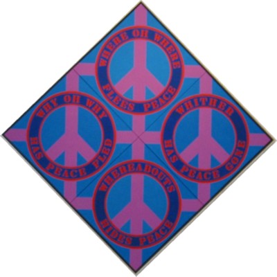
And when you enter, there it is: one of the big ones. There are three, four-panel paintings but The Four Diamond Peace Diamond is the biggest at 101 x 101 inches. On a blue ground, mauve signs are circled in dark blue, inscribed with red words: (top) WHERE OH WHERE FLEES PEACE (right) WHITHER HAS PEACE GONE, (bottom) WHEREABOUTS HIDES PEACE, (left) WHY OH WHY HAS PEACE FLED.
Where does that mauve come from? Here’s an idea: Apparently, the 1973 Indiana 8-cent LOVE stamp, meant to be red, blue and green on some sheets, developed a purplish tint. This was the first time Indiana used purple. (What a collectible!) The smaller four-panel pieces ask us to HOWL, SHRIEK, SCREAM, SHOUT FOR PEACE or WOOF, HOLLER, CLAMOR, HOOT FOR PEACE. In both, the peace signs point to each of the four directions.
Four of the single-sign peace-sign paintings have the sign upside-down, but this does not match the words — none of which suggest surrender. The peace sign (which is not an anti-Christian or an occult symbol, as has been rumored since the ’60s by the lunatic right) was designed by one Gerald Holm in 1958 for the Campaign for Nuclear Disarmament. “I was in despair,” he recalls. “Deep despair. I drew myself: the representative of an individual in despair, with hands palm outstretched outwards and downwards in the manner of Goya’s peasant before the firing squad. I formalized the drawing into a line and put a circle round it.”
Why is Indiana making paintings of the peace sign?
It’s all very logical if you consider that Indiana made his fame with his LOVE design: the L and the O on top of the V and the E, the L at an acute angle. This was his invention, and he made paintings and sculptures using it. It was knocked off everywhere. I bought my partner a LOVE ring at the 26th Street flea several years back, made of brass, not gold, like the official ring. And I have an officially sanctioned LOVE doormat purchased on sale at the Whitney.
Peace is right up there with LOVE. That the symbol Indiana’s using already exists is neither here nor there. It is the timing that is particularly his. LOVE was hot on the heels of the “love generation.” And now peace, in the form of hard-edge variations on the peace symbol, is equally appropriately timed. Because of the words, the paintings — bright colors notwithstanding –are either mournful or are exhortations. When has that been seen in art before?