

Pointillism or pointlessness?
Visualizations I Have Known: A Tale of Two Villages
I am a fan of visualization. Because…when you think of it, all art is a form of same, right? Even paintings; particularly paintings. Visualization is a way of thinking and communicating. My breakthrough was the braid. I was annoyed with the way the history of art is pictured, in words, but also in timelines and such, and well aware that the staircase model is false (as is the tree, no matter which side up). To change thought you need a new picture. I am not sure how the braid popped into my brain, but it did.
Finally grasping that Tibetan mandalas are meant to help you visualize entering a physical/spiritual construct as if in three dimensions? Remembering John Cage’s notion that having at least five different things going on at once is likely to produce interesting results? Yes, and more.
The braid visualization made it easier for me to grasp the ups and downs, the ins and outs, the disappearances and reappearances of various kinds and aspects of art — and perhaps made it easier to explain those things to others.
But constant readers have heard all of this from me before; “weaving” in and out of my various essays. The braid has also helped me come to grips with my various pursuits. For instance, I can see five aspects of myself as interrelated: poet, artist, critic, curator, fiction writer. These roles are not at war, but interwoven.
And I am working on using the braid as a way of understanding the interrelationships of sculpture, painting, craft, architecture and design.
Because of the braid, I am interested in other kinds of visualizations, too: maps, graphs, diagrams — for their beauty as well as for their information. I am well aware that beauty and/or logic can distort. Just because something is beautiful or logical doesn’t mean it’s true. Quantification is sometimes obfuscation. Truth needs to be tested.

That said, I confess I am fascinated by the new digital, zoom-in map derived from the Census Bureau’s American Community Survey and made available by the New York Times as Mapping America: Every City, Every Block. It really seems to be true that for the first time in the U.S. Euro-Americans are a minority; therefore, “minorities” are in the majority. We are warned, however, that the data should be treated as estimates because they are based on samples.
You can chose maps for race and ethnicity, income, housing and family, and education. You can zoom in on your very own neighborhood to glean all kinds of information and, if you aren’t careful, misinformation. And you may be surprised.
I urge you to try it out right now by clicking HERE, although I warn you it is a rabbit hole.
I learned many things I already knew. Rather, I had my random samplings and personal perceptions confirmed. Zooming in on the area around Tompkins Square Park, near where Jeff and I have lived since 1977 in the East Village, New York City, the apparent dominance of white faces is confirmed –almost all the way to the East River. That was not the case east of Tompkins Square, when in really ancient times I lived on 8th Street and Avenue D, with a great view of the East River, but also a southern view of burning buildings.

Tompkins Square Park yesterday…..

Tompkins Square Park today.
The funny thing about information is that you always want more. I want to see how the ethnicity of my neighborhood has changed. Not possible here. Judging by our own building, closer to Second Avenue than Tompkins Square, the traditional Ukrainian tenants are all but gone. One old Ukrainian lady remains, solely to fulfill her pigeon-feeding duties. In the ’60s when this part of the Lower East Side was renamed the “East Village” by realtors, most of the Slavs were sent into Jersey exile by bohemians of the artistic sort, citizens of that Bohemia famous for its nonexistent seacoast. Even our Polish-American landlord lives in New Jersey. Now, the neighborhood poets, novelists, filmmakers and artists have been driven out by NYU students who have well-off parents or gigantic bank loans to handle the sky-high tuition and exorbitant, free-market rents for still-tiny apartments — where plaster-board and designer mini-refrigerators have forced the roaches and rats back into the sewers.
On the new survey map there were some surprises. Obviously, annual income is up from 1977. But “truth” is in the details. I never would have thought that the census tract east of Tompkins Square — once infamous for B-ins and Smoke-ins, but now clean and well-groomed with a yuppie doggy run — had a higher median income than the blocks west of the park — until you hit the area between Second Avenue and The Bowery, where income jumps again, slightly but inexplicably. Same old tenement buildings. Maybe the one hi-rise on The Bowery is all it took, or somehow there are rich households hidden in the basement of the ugly-as-sin Ukrainian Church (1977) or in the backroom of McSorley’s Olde Ale House.
And another village…..
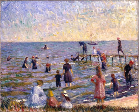
Bathing [on Long Isand] by William Glackens, 1910.
 Mansion for Sale, Long Island, 2010
The Map Is Not the Territory
Hooked (beware!) and in order to illustrate more points, I zoomed in then on the little Long Island village where we sometimes go to escape noisy, latte-slurping students. Although not surprised that this celebration of the Neo-Colonial is 91% white, I was amazed that the largest concentration of African Americans is not immediately north of our picket-fence, Mickey-and-Judy village, as many presume, but somewhere far, far away in the middle of Long Island.
But every paradise must have its serpent. This charming village was once “restricted.” A sign of that is, literally, a sign once posted (c. 1910) on the village’s Fire Island beach that read, “No Blacks, Jews, Italians or School Teachers Allowed.” You won’t find that on any map, old or digital.
I also checked out the median income ($84,519 compared to our census tract in Manhattan at $53,405) and other factoids. I say factoids for a reason. It dawned on me that although it is probably true that the highest household incomes in Suffolk County are in the Hamptons, our Secret Village has more than its share of wealth. I know that one billionaire – we have one – does not a Hampton make, but because we routinely stumble across a few multimillionaires and an occasional celebrity at summer lawn parties on the Great South Bay, we began to wonder about the income picture.
Something doesn’t smell right. Four well-known New York art dealers own homes on the “good” side of the Village’s main drag. And some of the stately homes built by whaling captains before the Civil War and the hidden shoreline mansions probably require more for energy and upkeep than the Village’s median income.
Do second homes count as households?
I asked a village friend if he had been quizzed for the census. Yes. But they were after persons who had primary residences and/or were registered voters. Weekenders do not count and were not counted. So perhaps the actual wealth or the residents on any weekend in the summer season — or any weekend, since The Village is only an hour and a quarter by limo or personal BMW from Manhattan — is much, much more than the census estimate.
My spy also noted the current controversy over whether New Yorkers with second homes should be able to vote in local elections. The Village once allowed this. (Saltaire on Fire Island still does.) This controversy is boiling up in other staid retreats with concentrations of second homes all across the country. My friend claims that the one-person/one-vote rule, used against second-home voters, is a red herring, since second-home owners would vote only on local issues in local elections. Anti-New Yorkers — some of them no doubt Tea Party acolytes — seem to have forgotten that “No taxation without representation” was once a rallying cry for a revolution.
Oh, even those who don’t pay taxes or own homes are allowed to vote for Village trustees. Sounds like a case for the Supreme Court.
In a nutshell, the census map in question is based not on perceptions but on abstractions, not only “households” defined by 20th century notions, but – worse yet — locally determined census tracts,. The tracts on Long Island are not the straightforward ones superimposed upon the grids of Mannahatta: “The free city! no slaves! no owners of slaves!…. The city of such young men, I swear I cannot live happy, without I often go talk, walk, eat, drink, sleep, with them!” [Walt Whitman]
To homeowners, realtors in search of premium prices and mere visitors, The Secret Village is what’s on the map you get at the quaint Village Hall: the area incorporated 100 years ago, the home zone that allows access to The Village’s very own Fire Island beach. The census tract, however, leaps over The Village’s legal northern boundary and incorporates the unincorporated, high-crime area just north.
The Census Bureau disclaims any responsibility for the determination of tracts and offers this as an explanation:
Census tracts are small, relatively permanent statistical subdivisions of a county. Tracts are delineated by a local committee of census data users for the purpose of presenting data. Census tract boundaries normally follow visible features, but may follow governmental unit boundaries and other non-visible features in some instances; they always nest within counties.
Designed to be relatively homogeneous units with respect to population characteristics, economic status, and living conditions, census tracts average about 4,000 inhabitants.
“Delineated by a local committee of census data users for the purpose of presenting data”!
Towards what end? Social programs? Funding opportunities? Real estate values?
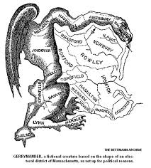
Is this a space alien, a prehistoric bird? No, it’s a gerrymander..
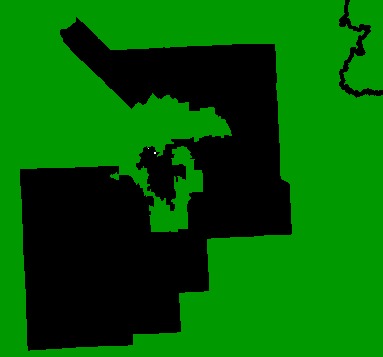
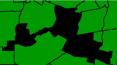 These are not weird jigsaw-puzzle pieces, but voting districts in Upstate New York, courtesy of Citizens for a Better New York.
Be suspicious of maps. They are only tools. Just remember, in spite of a recent exhibition in Tokyo called “The Definition of Self” you cannot really map the self. It might not exist
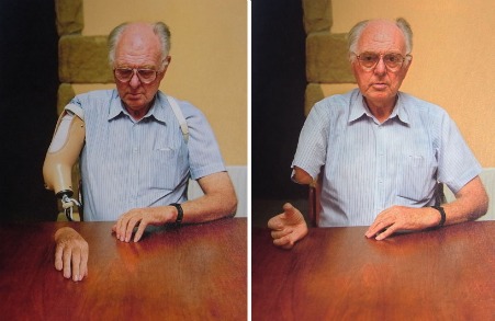
Phantom limb demo,”The Definition of Self”
And art? How many artists and/or poets are there in each census tract? How many art critics? Can we see any numbers in regard to art in general? Not on the current map, but we can see some information on other visualizations now available, alas. And the state of art in general doesn’t look good.
Graphology
Also in the news at the end of the year was a new Google tool. “Google Insights for Search” allows instant graphic representations of Google searches by word or multiple words for comparison over the past six years. I urge you to try it by clicking on Google for Insights for Search at the top of the graph above. But be aware, it is another rabbit hole.
For instance:
First I entered “apples” and “oranges” in the search window to see if you can indeed compare apples to oranges: Yes!
I decided to stick to worldwide numbers, because Google is largely U.S. anyway, and the difference in relative numbers when I compared results seems to be minor. You can also search separately by state as well as region or country. Other options are “All Categories,” or specific ones like “Art and Humanities,” “Automotive,” “Shopping,” and so forth.
Worldwide in All Categories:
From 2004 to 2010 there were more searches for “apples” than for “oranges,” with a ratio of 56:18. As you can see on the graph above, interest in both spikes at the end of each of the six years covered by the graph, but “oranges” for some reason spikes almost exactly at the end of the year. Apples for Christmas? Oranges for New Year’s Day?
I also tried comparing apples, oranges, and bananas, but it didn’t make any sense at all.
Interpretation is, as usual, the extra-visual “art” required when reading graphs, diagrams and maps, and maybe all visualizations including painting and sculpture.
But what would happen if I were to use the new Google tool to compare Andy Warhol to Jasper Johns? Worldwide, U.S., and even narrowed to the “Arts and Humanities” filter, it’s pretty much 65:5 in favor of Andy.
Here I made a mistake. I deleted “apples” and “oranges,” but forgot to delete “bananas.” By accident, I came up with a graph of the worldwide interest in Andy Warhol compared to the interest in bananas. Close, very close: 67:63. In favor of bananas.
Jeff Koons to Damien Hirst? 17:21. Hirst is first.
Damien Hirst to Andy Warhol? 7:64. Though dead, Andy wins.

Then I Made My Big Mistake
For a project I am working on, keeping in mind all the possible anomalies and fallacies, using the U.S. filter, I compared the following:
Painting to sculpture: General Search 65:16, Arts Category 60:20. Could have guessed this one.
Ceramics to sculpture: 29:60. Is this why ceramists sometimes foolishly insist they are making sculpture? To get a bigger piece of the interest/must-know pie?
Ceramics to pottery: 11:72. Never would have guessed that interest in “lowly” pottery — one of my favorite art forms — would beat interest in the more tony ceramics.
So why not bite the bullet and compare searches for art and for craft? Both words have multiple uses that might fuzz the results. My gamble was that the use of the word craft in the phrase “the craft of brewing beer” or “the craft” as in witchcraft, or as referring to all manner of boats, would balance out the use of the word art for everything including the kitchen sink and thus allow some general indication of interest in art and/or craft beyond a limited “Arts and Humanities” filter.
So, art to craft: (62:7), in favor of art. Yet however low, low, low in comparison to art, interest in craft is stable through the six years covered by Google, unlike the interest in art.
But, there is a horrifying dip in relative searches involving the word art : 60% from 2004 to 2010. Why has this happened? What does it mean?
In an attempt to “prove” the decline, I plugged in specific words: painting, sculpture, drawing, etc. The decline held. And in other arts areas? Similar declines showed up in searches for jazz and ballet — but surprisingly, not much of a dip for opera.
I tried other words: surely the interest in sex has not declined, right? Right. Steadily increasing. Worldwide, “sex” is on the rise. Even in the U.S. and in Poland; but not in China, which may be because Google is forbidden, thus skewing the figures.
Sex is on the rise, but poetry, like craft, is steady:
The map offered with every search provided another revelation. Relatively speaking, Pakistan may share the sex-search crown with Vietnam, but it has the highest relative number of searches for poetry of any country in the world. I can’t embed map so click on Google Insight for Search at bottom of graph above. World map is below and to the left of graph. And Pakistan really sticks out.
Maybe I should move to Pakistan. Mmm. Don’t think so.

And the Meaning Is?
I proffer some probable and not-so-possible probable explanations for the drop in art searches and thus, I assume, the drop in art interest:
1. Because of the recession, there may be fewer art and art-history students, and therefore fewer searches for art. An MFA now has little cash-value.
Makes sense, except that the search decline started before 2008, the start of the Great Recession.
2. I might be wrong in equating actual interest in art with Google searches involving the word art — no matter how I have refined my search of searches. Although Google normalizes its data and takes into account the effect of constantly increasing users, something may be missing from the equation. There may be anomalies, as in the American Community Survey interactive map dependent upon traditional but suspect definitions (i.e., that of households and primary residence) and upon politically self-serving gerrymandering. And there may be other reasons for the Google-search drop, such as: art interest is wayward and easily satisfied, or searchers are so disappointed they lose interest and go on to other things like sex or Lady Gaga, the anti-DADT heroine. Are new Googlers older or younger? Richer of poorer? Less educated? Less visual? Less curious?
3. Worst reason I can imagine: I have heard many otherwise intelligent acquaintances express a new contempt for contemporary art on the grounds that it’s just for rich people.
Gigantic auction prices along with hints of rigging of same by interested parties, not necessarily but not excluding the artists themselves, may be having a deadly effect. Could it be that art has lost its role as a spiritual path and instrument of knowledge — and, therefore, its perennial appeal? Maybe this is also true of the arts in general, including the performing arts (to give them their due), finally reduced to entertainment.
Is there any other evidence of the decline of interest in art? We are told that U.S. art-museum attendance, except for MoMA and MoMA-like “location-based entertainment centers”(LBEs ), has dropped by almost a third. Most commentators blame the economy, but…could it also be disillusionment with art? False expectations finally exposed? Internet substitutes?
It is not such a big jump from talking about the business aspect of art to the perception that art is business, and nothing else. If art is just business, why should anyone care about it, make sacrifices, waste time and energy just so investors and artists can go crying all the way to the bank?
But in Artopia we insist that art continues, even when it is not called art, per se. It could be called Dada or Gaga or something that no one is interested in at all except the artist making it. Art may be in eclipse, in hiding, but it is still there, off the maps — unnoticed, doing its work.

Lady Gaga’s Meat Shoes, 2010
However, some visualizations may be a kind of art themselves.
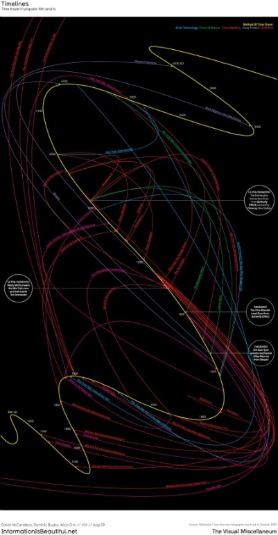
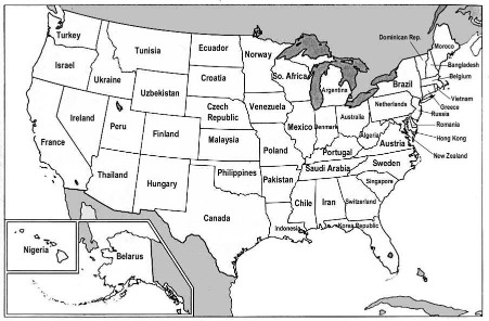
David McCandles: Time Travel in Popular Film and TV.
How Would You Picture Time Travel? Or Billions Spent?
I am now an admirer of the British “graphic designer” David McCandles whose website is called Information Is Beautiful.
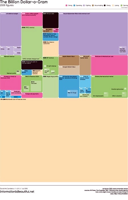
Or how about his Billion Dollar O’Gram:
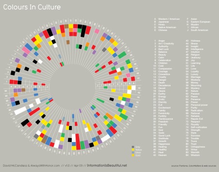
Or his Colours in Culture:
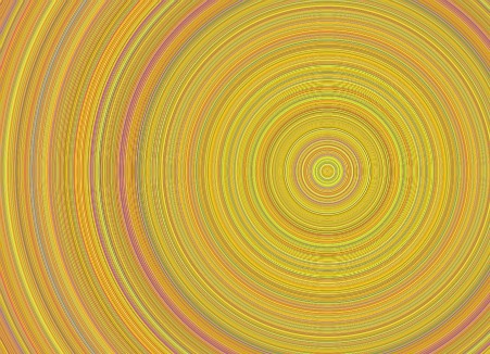
And then I discovered Chris Harrison’s Digg Rings.
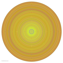
Go to Harrison’s blog for more images and an explanation of what the rings represent.
Chris Harrison, “All Stories from December 1, 2004 to May 1, 2008” [close-up]
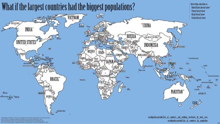
A good source of other visualizations verging on art is Visual Complexity. Vast, but all images are under pretentious and self-defeating copyright restrictions, so I disdain to present them here. And Frank Jacobs’ Big Think/Strange Maps, although more historical and conceptual and more at the map end of the spectrum is worth a try. How about his Map of the World’s Countries Rearranged by Populations:
FOR AN AUTOMATIC ARTOPIA ALERT E-MAIL perreault@aol.com
John Perreault is on Facebook.
You can also follow John Perreault on Twitter: johnperreault