main: April 2008 Archives
I am entertaining myself with a list of critics and artists who will hate "©Murakami," a retrospective of the Japanese artist Takashi Murakami (b. 1962), at the Brooklyn Museum (200 Eastern Parkway) to July 13, 2008.
Takashi Murakami, DOB's March, 1995 © Takashi Murakami/Kaikai Kiki Co., Ltd.
All Rights Reserved
Or, if they have passed on, would have hated it. The list is composed largely of those who despised Pop Art the first time around -- mostly because of an emotional, poetic, and/or economic stake in Abstract Expressionism. The fear was that Pop would replace the well-worn, familiar feeding-trough, the A.E. hierarchy, and hard-won standards of seriousness -- and machismo. At the same time, Minimalism, neither friend nor foe of Pop, was another threat that needed to be squashed. How could you have art without obvious self-expression? Without the traces of the artist's hand?

Long Live Pop
I will not share my list with you, because some Anti-Popsters are still alive, if not exactly alive and kicking. You can come up with your own. Suffice it to say, I myself was prepared to hate Murakami's slick and oddly sticky offerings. How dare this artist appropriate manga and anime -- two well-known Japanese mass-media forms -- with such cynicism, such determination both to shock and please? How dare he, like a certain mastermind of marketing, place some of his paintings on top of his own wallpaper?
I hated Murakami's Reversed Double Helix (2003) when it was shown at Rockefeller Center a few years ago. It seemed gaudy and small. There was no way it could reach the grandeur of Jeff Koons' miraculous flower puppy.
But I hope I am not giving too much away right here at the start. I'll begin by saying that I was greeted by a Reversed Double Helix doppelganger called Tongari-kun (Mr. Pointy) smack in the middle of the BMA's silly glass entrance. I've said it before and I will say it again (art critics never forget, never forgive): when is the next hydrofoil ferry leaving? And for this they ruined the grand stepped entrance?
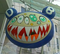
Although the sculpture was iffy, the floating DOB's March balloon at least has some teeth to it. The cute but snarling DOB figure is said to be the artist's surrogate. On the way in, I was already warming to the forthcoming charming but disarming stew.
But not quite yet.
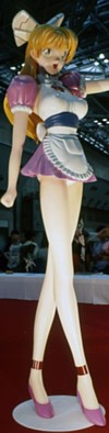
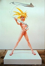
The exhibition begins in the fifth-floor rotunda. I breezed by some Murakami paintings that did not at first impress and took a quick look at the ultra-cute Miss ko2 (1997), a painted fiberglass statue of a perky, fetishized waitress. My exploration of anime (rented from Kim's Video on St. Mark's) of over a decade ago had clued me in to the salaryman's schoolgirls-in-uniforms fetish. Cute nurses-in-uniforms also figure in anime soft-core. So I guess I need to add cute and perky waitresses-in-uniforms to my useless list.
Smack in the middle of the rotunda was Murakami's three-part Second Mission Project ko2 Advanced (1999-2007). Miss Cute Waitress, in three steps -- Human Type, GA-Walk Type, and, yes, Jet Airplane Type -- is transformed into a scary, deadly, no longer cute jet airplane. Well, that bears thinking about. Nevertheless, my first response was that I had already seen such things in the second-floor Japanese toy store a block from where I live: transformers are now universal, right? But what does it mean to transform a cute and perky waitress into a jet airplane? That stopped me in my tracks. I'm still not sure.
Takashi Murakami
Installation view of Miss ko2 (Project ko2) (1997)
at Wonder Festival, Summer 2000
Oil, acrylic, fiberglass, and iron
100 x 46 x 36 in.
Courtesy of Marianne Boesky Gallery, New York
Blum & Poe, Los Angeles, Galerie Emmanuel
Perrotin, Paris and Miami, and Tomio Koyama Gallery Tokyo
Photo by Kazuo Fukunaga
©1997 Takashi Murakami/Kaikai Kiki Co., Ltd. All Rights Reserved
I have been to Japan a number of times on various projects -- as the U.S. commissioner for an international survey of figurative painting, to write a text about a contemporary ceramics artist, and once to attend a glass-art conference in the little city of Seto. I should also point out that I live in a colonized East Village. There are so many Asian students at nearby NYU that the area could be called Little Tokyo. Strange fast-food chains with names like Very Berry and T-Kettle are dotted along St. Mark's Place, no doubt soon to edge out tattoo parlors and other tidewrack.
Bubble tea is not my favorite thing in the world, nor is any of the Japanese pastry, which has more eye-appeal than taste. But I shop routinely in the totally Japanese, Stuyvesant Place Sunrise Mart above the St. Mark's Bookshop on The Bowery. I also seek out the latest secret ramen joint, occasionally have exquisite sushi at Hasaki on 9th Street, and will happily slurp cold noodles or hot udon at Soba-ya, also on 9th.
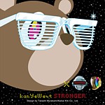
Promo for rapper Kanye West, designed by Murakmi (not in exhibition)
Cuteness-hating, salaryman-hating, good old me, I wandered into the Murakami films, which are being shown in a dark room just off the rotunda. The first one up was a music video for rap star Kanye West's Good Morning, called not surprisingly Good Morning. A cuddly-cute bear wearing cute shades barrels through a number of cute and not-so-cute ultra-urban encounters.
Wait a minute. Those are my sunglasses, white ones with slats instead of glass. The cute teddy bear is wearing my new glasses. I bought them at a sidewalk stand on St. Mark's and Second Avenue in front of Gem Spa just a month ago, but after a great deal of debate. Would I actually wear them to the beach this summer? Would they protect my eyes? I think not, said the Indian man stationed at the outdoor sunglass rack. They are for parties. And what color should I get? I looked at orange and Day-Glo green, but settled on stark white as much more becoming. They were only $5. Alas, upon minute inspections mine are slightly different from those in Murakami's music video. Mine were designed in Italy and "hand-polished in China." Nevertheless, I will keep them forever, even if I do not wear them to Ho-Hum beach.
You can see Murakami's "hip-hop" music video on (click here) Myspace and I am sure you will agree that although I may now fear I will look like a cute anime teddy bear, my nearly identical sunglasses must be extremely cool.
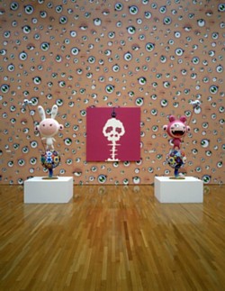
Next on the bill were two episodes of Murakami's Kaikai & Kiki (2007). Bunny-cute Kaikai has protrusions on his/her head that could be mistaken for bunny-cute ears. Kooky-cute Kiki has three and sometimes five cute-Keane anime-type eyes.
When I was back in the East Village, I decided I needed to look at some anime again: not Akira or cute perky-breasted porn featuring cute nurses nursing (each other), but Sailor Moon (barf!) and Demon Beast Invasion (surprisingly lewd and violent). You see, in terms of the latter, muscular demon giants on steroids once ruled the earth and had to leave when the atmosphere changed and now they are back trying to impregnate cute human girly-girls so their demon offspring will be born acclimatized...The big demon seems to have not-cute tubes coming out of his not-cute nipples and other places that he uses to... Well, never mind. Until he meets the cute heroine who can't get enough of those demon tentacles, his stock response to his own failure to implant his demon seed is: "Another inadequate earth girl." Earth girl dead, bloody dead, gruesomely unpregnant and dead.
What happened to cute? Did I miss something?
Demon Beast Invasion did have an extra that tried to explain some anime conventions to the uninformed. Yes, Japanese men have a schoolgirl fetish. The weird hairdos are so we can easily differentiate all the cute and perky, squeaky-voiced teenage girls. The big eyes? They come from Betty Boop, which was an early cartoon import from the U.S., and not from Margaret Keane's bug-eyed children.
Long Live Poop
Oddly enough, Episode I of Murakami's Kaikai & Kiki is called "Planting the Seeds." No, not those kind of seeds, not demon seeds, watermelon seeds. It is really all about poop.
Poop Alert! Poop Alert! Click here for a preview.
The seeds need poop to pop. The sophisticated audience giggles on cue every time the word poop is used. When the seeds refuse to pop up, Kaikai provides some human fertilizer. Very educational.
Infantilism! It's as if that other favorite of mine -- the cunningly cute, British-born Teletubbies -- somehow got crossed with some coprophilic Japanese daydream. Episode II features even more poop. I've heard that body functions are treated cavalierly in Japan, but not pubic hair, as I myself found out when a Philip Pearlstein painting for the exhibition I was curating for a Japanese department store was stopped by Japanese customs. Or is Murakami just being naughty? Will we ever see episodes of Kaikai & Kiki on PBS?
Next we are treated to the "preview trailer" for Murakami's first live-action feature, to be called Dharma. The film, which so far looks very, very chic indeed, will feature an impotent assassin who meets his doppelganger in Tokyo.
The films - and I am being serious -- set the right tone for the exhibition, and I recommend that you see them first. Don't even look at Miss ko2 until you've seen the films.

I am not sure if it is the exhibition layout over two floors -- in and out of rotundas and some odd side rooms, here and there, and even down a staircase, papered with Murakami wallpaper -- that is non-linear, or the oeuvre itself. The highly publicized Louis Vuitton boutique featuring Murakami's not very original handbags is dead center. The staff is immaculately white-suited. That's the most interesting thing about the embedded boutique, certainly not the handbags. And then there's a cheaper gift shop with Kaikai & Kiki souvenirs and $100 stuffed toys, all more to my liking than the logo-speckled bags. But I don't remember seeing my white, slated sunglasses. That is a retailing mistake.
The exhibition feels immense, but to me -- at least the first time around -- there were two highlights. I count the two statues called Hiropon and My Lonesome Cowboy as one piece, at least the way they are here installed, facing each other, in a room "decorated" with "cream" splashes.
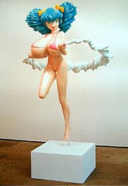 I was amused to see the mom of a well-heeled mom-and-pop team trying to explain to her seven-year-old daughter (and with a straight face, while daddy shrank to nothingness nearby) why the young lady with the enormous breasts was squeezing her cute cherrylike nipples to spurt a cute circle of milk that was like a dairy hula-hoop. While poised on one foot.
If you can't explain Hiropon to your seven-year-old, then you probably can't explain her companion, My Favorite Cowboy, who is spurting a rope or whip of "cream" from his erect, hand-held penis. Leave your seven-year-old at home.
 You can hear the artist himself trying to explain his My Lonesome Cowboy by dialing 718-362-9589, followed by 10#. This is the BMA's cellphone gallery guide, which can be called from anywhere. Here you will learn that Murakami has never seen the film Lonesome Cowboys. Guess who made that film?
My second highlight is Tan Tan Bo Puking (718-362-9589, 21# for Murakami's explanation). Made in 2001, it is a large painting about...puking. Like pooping, everybody does it, but Murakami blows it up to Peter Saul proportions: throwing-up on acid, I suppose. But without disgust.
 Takashi Murakami
Tan Tan Bo Puking - a.k.a. Gero Tan, 2002
Acrylic on canvas mounted on board
141 3/4 x 283 7/16 x 2 5/8 in.
Collection of Amalia Dayan and Adam Lindemann
Courtesy of Galerie Emmanuel Perrotin, Paris and Miami
©2002 Takashi Murakami/Kaikai Kiki Co., Ltd. All Rights Reserved
If you want more of Murakami's "explanations" or the sound is just not good enough on your cellphone click here for MoCA's artist tour. MoCA is where the exhibition originated.
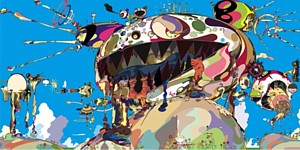
Murakami: Summon Monsters? Open the door? Heal? or Die? and Kaikai and Kiki
©2001 Takashi Murakami/Kaikai Kiki Co., Ltd. All Rights Reserved
And then there are the cute "flowers" and the very Miro/Kandinsky-cute "jellyfish." Even the "death's head" A-bomb blasts are radioactive cute. In writing about Murakami, nearly everything has to be put inside quotation marks. Even "Murakami" has to be put in quotes marks, for he has a huge staff. He is a huge staff. The crawl for one of his films goes on and on for an eternity.
And throughout the survey there are countless cross-references.
The early mushroom death's head cloud (both on canvas and on wallpaper) rimes with the saccharin toadstools that come later. Somewhere well into the exhibition you will come across the Inochi cycle (c.2004). Inochi is a kind of hydrocephalic space alien. One loony theory is that the real aliens look like this because the oversize head will remind us of infants with their big heads, and thus we will go all warm and protective. But there is a Inochi on a flat screen in what appears to be a TV ad promoting milk as a healthy beverage. Did the Hiropon and Cowboy manikins start out as proposals for a national drink-milk ad?

Here are some generalizations:
1. Pop did not go away. It was only in hiding. Since art history is most productively seen as a braid with several strands, it is obvious that Koons first and now Murakami have ended the Pop occultation. Murakami has appropriated image types and even themes from Japanese popular culture and used them to create a weird, off-center language to address fecundity, mortality, infantilism, and, yes, commerce.
2. Although one way to make new art is to apply old principles to new materials and thus generate new images and new thoughts, I still wonder if Murakami's obvious success is due to exoticism more than innovation. We have already seen artists appropriate comic-strip and cartoon material from Western mass media. Is referencing Japanese mass-media imagery a big step forward or only a shuffle sideways? Does it matter?
3. In the days when the only "mouse" other than the trappable kind was Mickey, I am told that pornographic versions of Walt Disney offerings and Looney Tunes escapades were made sub rosa. And lewd Dagwood and Blondie comic books. But would paintings or videos of Minnie and Mickey pooping and puking instead of doing the old in-and-out be as effective as Murakami's Nippon-centric efforts?
4. In terms of Japanese culture, one is initially attracted to the austerity of the tea ceremony, sumi ink drawings, Zen rock gardens, or the dry tearjerkers of Ozu, which, for all their focus on the quotidian, are in their own way as mysterious as any koan. They are so ordinary that they're almost not there, even while you are watching them. And yet we are forced to care about a daughter growing up or some other banal family crisis. But in Japan there is a gaudy, bawdy shadow that balances restraint. Think of all that neon putting Times Square to shame. I can see how austerity can become oppressive, and one might be driven to seek excess to keep sane. Extreme decorum needs to be balance by extreme décor. Murakami represents that excess.
On my way out -- obviously brainwashed by too many flowers, too many Betty Boop eyeballs, too many mushrooms, too many jellyfish, too many colors -- the Mr. Pointy sculpture at the entrance now made perfect sense. Psychedelic Buddha? Why not. But shouldn't he be pooping and puking?
Footnote: For samples of manga comics in English click here. The titles of these comics are in themselves poetic: Bleach, One Piece, School Rumble, Vampire Knight Air Gear, Eyeshield 21, Full Metal Alchemist, Bitter Virgin....There are highly segmented manga categories: boys, girls, of course, but also salaryman, "ladies" and, yes, adult (meaning porn). No porn here, sorry, but most you usually have to read them back to front and from right to left. There's a diagram on the site to help you out. There are also on-line manga shrines devoted to particular comic books, but you will have to search for them yourself.
If you want a taste of anime, click here. The site is a little bit difficult to figure out and full of pop-ups and ads, but if you can find them, I recommend a 23 minute episode of the sugary Bleach (an anime version of the comic book) with English subtiles and the pro-peace Soul Eater.

FOR AN AUTOMATIC ARTOPIA ALERT FOR NEW ENTRIES
CONTACT: perreault@aol.com
The most thoughtful, thought-provoking and provocative gallery show this season has to be "Dan Flavin: The 1964 Green Gallery Exhibition" at Zwirner & Wirth, 32 East 69th Street, to May 3, 2008.
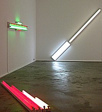
Installation view (detail) at Zwirner & Wirth.
Flavin Redux
I remember the original well. I even wrote about it for the now long defunct Art International, coming out of Berne, Switzerland. If a gallery can appropriate a long-ago exhibition, then I can certainly feel free to re-deploy my equally ageless and at last uncensored review:
Dan Flavin is no doubt the most irritable man alive. To make matters worse, he tends to rage and rant in the form of single-spaced, badly typed missals, often five or six pages in length on airmail paper, to save money on postage or to make it seem he's writing from the front. But the battleground is only in his mind.In spite of the enormous chip on his shoulder, at last Flavin has had his breakthrough moment at the Green Gallery this month. This doesn't mean he'll stop his tirades. The kind of work he does leaves him with lots of time on his hands to get angry.
We were previously aware of his fluorescent light "sculptures" and now there's an array of seven recent pieces that marks out some of the possibilities of his readymades-on-display. Calling them readymades risks evoking one of his letters, for, like the critic Don Judd, I am told Mr. Flavin despises Marcel Duchamp. Perhaps because Marcel has always been a gentleman of the worst sort.
Well, Flavin's ultra-cool fluorescents are really about placement rather than semantics, but like the 1917 urinal signed R. Mutt, Flavin's store-bought tubes are also philosophical. Clever choices and specific display in art contexts is what makes these obdurate propositions art, but not self-expression.
But how many ways can you vary the placement of fluorescent light fixtures?
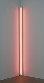
Let me count them: 1. the diagonal of May 25, 1963 (to Robert Rosenblum) is an eight-foot fluorescent light placed - you guessed it - diagonally; 2. a primary picture is a square on the wall made up of red yellow and blue fluorescents, the colors of which wash the inside of the square like the pastels in a Jules Olitiski painting but also bleed out along the wall; 3. gold, pink and red, red is an eight foot configuration placed directly on the floor; 4. red and green alternatives (to Sonja) is a symmetrical wall arrangement that could be a minimalized Chevy or Frigidaire logo; 5. alternate diagonals of March 2, 1964 (to Don Judd) is a 12 foot, diagonal wall piece; 6. the nominal three (to William of Ockham) is one vertical fixture/tube next to two next to three; 7. pink out of corner (to Jasper Johns) is a fluorescent standing in a corner, washing the two walls with pink.
So here you have the ingredients: number of fixtures, arrangement of fixtures (either vertical, horizontal or at a 45 degree angle, colors of the fluorescent tubes. One wonders if Flavin will come up with more variations, but I doubt it. For all their austere (here comes that letter!) Platonism, this ultra-cool exhibition in Dick Bellamy's hot-spot is a serene antidote to the Claes Oldenburg, James Rosenquist, and George Segal exhibitions that came before, but can also be seen as Pop. Hardware Pop. Or Color Field paintings painted with light directly on the walls. It is no doubt extremely difficult to strip light of metaphysics, but Flavin has done just that. Almost. Now if he would only drop his sentimental or suck-up titles....
Dan Flavin: pink out of a corner...(1963). Exhibition Copy, Courtesy of Stephen Flavin.
True Confessions
Now that I have had a second look at that 1964 exhibition, I still stand by my words. Of course, I wrote them today and not 34 years ago. Since 1964 he came up with many variations. Just search Google Images for a taste. But I could have written the above review in 1964. I was already writing about art then, but not for Art International, which came a bit later. In any case, next week I fully expect to receive a single-spaced badly typed letter from the Beyond.
I wish, however, I had saved the one I really received from Flavin (1933-1996) while he was alive. I don't remember the occasion or the horrendous offense against art and Flavin's ego I had committed. I immediately tore it up and flushed away the shreds. If I had saved it, I could quote from it and it would give him back some of his humanity, now that he is fully sanctified. We do wonder how an artist who made such sublime work could have been so paranoid.
Although I hate to admit it - since I am Mr. Antiformalist - in some cases it might be better not to have ever met a particular artist, or received a letter from him (or her) or better not to know anything biographical. Aesthetic intentions or critical program? Any artist can put his foot in his mouth; but to be born with your foot in your mouth is truly a curse. You know what they say: time wounds all heels.
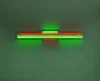
Flavin, red and green alternatives...(1964). Collection of Sonja Flavin.
In the Neck
The first thing, however, I did think of when I turned off classy East 69th Street into Z & W was that something was wrong. I had indeed been in the Green Gallery ages ago and I assure you it was not on street level. It was also one large room, which is not the case with the Z & W which has a small front room with a roll-up window onto the street then a narrow trunk or neck or hyphen to a larger back room.
The drawings opposite the reception counter in the neck were not shown in the original exhibit, but someone saved them; someone found them. One is a sketch made by Flavin of the installation he wanted. There is one room and one room only. Suspicions confirmed.
We have to refine our description of the current exhibition; it is not a recreation of the 1964 show because the space is different and anyone who knows Flavin's work appreciates how important installation is and how placement in a specific room cannot be divorced from the component or components involved. What we are really seeing is the works from 1964 reassembled, reunited in a totally different space. And as such, they are different works.
You cannot step into the same stream twice, even when it's art you are stepping into. The fact that the 1964 fluorescent works are being shown on the chic Upper Eastside and not 57th Street where the Green Gallery was, makes the work look different. If the recreation were in any other of the Z & W galleries, whether in Chelsea or Zurich or London, other attitudes would apply.
And art has changed. The art world has changed. And I have changed.
Most importantly, unless this is the first Flavin fluorescent pieces you have ever seen, you will see these knowing what came later: more of the same. And more and more. He stuck to his guns.
Back then we thought of Flavin as stubborn, obstinate, stuck in one place or, more positively, as dedicated, committed, forthright, uncompromising, even anti-artworld. Certainly anti-Pop as well as anti-Abstract Expressionist. The works could even be interpreted at anti-commercial, for who would spend good money for a few fluorescent lights?
We did not think Flavin was merely establishing a brand. Nowadays if you were limiting yourself to fluorescents that is exactly would you would be doing. And you would, alas, be praised for it, for that is what the customers currently understand and want.
We cannot see the work afresh. It is like seeing art entombed, which is the destiny of all art that is honored enough to be saved. Or, because it is so timeless, is this art perpetually fresh? Timeless? Who ever would have guessed.
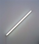
Flavin: the diagonal of May 25, 1963...Private Collection.
Serious Games
This week's art game: Are there other exhibitions you would like to see re-created?
I, myself, would like to see the 1950 Jackson Pollock exhibition at the Betty Parsons Gallery once on 57th Street, but only if the space itself could also be recreated so we could experience the much touted shock of scale. But also for another reason. My friend Lil Picard (1889-1994) artist, critic, and what she called a Wiemar Republic Coffee-House Girl, long lamented not buying a small Pollock out of that historic exhibition. It was only $100 and she circled the block several times before deciding it was too expensive for her budget. I want to see the original price list.
Then I could really go for the 1953 Rauschenberg/Twombly exhibition at the Stable Gallery once on 58th and 7th Avenue. It included the first New York showing of two of Robert Rauschenberg's all-white paintings made in 1951 at Black Mountain, and came with a text by his friend John Cage: "..No subject/No image/No taste/ No object/No beauty/No message/No talent/No technique...I have come to the conclusion that there is nothing in these paintings that could not be changed, that they can be seen in any light and are not destroyed by the action of shadows..."
I would certainly want to revisit Robert Smithson's 1968 "Non-Site" exhibition at Virginia Dwan's 57th Street venue. There were geometrical bins of rocks brought in from mapped sites. The pieces look better and better every time I see them, although at the time I thought Smithson was "cheating" by bringing Earth Art indoors---which is not really what he was doing.
And are there ancient and nearly forgotten but important museum exhibitions I would like everyone to see or see again? Here's my initial list:
Marsha Tucker and James Monte's 1969 "Anti-Illusion" at the Whitney. I remember Rafael Ferrer's pile of leaves and blocks of ice at the entrance to the museum. Ferrer was an Artopian before there was an Artopia. Will time have tamed the art?
Kynaston McShine's 1970 "Information" at MoMA. Would I now crawl into Helio Oiticica's "nest"?
Thomas Hess' 1971 Barnett Newman retrospective at MoMA, but with the Stations of the Cross in a room with an entry that would allow them to be read left to right, not from right to left, as shown in '71.
Alanna Heiss' 1977 "Rooms," the inaugural exhibition at P.S.1. Could that old schoolhouse be returned to its inspiring state of crumble and decay so that the recreated site-specific works would once again make sense?
FOR AN AUTOMATIC ARTOPIA ALERT FOR EACH NEW ENTRY
CONTACT: perreault@aol.com.
AJ Ads
AJ Blogs
AJBlogCentral | rssculture
Terry Teachout on the arts in New York City
Andrew Taylor on the business of arts & culture
rock culture approximately
Laura Collins-Hughes on arts, culture and coverage
Richard Kessler on arts education
Douglas McLennan's blog
Dalouge Smith advocates for the Arts
Art from the American Outback
For immediate release: the arts are marketable
No genre is the new genre
David Jays on theatre and dance
Paul Levy measures the Angles
Judith H. Dobrzynski on Culture
John Rockwell on the arts
Jan Herman - arts, media & culture with 'tude
dance
Apollinaire Scherr talks about dance
Tobi Tobias on dance et al...
jazz
Howard Mandel's freelance Urban Improvisation
Focus on New Orleans. Jazz and Other Sounds
Doug Ramsey on Jazz and other matters...
media
Jeff Weinstein's Cultural Mixology
Martha Bayles on Film...
classical music
Fresh ideas on building arts communities
Greg Sandow performs a book-in-progress
Exploring Orchestras w/ Henry Fogel
Harvey Sachs on music, and various digressions
Bruce Brubaker on all things Piano
Kyle Gann on music after the fact
Greg Sandow on the future of Classical Music
Norman Lebrecht on Shifting Sound Worlds
publishing
Jerome Weeks on Books
Scott McLemee on books, ideas & trash-culture ephemera
theatre
Wendy Rosenfield: covering drama, onstage and off
Chloe Veltman on how culture will save the world
visual
Public Art, Public Space
Regina Hackett takes her Art To Go
John Perreault's art diary
Lee Rosenbaum's Cultural Commentary
Tyler Green's modern & contemporary art blog
