main: April 2004 Archives
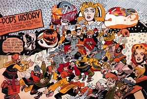
Erro, Pop's History, 1967
Too Political To Be Pop?
This is the year of the second Icelandic invasion; the first happened before Columbus. Adventurous Icelandics settled briefly in what they called Vineland. You can even read about it in one of the Icelandic sagas. Now its art that's coming over. First, Dieter Roth at MoMA and P.S. 1; now Erró at the Grey Art Gallery of New York University (100 Washington Square East, to July 17) and Goethe-Institut (1014 Fifth Avenue, to July 16).
Erró is commonly thought to be one of the European Pop artists. Iceland is part of Europe, although far from Norway and Denmark, the countries that in succession held it as a colony. Then too, Erró has lived for an awfully long time in Paris. The question isn't Euro or not, it's how Pop is his Pop?
Like Roth, Erró had a name problem. Roth, who favored lower-case letters, became rot, then roth, although now we use Roth. Perhaps it is an Icelandic thing. But unlike Roth, who adopted Iceland, Erró was born there, as Gudmundur Gudmunsson, in 1932. Icelandics, like Australians, have a tendency to wander over the earth: You never know when one is going to pop up. It's their sense of isolation and, on the part of the Icelandics, their Viking blood.
Ensconced in the Spanish village of Castell del Ferro in 1953, liking it very much, our Gudmunsson changed his name to Ferro. In 1967, when he was living and working in Paris, the artist Gabriel Ferraud (in French, sounds like Ferro) sued him over his appropriated name. So Ferro dropped the F. One gathers he did not have a lot of monogrammed handkerchiefs or luggage and that he had the time to white-out the offensive F on his calling card and stationery.
But I am not writing about Erró because of his name or because I like Iceland.
(I am enamored of the light and the air.) I am writing about Erró, my fondness for Iceland aside, because he deserves some attention. Twice now I have seen impressive selections of his large paintings at the Reykjavik Art Museum - Harbour House. In 1989, Erró donated over 3000 works to this, the major modern museum of his homeland.
Although his work is pictured in most books about Pop Art, he has not had the exposure in the U.S. that he has had in Europe or, of course, in Iceland, where he is a celebrity.
Erró participated in the European version of Happenings and, it appears, was always involved in political protest. His paintings reflect that. He's even made films. His 1963 Concerto Mechanique, or the Madwoman's Mechanical Metamorphosis (in collaboration with Eric Duviver; commissioned by Sandoz, the European drug company) can be seen at Goethe-Institut and at the Grey, where it is accompanied by some startling Dadaistic props. Grimaces (1962-67) has 100 artists grimacing. A poster provides identifications: Claes Oldenburg, Jim Rosenquist, Man Ray, Andy Warhol and many others. In the film, the faces pass by, disguised by time as well as face-pulling. Is that artist and critic Lil Picard? Yes.
But it is as a Pop painter, rather than a filmmaker, that Erró is most celebrated. He admits it was his encounter with Pop Art in New York in 1963 that set him on that course. He saw the now-famous New Realists show at the Sydney Janis Gallery. Very trans-Atlantic, it even included Erró's Swedish friend Oyvind Fahlstrom. Fahlstrom's comic strip-inspired "variables" still stick in my mind.
What makes Erró Pop so different from American Pop -- and even gives it some distinction amongst the Euro Pop crowd -- is its overt politics.
Erró Pop, like Fahlstrom Pop, has distinctly political subject matter: the Cold War, Algeria, Vietnam are all grist for the mill. At this very moment, Erró is probably working on Iraq.
Both Erró Pop and Euro Pop are quite different from Pop Art proper -- which can only be American. Pop Art is inordinately cool, like television. Of course, the more we know the works of Rauschenberg, Rosenquist, and Warhol, the more socially minded are the artists and socially engaged the art. But it never hits you in the face like Erró Pop. Is that what is so refreshing about Erró's painted, comic-book collage? Erró Pop is linguistic rather than nostalgic, orgiastic rather than formal. He uses comic-book imagery as words and sentences, but not as signs of signs. He is more like Peter Saul than Roy Lichtenstein. Chaos abounds, along with lots of lusty good cheer.
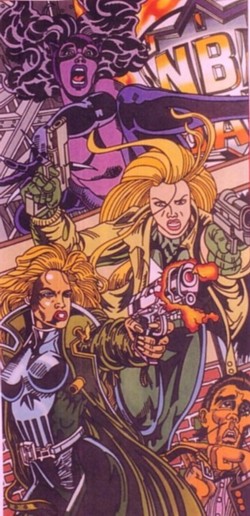
Erro, Tiger Woman, NB (Femme Fatales), 1987-95
So here we have two very different exhibitions of Erró's work: 'Worldscapes" at the Grey and "Femmes Fatales" at Goethe-Institut. (A third, "Mao's Last Visit to Venice," is a recent suite of prints "reprising" an earlier Chinese Paintings series, but since they are shown in a lecture hall they are not seen at their best.)
"Worldscapes" is a scholarly exploration of Erró's development from early, Dada-like collages, through his "Pope," "Astronaut," "Socialist Realist" parodies, to the "Scapes," of which there are only two full-blown examples: Pop's History (1967) in which cartoon Russians are shown with Warhol, Lichtenstein and Wesselmann images; and the black-and-white Simon Clay Wilson-scape (1989), an homage to a co-worker of R. Crumb at Zap Comics. As the catalog admits: "Given the compact size of the Grey Art Gallery, his recent paintings in "Worldscapes" are represented by preparatory collages. …"
This is fine for me. I've already seen a lot of the big paintings, so it is a pleasure to get a closer peek at Erró's work process. First he makes an elaborate collage out of images from comic books and other sources, and then he paints the results from a projected image. We saw at the Rosenquist retrospective some of that artist's preparatory collages. Erró's collages are less cubist; the teeming images, as in his best paintings, transcend both composition and taste.
The catalog, through the judicious use of details of paintings, fills in some of the gaps. But short of flying to Iceland, I recommend that after the Grey Gallery, you see "Femme Fatale" uptown for a more direct appreciation of Erró's energy. Not hampered by the lighting requirements of works on paper, in a chic, light-drenched second-floor room opposite the Metropolitan Museum of Art (the paintings should be in the Metropolitan), the ten panels from Erró's Femme Fatale Series (1987-1995) "pop." In a vertical format, the images are less diffuse than the horizontal "Scapes," but just as crisp and outrageous.
We are on the edge of narrative. In Space Suit, Wonder Woman emerges from a metallic garment; a buxom Joan of Arc makes two appearances in two separate paintings. In Big Bride -- here comes Kill Bill's Uma Thurman! - the bride wears blue, and side panels seem to show the same figure weeping, then drowning. There's also Double Wedding, in which villains are taking vows, and Sisters, one a nun and the other with a gun. There are words, here and there, when appropriate (or inappropriate). Day by Day Girl has the following dialogue between an orange-faced woman and another in a red helmet: "Oh, Celia …how on earth will we be able to GO ON with this hanging over us?"…"Day by day, Girl."…"We haveta learn ta live DAY by DAY."…"And our glorious mission? What becomes of that?"
What is the this hanging over them? What is the glorious mission? We'll never know. What we do find out is that Erró obviously likes superwomen. Wearing bras of steel, these are some pretty tough babes. It is not so much a question of where he finds these images (I spotted Tank Girl and Bat Girl), but how and why he puts them together. They have none of the decorousness of Lichtenstein, the reverie of Rosenquist, the dankness of Warhol. They are pure Erró Pop.
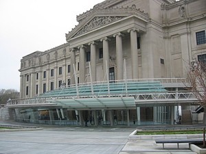
A Pavilion Grows in Brooklyn
The Brooklyn Museum has a new look. Images of the just-inaugurated "entry pavilion" look best when shot inside, aimed at the glass ceiling or outside from high above to include the plaza. Unfortunately, when you actually see the Polshek Partnership redo of both entryway and front yard upon emerging from the subway or just at street level, the pavilion looks like a flimsy glass tent with no relationship to the looming hulk of a building it inadequately fronts. The plaza, aside from the distant spurts of a fountain, is glare on glare.
Although the intention to make the entrance more welcoming is not all bad, I fear that looking like a ferry terminal in Scandinavia is not quite right. That glassed-in aquarium effect! Those tilted masts!
True enough, the old entrance, consisting of stingy doors leading to the stygian lobby, was off-putting. We will now enter through the best party room in Brooklyn, but at the expense of grandeur.
I would have rebuilt the original, vertiginous staircase removed by the WPA in the '30s,but as a decorative feature. I would have encased the entire 1897 McKim, Mead & White Beaux-Arts pile, not just the front door, in glass.
In the meantime, I'd use the spin that entering the pavilion is to embark on a journey through art. Because it is one of the world's great museums and has always seemed more people-friendly than the teeming Metropolitan, we have always loved the Brooklyn Museum of Art -- oops! I mean the Brooklyn Museum.
Having changed the name to the Brooklyn Museum of Art in 1988, they are now back to plain old Brooklyn Museum. There's a new logo, too. It's a negative B inside various, bright blue, seal-like bursts, petals, splashes -- "seal" as in seal of approval; not aquatic animal. This, the press release says, is all part of "strategic changes to name, logo and graphic identity."
Is museum name-change a fad? Well, at least dropping "of Art" is not as drastic as the American Craft Museum changing its name to the Museum of the Arts and Design. We might, however, want to consider other changes. The American Museum of Natural History could be the Nature and Culture Museum. We could call the Bronx Zoo, Animals-R-Us.
I once lived in Brooklyn. I once worked in Brooklyn. I know that sometimes to get from point A to point B in Brooklyn you first must come into Manhattan. Nevertheless, if Brooklyn were still a separate municipality, it would now be the fourth most populated city in the U.S. Eat your heart out San Francisco, Houston and Detroit. Such a city, rich in legend and in diversity, deserves some amenities, right? The Brooklyn Museum already has the second largest art collection in the country. Eat your art out, Chicago, Los Angeles, and Houston.
City of Artists
To celebrate its new look, the Brooklyn Museum is now offering "Open House: Working in Brooklyn," a surprising survey of 300 works by 200 artists (through August 15). Although the new-and-improved Whitney Biennial has already cheered everybody up, "Open House" will make you giddy. There are a few names we already know, guaranteeing weight: Nayland Blake (disconcerting wall pieces made with glass beads, buttons, feathers, and sequins), Louise Bourgeois (two tapestry and aluminum heads), Leonardo Drew (a beautiful wall of cases containing cast-paper objects), Glenn Ligon (a Warholian silkscreen painting of Malcolm X), Vik Muniz (a photo of a chocolate-syrup drawing of Cassius Clay), Roxy Paine (a startling mushroom wallpiece) and Fred Tomaselli (splendiferous collages).
I always expect good work by these artists, but the real surprise is the high level of art by the artists one does not know, may have missed in any of the hundreds and hundreds of Manhattan and Williamsburg galleries, or who may never have shown before. The BM's contemporary curator, the well-respected Charlotta Kotik, and assistant curator Tumelo Mosaka did a lot of legwork. Thousands of artists now live and work in Brooklyn; Manhattan is just too expensive. Given the multiethnic population of Brooklyn, the curators made an effort to be inclusive. The purview is not only intergenerational, as in the Whitney Biennial, but also multicultural. As a curator, I always hated the idea of including little snapshots of artists next to or on wall labels, but in this case it works. Particularly for African Americans, the surname does not say it all. Which of the artists on my list of artists already known to me is African American?
In ARTOPIA, anyone can be whatever he or she has the talent to be, regardless of "race," ethnicity, gender or sex. In ARTOPIA, anyone can dream. In the meantime, this goal may need a little help. Both young and old need to see that the people they look like can be artists too.
Is this obvious? I wish it were.
Then there is also the author problem. A painting of Cassius Clay or Aunt Jemima by a black artist has a different meaning when it is by someone whose ancestors came from Scotland. Although the excellent survey of the exuberant fashion designs by the late Patrick Kelly are not part of "Open House," they also illustrate my point. The "gollywog" image he used as his logo and sometimes as a fabric pattern would be understood as racist if we did not know the designer was African American. We see a photo of him at the entrance. He also collected so-called derogatory black memorabilia, some of which is part of the exhibition. The gollywog becomes ironic.
Here are some highlights of the huge survey (mostly without thumbnail snapshots):
Heidi Cody's Exxon Mobil is a giant, revolving vacuum-formed abstraction of the Exxon and Mobil logos: on one side a big O, on the other a partial view of those double-Xs. It has the two-for-the-price-of-one directness of Pop because it can say two or more things at once. We cannot help but bring to it our loathing for giant oil companies and what they represent: oil spills and high-prices at the pump. But we also see their logos as bright designs on the dismal roadside.
At first I thought the outsider-art, prison-art guy who makes tiny "paintings" out of salvaged sock yarn had gone abstract. No, two two-inch square (one is actually 2 x 2 3/4) are actually oil on wood. That James Sheehan gets them to work as paintings is astounding.
Found Object Prize: Matthew Northridge's assemblage of pencils, pens and other desktop things glued and push-pinned to the wall to make a kind of head-on missile.
Three "cultured marble" sculptures by Bryan Crockett, called Pride, Greed, and Gluttony are infant rats, I think. In any case, they are perfectly realized, bigger than life (in cases, thank goodness), hairless, with eyes still unopened and creepy.
Painted bottle caps by Eung Ho Park called Eyes (or "I'm Looking for You") do more than solve the age-old bottle cap problem: they tease the eyes. We have seen bottle-cap baskets, bottle-cap men, and bottle-cap door mats, but never a bottle-cap painting before.
David Baskin gives a new meaning to the phrase "think pink." Made out of cast urethane, rubber and wood, is a man's outfit, all pink, displayed on a platform: pink overcoat, pink shirt, pink tie, pink pants, pink belt, pink hat and pink pipe. Later, when you have had time to think about it, you might wonder if the artist is feminizing the male getup or making the color pink masculine
Centipede, a fanciful, mixed-media depiction of said insect, by Wangechi Mutu holds a curved wall with grace and menace.
A big C-print by Anthony Goicolea (b. 1971) called Poolpushers, shows the preternaturally youthful artist in a natatorium with multiple versions of himself. The thumbnail snapshot next to the wall label lets me identify the artist's obsessive subject. Also worth sitting through is a video Classroom in which a student (looks like Goicolea again) pulls out his hair while studying.
Maria Elena Gonzalez's two small electric transmitter-towers surprise and somehow delight. One is 55 inches high and made of lampworked glass, the other is flat on its back and made of fingernail parings.
Elana Herzog has her way with a tattered chenille bedspread, by stapling it over and over again to the wall so that the staples almost overwhelm the cheesy, adorable fabric. It works!
Accumulations seem to rule: Ward Shelley's Vendor is a vendor's cart plus video plus... (Is the artist lurking somewhere behind that opening into the wall?) ... And Yoko Inoue's Transmigration of the Sold, made up of thousands of found and cast objects is exhilarating in its multiplicity. Given the amount of junk that artists now use, one would think that all Thrift Shops would be bare and the world, outside of art, would be extremely clean and tidy...Jean Shin's Chance City is also a winner. She's used $17,119 worth of discarded lottery tickets to make a city, a gigantic house of cards.
Karlos Carcamo's Reach II is a surprising floor-to-ceiling sculpture made out of sport jerseys (it's that male clothing thing again.)
Please note: most of the artworks are in the Rubin, Special Exhibitions, and Seaver Galleries on the third, fourth and fifth floors, but there are also some works embedded in the regular collection galleries. Joe Amrhein's Arc is in the decorative arts galleries. Lettering on Mylar makes a free-hanging arch: ADOLESCENT, FLASH-IN-THE-PAN-STUFF, OSCILLATING AMBIGUITY, etc. Terry Adkin's Muffled Drums is a totem made of bass snare drums piled up to the very high ceiling, one of them covered with mother-of-pearl-buttons (in the newly redone Hall of the Americas). David Shapiro's A Tree Grows in Brooklyn is a pipeline lettered with words from that much-loved novel, snaking down a stairwell.
Also, don't forget to see Alexis Rochman's Manifest Destiny on the second floor, although technically it is not part of "Open House," but a separate commission. It depicts Brooklyn seen from Manhattan in the year 5004, when the water level has risen enough to obscure all but the upper parts of crumbling towers of the Brooklyn Bridge. Strange fish lurk in the murky East River. Part Museum of Natural History diorama, part sci-fi illustration, part Bierstadt-gone-berserk, Rochman's 24-foot-wide painting is much better in person than the picture that ran in The Times, showing it incomplete (but unlabeled as such). Much, much better.
* * *
The "Open House" exhibition at the new Brooklyn Museum is a breath of fresh air. There may be a dearth of expensive, technology-heavy media installations, but there is no dearth of creativity. Would it be too troublesome to the Museum staff if I suggested that "Open House: Working in Brooklyn" be a Triennial? Brooklyn used to be known in the 19th century as the city of churches; now it is the city of artists.
Dieter Roth: (detail)Garden Sculpture
What Are Masterpieces?
"Roth Time," the first U.S. retrospective of Dieter Roth (1930-1998), is now at P.S.1 and MoMA QNS through June 7. [See the MoMA website for an online exhibition.] Ten years ago I could not have predicted that such a survey -- actually a double-header -- would receive the Museum of Modern Art imprimatur. Although Roth was European (German mother, Swiss father), there hasn't been much of a market for his work in the U.S.A., or much critical support. School of Paris he was not, nor was he a formalist of the postwar kind. Although we may now see his kinship to Dada, he certainly wasn't a surrealist of either the biomorphic or the illusionistic ilk. And he wasn't an Abstract Expressionist. (He certainly wasn't Frank Stella.) Things have changed at MoMA.
Because of Roth's innovations in the realm of artists books, I thought of him in the Fluxus orbit. Fluxus was a loosely organized, international group of performance- and "ephemera"-oriented artists. Didn't Roth cast chocolate busts of himself and instruct a collector how to make sausages out of the complete works of Hegel? Yes, as a matter of fact, and you can see examples of his chocolates and his Literaturwursts at the MoMA arm of the show.
In fact, Roth hated Fluxus: "It was the club of the untalented who made a verbal virtue of their lack of talent so that nobody could say they had no talent," he told an interviewer. "The modesty that they ascribed to themselves was actually a good insight in that sense. Because they had to be modest because they were so incapable."
But we also learn that George Maciunas, self-proclaimed founder of Fluxus, rejected the prospect of producing one of Roth's Literaturwursts. Hell hath no fury like an artist scorned.
So, if not exactly in the central zone of Fluxus, where do we put Roth? One of his oldest friends was Daniel Spoerri, who made a name for himself by gluing down the remains of dinner parties and exhibiting them as paintings. Roth also collaborated with Richard Hamilton, the pioneer of British Pop, and he felt liberated by Jean Tinguely's kinetic sculptures, the most famous of which is his 1960 Homage to New York which self-destructed in MoMA's elegant sculpture garden within a period of 27 minutes. Roth also met and liked Robert Filliou and Marcel Broodthaers. But art-world sociograms will get us only so far. Could one mix together characteristics of the works of all these artists and come up with Dieter Roth's Garden Sculpture? No, not really.
I am sure that at MoMA, you will find Roth's books, prints, jewelry, assemblage, studio tabletops, drawings made with slices of sausage allowed to rot, and monoprints made with banana skins all very tasty. The best, like the big works at P.S.1, are forlorn with a vengeance, and yet not without humor. I'd bet anything that Roth's Mold Museum in Hamburg is fairly provocative too, with its towers of chocolate self-portrait busts purposefully left vulnerable to gravity and insects.
Roth himself was full of mild weirdnesses. In 1957, he moved to Iceland to be with the love of his life and tried to make a living designing jewelry and furniture. At one point he lived in the basement of a laundry in Reykjavik. He was suspicious of art dealers and preferred to set up his own exhibitions and sell his own work. Later in life, he would require collectors to put money on the table before he would take them into his studio. He wanted to be recognized as a writer more than as an artist. For awhile he couldn't even decide on his own name: Dieter Roth became dieter roth, then diter rot (1959), then dieter rot (1968), and dieter roth in 1973.
Most of this information comes from the excellent narrative chronology in the MoMA catalog (by Bernadette Walter and Dirk Dobke). But for all their serviceability, these texts do not help to distinguish Roth from his contemporaries. He doesn't offer the high drama and big myth of either Joseph Beuys or Yves Klein. He did, however, produced at least one spectacular masterpiece.
But before we get to that, we have to go through more easily grasped and probably less important contributions. Roth redefined (or de-defined) the book as any accumulation of pages, bound or unbound. Of more contemporary import is his use of fugitive materials. Truly, chocolate -- not glass, as I once said -- is the new marble. One artist is even known now for toothpaste paintings. Employing chocolate, bread, cheese, bananas and the like, Roth collaborated with mold.
I'd also add his innovative use of smell. Apparently his rotting materials were so odoriferous that few would enter the galleries brave enough to show his art. He also did at least one sweet-smelling work with spices, Spice Window (1970). But it is the rot that worked best. He even had a piece that was a mold race between two oozing colonies.
That which makes Roth different from the artists he knew and was influenced by (Spoerri, Hamilton, etc.) can be found in the major installations at P.S.1. Not only was he insanely prolific, he was ambitious.
I certainly like Solo Scenes (1997-98), comprising 131 monitors playing tapes of Roth lounging around, working, sleeping, reading, puttering. It goes a long way to answer the question of what it's really like to be an artist. No drama; one big nothing. But is this work really about old age and aging? If so, we can add it to the growing body of work on that subject: John Coplans' self-portrait nudes and Barbara Zucker's recent jewelry made by casting her own wrinkles. We could also add Agnes Varda's The Cleaners, a documentary screed on various forms of scavenging. She keeps moving her digital camera back to her wrinkled hands as if discovering them for the first time. (Note: near the end of the film, she also points out that she has left the mold on the walls of her house because she enjoys the way it looks.)
And as a fan of Iceland, how could I not like Roth's Reykjavik Slides (1973-1975, 1990-1993)? Here we are bombarded with images of every house in Iceland's capital. It proves how subjective photography is. Someday I would like to compare Roth's slides with mine. I haven't photographed every house in Reykjavik, but I have been there several times and I assure you my slides are not as gloomy as his. Even sleet on the streets looks good to me.
Roth's abject homage to his adopted homeland (using 30,000 slides) is not as obsessive as the 623 office binders that make up Flat Garbage (1975-76/1992). You may never want to see this garbage again, or most likely will see it everywhere in the world, but the cumulative weight and archival obsessiveness is enormous.
The masterpiece, however, is Garden Sculpture (first called Garden Tool), the saga of a self-portrait bust made of bird seed placed outside in 1989 and how it grew and grew -- and, carried forward by Roth's son and collaborator Bjorn (and his grandson), will never stop growing. No longer exhibited outdoors, it now comes with plants, strange liquids produced from run-offs, windows, staircases, books, rolled-up carpets, and video monitors showing tapes of previous incarnations as well as the present one under construction. It also comes with its own workroom on public display, an integral part of the sculpture. The handout states the artwork is now 60 feet long, but it feels much, much bigger, looking like a ship made of cast-offs and wreckage.
This is the piece that gives depth and meaning to Roth's entire career: it is immense, casual, monstrous, offhand. And, in fact, so antimetaphysical that the more you walk around it, the more metaphysical it gets. The thing that makes Roth different from his colleagues is that almost in spite of himself (given his anti-art world quirkiness), he managed to produce a masterpiece, one that will continue to drive museum people crazy.
As a friend of mine in the museum world said: Imagine being the registrar in charge? Think of the thousands of pieces that have to be kept track of? The plants that have to be watered? It's a museum nightmare.
Roth's Garden Sculpture is both his masterpiece and a masterpiece. It is iconic.
Here we might compare it to the work of his immediate predecessors, Beuys and Klein, both Europeans and the artists to match or beat. Is Beuys' Lecture to a Dead Hare a masterpiece? It is certainly iconic, although it is now only a photograph or an idea. Which Klein all-blue painting is his masterpiece, or is it International Yves Klein blue that is iconic? That a color can be iconic is a masterpiece in itself. Both Beuys and Klein were metaphysicians, whereas Roth, on the surface, was not. Can the poignant be profound?
But as Gertrude Stein once asked, what are masterpieces? One can become an important artist without producing a masterpiece (Miro). Some great artists produce more than one (Duchamp). And, of course, because of postmodernism, we are now supposed to be artists without masterpieces and without genius. This is either a dim-witted idea of postmodernism or shows how dim-witted postmodernism was. Garden Sculpture is about decay, but it is also about growth. It's a masterpiece because it questions both authorship and closure. It is the quintessential antimasterpiece masterpiece.
Ruppersberg: (detail) The New Five Foot Shelf
Why Leave Home?
He lives there in two rooms which he had covered ceiling to floor with the most strange and troubling designs that made certain distinguished critics repeat for the thousandth time: It is nothing but Literature!
-- Giorgio de Chirico, quoted at the beginning of each book in
Ruppersberg's The New Five Foot Shelf
I like to keep my eye on new forms as they grow and mutate. In the deep, dark past I did that with conceptual art, performance, and video art. Now I'm watching Internet Art, the liveliest subset of Cyber Art (i.e., computer-based art), which, as of yet, is not saying much. I am not sure if mere PhotoShop manipulation of digital images qualifies as Cyber Art, since the electronic darkroom is still "a darkroom by any other name."
But wait. I don't want to be a formalist by insisting that each art form must exploit characteristics unique to itself and not others. Nevertheless, it is a place to start, bearing in mind the McLuhan principle that new technology initially imitates its predecessor: early automobilesmimicked the forms of horse-drawn carriages, hence the nickname "horseless carriage."
As we now know, video moved unpredictably from single-monitor to multiple-monitor installations and then to DVD wall-projections. Sometimes, when I go to galleries or museums, I feel I am still trapped in the 1964 N.Y. World's Fair, which featured multiple-screen movie projections everywhere.
Seeing a computer in a gallery or a museum makes most people want to turn around and run. If I am out on the town, I want to be in a gallery or a museum, not in a library or at work. Most of all, there is something too humbling and too revealing about being seen in public clicking away at keys in front of an IBM or Mac.
Nevertheless, Internet Art is a fact. The Whitney, S.F. MoMA, the Walker Art Center, and the DIA Museum all have Internet Art websites. Internet Art so far is like cable TV, but free. It's like photography in a book, or a poem read to yourself, or the usual way people look at pornography. It's for one person at a time. It's private and, I suppose, could be contemplative -- though mostly it is not.
That said, all kinds of hell can break loose: The hell of boredom, the hell of self-indulgence, the hell of cartoon and stick-figure subart, and the hell of unwarranted complexity. Perhaps some day soon, when we all have giant, flat screens we can plug our computers into, Internet Art will look more like DVD projections in galleries and museums: rent-a-painting, rent-a-photo, rent-a-performance art epic of ice cubes melting. Turn your bedroom wall into awebcast of the Brooklyn Bridge.
* * *
All of this is but a prelude to an artwork by Allen Ruppersberg launched by the DIA Art Foundation just this past week. Ruppersberg's The New Five Foot Shelf, we learn from the press release, is based on "an edition and installation" completed in 2001. We are not informed where, when, or if the installation was on public view. Ruppersberg, however, is hardly a newcomer and has shown his conceptualistic pieces all over the place, ranging from MoMA New York and the New Museum to ArtPace in San Antonio.
On the surface, The New Five Foot Shelf is about Dr. William Eliot's 1910 Five Foot Shelf of Books, the Harvard Classics that purported to be the equivalent of "a Harvard Education." Ruppersberg's version includes a replica of Eliot's preface that begins: You remember perhaps, President Garfield's reply when asked for a definition of college. "My idea of college", he said, "would be Mark Hopkins on one end of a log and a student on the other." We do know who President Garfield was, but we'll have to Google Mark Hopkins, won't we?
(Hopkins was one of the founders of the Central Pacific Railroad, but why this qualifies him for this particular metaphor or what it means would need further research. Was he the Trump of his day? Will Trump someday need to be Googled too?)
Now the bindings of at least one edition of Dr. Eliot's education populizerhold Ruppersberg's own amalgam of texts. Five simultaneously running screeds go from page to page on your screen. You can select each volume and then read each, page by page. Or, if adventurous, read down the page for a wild collage. There are the equivalent of 800 pages.
Volume numbers on the spines are not the same as the volume numbers on the inside of the "books." The former are at random; the latter in order. Be forewarned also that the first volume (a facsimile of Eliot's introduction to the original Five Foot Shelf) requires Adobe Reader. If you are on dial-up, loading pages and images can be rather slow. Arrows to turn pages are at the bottom of the book window.
The table of contents, repeated like the de Chirico quote at the front of each volume, will convey the flavor of the entries:
1. Honey, I rearranged the collection
2. When In Doubt Go to the Movies
3. ONCE UPON A TIME WHEN BOOKS WERE FAMOUS
4. The Three Marcels [Duchamp, Proust, and Broodthaers]
5. THE MASTER OF THE FAMILIAR (PRIVATE)
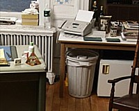
One can also elect to scan images of the artist's former Manhattan hideout at 611 Broadway (1986 to 2001), all four walls, rectangle by rectangle. These have been made into life-size posters that if assembled would exactly replicate the original space: with images of books, postcards, radiator, stuff and more stuff. You can find your way through all of this using MapQuest-type arrows. There are also a number of rectangular views you can download for use as wallpaper on your computer or, I suppose, if you were ambitious and wanted to spend the money for color-ink cartridges, as real wallpaper for your very own digs.
This is not an easy work to describe, although I can notate it by going back and forth between my Word screen and the online DIA site. I hope the reader enjoys the irony. Reading all the Ruppersberg pages will take forever, so perhaps the best thing to do is use the texts like the I Ching or read them like a novel. It is, after all, subtitled Memoir/Novel/Index.
I can also look at a little bit of it now and then, some more later -- and so can you. It is much better to deal with text-based art on your computer than in a gallery.
I found The New Five Foot Shelf engaging on several different levels, which is always a good sign. Is it safe to say that everyone interested in art is in some sense a voyeur? Sure enough. Therefore, artists conversely must be exhibitionists. Ruppersberg is playing with our curiosity about where someone else lives and what someone else reads or writes. This turns out to make him a poet of the ordinary: That radiator is too familiar. That "what am I going to do with all my books?" feeling is too universal. Those Duchamp references are too reader-friendly. And yet we keep going through the pages of the books and keep scanning these long-gone walls and shelves. Hoping for what? A corpse? A book of one's own? Where are those conceptual art anthologies I am in?
Clearly, Ruppersberg isn't a techno-visionary, not here at least. He does not propose a new use for the internet. Instead, he capitalizes on what most people do with the internet: find texts to read and pictures to look at. Although I learned that Ruppersberg is as big a pack rat as I am, we do not really learn anything more about the artist himself. But we didn't want to, anyway. He reads the same books as everyone else. Reading lists are not an identikit; only evil government forces think they are. Specific books, bundles of postcards, quotations, funeral notices and so forth are in themselves of no particular interest, but it is the mass of them and the retrieval system that is. All we needed to have confirmed is that the best place to hide is within the quotidian.
AJ Ads
AJ Blogs
AJBlogCentral | rssculture
Terry Teachout on the arts in New York City
Andrew Taylor on the business of arts & culture
rock culture approximately
Laura Collins-Hughes on arts, culture and coverage
Richard Kessler on arts education
Douglas McLennan's blog
Dalouge Smith advocates for the Arts
Art from the American Outback
For immediate release: the arts are marketable
No genre is the new genre
David Jays on theatre and dance
Paul Levy measures the Angles
Judith H. Dobrzynski on Culture
John Rockwell on the arts
Jan Herman - arts, media & culture with 'tude
dance
Apollinaire Scherr talks about dance
Tobi Tobias on dance et al...
jazz
Howard Mandel's freelance Urban Improvisation
Focus on New Orleans. Jazz and Other Sounds
Doug Ramsey on Jazz and other matters...
media
Jeff Weinstein's Cultural Mixology
Martha Bayles on Film...
classical music
Fresh ideas on building arts communities
Greg Sandow performs a book-in-progress
Exploring Orchestras w/ Henry Fogel
Harvey Sachs on music, and various digressions
Bruce Brubaker on all things Piano
Kyle Gann on music after the fact
Greg Sandow on the future of Classical Music
Norman Lebrecht on Shifting Sound Worlds
publishing
Jerome Weeks on Books
Scott McLemee on books, ideas & trash-culture ephemera
theatre
Wendy Rosenfield: covering drama, onstage and off
Chloe Veltman on how culture will save the world
visual
Public Art, Public Space
Regina Hackett takes her Art To Go
John Perreault's art diary
Lee Rosenbaum's Cultural Commentary
Tyler Green's modern & contemporary art blog
