main: April 2007 Archives
Semaphore, Board Game & Symbol
San Jose, Melbourne, Indianapolis
Adobe, Digital Harbour, International Airport
LED, Laser Cut, Stone
Rubin and Innocent
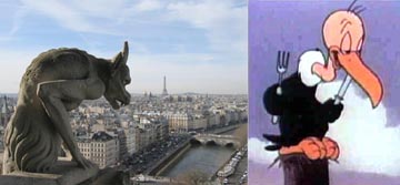
Below continues the comparison on three works installed between August 2006 and September 2007. Today I leave the comparisons stark as I don't know yet, what to make of the simultaneous birthing of the works. I started with the online-inperson duality of the Troy Innocent's Field of Play and then added Ben Rubin's San Jose Semaphore with its unknown message that is broadcast in LED and online. Dale Enochs' Elemental Indiana joins the group as the traditional stone sculptor depending on the legibility of simple symbols - similar in form to Innocent and Rubin, but intended to be read. Innocent and Rubin have no interest in the translation of each graphic itself.
Please give me some help on why these works are so compelling to examine.
Glenn Weiss. gw@glennweiss.com
Enochs
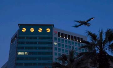
Four Identical Rotating Amber Light Circular Shapes
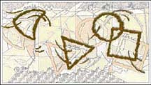
Three Invented Logographic Writing Styles in Three Separate Colors
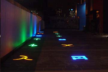
Square, Circle, Triangle and Guitar Pick representing Earth, Water, Fire and Wind
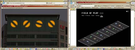
On Internet, view animation and webcam. In Field, view moving semaphores and listen to sounds on radio.
On Internet, interact with animation and view webcam. In Field, interact with plaza-scaled game board and hear sounds. Click here to play online.
On Internet, view still picture. In Field, view still sculpture.
On Website, specific links to learn about semaphores, code cracking, relevant San Jose history and the sounds of the atomic clock.
On Website, no specific links to learn. Links could exist for Janken, Logographic Languages, Contemporary Pictograms and Munsterberg Illusion (Architecture)
On Website, no website developed. Links could exist for the sacred geometry.
Audience of the code crackers, semaphore historians, intellectual arts crowd, San Jose drivers and anyone that likes to be mesmerized
Audience of bridge and checkers internet players, techno graphic artists and Digital Harbour workers
Audience of bored travellers and followers of sacred geometries
Troy Innocent, Ben Rubin, Dale Enochs
Quote:
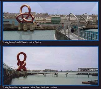
Located within the top floors of Adobe's Almaden Tower headquarters in San Jose, California, San Jose Semaphore is a multi-sensory kinetic artwork that illuminates the San Jose skyline with the transmission of a coded message. The content of the San Jose Semaphore's message is a mystery; cracking the encryption technique and deciphering the message is posed as a challenge for the public. To the first person or group to successfully crack the code, Adobe will award bragging rights and acknowledgment on both the Adobe website (www.adobe.com) and the San Jose Semaphore website.Adobe's Almaden Tower is situated directly beneath the flight path for aircraft landing at the Mineta San Jose International Airport, and the San Jose Semaphore is sensitive to the passage of aircraft above it. When a plane flies overhead, Semaphore reacts visibly to the disturbance, and its steady rhythm is broken. After the plane has passed, the disks resume their steady, purposeful transmission.
San Jose Semaphore is a slow-motion magnifier for data transmission that functions as a beacon in the San Jose skyline. Unlike digital signals that pass invisibly through the air and across microscopic circuitry, the San Jose Semaphore's communication efforts are visible for all to see.
Quote:
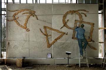
Play has become an integral part of almost every aspect of contemporary life. Field of Play is an urban art environment that transforms Digital Harbour into a zone for play. It consists of digital icons rendered in a range of materials that are integrated within the surrounding architecture and landscape. Central to the work are three iconographic languages inspired by electronic networks, digital games, and tribal cultures. They represent the communities that work and play within Digital Harbour.After dark, a digital game generates patterns of light and sound via the illuminated icons in Harbour Lane. Inspired by the classic game of rock-paper-scissors (Janken), it may be played online or on site. Gameplay is based on interaction between the three sets of iconography - orange, blue and green. The game connects two different kinds of public space - the virtual space of the Internet and the real space of Digital Harbour.
Quote: None available. Dale Enoch's website has no text except for his resume.
The flu kicked the shit out of me this week. So some foggy thinking about Indianapolis.
This week, Indy announced that Donald Lipski would develop the 50th Anniversary Legacy Public Art Project. I would say that Lipski is now the most popular public artist in the USA, replacing James Carpenter from a few years back. I liked the old Horse on the Red Chair, but the current crop of repeating shapes making up another shape seem a little too easy. Lipski's latest work The Doors, (three doors making a walk-in kaleidoscope) is dedicated on May 12th in Scottsdale.
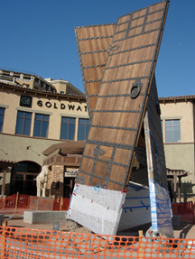
Donald Lipski, The Doors, Installation Photo, 2007
The Indy public art program has jumped quickly on the scene with a good mix of temporary installations, local commissions and international artists. Indy seems to be using the visual and civic arts to invigorate the community in a very American rational way. Everything seems thought out, straightforward and democratic. Each effort has multiple rationales that different kinds of people can find useful. For example, I was surprised, but it is very Indy, that the "Cultural Trail" is really the new urban bikeway.
The problem with Indianapolis is that my critical heart just wants to make fun of. Everything is so earnest and sensible. The video pod casts are well done short works where the artist or public art director leads a quick tour of a work or place. These are best in the country, but I can hardly watch them.
Emily Kennerk, Marbles, Proposal for Cultural Trail, 2007
Something gets started in the mind that is very unfair to Indianapolis. Once it starts, nothing is really good. As I will continue to argue, public art has a vernacular attribute that is valuable to the critical dialogue and emotional connections. But when I see Emily Kennerk proposed artwork for large marbles, I think Nancy Holt, Martha Jackson-Jackson and Target Stores. Here is a perfect opportunity to compare the uses of the form and its meanings, but instead I react like the artist is unaware. This is unfair, but it's my instinct.
Some criticism exists through a few blogs by the same gang of: Four Square No. 266, Circle and Squares and On the Cusps. Thanks to them, I learned on the worst gateway/icon project now under consideration. Indianapolis is apparently considering building an oversized loop from a contemporary rollercoaster as its civic monument. Absolutely meaningless and uninspired artistically. I hope they check out other competitions in the UK and elsewhere and start over. Otherwise, Indianapolis will spend millions on something that will make them feel equal, but will be insignificant to anyone outside the state.
Maybe this is what bothers me. Indy does not care about me. Indy creates art and civic spaces to make them feel good about themselves. And why shouldn't they do that?
Kevin Parsons & Associates Team, 2006
The image trap in public art is the administrator's, the curator's or the committee's dilemma, not the artists. (Of course, many artists do play.) The trap drops when a particular work is required to be a significant symbol for a place, a time or a people.
So many writers have analyzed the invention of symbols. I don't have the background to comment on simulacre or metaphor. Sincerity or manipulation. As you can see, I don't even know the polarities.
In my day job, I am in the self-laid trap. In the USA and UK, art projects abound to find that gigantic landmark or gateway or monument that identifies the city, region or country to the tourist and citizen. Both soulful and photographic; durable and immediate; and always night and day.
Copyright: Aktins, Howard Bowcott - Celtic Knot
I am more disabled as I come from architecture, not visual art, literature or film. The architect's controversy of modern or pre-modern is completely immature compared to the dilemmas of the visual artists regarding the urban interjection that seeks meaning for the place and people. For 150 years, architects have debated only one symbolic clash: modern (the now and future) and historic (the valuable and humane).
So I utilized someone else trap to think about my problem as an administrator: the LANDMARK WALES competition for a series of huge artworks to welcome people to places in Wales, UK. As with all UK competitions, they are seeking the success of the "Angel of the North" by Gormley. I hope the Brits can free themselves faster from Gormley than the Yank's freed themselves from Maya Lin's Vietnam War Memorial. (Perhaps we are not free yet)
In the trap, most evaluations are grounded in sensible functional concerns and generic cultural beliefs. Function is both "Will it standup for 100 years?" and "What does it do for our image?" On a cultural note, "How does the artwork say who we were and will be?" Although some engineering analysis may help a little, the success of artistic solutions to the questions are completely unknowable in a political situation seeking certainity.
Without much rationale justification, someone accuses some else of forcing the artwork on the community. It will be true - in every single case. Can't be avoided. Don't play if you don't want to get burned. Even with the case of the Fremont Troll in Seattle, the art community felt repressed by the popular vote (Accompanied by campaigning by the winning artists.)
So in the irrational, I ask some simple questions of myself.
1. "Do I want to see the artwork in person. Would I travel to be with it?"
2. "Do I find myself thinking about it? Does it make me appreciate some unusual qualities of the people that built it and live with it.
3. For a proposal evaluation, "Do I believe the artist can make it just right?"
So armed with the questions and my inconsistent application, I return to the Landmark Wales. (Hey these questions really work. Try it yourself). The first question requires visualization that the actualization will be better than the drawing or photograph. Even if the drawing is appealing, do you really need more than the drawing?
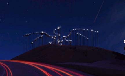
Copyright: Infanger & Parker: Dragon's Breathe
In this category: Echelman's 3D banner, Aktin's Celtic Knot and Infanger/Parker's constellation dragon. Echelman to see the heraldic thing wave on the hill. Aktins for its scale and shape against the city. Infanger/Parker to see the man-made flickering against the stars.
Second Question about thinking. But this is harder than it appears because you must eliminate all cheap easy cynical thoughts and thoughts regarding position in the international art dialogue. These thoughts are fun, but ask yourself about the narrative of the people installing and living with the work. My mind goes filmic. Burke's double headed janus and willingness to live with the android self-image. That's it. I want Plensa's Sleeping Lord and Marks Barfield's Red Cloud to spark thoughts, but nothing comes.
Finally, can the artist make it just right? With these caliber of artists, the answer should be "yes" for all. The question is not just execution, but rather if the idea presented can be achieved. This is the problem with "Red Cloud". All the flying and quivering red mannequins will add up to nothing. I think another artist might be able to make this proposal work, but not the inventors. Based on the drawings and past work, I believe that Leighton's Sentinels through execution might surpass the lack of visual spendor.
If I had a blank check, I would build Echelman's banner. Something about it is very 19th century, military pride from the UK. If it stands up and moves in the wind, I would love to watch it in person. It is her best work yet.
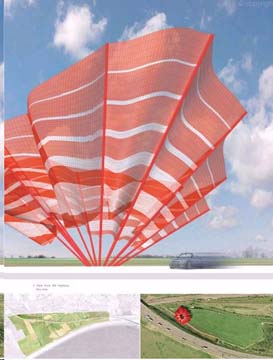
Copyright: Echelman: Untitled
I have mixed up all the individual competitions. Here are my predictions on the winners
1. A550: START OVER. If forced, Graeme Massie & Donald Urquhart: Red Linear
2. Holyhead Harbor: Atkins, Howard Bowcott: Celtic Knot
3. Second Servern Crossing: Amber and Pearl: Dragon Egg
4. Dowlais Top: Infanger and Parker: Dragon's Breath
5. Monmouth A40: Openarch
6. A483/A5: Simeon Nelson: Draco
Good Luck in Wales and every other place seeking the big symbol.
If I recall correctly, the Seattle artist Jim Pridgeon had a concept to create a drawing in sky by unrolling a ___ mile long reflective mylar sheet in the lowest level of orbiting satellites around the earth. Depending on the time of day, the drawing would be more or less visible. Most visible at sunset.
At a global scale, Pridgeon's sculpture would capture and redirect (reflect) the light of sun to make a cut in the sky. A crisp edge of brighter light is the first aesthetic act of the reflected surface.
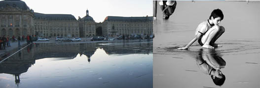
Other aesthetic acts of reflection include the displacement a visual image into the reflective surface, the doubling of an image along an axis and the movement of an image against a stable background when the person moves. A game of image and bodily movement is always ready.
Of course, in the main, reflection is used by humans to know themselves. Especially the faces and especially as they appear to others.
Owen Morrel's Lighthouse and Anish Kapoor's Sky Mirror
It seems to me, without any scientific survey, that shinny things and reflective surfaces are more popular with artists. Perhaps visual artists have been influence by hip-hop artists. At least it is fun to think of Anish Kapoor's work as civic "bling" with the similar spatial and cultural function. One on a chest or smile and the other on a plaza or doorway.
Also unscientific is my feeling that buildings with 100% heavily reflective glass walls are no longer popular. Now the glass (or metal) is modestly reflective and covering less of the building surfaces. The 1970's and 80's reflective building that attempted to disappear into the sky has, well, disappeared.
Photos from Corajoud website
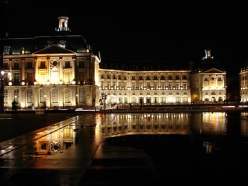
Into this musing on reflection jumps French landscape architects, Claire and Michel Corajoud, and their "Water Mirror" in Bordeaux, France. I could not find enough English, but I think the miroir d'eau was completed last October.
Corajoud replaced the working docks on the Garonne River with a giant rectangle of ½ thick water. Just enough water over a black granite (?) plaza to create a surface large enough to reflect the entire 18th century Stock Exchange building. The mirrored images of the building at night have already become a photo tourist's "must have" picture in Bordeaux.
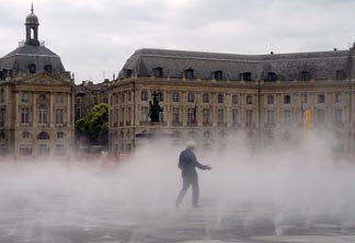
A fog systems operates with and without the water. The scale of the site creates a miniature fog bank for more great photographs and helps the illusion of continuity of the water with the river like a misty infinity pool.
The elegant historic French idea of the central reflecting pool has been makes it participatory. The water mirror both forces people backwards to observe the reflection and then bring them together in the play of splashing water and hide-and-go-seek fog.
As stated above, the reflection of the mirror is to see ourselves and to see how others see us. This is also the perfect definition of the cultural role of the plaza. Did Corajoud intend symmetric reflection of definitions? He is French.
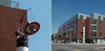
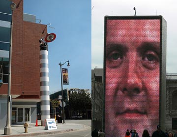
Artist Christian Moeller is completing "Mojo", an interactive public artwork in San Pedro, California, 20 miles south of downtown Los Angeles. The developers of Centre Street Lofts funded the vulture - and the creepiest public art in 2007.
Clearly, Moeller steps on every fear of surveillance: 1. a generally unsafe street at night, 2. potential attack by a thug or stalker in any neighborhood, 3. innocent movements recorded by unknown and untrusted authority and 4. police (or prison guards) spotting YOU in a searchlight.
Photos by Marshal Astor, Life on the Edges
Based on the writing of Hugh Hart, the robot with a spot light head can track a pedestrian on the sidewalk. A computer receives information on human movements though two cameras and direct the robot to hit and then follow the pedestrian with the light. We are naively accustomed to the garage door floodlight activated by motion, but we are not accustomed to being followed.
Perhaps it is fun as it is Los Angeles. Everyone wants to be in the spotlight. Perhaps karaoke street parties should be held. The more energetic will attempt to out run or zigzag the robot. Others with attempt to confuse the robot the multiple pedestrians moving in different directions.
I admire Moeller for discovering a visual form to test our apprehensions about surveillance. Normally, artwork about surveillance is virtual or documentary. Moeller's sculptural form and interaction have the potential to experience fear.
My first instinct regarding the robot on a pole was a vulture. Not a real vulture, but a Looney Tunes memory from my youth. (An Internet search only produced Bob Clampett's "Beaky Buzzards" of 1942-45. Perhaps?). The long necked buzzard surveyed the California desert for a meal.
Notre Dame and Beaky Buzzard
In our brains, we make this link of drawn/graphic annimation with robots. In LA Curbed.com, other commentors invoked annimated images of the desk lamp at the beginning of Pixar movies or the some device from "Honey I Shrunk the Kids". Moellers's black and white striping of the pole perch of the vulture reinforcing the graphic connection.
The sculpture's location at the corner of the building seeks memories of the gargolye- another fantasy mixing danger, protection and survelience from the space above. Via gargolye, cartoon or actual vulture atop cacti or telephone poles, Moeller's visual form brings the sensation of surveillance into the street.
UK Yellow Vultures and CA Turkey Buzzards
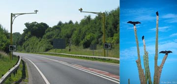
Of course survelience is excellerating everywhere. In the UK, new camera above the highway to track speeders have earned the name, "Yellow Vultures". According to the Chicago Tribune, Mayor Daly wants more than 100 new police cameras for high crime streets to join the numerous cameras through out the Chicago housing projects.
In 2006, US Homeland Security gave Chicago $52 million and small part of that money installed surveilence cameras appeared atop Jaume Plensa's Crown Fountain in Chicago. The Chicago Tribune quoted James Yood, professor of art history at the School of the Art Institute of Chicago. That is one of those `What were they thinking?' kind of moments, " to place the camera on top of the public art work. In the two massive stellas of glass blocks, photographs of Chicago citizens are illuminated and even spray a cool shower of water from their mouths (Back to gargoyles again) The camera "changed the whole idea of the sculpture, which is that these are our brethren," Yood said. "Now instead of looking at us, they're surveilling us, which I think is not exactly the artist's intention."
Moeller by Marshal Astor. Plensa photo by Looper
In Plensa's photographs, the citizens stare into the space above the visitor's head. Looking at you is not part of the work. The work wants to be looked at like a traditional painting, not engaged like the fountain suggests. Plensa missed the opportunity to finds a great new work of art. Perhaps the Chicago police were attempting to remind Plensa on his failure that Moeller is attempting to solve.
We are at the beginning of all of this new public art and public space making with electronics and therefore we can have honest debates. No one knows how the art in response to reality will turnout. No one knows where reality is headed. No one knows if the medium can remain the message when the medium and message go underground.
The exhibition website starts with: "Ethics is the true axis of the gathering that will attempt to link Art and Politics with Poetry, Ecology and Technology." For the first time, I love getting old. In my mind, I join these artists at the southern most city on the planet at the end of nowhere - Patagonia. Although I might be disappointed if I hopped on an airplane for Ushuaia, Argentina, I believe that I know this artistic spirit. A spirit to live directly in the true physical and political world and enjoy for a few days the company of fellow artists making new stuff.
I feel my younger days through these artists seeking new ways to make connections: intellectual, physical and social. They repeat projects that I have seen before and yet I am glad, not disappointed. I think I just stepped past middle age.
Most of the work in the Bienal del Fin del Mundo I don't understand since I don't read Spanish and don't know much about the conversation among artists in Argentina, Brazil and other parts of Latin America. Here are the links to explore.
Aesthetic Grounds Photo Compilation
Official Website of Bienal del Fin del Mundo
Website of Proposals for the Exhibition
Good Straight News Story in English
Three Artist Project Sites
Fred Forest
Studio Orta
Joaquín Fargas
My spirit is attracted to Ushuaia because public arts of my professional life have changed. Everyday, a new sculpture garden or temporary outdoor sculpture exhibition is announced in the most liberal and most conservative cities in the USA. Murals blossom across Los Angeles, Philadelphia and Lake Placid, Florida. Benches and shelters and lobbies and parking garages have corners or floors or facades for public art in 500 local and state governments.
Except for the old murals, these new civic artworks fail to address people about much of anything. They don't start from a position of speaking - and even less so - yelling. No challenge and more importantly, no invitation, is made.
Studio Orta
The artists of Ushuaia do talk to you. Their works are yelling or crying for common failures of human beings. Through the artwork, I can feel the failure and thing lost by the failure. Some artworks demonstrate the possibility of response - together.
The melting of polar ice is the primary physical proof of global warming - the most significant technological and political human failure ever. Ushuaia is the base camp of southern disaster and the artists have traveled many expensive miles to talk about it.
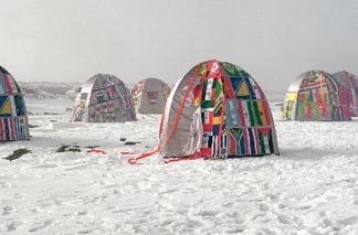
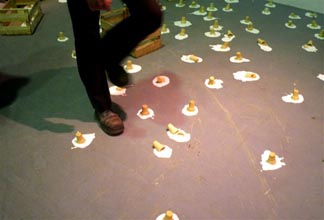
Blowing fabrics of bright colors dramatize the cold wind and barren landscape. Tents gather on the ice from all nations describing unified global action based in unified experience of the ice. Oars raise the furniture above the floodwaters and a wooden fish weir is preposition a few feet above current sea levels. A metal sunflower is required to record the climate change that might mutate real sunflowers. And my favorite, ice cream cones melt on the ground - a small luxury with high-energy cost that we won't give up. We don't even want to think about giving it up.
Virtually, enjoy the work and the sharp cold of Ushuaia. Enjoy your contemplation regarding this work and the work that is being spread across the planet in public plazas. And regret the fact that I am too afraid to pick-up my copies of Lucy Lippard's writing to find out how much all of this has been said before and better.
BGL Canadá, Escultura con Leche
A few months ago in Fort Lauderdale, landscape architect, Walter Hood of Oakland, California, present his work. Never heard of him, but the Design Arts speakers had been excellent at Broward County Cultural Affairs in the last few years.
Hood sticks with me. Especially his recognition of the "overgrown" from the people on the Phillips community near Charleston, South Carolina. According to my memory of his talk, overgrown became a noun - the overgrown. Instead of an unkempt and unweeded outdoor place where vines and other plants cover-up up the garden or the collapsed building, in this rural landscape the overgrown was the thick, green stuff that made the edges of property. The overgrown expanded naturally providing more protection and was cut back when the owner need more space and I guess less protection.
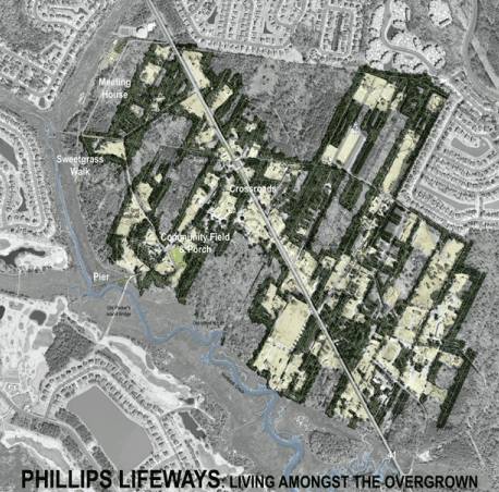
Phillips Site Plan. Drawing by Walter Hood.
In reverse of the suburban openness, each family lives in a giant green room that is furnished with a house, outbuildings, automobiles and gardens. Walls of the room expand and contract through the interaction of the humans and the overgrown. Decades long time-lapsed photography might resemble a slowly beating heart. (See note on overgrown at bottom for the desert and plains dwellers)
What I felt through Hood's interpretation was a community wide language expressing a psychological state through spatial form. In literature and garden design, overgrowth has been a romantic, emotional metaphor of life in death. But here the overgrown is straightforward outcome of family health. New young adults or the determined aged patriarch keep the overgrown shallow and the space open. The thick overgrown hides the exhausted working single mom or alcoholic dad.
If I recall correctly, part of Hood's proposal was to clear part of the overgrown for a community meeting place. A direct choice that has more power with his observation. Or does it? Can these narratives be art?
Hood has designed a garden on top of the archeological site of the Foster Homestead at the University of Virginia. This is not a community setting, but an institutional setting where visitors will be told about the African-American family history forgotten and now recovered. His "Shadowcatcher" suspends an outline of foundation of the lost house in a Cartesian grid high above the archeological dig. (Cartesian for surveying America and for cataloguing a dig). As an image above our heads we have reference to heaven or to flying spirits of the dead. As a shadow on the ground, we have the purity of platonic form and the memory lightly marked on the sacred or archeological space.
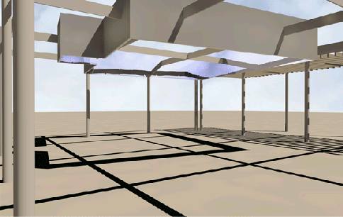
Shadowcatcher at Foster Homestead. Drawing by Walter Hood.
The work is a diagram of ideas and references. In the 1960s or 1970s Venturi made white drawing in space of Ben Franklin's house on the spot of Franklin's house in Philadelphia. Venturi makes no other references - just a pop icon of a 3D outline that marks the spot.
Many other contemporary installations draw the thing below on the ground like the former water edge of the natural harbor or the culverted stream. Rebuilding a one or two stone high foundations is typical of archaeological tourist sites in every country.
Like so many others of contemporary public art, Hood invents from the known experience to diagram literal narrative. Will the visitor really look at the floating foundation and find something unknown in the descriptive words? Will the floating foundation be a magical transformation of a typical one or two stone high ground level re-creation?
Leaving forms in the literal can never reach a complexity that I desire in my art. Making only the smart, respectable choice is not the same as artistic celebration. During careless, thoughtless days of modernism, just doing the right thing was a dramatic success that the public artist frequently brought to public space. Just doing the right thing is no longer enough for me.
Someday, I look forward to visiting Hood's completed projects in California. I think I will learn something entirely different.
Footnote: The Overgrown
For those you unfamilar with carving space from a forest in a wet, warm climate, the overgrown forms quickly at the cut edge from young trees, bushes and vines. The mature forest or stand of mature trees grows very little on the floor until a trees falls, letting in the sunlight. The forest is generally easier to walk through than the edge. So it is the overgrown at the edge makes the enclosure and protection. Normally on both the farm and suburb, the overgrown is cut to stop the loss of "useable" land and to maintain a visually open feeling into the forest.
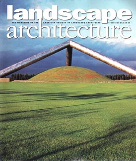
I pulled all 15 arbitrary issues of Landscape Architecture Magazine still on my office shelf published between 2005 and 2007. Here is what added up for Public Art.
1. Seven Issues with Public Art covers. (Almost half)
2. Full length profiles on artists Maya Lin, Brad Goldberg and Stacy Levy.
Moerenuma Park by Noguchi
3. Reviews of major public artworks, in collaboration with landscape architects, by artists Robert Irwin, Doug Hollis, Toshihiro Katayama and Isamu Noguchi.
4. Projects by landscape architects that can or have secured public art commissions including Michael Van Valkenburgh, Peter Walker, Walter Hood, Ken Smith and the founder of cross-over - Martha Schwartz.
5. Coverage of art and landscape exhibitions such as the Chaumont Garden Festival (with a work by filmmaker Peter Greenaway), the International Garden Festival at Metis and Mac's Farm and Sculpture Center.
AND THEN the MOST AMAZING THING. I have never seen this in any non-art magazine. Every time an artwork appears in a photograph, the artist is identified. If the artist was a collaborator on the design (not a purchased sculpture), the artist is listed as a member of the team at the end credits. JUST FOR THIS, every public artist and supporter should subscribe.
If the landscape design is a collaboration, the artist is treated just like any other member of the team. Not more special and not ignored. Interviewed or mentioned for the work performed like everyone else. In other words, LANDSCAPE ARCHITECTURE MAGAZINE has 100% accepted the equality of the public artist - the design team concept started in Seattle more than 20 years ago. No other American magazine does this - art, architecture, design, home, garden.
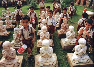
Artwork by Kamal Nayan. Photo by Amit Mehra.
Only one other magazine achieved this unity of respect: India's MARG Magazine while edited by Mulk Raj Anand between 1946 and the 1960s. (In my opinion, the best art and architecture publication of the 20th century.) Perhaps editor J. William Thompson was giving us a reminder of the cultural complexity of MARG analysis when he placed New Delhi's "Garden of the Five Senses" on the cover. Like Anand thinking, the garden by Pradeep Sachdeva and many NAMED artists mixes sculptures, carvings, landscapes, land symbols, old myths and new ones.
The writing of Landscape Architecture is primarily reporting without much creative interpretation or comparison to other works. Opportunities are missed such as the relationship of the landscape visions of artists Frederick Church and Robert Irwin - only a few miles apart on the Hudson River. Or the comparison of Michael Van Valkenburgh's and Ann Hamilton's use of agitated stacked stones in the beautiful Tear Drop Park in New York City.
If you don't know all the artists or landscape architects, then an afternoon at the public or university library is worth the trip. Because the information is consolidated and SO COMPLETE. Photos, site plans and details. Thank you editors and writers and the members of America Society of Landscape Architects. Now if we could just get them to put the issues online.
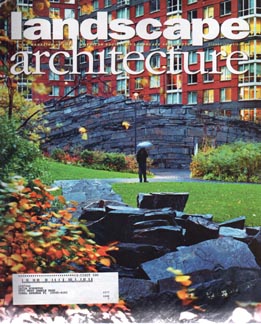
Tear Drop Park, M. Van Valkenburgh and A. Hamilton
Plagiarism was the topic on C-SPAN's BOOK-TV, March 31, 2007, rebroadcast a panel discussion held at the 2007 Chicago Humanities Festival. The old simple idea of claiming someone else's work as your own is not so simple anymore. Federal Judge Richard Posner laid out some legal theory about plagiarism in the age of growing copyright powers. (Ironically while stealing his book title, 'The Little Book of Plagiarism', from the uncopyrighted 2003 manuscript by Marie Stinson of Leeds Metropolitan University)
Writer Jonathan Lethem saw the 20th century as the age of appropriation and collage, which followed a history of mankind, where starting with the works of other artists was the norm. (Read his excellent Harper's Magazine essay.) To Professor Francoise Meltzer "Everything is cumulative. The originality myth has come to a close." as reprinted by the Chicago Reader.
Originality as the ultimate artistic goal may be over as per Dr. Meltzer, but originality will always have a significant place in a culture that celebrates the uniqueness of individuals and freedom of action. An old term - vernacular - needs to be added to complement originality and, its brother, craftsmanship.
The Public Art field ignores conscious and unconscious plagiarism (not deception, but plagiarism in the positive "open source" use as described by Lethem). It is too dangerous to touch. But after sitting through 200 visual applications for a public art project, repetition and similarity dominate the brain. Whether the repetition is in glistening stainless steel "abstraction", smiling bronze children on a bench, or rivers of terrazzo in giant lobbies, the concept of originality SHOULD start to fade. Instead the unfortunate artists in the repetitive pools drift into a blur and the "unique" artists jump forward.
Public art administrators don't want to discuss this because it strikes at the conflict of audiences. Every public art administrator, curator and advocate wants unique works that verify the artistic credibility of the program to art institutions. Every civic leader wants public art like other places, only different. The supportive general public appreciates public art that looks like excellent art from all qualities of museums, galleries and, most important, art fairs. A transition of desire exists from originality to unidentified plagiarism.
Avoiding the WORLDWIDE repetition of artwork concepts and productions fails to secure an intellectual position that could expand the impact and implementation of artistic influence on the public realm. (It also discriminates against the talented artists who are without the desire to conceptually separate their work from the pack.) In architecture, fashion and product design, the appropriate ideas of the moment move quickly (and literally) across the landscape. Stuck only with originality, public art cannot move the built environment.
Adding an updated concept of the vernacular could expand the foundation of public art. Remove the folk or traditional attribute of the definition of vernacular. It becomes a repetitive method of making within a specific industry and sometimes modified for local places. The vernacular becomes as much a mental repetition as a physical one.
With originality and craftsmanship, vernacular makes legitimate the comparison to similar thoughts and objects both historic and contemporary. Repeating some attributes would become the best choice. A community could want "more of that" and still find ways for "more of that" to be invigorating artistically.
Vernacular has a powerful concept of "of a place". Freed from only originality, public artworks can merge with the location and adapt to the changes during the future. This additional definition of the vernacular was my intention regards to the work of Morris Lapidus on Miami Beach's Lincoln Road. The work was part of the vernacular global thinking AND is now part of Miami Beach.
Ries Niemi wrote in a letter to Aesthetic Grounds that Lapidus saw these follies as pure original invention. Niemi is probably right given the time period in the 1960s, but I was interested in what happened to the artworks. The concrete canopies are now part of the vernacular of the 1960s and the contemporary streetscape due to the respect of other artists and designers in the 1990s. Lapidus's work is original, well crafted AND vernacular.
Blogroll
AJ Ads
AJ Blogs
AJBlogCentral | rssculture
Terry Teachout on the arts in New York City
Andrew Taylor on the business of arts & culture
rock culture approximately
Laura Collins-Hughes on arts, culture and coverage
Richard Kessler on arts education
Douglas McLennan's blog
Dalouge Smith advocates for the Arts
Art from the American Outback
For immediate release: the arts are marketable
No genre is the new genre
David Jays on theatre and dance
Paul Levy measures the Angles
Judith H. Dobrzynski on Culture
John Rockwell on the arts
Jan Herman - arts, media & culture with 'tude
dance
Apollinaire Scherr talks about dance
Tobi Tobias on dance et al...
jazz
Howard Mandel's freelance Urban Improvisation
Focus on New Orleans. Jazz and Other Sounds
Doug Ramsey on Jazz and other matters...
media
Jeff Weinstein's Cultural Mixology
Martha Bayles on Film...
classical music
Fresh ideas on building arts communities
Greg Sandow performs a book-in-progress
Exploring Orchestras w/ Henry Fogel
Harvey Sachs on music, and various digressions
Bruce Brubaker on all things Piano
Kyle Gann on music after the fact
Greg Sandow on the future of Classical Music
Norman Lebrecht on Shifting Sound Worlds
publishing
Jerome Weeks on Books
Scott McLemee on books, ideas & trash-culture ephemera
theatre
Wendy Rosenfield: covering drama, onstage and off
Chloe Veltman on how culture will save the world
visual
Public Art, Public Space
Regina Hackett takes her Art To Go
John Perreault's art diary
Lee Rosenbaum's Cultural Commentary
Tyler Green's modern & contemporary art blog
