Artopia: January 2004 Archives
An Identikit for Unreeling the Invisible
identikit n: (trademark) a likeness of a person's faceconstructed from descriptions given to police; uses a set of transparencies of various facial features that can be combined to build up a picture of the person sought.
Identity politics, as exemplified by the black power, women's liberation, and gay and lesbian movements, yielded identity art. Identity politics and identity art both started in the early '70s. Both are responses to being identified as someone to be looked down upon, repressed, discriminated against, abused -- and then turning that identification around as a source of power and pride. Both are ways of fighting back.
But what is identity? Are you your sex, your gender, your skin color, your ethnic background, your age, your nationality, your religion? Ah, if only identity were that simple. In Artopia no one is ever identified by a single identifier. Identity is a sum of characteristics. Identity is what makes you not someone else. Identity is playful; identity is what makes you interesting.
Unfortunately, identity outside of Artopia is how other people identify you when they want to point you out, beat you up, or sell you something. This in turn can become how you identify and limit yourself. You are controlled.
I have often puzzled why, although we are genetically virtually identical, there's this awful tendency to construct minorities -- to exclude, repress, sometimes to the point of slavery, torture, and murder. Competition for money, privilege, jobs, or salvation seem to be the cause. Fear is the root.
But in my darkest moments I think that some people simply like to cause misery and death and will make up all kinds of excuses to achieve their diabolical pleasures.
Not unrelated to this pleasure theory of repression is the fact that discrimination is about power. You don't have power unless you can push people around. This explains why certain politicians can have very close gay friends (even their own children) and yet do everything possible in their political life to make life miserable for the majority of gay men and lesbians. It's an easy way of showing their power. It's what bullies do, so their buddies will obey. Scapegoats and foils are good to have around while you're cheating on your wife or robbing the bank.
***
Is Nayland Blake's "Reel Around" (Matthew Marks Gallery, 522 W. 22 St., to Feb. 21) identity art, identity politics, or something else? All three, I'd say, but with an emphasis on the last. Complexity is what makes Blake's art stand out. Blake has been exhibiting since 1986, has curated exhibitions himself and, although there is no coffee-table book about him or October magazine celebration, he is a known art-world player. Nevertheless, unless you have some idea about what's gone on before, the current offerings might be puzzling. (To see some thumbnails of past work, check out the gallery website.) You do, however, need to know that Blake has a white mother and a black father and is an out gay man, significant aspects of the content of his art.
Years ago, when I first met Blake, he had already made a name for himself in San Francisco with artworks that used semen and blood, I think, from h.i.v. infected men. He was thin and polite. Now, as you will see from the video pieces in his current exhibition, he is hirsute, tattooed in a major way and burly, a bear if ever there was one. "Bear" is a gay subcategory, the opposite I suppose of "twinkie."
Since the history of recent art has fallen by the wayside, catching up with the past is sometimes necessary. You need to know there's some precedent for art about mixed-race identity. The great piece that first comes to mind is Adrian Piper's 1986 My Calling (Card) #1, distributed mostly at art world dinner parties. At even the slightest hint of a racist remark, she (who, like Blake, might not be perceived as African American) passed around a business card declaring her "racial"background:
Dear Friend,
I am black.
I am sure you did not realize this when you made/laughed at/agreed with that racist remark. In the past I have attempted to alert white people to myracial identity in advance. Unfortunately, this invariably cause them to react to me as pushy, manipulative, or socially inappropriate. Therefore, my policy is to assume that white people do not make these remarks, even when they believe there are not black people present, and to distribute this card when they do.
I regret any discomfort my presence is causing you, just as I am sure you to regret the discomfort your racism is causing me.
Sincerely yours,
Adrian Margaret Smith Piper
The highly regarded avant-garde novelist Walter Abish (author of How German Is It?) told me that upon his first visit to Germany, he was embarrassed by anti-Semitic remarks that his hosts made among themselves, thinking he did not understand German. A Jewish calling card like Piper's black one might have been appropriate. I myself have often felt the need of a gay one, particularly when stepping outside the art world -- but, if the truth be known, sometimes even within this protective zone.
Now, thanks to Will & Grace and Queer Eye for the Straight Guy, we are all much more sophisticated, right? But if you are made uncomfortable by the sight of two bearded men, one smeared with white frosting and the other with black frosting, kissing rather passionately for a long, long time (Coat), and the sight of a 16-foot white bunny suit (The Big One) collapsed on the floor, or the spectacle of the artist being slapped by "people with whom the artist has had a meaningful relationship, including teachers, students, and family members" on a row of monitors, you are not, I am afraid,as sophisticated as you may think.
A bunny suit? I suspect it has something to do with some childhood indignity, the reversal of Blake's classic gingerbread house exhibited at Matthew Marks in 1998. You also have to know that not too long ago Blake made a video of himself in a bunny suit, dancing to the orders of an offscreen male voice. Was this Blake criticizing himself for masochistically trying to be white? For being worried about being heavy?
But you cannot see rabbits and not think of male fertility and promiscuity, Br'er Rabbit, Bugs Bunny, and the Native American trickster rabbit. Or, for that matter, the rabbit-in-the-moon. Europeans see the man in the moon; other cultures see an old woman. I, like Native Americans, have since childhood seen a rabbit. I don't know what that makes me.
This begins to get closer to what I like about Blake's art. The meanings echo and fan out. Yes, as was once a motto, the personal is political. But only if you make it so; if you make the personal into good art.
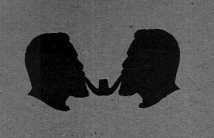
The title of the exhibition is "Reel Around." And it certainly sets one reeling. Not yet convinced? Then I would point out the show's logo: two identical male silhouettes, face to face, both Blake, simultaneously smoking a two-stemmed pipe. The pipe is a fine sculpture called Root. Try to unpack that.
DeChirico, Gladiators (1930-31)
Picabia, Minos (1930)
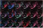
Warhol, 18 Multicolored Marilyns (1979-86)
I was once called "the peripatetic art critic" by Lawrence Alloway. Because, mid-career, he moved from London to New York, he was rather a peripatetic art critic himself. Aristotle was called peripatetic because he offered philosophical discourse while walking around. As astute readers will discern, I am hardly Aristotelian. For one thing, I attack all either/or formulations. But I do tend to walk a lot.
Looking at art is great exercise, at least in New York. Art lovers have to deal withChelsea, which, as the art zone, now stretches from the far end of the Meat Packing District to West 31st Street; 203 Chelsea galleries are listed in the Art in America gallery guide. And there's one aspect of Artopia that no one talks about: unlike the museums, all galleries are free.
At the beginning of my Art Walk last week, I clambered up the still raw staircase to the Sperone Westwater gallery (415 W. 13th St.), the odor of meat in my nose. I really wanted to see "A Triple Alliance: De Chirico, Picabia, Warhol" (to February 21). I'll go anywhere for Francis Picabia. It is a bit strange to see galleries, boutiques and a chic Vitro repro-modern furniture store in the middle of an active meat-butchering neighborhood. But vegetarians take heart; art real estate always drives out more plebian workplaces. Look at Soho. Where are all the sweatshops now?
The current Sperone Westwater offering easily could be a small museum show. Art historian Robert Rosenblum must have really enjoyed juxtaposing works by these three masters and thinking about how, surprisingly, the artists are alike. All three had problematic late careers, were big on socialites, and were accused of selling out.
But, let's face it, the late Giorgio De Chirico gladiator paintings (or even the male bathhouse-bather paintings) are just not as metaphysical as his Metaphysical paintings early, early in the century. And Andy Warhol, at the other end of this game, got spotty as his cutting-edge position disappeared. Here, however, there's the outstanding 18 Multi-Colored Marilyns (Reversed Series), 1979-86. I really do not warm to Warhol's portraits, whether of tennis stars or dogs, but I'm sure there's still much gold to be found. For instance, "The Last Supper" paintings, not included here, are superb, perhaps because the artist again used an instantly recognizable image.
For me, however, Picabia could do no wrong. His Minos (1929) has at least five superimposed images, and from 1942 there's an untitled painting of two women (or maybe the same woman twice) almost obliterated with quick, dry, black brushstrokes across the canvas surface, as if in anger but not quite. No one can deny Picabia's Dada period, but the works after those witty machines need to be looked at on their own. I think Picabia's Dada period never ended.
Then a big walk to 22nd Street to a gallery I had not visited before. I usually make this a rule: if possible, go somewhere I have never been. Having referred to Bruce Conner in my piece on Jay DeFeo, I thought I'd like to catch up on his work. The tiny, tiny Susan Inglett Gallery is nestled inside the Frederieke Taylor Gallery (535 W. 22nd St.).
Conner, of course, did the famous film aboutDeFeo's The Rose and several other celebrated, perhaps more film-qua-film films, including a steamy homage to Marilyn Monroe and the image-barrage called A Movie. But he's also an artist who has made some beautifully creepy assemblage.
Now 80 years old, he's produced four new computer-generated, poster-size prints (at Inglett until February 7). Bombhead is a military man with a mushroom-cloud head. Is the image weirdly nostalgic or is the warning still in effect? Three other prints use a field of tiny, Rorschach-like ideograms: (1) all alone, like wallpaper, in Memorial Inscription; (2) superimposed on the face of a cliff in Memorial Wall and (3) in the sky in Tracery in the Sky. But Bombhead should be on every dormitory wall.
Then I ducked into Sonnebend (536 W. 22nd St.) and was pleasantly surprised by a show of work from the '60s by the arte povera artist Gilberto Zorio (to February 7). Zorio's quirky, informal, yet minimal use of material is poetic indeed but now leaves one aching for myth, angst, something more. Maybe beauty is enough.
* * *
As usual I started out with a checklist of where I wanted to go, using listings and mailed and e-mailed announcements. Of course, I never get to see all the shows I target. But then there's the chance encounter, the gallery you had not counted on: i.e., the Nancy Margolis Gallery (524 W. 25th St.). I missed the opening celebration for its new location, but there it was, on my way to Feature Inc., right on street level with some tempting art on view. Once inside I certainly liked Ferne Jacobs's tightly wrought, fiber vessel-forms, but the real surprise was giant ceramic platters by the Norwegian Marit Tingleff: too big to use, but hanging there as wallpieces. The largest is 61 inches wide, but my favorite, Plain with Map, is 35 x 51.
Then on to Feature Inc. across the street (530 W. 25th St.) to see what John Torreano has been up to after all these years. On view to February 14, Feature features three paintings, almost too big for the space. Made up of panels, all are implanted, as it were, with acrylic and glass "jewels" and strewn with demispheres. My favorite is DEM 106, the painting with a white ground that includes graphite or charcoal circles. But one cannot fault the two other paintings that go for a night-sky look, offering a celestial beauty while hugging the surface as you plunge into deep space.
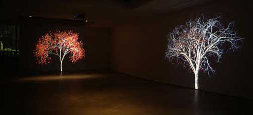
Jennifer Steinkamp, (detail) Dervish.
Then stopping here and there, bracing myself against the cold, I headed over to the Robert Miller Gallery, but passing Lehmann Maupin (540 W. 26th St.), I remembered two oddly shaped announcements they had sent. Inside, I was moved by Jennifer Steinkamp'sDervish,giant projections of four computer-animated trees, each twirling first in one direction and then in the other. Following up this positive Muslim theme with a more critical take, in the South Gallery Sadegh Tirafkan shows photos of a bare-chested man (in a series called "Body Curves"). Tirafkan, an Iranian, has inscribed these photos of himself with Arabic letters. Hardly nude by Euro-American standards, these are meant to break the taboo on Arabic "nudity," for, as the artist is quoted as saying, "Flesh is the canvas branded by culture." There's a good website with a video of the Steinkamp trees.
But if you really want to see nudes, then the new Philip Pearlstein paintings at Miller (524 W. 26th St., to February 7) should fit the bill. Pearlstein did his master's thesis on Picabia.Was Dada an influence on one of our most celebrated realist painters? As usual, Pearlstein's affectless but never abject models are shown deployed among various folk and popular culture collectibles.This is all in the service of the skewed, dynamic compositions that are effectively at odds with the neutralized nudes. I like best the small paintings and those in square formats. The two "Luna Park Lion" paintings are each only 33 inches square. The larger 2 Models with Hobby Horse and Carousel Ostrich (60" square) and Model on Lawn Chair with Tin Toy Locomotive (actually a 48" x 48" diamond) are particularly to my liking. The squares and diamonds are powerful shapes, and making them work as a paintings is difficult indeed, for you do not have the anchoring of "landscape" or "portrait" formats. The former gives you an implied horizon to work with or against, and in the latter there's a central axis. Painting on squares and diamonds is like working without a net -- just like using the peripatetic and commentary modes in art writing.
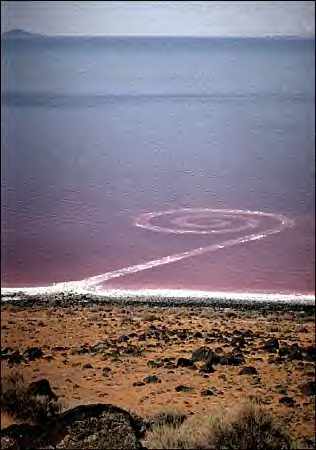
Robert Smithson: Spiral Jetty, 1970.
SAVING THE JETTY
Robert Smithson's Spiral Jetty, thanks to drought, is above water level again after nearly 30 years. It's covered with salt crystals. Should it be rebuilt? The DIA Foundation, its owner, is considering some sort of restoration. The New York Times of January 13 in an article on the Spiral Jetty, as is its custom, covered all sides of the argument.
The Spiral Jetty, composed of basalt rocks, forms a fiddle-head roadway out from the shore of Utah's Great SaltLake at Rozel Point. Smithson's wife, artist Nancy Holt, thinks it should be built up again, and apparently the artist himself, before he died in a plane crash in 1973, gave an interview indicating preservation of his Earth Art might be in order.
I knew Smithson. I think he was a friend. Alice Neel, sometimes referred to as the catcher of souls, painted Smithson before he was famous. She called him The Wolf Boy. But he had many enemies too. The Smithson section of Amy Newman's all-too revealing Challenging Art: Artforum 1962-1974, now in paperback from Soho Press, shows how nasty some critics once featured in Philip Leider's magazine could really be. Suspicions confirmed: what a group.
But, as far as I know, I was the first art critic to write about Smithson. I covered an early non-site. That was his term for bits of the landscape dragged into Virginia Dwan's New York gallery as rocks in bins or on the floor with mirrors or sometimes just as photographs. Traditional sculptors liked to bring some art into the landscape; Smithson once said he liked to bring a little bit of the landscape indoors. There's more to Smithson than the Spiral Jetty.
So I tramped with him around the remains of an old quarry right up against the Jersey Turnpike on a promontory overlooking the Meadowlands. Holt did the driving and took the photographs. This was, believe it or not, for New York Magazine.
Was he really a friend? Let's put it this way. I enjoyed arguing with him. I appreciated his dark vision, his sarcasm and his talent. Spiral Jetty was indeed his masterpiece. And, just as important, the masterpiece of Earth Art. I lost interest when he began proposing earthworks to mining companies so they could beautify their open pits and depleted strips.
My own feeling is that such scars should be left as they are, as reminders, as symbols of desecration and greed. Be that as it may, I myself am much taken by the gorgeous Lavender Pit in Bisbee, Arizona, a deep wound in the name of copper. It should never be filled in. It is part of history.
Nature, given half a chance, will always retake the land. Or like the manmade Great Plains, huge parts of the Sonoran Desert, and Viking-deforested Iceland, these newer landscapes will themselves become nature. We are not separate from nature. We are nature, not only in tooth and claw, but also with bulldozer and plow.
I know the DIA Foundation has good intentions, but isn't Smithson's notion of entropy, in both its aesthetic and philosophical dimensions, more important than trying to imitate the way the Spiral Jetty looked in 1970? Entropy, in Smithson's preferred meaning, has been defined by one dictionary as "the degradation of matter and energy in the universe to an ultimate state of inert uniformity." Smithson had a liking for science fiction of the cosmological kind. Things fall apart. Chaos rules. Matter becomes one large lump, frozen in endless space. One could save the Spiral Jetty, but in the process lose the poetry.
To see the Spiral Jetty now, why not look from a satellite?
We could, of course, have a Spiral Jetty Theme Park. We art tourists could buy helicopter shots of ourselvessprinting on the Jetty, just as Smithsonran in his movie. The glossy photos would be ready and waiting upon our return to the new resort hotel down the road. We have long been able to buy shots of ourselves white-water rafting. Instant photos in several sizes are spread out downstream on the banks of almost any Colorado river. I have one such photo; I once used it as a screensaver. Now I yearn to see John Perreault running on the Spiral Jetty! After all, I too like the desert. Smithson, no stranger to irony, might have enjoyed the socialization of his great work as yet another example of entropy.
Jay DeFeo, The Rose, 1958-66
INTO THE LIGHT
Is a halo by any other name still a rose? Are the titles Deathrose or The White Rose the same as The Rose? Jay DeFeo's masterpiece -- for it is indeed that, with a vengeance -- had these titles until she settled upon the last. Her painting, so thick it could be considered a relief, is roselike in so far as it radiates from a live rather than a dead center, but it explodes rather than unfolds. If anything, the painting suggests halolike rays of light or big splinters of glass, but not anything as harmless as petals.
Given DeFeo's Beat credentials (for a quick Beat update, a picture of the artist and the sound of bongo drums, go to Beat Museum), The Rose could be an H-bomb blast or the mystic's white light, more than merely a black-and-white rose. But wouldn't it be off-putting if DeFeo (1929-89) had settled on Deathrose or, to make up a few titles, The Bomb or The Halo as the final title of her nearly 2000-pound painting? A painting that took eight years to make, to the exclusion of all other art efforts? A painting that is still not dry after having been buried under plaster from 1974 to 1995 behind a classroom wall of the San Francisco Art Institute? A painting that destroyed the artist's career?
The Rose (1958-65) is the centerpiece, as it were, of "Beside the Rose," at the Whitney Museum until Feb. 29. The exhibition is in the small lobby gallery but worth a special visit. I first saw The Rose when it was featured in Lisa Phillips' "Beat Culture and the New America" at the Whitney in 1995 and I am thrilled to see it again. This time around it is accompanied by the pre-Rose The Eyes (1958) and post-Rose Crescent Bridge I and II (1970-1972). The first is a large, hypnotic drawing of the artist's eyes; the second, a pair of paintings of -- I am not kidding -- DeFeo's false teeth.
How can you not love an artist who would make paintings of her own false teeth (and later photographs them in different settings)? How can you not love an artist who in 1959 would allow herself to be photographed by the neo-kabbalist Wallace Berman naked in front of The Rose with arms and legs stretched out in the da Vinci pose? Who couldn't love an artist who would allow Berman to paste the Hebrew letter tzadi on her gaminlike chest? Did DeFeo know what the tzadi means?
According to a footnote in Daniel Matt's new translation of The Zohar (Stanford University Press), the tzadi represents the androgynous origin of the male and female sexes: "The tzadi must remain hidden so that this secret will not become widely known and provide the world a pretext 'to impugn the divine union.' "
Oh, they were wild in the '50s. And they were wild in Second Temple Jerusalem or 13th century Spain, or whenever The Zohar, the key work of Jewish mysticism, was written or compiled.
This tzadi photo collage and other photographs of DeFeo in front of her painting can be seen in the worthy book Jay DeFeo and The Rose, 2003, University of California Press (access to photo portfolio which includes the Wallace Berman tazadi photo collage is at UC Press). The book includes essays by, among others, ex-Whitney director David Ross (the hero who rescued The Rose), Bill Berkson, Lucy Lippard, Greil Marcus, and Carter Ratcliff. Almost every essay, whether factual or conjectural, includes great and justifiable praise:
As an image of creation, The Rose knows only the contingency of sheer matter on the rise. (Bill Berkson).
Jay DeFeo and her work confound historiography. The contributors to this book have had the pleasure of grappling with the power and mystery, place and context of this extraordinary work of art. (Jane Green and Leah Levy).
Few artworks demonstrate such single-minded intensity as The Rose. ...The strength and inventiveness of her finest art will be seen as rivaling that of the greatest artists of the twentieth century. (Walter Hopps).
DeFeo's Rose is the queen of all feminist and nonfeminist roses. Its presence testifies to the devotion of its maker to art. (Lucy Lippard).
DeFeo is Dr. Frankenstein; The Rose is her monster. (Greil Marcus).
... the great painting that has virtually defined her reputation. (Marla Prather).
The Rose has a status befitting a legend. (David Ross).
It is a pure experience and a sacred thing, a great work of art. (Martha Sherrill).
It is an artifact of a civilization that, at its best, finds its ultimate values in irreducible individuality. This is the truth celebrated on a heroic scale by DeFeo's monumental work of art. (Carter Ratcliff).
Yes, The Rose is a special artwork, a masterpiece. DeFeo was a special artist. So what is there left to say? Plenty. For instance, The Rose, like the unfinished blank canvas in Balzac's The Hidden Masterpiece and the ur-monochromatic abstraction in Henry James' story The Madonna of the Future (both available as free downloads fromProject Gutenberg) is an allegory about creativity. Balzac's arch prose-piece (also sometimes called The Unknown Masterpiece) lays out the tale of a painter who, in his pursuit of the ideal, in the end produced "a mere mass of incoherent scratches and daubs, a jumble of dead paint." James' latter-day rewrite, which even refers to the Balzac tale, has his American in Florence produce nothing but a blank canvas.
Of course, both these tales of artistic obsession outwardly involve a pursuit of the ideal female form. In Balzac, a perfect model is offered and leads to the exposure of the truth and, of course, the artist's death. In James, the artist, referring to his hidden masterpiece, says: "I detest this modern custom of premature publicity. A great work needs silence, privacy, mystery even." Guess what happens when the nasty Jamesian narrator discovers that the much adored model for the Madonna is now an old and rather fat embroiderer and forces poor, deluded artist Theobald to realize that the canvas in his hovel is only the naked screen of his imagination?
Unlike these two fictional paintings, The Rose is real. And it is not a blank canvas or a failure. There are, I am told, still some diehard Bay Area Figuration devotees who insist that DeFeo was a fraud and that the painting never really existed or that it had become one big blob of ooze. Haven't they seen artist Bruce Connor's classic film The White Rose: Jay DeFeo's Painting Removed by Angelic Hosts? Have the boring paintings of David Parks and Richard Diebenkorn blinded them to real art? Now that The Rose has been restored (reportedly to the tune of a quarter of a million dollars) and is in the Whitney Museum's permanent collection, can anyone deny its existence? Paintings may be reborn, but bad attitudes never die. This is why The Rose blooms in New York and not San Francisco.
It took DeFeo eight years to complete The Rose, during which she worked on nothing else. It was big for its time, eventually 128 x 92 x 11 inches, and twice as tall as the artist. It blanked out a bay window in her studio on Fillmore Street. And when it had to be moved from its niche because DeFeo and husband Wally Hedrick were being evicted, the only egress possible involved cutting out the wall beneath a window and then hoisting the monster to the street.
But the myth would not be complete without the information that the artist produced no other artwork for three years, and that her career, such as it was, went into eclipse. She had been chosen for trend-spotter Dorothy Miller's "16 Americans" at MoMA in New York but would not ship her yet incomplete masterpiece. Everyone wanted to buy it. But then there was silence. It was too big, too heavy, too delicate. And finally it was buried in plaster for safekeeping.
Although DeFeo did indeed begin working again, her moment had passed. The fickle art-world spotlight keeps right on moving. No more paintings? Well, how can you develop a market if you have only one big painting that no one can see and no one really wants anymore?
But this is, I remind you, Artopia, where art matters. Inspired by the science fiction subgenre of alternative histories (think Philip K. Dick's The Man in the High Castle), I'll be teaching a seminar this summer called A New Agenda for Art at the Anderson Ranch in Colorado. We'll explore and create alternative art histories for art, thus analyzing how art history is constructed. What would have happened if Jackson Pollock had lived to a ripe old age? What if Julian Schnabel or Jeff Koons had not been able to show their work? What would have happened if Los Angeles or Tokyo had become the art world center?
In terms of DeFeo, imagine an art world in which she had sent The Rose to MoMA. Would she, like Jasper Johns, Robert Rauschenberg, and Frank Stella, who were also in that now-seminal exhibition, have ended up represented by Leo Castelli? And if so, would The Rose now be as important? Imagine a DeFeo career consisting of thousands of roses and not one painting of her own false teeth.
Imagine an art world in which David Ross had never been the director of The Whitney and there was still no museum willing to subsidize the restoration of The Rose and then put it in its permanent collection. Would the legend of The Rose become even greater? Or would The Rose have faded away?
Better yet, imagine a San Francisco art world in which Bay Area Figuration had never caught hold. Where the works of DeFeo, Connor, and Berman were purchased instead of the paintings of the virtually talentless Parks and the banal Diebenkorn. Would DeFeo have lived any longer, been any more productive? Would The Rose, safely on display in the San Francisco Museum of Art, have become a meta-masterpiece, an art lesson?
* * *
Life imitates art; or art imitates literature. The obsessive search for perfection in an artwork transmigrated from Balzac and James to Marcel Duchamp's The Bride Stripped Bare by Bachelors, Even and later to de Kooning's Woman I. The Bride was never completed; rather was "completed" when the glass cracked in transit. De Kooning repainted Woman I every day for two years. According to Harold Rosenberg in The Anxious Object, de Kooning "knew that the project on which he had embarked in this Woman could, if pursued to the end, finish him as a painter. He spoke of wanting to spend his entire life on a single painting -- Woman would then be indeed 'painting as a way of living.' "
We are no longer enthralled by Duchamp's inability or unwillingness to finish The Bride, and nothing looks more finished now than one of de Kooning's "Women." Just as in the movies there must always be a blond goddess and a dark-haired temptress (cinema's most obvious archetypes), in art there must always be a killer artwork, a masterpiece that takes forever to make and nearly destroys the maker. That slot had been vacant for far too long. Fortunately, The Rose is now in place.
The subject of such an artwork must be archaic and sexual. Intention has nothing to do with it. The Bride is about the alchemical, Rosicrucian The Chemical Wedding of Christian Rosenkreutz (1616), whether Duchamp consciously thought of this or not, or even knew of such a text. The de Kooning Woman -- which, he maintained, he always found humorous -- is Robert Graves' White Goddess personified. The Rose is ... well, it won't work unless you yourself figure it out or are correctly stymied. Logic can take you only so far.
The Rose is what we need now. It reaffirms that artworks of major significance are created without market considerations, are initially totally unsaleable, are beyond the pale, are messages from the id or the beyond. Like Duchamp's Bride and de Kooning's Woman, The Rose could at first be seen only in the artist's studio, had a cultlike status, was hidden. Adding to the hidden masterpiece template, The Rose had a period of occultation and then was reborn, accruing even deeper meanings.
What I would really like to see is The Rose permanently installed in a re-creation of the bay window that was originally its home and womb, blocking the view, but with light streaming in on it from both sides. Was that the real artwork? Or was it born when borne on hoists through the caesarian opening? Or, blasphemy, was it most real when hidden under plaster and behind a wall? Is it, now that it is stabilized and in a museum, slowly, slowly dying? See it before too many viewers have robbed it of its aura. See it before it becomes art history rather than art.
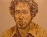
Philip Pearlstein: John Perreault, 1975
Welcome to my blog. I'm really excited to be writing about art every week once again. Finally technology has caught up with my preferred writing style. Let me explain what I mean. Years ago when I was writing for the Village Voice, I remember that after my first year of art columns an irate reader wrote complaining I had used the first person pronoun 73 times. First of all, he obviously did not follow what was then called the New Journalism. Secondly, my goal was to include myself in the picture, not out of egotism, but so readers would know what was going on or, as we used to say, where I was coming from. I had a voice. I argued with myself. I included the quotidian. I wanted to show that looking at art is not separated from life. Perceiving art can't be isolated from thinking or feeling. I did the same thing when I was writing for the Soho News in the '70s. And now, although I use the required dispassionate mode for other venues, here I can more obviously let the reader in on the process of looking at art. Blog culture demands the personal. What could be better? More honest? So now on to...
THE ANXIETY OF INFLUENCES
When asked why he robbed banks, a once famous holdup man answered "because that's where the money is." So to paraphrase Willie Sutton, we keep on going to museums because that's where the art is. Of course, art is now everywhere, not just in museums or art galleries. It's on the streets, in fields and even on the internet. The difference is that museums are supposed to have fool-proof art, art that already has survived or soon will survive the test of time.
Unfortunately, this is an idea that has lost its currency. But we keep on going to museums, on dates or as solitary wanderers, on flings, seeking beauty, prestige, edification, fun. Oh, yes, certainly fun.
There is, after all, thanks to many points of purchase, a mall effect at the Metropolitan and the Guggenheim museums. To be art, it seems, art must create desire: must sell itself or, increasingly, the celebrity of the artist. Art creates a higher form of shopping. If you can't buy the art, you can definitely buy the refrigerator magnet. Mind you, I love museum shops.
Pressed for time in a foreign land, an initial museum shop visit will let you know what you shouldn't miss inside or, on your way out, might make you turn around and go back in. It's not the postcards that make people come to museums, but what the postcards (and scarves, ties, jigsaw puzzles, calendars, and pins) represent. For instance, last June I noticed that the zigzag logo representing the footprint of the Jewish Museum in Berlin is given gift-shop prominence (on scarves, ties, jigsaw puzzles, calendars and pins). This may tell you that most people come for the architecture and not the cluttered, murky exhibition that wanders from floor to floor, requiring stenciled red footprints to get you from one display to the next.
Back in New York, the good news is that the Metropolitan Museum of Art is jam-packed with visitors again, but please note that both the Whitney and the Museum of Modern Art (more correctly, MoMA QNS) are still closed two days a week. We know what that means: they save money on guards, ticket-takers, and the electric bill. The loss of gate is minor; 98 percent of the people who would have come on that extra dark day will visit later in the week and buy just as many souvenirs. Years ago, when I was privy to such things, I remember a MoMA annual report that revealed that more money was made from gift shop sales than from admittance fees. These purchases help keep the doors open, so even more people can purchase tchotchkas.
Domenikos Theotokopoulos (a.k.a. El Greco)
But who could fault the El Greco (through January 11) exhibition at the Metropolitan? Me, for one, but not because of the paintings. I myself had a little book of El Greco reproductions when I was ten. Let me try to leave aside that I always have a hard time with commissioned portraits. No matter how much lace is involved, they usually remind me of what whores artists have had to be. The same is true for most church or state commissions. Are religious paintings just excuses for compositions or are the artists sincere? We'll never know or, more correctly, perhaps we are not supposed to ask. This would be like asking a present-day artist when commissioned by a corporation to uplift some dismal lobby, if he or she really, really believes in capitalism. Maybe, yes; maybe, no. Maybe the rent needs to be paid.
The beginning of the El Greco installation insinuates that the artistic roots of the Greek-born Domenikos Theotokopoulos are in his icons. He painted some in his youth. Never mind, as the exhibition proves, that it did not take him very long to abandon the frontality, the simplicity, and a lot of the direct spirituality of that tradition for more Westernized depictions, finally breaking through, or so the story goes, in his late and wildly mannerist, individualist paintings, to become a proto-modernist!
Photos and texts removed from books and placed on museum walls or refashioned as hand-outs assume more importance than may have been intended. Here the presentation implies that El Greco was great because Jackson Pollock made drawings of his paintings and that earlier the master's Opening of the Fifth Seal, apparently misinterpreted, inspired Picasso's Les Demoiselle d'Avignon (now being cleaned and repaired at MoMA). Wouldn't El Greco have been a wonderful, sometimes daring painter even if Picasso and Pollock had never existed? I blush at the number of times I have used the same defense of this or that artist: the reflected glory of influence. Nevertheless, perfectly awful or merely minor artists have influenced some great ones. Great ones have influenced hordes of schlocky paint-pushers.Influence is interesting, but not conclusive. Of course, the Pollock El Greco studies are available in three beautiful, facsimile notebooks for $750 at various Metropolitan Museum of Art checkout counters.
Philip Guston
Another offering at the Metropolitan, a Philip Guston retrospective (now closed), was underlit and, more important suffers from the "bad" paintings his late cartoon paintings came to inspire. After awhile cartooning just looks stupid. Let that be a lesson. Being an influence can also work against you.
The story here is the artist's radical style-change. Upset by what was coming down in the '60s, Guston reverted to his Depression/WPA iconography, or at least the hooded Klan figures he once used, but presenting his rage in cartoon simplicity.
Guston's precartoon paintings, sometimes referred to as Abstract Impressionism, hold up, although you can see the figuration lurking behind the willfully insouciant surfaces and the rosy but shadowy colors. These are smudge paintings of dusk, not dawn, and as much as one may sympathize with Guston's social concern they, not the cartoons, are the paintings that will last.
Retrospectives are a risk. Artists both fear and demand them. Collectors love them. Critics welcome the opportunity for an overview of a particular artist's work. Was I right or wrong? Did I overpraise? Or, perish the thought, did I miss the boat.
Guston's retrospective is in some ways a disappointment. The show brings up the question of whether lifelong creativity is even possible and if it is always right to let the moment of anger (or the moment of new inspiration) prevail. What happens when an artist suddenly and radically changes style? We know what bad moves stubborn old de Chirico made and was then reduced to forge his own, earlier paintings. We know that Magritte once tried to be a new Renoir but, unlike de Chirico, quickly and wisely reverted to his signature look.
James Rosenquist
The Rosenquist retrospective at the Guggenheim (closes January 25), like the Guston survey, has some fine paintings, but also brings up some troubling questions. Can a presentation space and a presentation ruin art? Or does good art have to stand up to nondomestic vistas, poor editing and sloping floors? More importantly, did Cubism ever really go away?
By all accounts James Rosenquist is one of the key pop artists, along with Dine, Oldenburg, Indiana, Lichtenstein, and Warhol -- and of course the precursors Rauschenberg and Johns.
Fortunately, Rosenquist's 86 -foot wrap-around painting F-111 (1964-65) holds up. As many will remember, the gigantic fighter plane of the title is interrupted along its considerable length by a little girl under a hair dryer, spaghetti, tire-treads and other glossy images. The mural-size Time Dust of 1992, located in the Level 5 Annex, devoted to Rosenquist's "cosmos" paintings (i.e. space flight images), is, in spite of the silly wall texts, also a winner. And since the Deutsche Bank-commissioned megapaintings are also knockouts, I must conclude that although we still must have his paintings of Marilyn and JFK, with Rosenquist bigger is better. But why? Is it that his day job as a young man was billboard painter? Is it that the first influence is always best?
The smaller paintings, in the majority, are deployed along the ramps of the Guggenheim rotunda. When viewed across the drop-dead plunge of space they are reduced to postage stamps or posters or easel paintings. Their basic Late Cubism, confirmed by the preparatory collages and drawings shown in another "annex," is very hard to avoid. The influence of Cubism lingers. To those who have had their eyes schooled by the anti-Cubism of the signature works of Pollock, Rothko, Newman, and Reinhardt, this is an unforgivable sin.
When Rosenquist's scale is big and even when the smaller paintings are seen in normal rooms, the movielike closeup effect screens the fractured space. His fracturing is done through non-narrative image juxtapositions rather than through the prismatic attempt to present multiple viewpoints. Nevertheless, this is still the composing of one area balanced by another in shallow space depicted on a plane. Late Cubism, however, is more about being bombarded by disconnected media images than it is about relativity or the fifth dimension. Somewhere in the mid-'50s, media imagery became the new fifth dimension.
But here's an idea for a book and/or an exhibition. Let's take a look at de Kooning, Rauschenberg, Johns (beginning with the flagstone paintings), Rosenquist, and David Salle as Late Cubists. Would that be so bad?
Kiki Smith
And on to the borough of Queens: First, try to remember that MoMA QNS is closed on Tuesdays and Wednesdays. Then try to be patient. The No. 7 train often skips 33rd Street and you have to double back at the first express stop that comes your way. Also, say over and over to yourself that this is only temporary and we will have a bigger and more beautiful Museum of Modern Art in Manhattan soon. Not soon enough, I say. But not to worry. The MoMA design store is still open on 53rd Street, and there is a branch on Spring Street in Soho, New York's version of the Mall of America.
Kiki Smith ("Prints, Books & Things," closes March) is the currentpatron saint of the art bohemia, so it is not so shocking that she was carted from MOMA Manhattan to MoMA QNS as part of Francis Alys' The Modern Procession last June. Why was she so honored?
Not because she's one of sculptor Tony Smith's daughters or that she was a member of the legendary Co-Lab "collective." And it 's not because, as the catalogue seems to delight in pointing out, she had a self-image as a girl-child and now thinks of herself as a witch-crone. And it's not because she has been on the cover of ARTnews twice and been known to sport Comme des Garçons garb or that she is represented by PaceWildenstein, the quintessential blue chip gallery. It's because she really is enormously talented.
There are some oddities about the MoMA survey. It is indeed strange that two of the three artists Smith claims as important influences (Nancy Spero and the late Hannah Wilke) have not had solo exhibitions MoMA. Spero is probably too political, and Wilke died too soon and, in fact, documented her own battle with cancer. But the oddest thing of all is that Smith is represented only by her prints and multiples when a full-scale retrospective would not be out of order.
Although I do like some of her prints and multiples, her sculptures, often dealing with the body and the abjectness of same, inform the printed and editioned works. The MoMA's groundbreaking Smith website (see below) includes every image in the exhibition and the full text of the catalogue. That test, like the show itself, is exceedingly thorough and will be of value to collectors and scholars. Even I learned a few things: Kiki Smith has never had a studio but prefers to work at various ateliers or as an invited artist. Furthermore, a case can be made that sometimes the iconography of some of the prints and multiples inspired some of her sculptures. But is her work more feminine than feminist? What is feminine? Not only is Smith enormously talented, her talent is splendidly off-center. So how long will we have to wait for a full retrospective?
For images or further information:
http://moma.org/exhibitions/2003/kiki_smith.html
http://www.metmuseum.org/home.asp
http://www.guggenheim.org/exhibitions/rosenquist/index.html
AJ Ads
AJ Blogs
AJBlogCentral | rssculture
Terry Teachout on the arts in New York City
Andrew Taylor on the business of arts & culture
rock culture approximately
Laura Collins-Hughes on arts, culture and coverage
Richard Kessler on arts education
Douglas McLennan's blog
Dalouge Smith advocates for the Arts
Art from the American Outback
For immediate release: the arts are marketable
No genre is the new genre
David Jays on theatre and dance
Paul Levy measures the Angles
Judith H. Dobrzynski on Culture
John Rockwell on the arts
Jan Herman - arts, media & culture with 'tude
dance
Apollinaire Scherr talks about dance
Tobi Tobias on dance et al...
jazz
Howard Mandel's freelance Urban Improvisation
Focus on New Orleans. Jazz and Other Sounds
Doug Ramsey on Jazz and other matters...
media
Jeff Weinstein's Cultural Mixology
Martha Bayles on Film...
classical music
Fresh ideas on building arts communities
Greg Sandow performs a book-in-progress
Exploring Orchestras w/ Henry Fogel
Harvey Sachs on music, and various digressions
Bruce Brubaker on all things Piano
Kyle Gann on music after the fact
Greg Sandow on the future of Classical Music
Norman Lebrecht on Shifting Sound Worlds
publishing
Jerome Weeks on Books
Scott McLemee on books, ideas & trash-culture ephemera
theatre
Wendy Rosenfield: covering drama, onstage and off
Chloe Veltman on how culture will save the world
visual
Public Art, Public Space
Regina Hackett takes her Art To Go
John Perreault's art diary
Lee Rosenbaum's Cultural Commentary
Tyler Green's modern & contemporary art blog
