
On Facebook and Twitter I’ve been talking about bad graphic design in classical music.
Why does bad design matter? Because we need a new audience. Our new audience comes — will come — from the outside world, where good design is everywhere, taken for granted when you’re dealing with professionals. If we can’t match that, we look like we don’t function in the real word. That we’re not professional. That what we do can’t be very good.
Which, to put it mildly, isn’t in our interest.
I’ll give an example — the Kennedy Center program book. Not because I have any agenda to attack the Kennedy Center, but because for me, living in DC, they’re local. So I see their stuff often. And can’t escape noticing that it’s another example of bad classical music design.
Take a look…
At one sample page. Early in the book, we see a photo of the KenCen’s radiant president, Deborah Rutter. And in person she really is radiant. Warm, commanding, and at the same time, completely down to earth. An admirable presence, admirable executive.
And this is how they show her:
photo
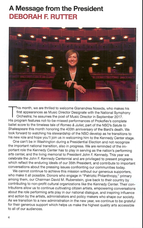
Wow, that’s weak. You can barely see Deborah! Plus, the colors are drab (unappealing, too unvaried). And the page design is poor. Too much text. Who’s going to read it all? No subheadlines or pullquotes to draw interest, offer contrast, divert the eye.
And the headline: “A Message from the President.” That’s not how you write headlines in the real world. A headline should say something, draw you in. You won’t see newspaper headlines saying, “Mets Play Baseball Game.” Instead you see “Mets Win 15-4.” So the headline here should tell us what the message is about. “Our President: We’re Going to Have Hiphop Here.” (An announcement they really did make.) Or something like that.
Moving onward
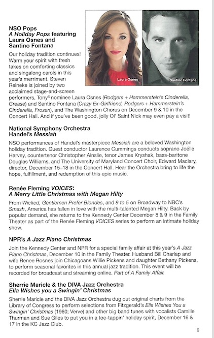
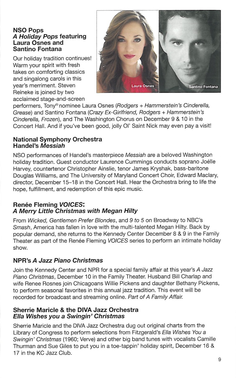
This isn’t terrible. (Though I don’t like running one photo ini color, and one in black and white.) Not too cramped, reasonable layout. Except that it clashes badly with other pages in the book, like these two facing pages, which look like they come from an entirely different publication:
We had color, so why not black and white? These pages are also clumsy. Not well designed. And afflicted, who knows why, with glaring periods after the headlines. Which look brutal, and aren’t correct. Headlines never get periods at the end. (Just look at any magazine or newspaper.)
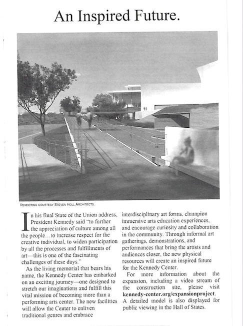
And then all the pages I’v pictured clash with the cover, which seems to come from somewhere else entirely:
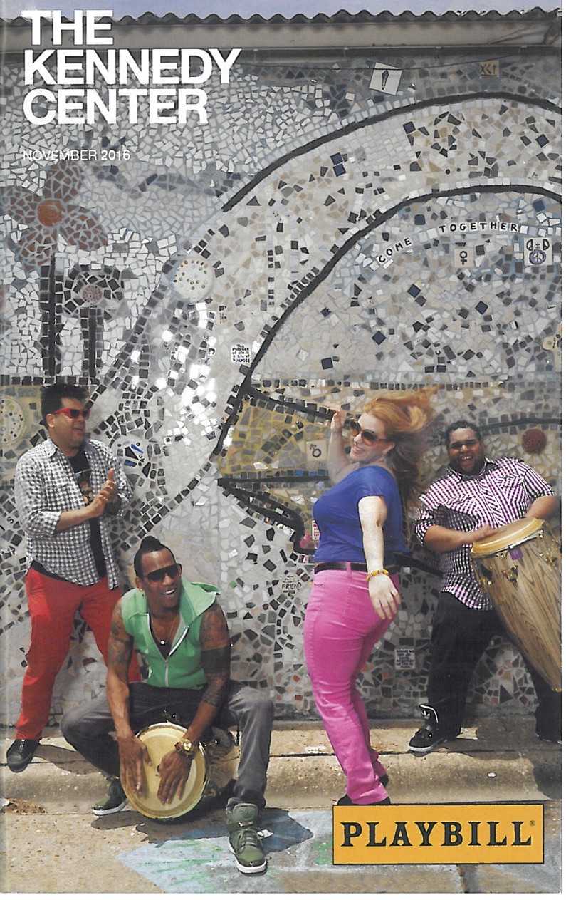
You’d think the whole book would be a feast of lively color.
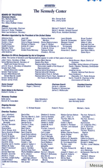
Inside we also find what follows, which, granted, has to solve a difficult problem, to get many names on a page. But the solution is awkward. The layout doesn’t make the different areas on the page, the places where we find the groups of names, stand out. Which makes the names harder to read.
Finally we get pages and pages of this:
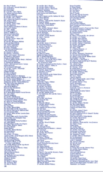
Donors’ names. important, I grant, to get in the book. But as I’ll show in later posts, other organization —for instance the Lyric Opera of Chicago, the Clarice Smith Center at the University of Maryland, and Seraphic Fire (a terrific Miami-based choral group that sings each year in DC) — do it elegantly.
So, the mighty Kennedy Center. With a program book that looks like it was designed by amateurs.
I got some pushback when I posted some of this on Facebook. Was told that, first, the Playbill company produces the book, so maybe the Kennedy Center doesn’t have much control. And also that a cost-benefit analysis might suggest that revamping the book wouldn’t be worth the money it would cost.
My answers to that are coming. Among them: If you want to reach a new, young audience, good design is nonnegotiable. So if using Playbill means you settle for bad design, don’t use them. And how can a top-class professional organization bear to put out substandard work?