• Skip to main content
  • Skip to primary sidebar
  • Home
  • About
    • Real Clear Arts
    • Judith H. Dobrzynski
    • Contact
  • ArtsJournal
  • AJBlogs

Real Clear Arts

Judith H. Dobrzynski on Culture

The Ax Falls At The Met, Again…More to Come

Today the Metropolitan Museum announced a significant layoff: Cynthia Round (below), the senior vice president of Marketing and External Relation–who was hired by Thomas Campbell, the director, only in 2014. Her department, remember, was in charge of the rebranding and the dreadful new logo. She also oversaw press and, apparently, was responsible for the regrettable profile of Sheena Wagstaff in The New York Times last fall.

028d6a9Round’s defenestration is no surprise in some ways therefore, but the fact that she was a Campbell hire, the person brought in to replace Harold Holzer, does not look good for him (to several people close the Met and/or former employees of the Met that I interviewed).

Round was preceded out the door recently by Olena M. Paslawsky, the chief financial officer, senior vice president and treasurer–who is taking some blame for the museum’s huge deficit, and Joanna Prosser, vice president and general manager, merchandise and retail. The Met’s stores are considered to be a bit of a disaster. Prosser was hired in 2013, also by Campbell

Christine Coulson, who was promoted to Chief Advisor to the Director in June 2014, is also leaving, though apparently of her own volition, and possibly for only a year.

Previously, several people who had been hired by Campbell’s predecessor Philippe de Montebello and were long-time employees, left or were encouraged to leave. They include Nina Diefenbach, the deputy vice president for external affairs and chief development officer, who left to be deputy director for advancement at the Barnes Foundation. You  might also include Holzer and Emily Rafferty, the former president in the this category. These people were thought by many to be “employees for life.” Perhaps wrongly. Meanwhile, Associate Director Jennifer Russell, hired long ago by de Montebello and again by Campbell (after other posts in between), also retired this spring.

Rebecca Rabinow, on the curatorial side, also recently resigned to be director of the Menil Collection. She was a huge loss, not only for her smart exhibitions and scholarship (like the 2012-13 Matisse show) but also because she was head of the Leonard A. Lauder Research Center for Modern Art at the Met, and close to him and his curator, Emily Braun.

Who’s next to go? Rumors suggest there will be many layoffs before July 1. Among the names being bandied about is Susan Sellers, named head of design by Campbell in 2013–she’s targeted in part because she also had a lot of say in the rebranding/logo initiative. Sellers oversees exhibition design, and while some recent shows have been praised, others have been disappointing.

And many hope that people will be let go from the huge tech department. It has ballooned out of proportion, my sources say.

 

What Is Manus x Machina Doing For the Met?

It was a hot Sunday afternoon on a three-day holiday weekend, and I decided to visit the Metropolitan Museum* to see Manus x Machina, the costume exhibition that occupies the Lehman wing. It was a revelation on many levels.

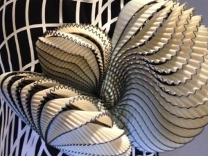
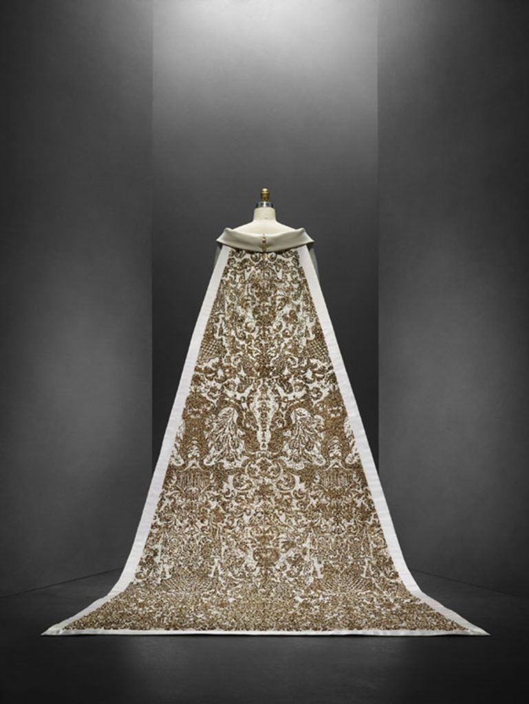
LagerfieldWeddingFirst, the exhibition is, as most commentary has said, a well-thought out execution of a very worthy theme. It certainly lives up to its description of “explor[ing] how fashion designers are reconciling the handmade and the machine-made in the creation of haute couture and avant-garde ready-to-wear.” Some outfits are stunningly beautiful; others are stunning for what they accomplish technologically, although one would be hard-put to wear some of them (I know, that’s the the point). Many, as critics have pointed out, function more as sculpture than as costume. But one thing is clear: fashion now delightly mixes hand and machine work, as the centerpiece of the show, Karl Lagerfield’s wedding dress (at left) so beautifully illustrates.

I’m not so sure I liked the organization–which is by “metier,” or trade (embroidery, pleating, leather work, lace, featherwork and flowers, plus a section on the foundations for these designs), which led to some jarring juxtapositions–but I understand that there’s no other way for this kind of show. Chronology certainly would not work. And some juxtapositions of the old and new were wonderful.

photoUnlike others, I disliked the installation–especially the eerie music (by Brian Eno), which I found too pervasive and clearly intended to create a church-like religion of fashion. Too much reverence for my taste. It’s also a 180 from what so many museums are doing–trying to cut back the reverence for art and make it “fun.” I think that I’d prefer chatter to this music, just as at other exhibitions (though some voices here were louder than usual for a museum).

I spent extra time in the exhibition to people-watch. I have to credit the Met here because the crowd was so eclectic. There were, as always with fashion show, a lot of women, both old and young, in pairs and groups. There were a lot of couples. There were a lot of people who were intensely interested in fashion, making comments on every piece as if they were, oh, Joan Rivers.

More interestingly, there seemed to be a lot of people, and more men than usual, who were studying the technology–making remarks about 3-D printing (which many costumes employed), about laser cutwork and so on. Of course, the exhibit was packed with people using their cell phones to capture designs, but there were also many individuals–men and women–with large SLR cameras taking pictures of specific designs, including details (above right), and labels.

It’s not a leap to think that this show will inspire new fashion designers or, better yet, new designers in other areas.

When I arrived back in the Great Hall, I found the museum to be just as crowded there as in the costume show. I walked through the Medieval hall and the antiquities galleries and peeked into some European paintings galleries. All jammed.

On my way home, I stopped at the Met Breuer. Alas, it was fairly empty–certainly by comparison. Makes me wonder how Diane Arbus, which certainly has been getting press, will fare there.

Photo Credits: Courtesy of the Met (top); detail of a dress by Noa Raviv (bottom), taken by me. 

*I consult to a foundation that supports the Met.

A Small Museum Focuses On Men

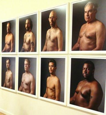
Small museums in this country, and probably everywhere, tend to be ignored. Most lack the kind of art and exhibition program that brings notice beyond their communities. But the Freeport Museum of Art, in northern Illinois, just did something that caught my eye: it organized an exhibition called The Nature of Masculinity. 

Freeport-MasculinityYes, there have been plenty of artists since the beginning of art who have focused on the male body, though a census of art that has gone down in history would probably find more female bodies. But here’s a show, in a small town (population 25,000) that is focused on men now, using the work of five photographers. The description, per the museum website, says:

The Nature of Masculinity explores how media plays a major role in the construction of masculinity, it has become an instructional guide on how society consumes and constructs gender identity. Once considered a one-dimensional concept, masculinity has become consumable through images just as the female form is commoditized in art and advertising, so is the male body. With the increasing acceptance of queer identity within mainstream culture, the definition of masculinity is ever-­‐changing. Gender identity is no longer a simple construction. Instead, masculinity has become a fluid concept, allowing attraction, lust, sexuality, and orientation to become subjective and malleable as individuals begin to construct gender identity for themselves. This exhibition critically examines stereotypes and offers a modern understanding of gender construction, through the photographic medium.

(That’s a direct quote: although the punctuation could use a little help, I did not attempt to fix it.)

What first interested me was not that summary; it was a photo in the local newspaper, The Journal-Standard. It’s something you don’t see all that often, as you can see from the detail I have posted here.

I wonder if this exhibition will attract or repel men. They make up too few of regular museum visitors, observation and studies show.

In some ways, I think many people are tired of viewing art through the gender lens. But maybe this show has found a fresh way to see men.

Photo Credit: Courtesy of the Journal-Standard


That Sad, Empty,Yet Hopeful Palestinian Museum

"Impossible Dream" by Leila Shawa, Palentine
“Impossible Dream” by Leila Shawa, Palentine
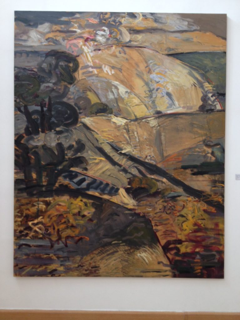
"Autumn Mountains" by Ammar Khamash, Jordan
“Autumn Mountains” by Ammar Khamash, Jordan

You may have seen the New York Times article headlined Palestinian Museum Prepares to Open, Minus Exhibitions in Tuesday’s paper. It told the sad story of a new museum, “a stunning, contemporary new building; soaring ambitions as a space to celebrate and redefine Palestinian art, history and culture; an outdoor amphitheater; a terraced garden” that because of a disagreement will open on Wednesday with nothing in it.

I found it hopeful, in one way.

Without getting to the politics of it–I have no way of knowing which side, the ex-director or the museum’s board, is right. The conflict centers on the execution of a show that was to “feature artistic interpretations of things like keys and photographs that Palestinians around the world have kept from the homes they fled or were forced from in what is now Israel.”

But the good news was simply that people looked to a museum and the arts as a way to uplift people. In a poor area, where many other needs are left unsatisfied, it’s easy to forget that people can be nourished with art. From the story:

Omar al-Qattan, the museum’s chairman, said Palestinians were “so in need of positive energy” that it was worthwhile to open even an empty building. “Symbolically it’s critical,” he said, conceding that the next phase, including the exhibitions, “is the more exciting one.”

That comment reminded me of something Darren Walker, president of the Ford Foundation, told me in a casual conversation about a year ago. He said that Ford staff had proposed creating arts programs for the refugee camps. “Who knew?” he said. But it made sense, because people are spending years in refugee camps. They need artistic visual stimulation and nourishment, too.

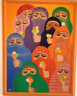
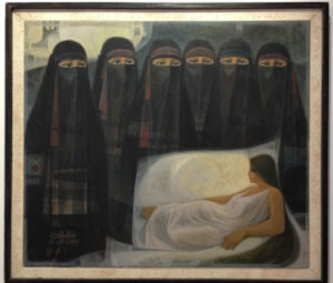
"The Masked" by Nasr Abdelaziz, Jordan
“The Masked” by Nasr Abdelaziz, Jordan

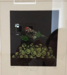
When I visited Jordan last fall, I stopped in at the National Gallery of Fine Arts in Amman. Being there on a weekday, early afternoon, I was not fighting crowds. But I had plenty of time see what kind of art Jordanians and other artists in the Mideast were producing for display in this kind of official museum. I’ve posted some here (sorry about the reflection on the mezzotint below). They are, obviously, not a comprehensive look–just a few paintings that encapsulated what was on view.

Westerners are increasingly interested in art made in the Middle East, and I need not say that that’s a very good thing.

"Bird and Grapes" by Hachmi Azza, Morocco/France
“Bird and Grapes” by Hachmi Azza, Morocco/France

SF MoMA and Museum Architecture: Killing A Meme

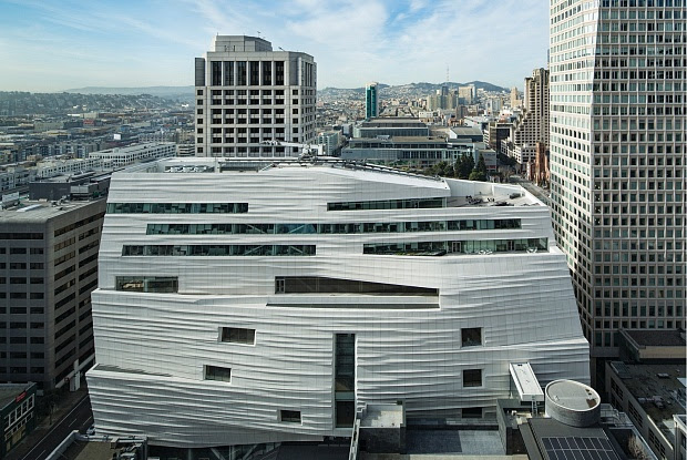
Have you seen the new Snohetta-designed expansion of the San Francisco Museum of Modern Art? I’ve seen only pictures (one, at right), but it should in my opinion put to rest the line many museum directors have been using in recent years that traditional museum buildings are “intimidating” to young people. (See here for such a reference by Tom Campbell, director of the Metropolitan Museum of Art,* and here for another instance in which he said it. Then you might go to another time I blogged about the very idea.)

SFMoMAFor some inexplicable reason, the meme going around is that Beaux Arts buildings and grand staircases are  too foreboding for the average person, especially if they are young and contemporary, to contemplate.

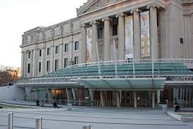
Rather, they stay away–unless the museum does something about, as the Brooklyn Museum did, to the dismay of many, by covering its grand entrance with a glass, well, something like a half-saucer (below right).

Why am I saying this about San Francisco, though? From the pictures, the new building looks as if it’s wrapped in bandages, masking some deep wounds, rather like a building equivalent of The English Patient. Too horrible to contemplate what’s underneath or, in this case, inside.

Of course, it’s not: SF MoMA’s permanent collection is excellent, and now it is supplemented by the 100-year loan of the huge collection amassed by Doris and the late Donald Fisher, founders of The Gap. Over the years, I’ve seen only a few samples from it, but it is reputed to be a great collection.

If museum visitors can enter SF MoMA without fear, they certainly can walk up the steps of any museum built in “traditional” architecture.

As for those staircases, a review by Julie Iovine in today’s Wall Street Journal indicates that this very up-to-the-moment design also includes staircases, including a grand one:

…Staircases, in fact, play a feature role throughout.

From the entrance plaza they flow like streams from a plateau: one set of stairs combined with tribunal seating leads down to a free gallery where commissioned works will reside, visible from the street through large plate glass windows; Richard Serra’s monumental “Sequence” (2006) is there now. A grand staircase cascades down from the new galleries; its maple-wood risers are narrow at the top and spread wide at the bottom. Another new stair runs down to the original lobby.

BrooklynMuseumThere’s more on those staircases in the review. Overall, Iovine praises the design for several reasons, including its circulation: “the architects make a daunting total of 460,000 square feet feel, not vast and intimidating, but inviting and easy to navigate.”

I do question one sentence in her review: “Welcome to the new museum experience—casual, transparent and diverting.” I’m not sure how the building’s external face, so covered as it is, suggests transparency (as, say, the Americas Wing at the Museum of Fine Arts in Boston does). Maybe you have to be there.

*I consult to a foundation that supports these museums.

« Previous Page
Next Page »

Primary Sidebar

About Judith H. Dobrzynski

Now an independent journalist, I've worked as a reporter in the culture and business sections of The New York Times, and been the editor of the Sunday business section and deputy business editor there as well as a senior editor of Business Week and the managing editor of CNBC, the cable TV

About Real Clear Arts

This blog is about culture in America as seen through my lens, which is informed and colored by years of reporting not only on the arts and humanities, but also on business, philanthropy, science, government and other subjects. I may break news, but more likely I will comment, provide

Archives