• Skip to main content
  • Skip to primary sidebar
  • Home
  • About
    • Real Clear Arts
    • Judith H. Dobrzynski
    • Contact
  • ArtsJournal
  • AJBlogs

Real Clear Arts

Judith H. Dobrzynski on Culture

Exhibitions

NY Historical Society’s Renovation Opens a Debate

Is more always better? Is it better when it comes to seeing art and artifacts? That’s the question I’ve been pondering since last week, when the New-York Historical Society* opened its new fourth floor. The renovated and recast floor includes a dazzling, two-level display of 100 Tiffany lamps (at left) and a gallery whose exhibitions will focus on women’s history, as produced by the new Center for Women’s History.

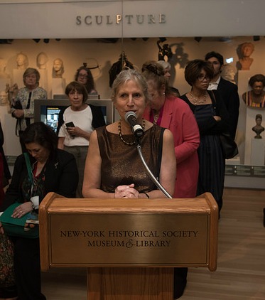
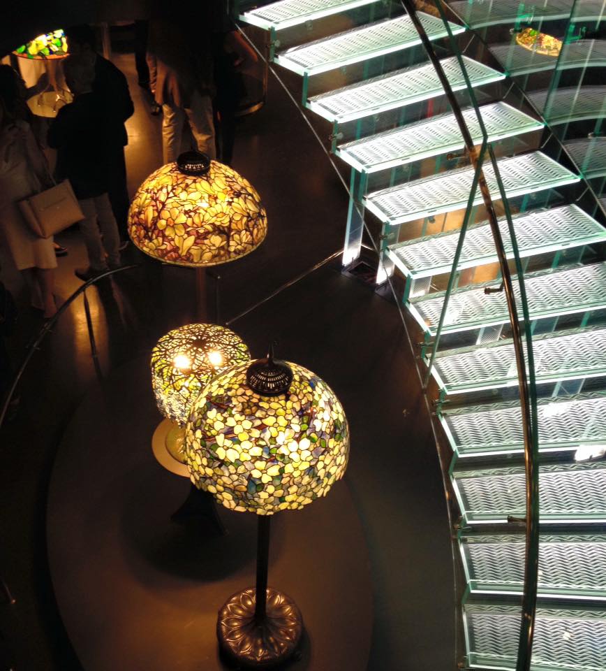
The floor, whose renewal was led by Louise Mirrer (below right), NYHS president. also houses the NYHS’s permanent collection galleries–the part of the museum known as the Henry Luce III Center for the Study of American Culture. From the press release:

…The striking space increases public access and engagement with treasures from New-York Historical’s holdings to illuminate aspects of New York and American history….

The North Gallery—a grand double-height expanse of the floor—features 15 themed niches with a variety of artifacts and artworks that illustrate aspects of urban life through generations, contrasted with six soaring vertical cases that feature dense presentations of objects. Objects relating to themes of recreation, the port of New York, Hudson River School artists, slavery in New York, and 9/11, among other topics, will be on view. The central corridor of the North Gallery features 10 historical artifacts that chart key moments in history, including a copper globe (1542) detailing Giovanni da Verrazzano’s exploration of the New York area; a draft wheel used in the lottery that sparked the Draft Riots in Civil War-torn New York in July 1863, one of the worst urban riots in American history; and a silver subway controller handle used by Mayor George McClellan to drive the first subway car on its maiden voyage from City Hall in 1904.

The Hall of American Silver will showcase a display of silver and jewelry by the New York retailer Tiffany & Co.—including the monumental punch bowl presented by five-and-dime magnate Frank W. Woolworth to architect Cass Gilbert upon the opening of the Woolworth Building in 1913—as well as highlights of the Museum’s collection of early American silver.

All good, and all true. But as my colleague James Panero pointed out in his review of the new space in The Wall Street Journal:

…tens of thousands of objects that had been on permanent view—treasures that have defined and described local history—have been taken down, with many of them shipped offsite to storage in New Jersey….

The society has chosen to destroy its fourth-floor display of “visible storage”—the unmediated assembly of its trove of objects—which had made a majority of its collection of 70,000 objects publicly available. Known as the Henry Luce III Center for the Study of American Culture, this award-winning, floor-wide installation, completed in 2000, was a place to become lost in the rich material of New York’s history….only a fraction of the collection [is] left on view.

Also true. Which raises my question, is more always better, or is the idea of open storage still as attractive as it once was?

Panero notes that “A truly radical approach to museum presentation, visible storage emerged in the 1970s as an effort to open museum collections to a broader public.” It became even more popular around the time of NYHS’s 2000 installation, as recounted in a 2001 article in The New York Times. It described the trend, saying that the NYHS installation followed the Met:

The first example in New York opened in 1988 on the mezzanine of the American Wing at the Metropolitan Museum of Art, where the Henry R. Luce Study Center for the Study of American Art keeps 18,312 objects on display, or roughly 80 percent of the Met’s collection of American art and decorative objects. (The rest is on regular exhibition in the American Wing or is away on loan.)

The Luce foundation also funded open storage galleries at the Brooklyn Museum and the Smithsonian American Art Museum.

Even in 2001, though, some people were beginning to question the value of open storage–which seemed geared more toward the experts who know what they’re looking at than at the general public. People were wowed by the sheer volume of things, true, but they did not necessarily actually look at them individually. If the average amount of time spent in curated galleries has now shrunk to two or three seconds per object, what must it be per item in open storage rooms? My experience at the Met and the Brooklyn is too minimal to make a judgment, but I have rarely seen someone spend a lot of time in either.

People do often want to know what’s in museum storerooms; they think museums are hiding riches beyond compare, whereas in truth many museums own a lot of items that have not stood up to the passage of time. But once the public sees the rooms for themselves, is their attention held? Might a smaller, more selective array actually serve the public better now? Sad as it is, fewer people read long articles now than before, and younger generations especially feed on Twitter and other bite-size bits of information.

I don’t know the answer to my question, but I suspect more museum-goers need “mediation” with the objects these days.

At the NYHS, there is another hope, though–if the themes/objects are indeed rotated more frequently, at least every two years, we may have the best of both worlds. Right now, museums simply need to get more people into their permanent collection galleries; let the NYHS try it this way and see what happens.

Photo Credit: Courtesy of NYHS (bottom)

*I consult to a foundation that supports the NYHS


American Watercolors: Excellent Exhibition, But…

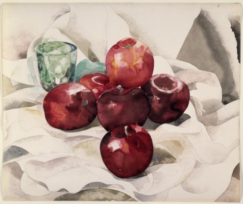
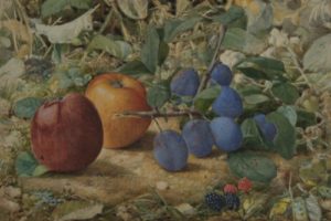
American Watercolor In the Age of Homer and Sargent, now on view at the Philadelphia Museum of Art, is an exhausting exhibition, in a good way. It displays more than 170 artworks and covers the period from the 1860s to 1925. It is, as the press release says, “the most comprehensive loan exhibition in over forty years devoted to the most important chapter in the history of watercolor painting in this country.”

I spent more than two hours in the exhibition this weekend, and here’s the paradox: though I was ready to leave when I reached the final gallery–there’s only so much the eye can absorb–I wanted more. I wanted more because the show builds to a climax in the 1920s, the time when watercolor became the “American medium.” The best artists in other countries in that period were not using watercolor this way. But we were–Marin, Demuth, Burchfield, Dove and Hopper had made watercolor their primary medium, and other great artists like O’Keeffe put it on equal footing with oil.

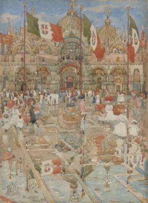
And yet this excellent exhibition–I can’t say enough about how good it is–gives us just one small gallery of works from that high point. One Burchfield, one Hopper, one Marin, two Demuths–no Doves. Two O’Keeffes on the same subject.

I am always loath to second-guess a curator, but here it feels as if Kathleen A. Foster, the museum’s senior curator of American Art, ended too abruptly at the story’s climax.

Space was not the issue, because the final gallery displays various papers used by Homer and Sargent, samples of watercolors mixed by the artists and those that come in prepared watercolor boxes. I’d rather have seen a Dove, a better Burchfield, etc.

Explaining process has become a feature of many exhibitions these days, but I question whether we needed that final gallery here, when most kids learn what a watercolor is. After all, the exhibit included videos showing processes–scraping, using salt, etc.–along the way.

Watercolor exhibitions don’t come around all that often, as we all know. They can’t be exposed to light for long, and this show will not travel. It’s a pity that I–and I am sure that I am  not the only one–left wanting more. I can only hope that Foster or someone else will mount a comprehensive exhibition of Modernist watercolors and explain watercolor then went out of fashion.

Meantime, see this exhibition if you can. Just because it’s not perfect doesn’t mean it’s not great. It is. I’ve posted three of my many favorites here: Apples and Plums by John William Hill (top); Splash of Sunshine and Rain (Piazza San Marco, Venice) by Maurice Prendergast (middle), Still Life: Apples and Green Glass by Charles Demuth (bottom).

Photo Credits: Courtesy of the Philadelphia Museum of Art. 

Can You Spot the Fake?

It would be a good idea. As the FBI recently warned, speaking about the case of Michigan art dealer Eric Spoutz, who pumped at least 40 forgeries into the market over the past 10 years (h/t to ArtNet) (to learn to spot fakes, that is):

Although Spoutz has been sentenced, [agents] McKeogh and Savona do not believe they have seen the last of the fakes he peddled. …there could be hundreds more that were sold to unsuspecting victims. “This is a case we’re going to be dealing with for years. Spoutz was a mill,” McKeogh said.

So the exhibition that Winterthur recently unveiled, Treasures on Trial: The Art and Science of Detecting Fakes, comes at an opportune time. It presents more than 40 fakes or forgeries–fine art, couture, silver, sporting memorabilia, wine, musical instruments, antiquities, stamps, ceramics, furniture, and folk art–drawn from its permanent collection and public and private collections. Conservationists from Winterthur and other institutions have used scientific analysis and connoisseurship to expose these fakes: their analysis and the pertinent stylistic clues is presented alongside the objects to show the techniques used by forgers to try to fool experts and/or trusting collectors. Among the items on display is a Rothko painting that Glafira Rosales, the notorious Long Island art dealer, sold to the Knoedler Gallery.

I have not seen the exhibit–I’ve just read about it. But such shows–other museums have done this in the past–are always, in my experience, learning experiences. And in keeping with today’s trend to involve visitors, Winterthur’s show invites visitors “to investigate several unresolved examples and share their opinion about the authenticity of the object based on the available evidence.” The highlights in this, the final section, include:

  • A painting purported to be by master forger Elmyr de Hory (whose fakes have themselves become highly collectible).
  • A oil painting whose owner has been trying for many years to prove it a genuine work by Winslow Homer.
  • A vampire killing kit brought to Winterthur for authentication by the Mercer Museum in Doylestown, Pennsylvania.

Colette Loll,  the founder of Art Fraud Insights, LLC, a Washington, DC, based consultancy, co-curated the exhibition with Winterthur’s Linda Eaton, a textile conservator who also serves as the museum’s director of collections.

Pictured here (top) is a painting “believed to be by de Kooning” from a private collection. Here’s what the label says:

Discovered online and purchased for just 450 euros, this portrait of a young boy holding a ball is stylistically similar to Portrait of Renée [at right]. The children share the same haunting expression, posture, and awkward clutching of an object. The works are the same dimension and also share the same technique, with thick paint on the skin; the same use of shadows; traces of conté crayon; and the same lips, hairstyle, and eyebrows. This work was sold with no provenance; the seller simply claimed that it once belonged to a homeless man who wished him to dispose of his things.

And here is the de Hory, mentioned above.

What do you think of these?

Photo Credit: Courtesy of Winterthur (top)


Max Hollein, Monet And Baseball

When baseball fans go to a game, they usually come prepared: they know the players, their records and their statistics. They know all about batting order strategy. The same for, say, horse-racing–even more so, because good bettors study the odds.

But when people go to art museums, they often know nothing in advance–at least nothing very specific about the art and artists they are going to see.

That, at least, is the position of Max Hollein, the director of the Fine Arts Museums of San Francisco, whom I visited recently when I was in the city.

So for a current exhibition, Monet: The Early Years, Hollein set out to create an online guide that visitors could read before going to the exhibition–and enjoy it more because they were better informed. I tend to agree.

The guide, called a Digital Story, is accessible on the Legion’s homepage and on the exhibition’s page, and is introduced with the words “Prepare for a visit with this interactive look into the exhibition.”

It’s very good and I encourage you to look at it. Among its chapters are “Contending with Convention,” “Monet and the Sea,” “Political Unrest,” “Training Your Eye: Color,” and so on. In certain sections, one can listen to more from the curators, Esther Bell and George Shackelford. In other places, one is invited click for further information or to “Look closer.”

In the final chapter, the guides brings it home to the local audience, saying, “Throughout this period one thing remained a constant—Monet’s avid preference for working directly from nature. Taking advantage of the stunning trails that meander through Lands End, the area surrounding the Legion of Honor, provides an immediate opportunity to gain insights into the artist’s experience and process.” Then it provides a link to a map of trails in the area.

I was in San Francisco in early March, and at the time–about two weeks since the show’s opening–some 60% of the visitors had clicked on the Digital Story–a very good result. The museum helped in one way: people who buy tickets are sent a link to the Digital Story–they can access the material for onsite preparation. About 50% of users are accessing it through a mobile phone or tablet.

The museum also printed–for those who do not want to spend $50 on the catalog or $30 for the softcover version–a 40-page booklet about the exhibition, pictured above. Also a great idea.

Photo Credit: Courtesy of FAMSF

It’s A Matter of Taste-And Touch And…

If three, as the old saying goes, makes a trend, the museum world is past that and into institutionalizing the idea of multi-sensory exhibitions. I still would call it a “mini-trend,” though–one that I wrote about for The New York Times in its annual Museums section, published in print today.

My article, headlined Drinking In the Art: Museums Offer a Growing Banquet for the Senses, includes these summary paragraphs:

Museums usually aim to offer a feast for the eyes, but [the Detroit Institute of Art] had much more in mind for “Bitter|Sweet: Coffee, Tea & Chocolate,” which just closed at the institute. Officials, who used art objects to illustrate how the introduction of those beverages to Europe in the 16th century from Africa, Asia and the Americas changed social and consumption patterns, wanted the exhibition to be a banquet for all five senses.

After giving a few more examples, I added the rationale:

“We’re interested in multisensory exhibitions because people come to a museum not just with their eyes but with their whole bodies,” said Swarupa Anila, head of interpretation at the Detroit Institute. She labeled them an “experiment.”

You can read the rest on the NYT site via the link above.

I could have added a few more examples: when the Musee d’Orsay exhibited Impressionism and Fashion a few years ago, I’m told it grouped all of the outdoor scenes in a large gallery at the end, with AstroTurf and chirping bird sounds. I don’t recall that when I saw it at the Metropolitan Museum. Also, I understand that the Nelson-Atkins Museum of Art, when presenting Luxury: Treasures of the Roman Empire last year, incorporated “a smelling station for visitors to sniff the different scents of Roman perfumes, and a digital interactive …allow[ing] visitors to virtually “try on” different hairstyles that were all the rage in ancient Rome.”

These ideas can be hokey, and too many of them would be awful. But every now and then, when the subject demands it, I think multi-sensory exhibitions, done properly, can be interesting. I agree with what Virginia Brilliant, curator at the Ringling Museum, told me: “There’s only so much a curator can say — sometimes you just have to experience an object.” A great example, at the Ringling, during “A Feast for the Senses: Art and Experience in Medieval Europe,” visitors can view medieval manuscripts and hear the very music being played as they do.

But I also agree with what Gary Tinterow, director of the Museum of Fine Arts in Houston, told me:

“Any human being can respond to great works of art,” said Gary Tinterow, director of the Museum of Fine Arts, Houston, speaking not about those specific exhibitions but the phenomenon in general. “We do not need intermediaries. We can augment the experience for children. For adults, I believe it isn’t necessary.”

I hope museums, with this trend, act judiciously. And since I cannot post a sound, smell, touch or taste opportunity, I will simply illustrate this with a few works of art from the Medieval show, which originated at the Walters Art Museum. They illustrate touch and taste, at least.

Photo Credits: Courtesy of the Walters and the Ringling Museums

« Previous Page
Next Page »

Primary Sidebar

About Judith H. Dobrzynski

Now an independent journalist, I've worked as a reporter in the culture and business sections of The New York Times, and been the editor of the Sunday business section and deputy business editor there as well as a senior editor of Business Week and the managing editor of CNBC, the cable TV

About Real Clear Arts

This blog is about culture in America as seen through my lens, which is informed and colored by years of reporting not only on the arts and humanities, but also on business, philanthropy, science, government and other subjects. I may break news, but more likely I will comment, provide

Archives