• Skip to main content
  • Skip to primary sidebar
  • Home
  • About
    • Real Clear Arts
    • Judith H. Dobrzynski
    • Contact
  • ArtsJournal
  • AJBlogs

Real Clear Arts

Judith H. Dobrzynski on Culture

Exhibitions

It’s A Rave: The Matisse/Diebenkorn Exhibition

San Francisco beckoned me because of the Matisse/Diebenkorn exhibition at the San Francisco Museum of Modern Art. Both artists are nothing if not seductive and, as I wrote in my review of the exhibition for The Wall Street Journal, published in yesterday’s print edition, “Rarely—if ever—in the history of modern art has a renowned artist been as deeply and openly inspired by another artist as Richard Diebenkorn was by Henri Matisse.”

So this was a natural, and like so many other naturals, surprising in that it had never been done in depth before. I loved it, as you will read, and I found different elements to admire in both venues: I saw it late last year at the Baltimore Museum of Art, where it was slightly smaller but just as great.

The curators, Katy Rothkopf in Baltimore and Janet Bishop in San Francisco, made different juxtapositions and were working with a different suite of galleries; each installation has its merits. For example, in Baltimore, the show seemed to build to a climax with Diebenkorn’s “Recollections of a Visit to Leningrad”–which visitors saw on its own large wall as they rounded a corner (though they likely stopped before getting to it to see other works on the way). The Baltimore wall label, as I recall, said “Recollections” was a summation of all Diebenkorn had learned from Matisse. Then they moved on to a large gallery that showed off all the Ocean Park series along with the Matisse paintings that helped inspire them. It practically glowed.
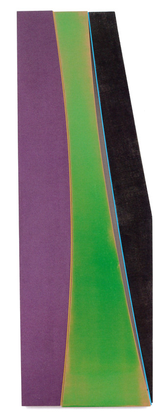
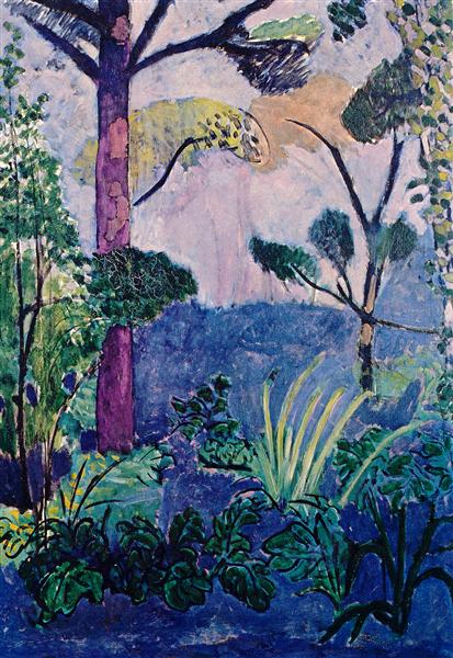
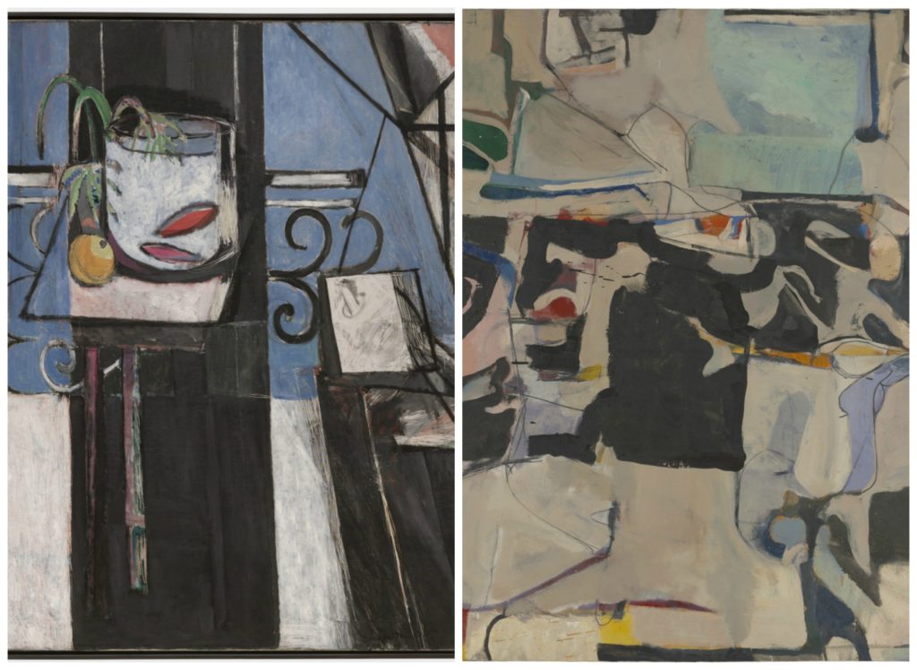
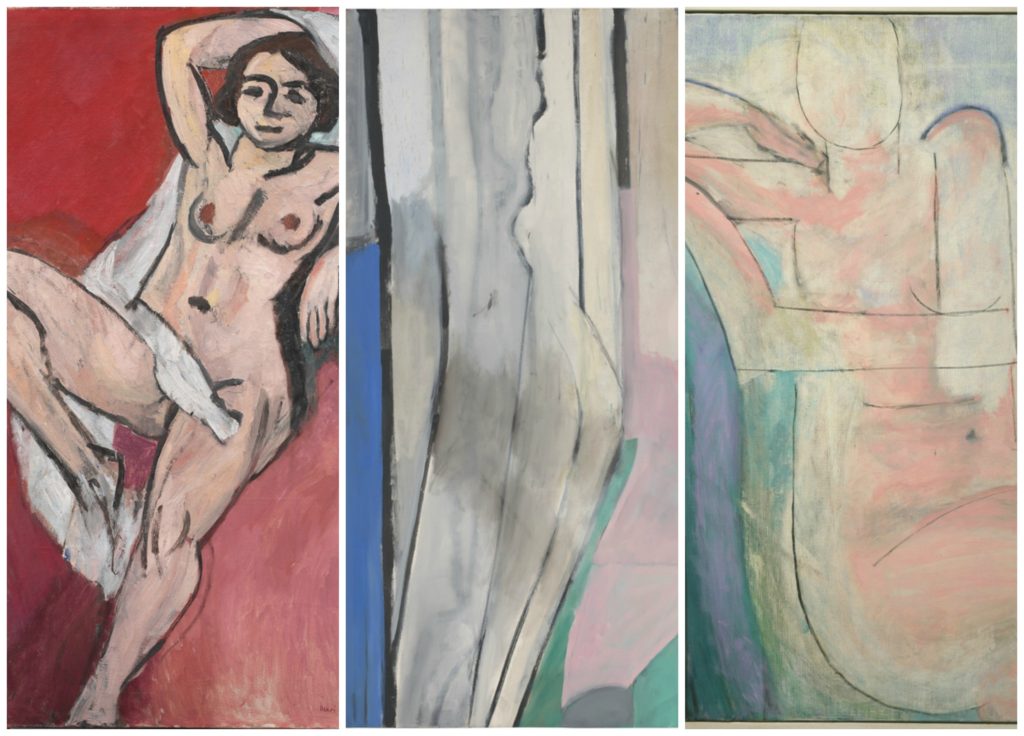
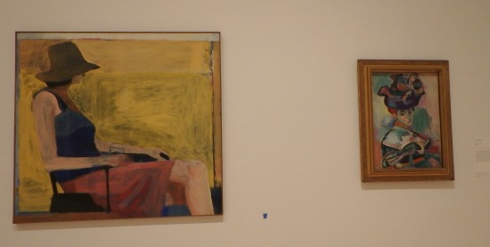
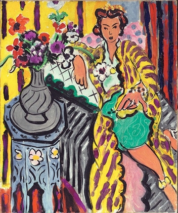
In San Francisco,  the hang seemed more evenly paced. But, in a brilliant move, Bishop hung Matisse’s “Goldfish and Palette” nearer the start, alongside “Urbana #6.” The pairing stopped me in my tracks from the get-go. Have a look:

But in SF, I think, “Recollections” was less prominent, just one painting in a gallery of several, and the space there required the splitting of the Ocean Park series into two galleries. Still, Bishop made this revealing sequence (maybe Baltimore did too, I do not recall).

Both installations encouraged the close looking that affords real insight into both artists’ minds.

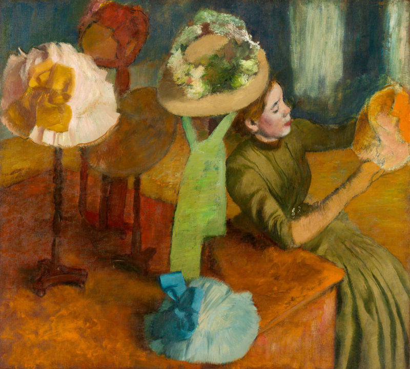
Diebenkorn seemed destined for a great career in art–at 26, he had already won a solo exhibition at the California Palace of the Legion of Honor. He was making abstract works then, and he continued to so do for years. But, as this show, which illustrates his evolution over the decades, he owes his greatness to his early exposure to Matisse. The works are accompanied by archival materials. Diebenkorn collected a vast library of publications about him, and he often later glued in color versions of the books’ black-and-white images. He would make notes, like the dimensions or the dates.

In fact, I came to the conclusion that a solo exhibition of Diebenkorn’s work would have been far less interesting than this dual show. (Not so for Matisse, obviously–he always looks great, to me.)

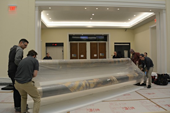
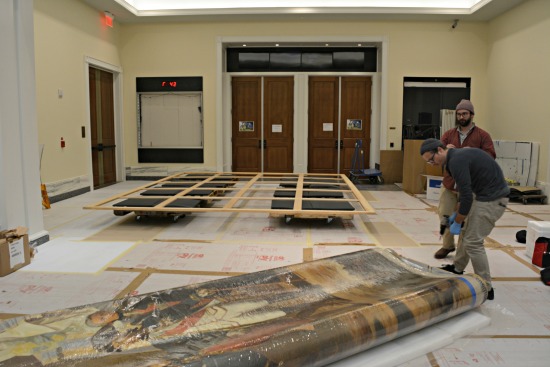
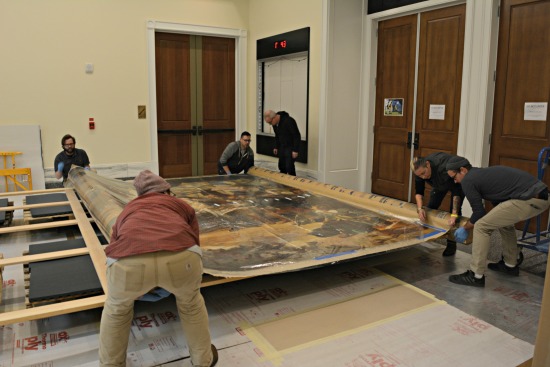
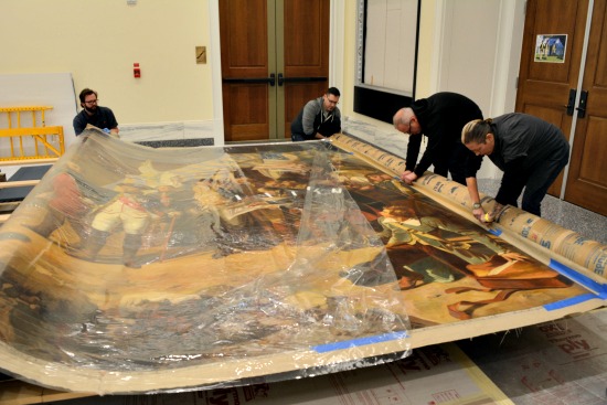
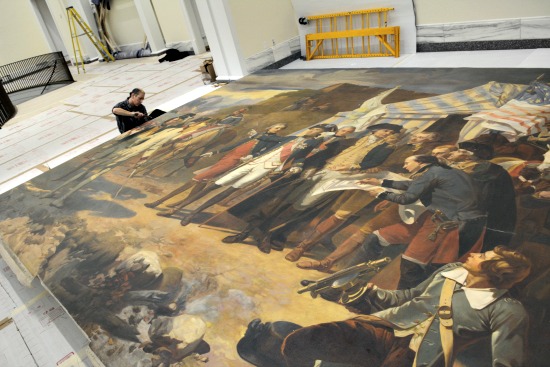
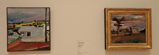
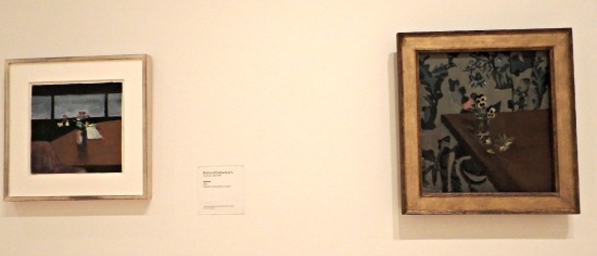
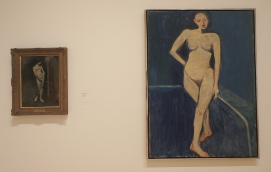
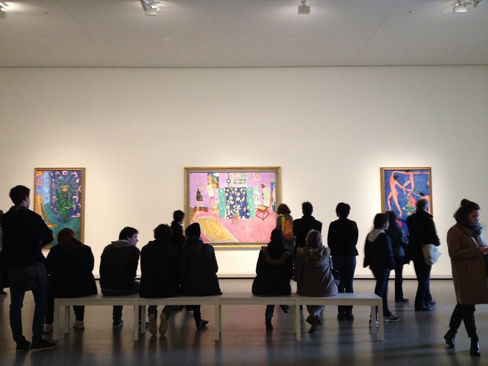
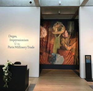
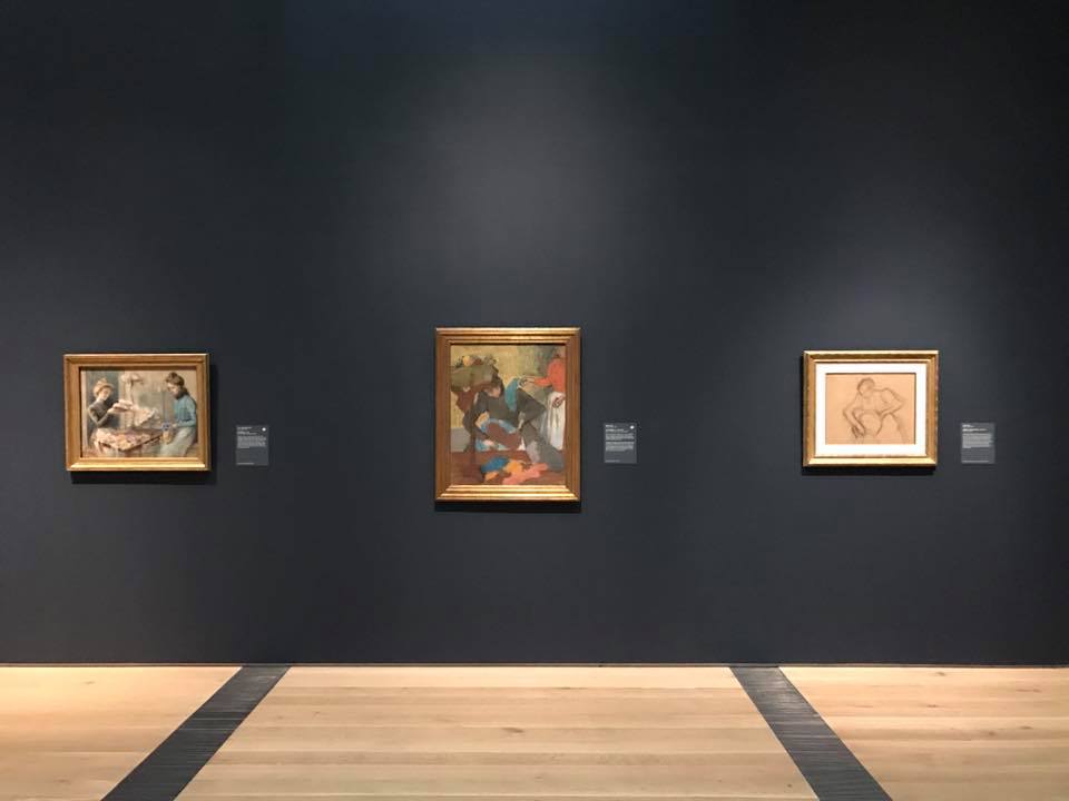
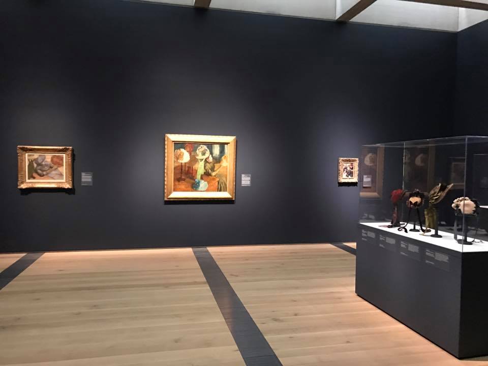
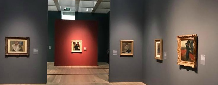
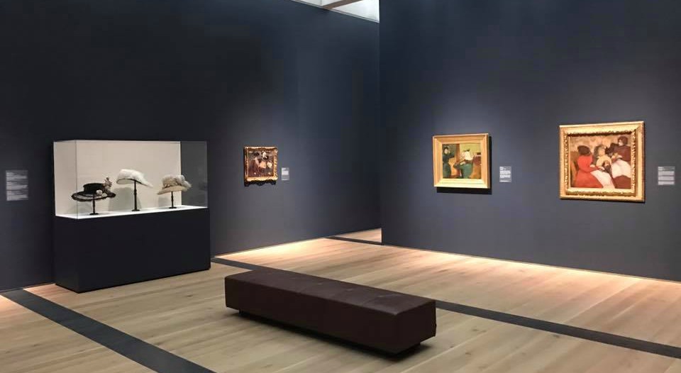
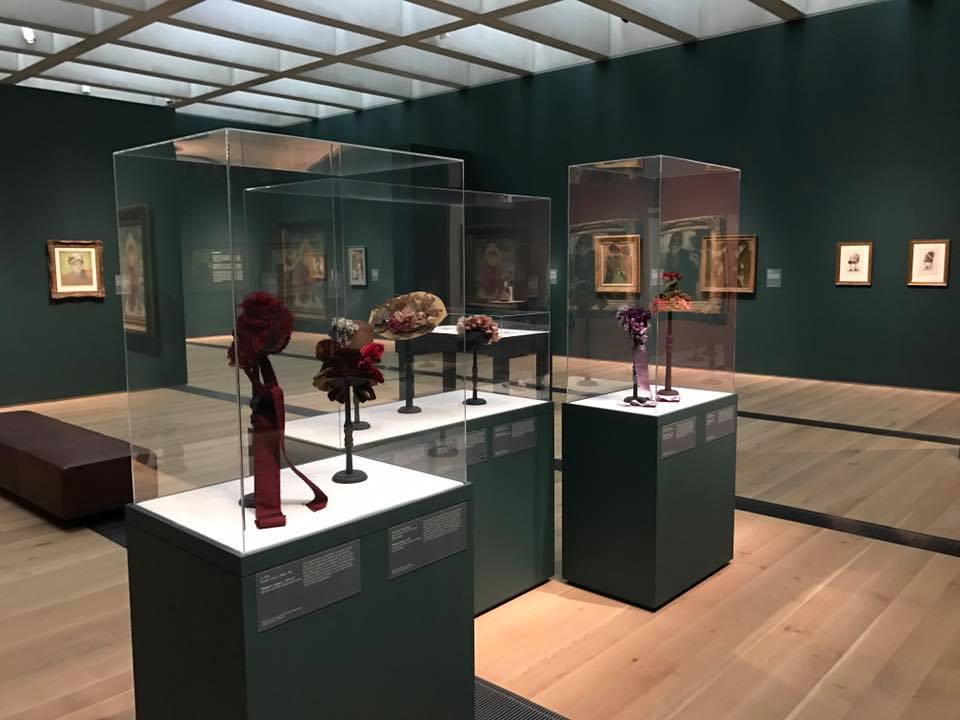
Here are a few more installation shots that I took at the SF exhibition–some, to my mind, more interesting than others.

UPDATE, 3/14: I just discovered this article written for SF MoMA that explains more about this exhibition and collaboration between Bishop and Rothkopf, which you can read here.

Many Miles To Go To See Art

I don’t know all that many people, aside from curators doing research and wealthy collectors, who hop on a plane a fly overseas mainly to see an art exhibition. But that is what has been happening in recent weeks for Icons of Modern Art: The Shchukin Collection at the Fondation Louis Vuitton in Paris. I did it myself over Presidents’ weekend, and–thanks to airfare and hotel sales, largely due to a drop in tourism in France attributed by many to terrorism fears–believe it was worth every penny I spent.

(The last time this happened, I think, was 2011, when the National Gallery in London presented Leonardo da Vinci: Painter at the Court of Milan. I am sorry I didn’t make the trip for that one.)

The Shchukin show is simply amazing. The highlight is a roomful of Matisse paintings, including The Red Room (Harmony in Red). It faces a wall with The Pick Studio in the center, as seen here (I got in as soon as the exhibition opened–later this room was much more crowded):

But there are so many surprises too–a tapestry work by Edward Burne-Jones; Picasso’s Portrait of Soler; a little Rousseau titled View of the Port Sevres, with a balloon, a biplane and a dirigibl; a wonderful Cezanne self-portrait; many Picassos, and a great roomful of Gauguins.

Shchukin bought these works between 1898 and 1914–the 130 at FLV, and another 145 or so–from top dealers like Vollard, Durand-Ruel, Bernheim and Kahnweiler. He displayed them cheek-by-jowl, too close together, as at right, and he opened his home to Russian artists, who learned from his collection.

The cost to mount this exhibition, I’ve heard, exceeded $1 billion in insurance, shipping. couriers, display/installation, preparation and publication of the catalog and other books (I bought an abbreviated paperback about the exhibition, rather than carry home a very weighty catalog), security and so on. Managing the lines to get into the FLV, located in the Bois de Boulogne, probably cost extra too! They are long.

But that’s not the reason to go. The reason to go is this: seeing these works together, in the west rather than in Russia, where the collection is split anyway–is unlikely to happen again, at least in our lifetimes. Which is why, in the three days I was in Paris, I knew of neighbors with no art world connections who went over, ran into some friends at the Musee d’Orsay who had arrived just for the Shchukin exhibition, and learned of a few other friends who had done the same on other recent weekends. And that doesn’t include the curators who spent their own money to go.

The one false move, for me, was an opening multi-screen video installation by Peter Greenaway and Saskia Boddeke that creates a conversation between Shchukin and Matisse, largely about his murals La Danse and Music, and gives minor roles to other artists. It comes off as very phony and not terribly entertaining.

If you can, I encourage a visit–the exhibition was extended until Mar. 5.

The FLV building, designed by Grank Gehry, seemed to me to be good for art, with grand galleries, small spaces and good traffic flow–but I did not like the colored splotches (blue, yellow, green, red) added by French artist Daniel Buren in a temporary installation titled Observatory of Light. The building is more beautiful without Buren’s work (at left, in a picture that makes it look good!), which said nothing to me.

Before Icons, FLV had been showing its collection, owned by Bernard Arnault, in different hangs, which you can see here. I cannot tell you whether they were good. But with Icons, Arnault has done the world a favor.


Paint, Hats and Degas–Really?

Today the Saint Louis Art Museum opened a new exhibition called Degas, Impressionism and the Paris Millinery Trade. On the surface, it sounds like one of those cooked-up theses, a mix of fashion with art, to lure people who generally don’t visit art museums into the galleries. A gimmick.

Well, probably not. I have not seen the show, but I have paged through the catalog and I’ve seen some installations shots, posted here. Let’s start there. The pictures were provided by Simon Kelly, the SLAM curator.

I love them! I think the installation is very theatrical, largely because of the dark wall colors and the striped floors. And the lighting, of course. Young people, I’ve been told, like this kind of dramatic showcase, so maybe this will help attract them. For me, it’s simply that the colors show off the paintings beautifully. (I know others disagree, but to each his own.)

Simon tells me that the dark shade is “hale navy, the lighter blue gray is Ashland slate. …There’s also a gallery with Tarrytown green and two accent walls in chestnut (a warm red).” I looked them up and they are all Benjamin Moore paint colors. I’m posting shots here, with all four colors:

Now, about the exhibition: I’d like to see it. The catalogue contains some pretty great pictures–and far from all of them are by Degas. That was a surprise, given the title. The introductory essay does say that Degas explored the millinery theme “with an exceptional intensity” and says the show has “reunited for the first time …all of his millinery paintings” plus some pastels. But it also showcases works by Renoir, Cassatt, Manet, Morisot, Tissot and others.

No question, the cover picture–owned by the Art Institute of Chicago–The Millinery Shop–looks like the star. Here it is.

Photo Credits: Simon Kelly for the gallery shots and the Art Institute of Chicago for the last picture.


ICYMI: Matisse and American Art

No sooner had my review of the exhibition at the Montclair Art Museum titled Matisse and American Art run in The Wall Street Journal on Tuesday than I was off, flying to another exhibition whose review you will see in the next several days, I hope.

But that early morning flight meant that I did not have the chance to post news of my review* and, more important, of the exhibition here. The Journal also, as it has recently, created a slide show of ten works in the exhibition.

Here are the nut grafs of my review:

…[In 1908] American artists weren’t laughing either, but for the opposite reason. They were admiring Matisse, studying with him, collecting him and drawing inspiration from him. And they have ever since, as “Matisse and American Art” at the Montclair Art Museum illustrates. With 19 works by Matisse and 44 by others, this enterprising exhibition extends the previously explored territory of Matisse’s influence on postwar painters like Mark Rothko, Helen Frankenthaler and, especially, Richard Diebenkorn backward to early modernist artists like Arthur Dove and forward to contemporary artists like Faith Ringgold.

Subtly and boldly, in homage, in spirit and in appropriation, the 34 Americans in this exhibition borrowed Matisse’s palette and images, learned from his compositional structures, adopted his fluid brushwork and adapted his themes to their purposes.
The list of those artists, in fact, was too long for this exhibition, but as I also noted, “As a supplement, the Montclair museum gathered 53 additional works from its permanent collection that relate to Matisse—by Alex Katz,Walt Kuhn, Nick Cave, Mickalene Thomas,Nancy Spero,William Baziotes and others—and installed them in its permanent collection galleries.”
I’ve seen that done at one or two other museums recently, and I applaud. While you have people looking at a subject, offer more to those who want to learn more–but the exhibition doesn’t get too large for those who don’t want too much.
I don’t have too much to add to my review–if I had had more space, I would have explained some connections. For example, Roy Lichtenstein’s appropriation of a Matisse gold fish bowl in a bronze sculpture works because Lichtenstein used different means–open spaces in the bronze and vertical blocks of yellow and white color–to create the light reflections off the glass bowl that Matisse created in paint.
But you’ll get that if you visit Montclair to see the exhibit, which was curated by Gail Stavitsky, a stalwart at Montclair and a very scholarly one too.
* If my review is blocked by a paywall, try Googling “A Modern Master and His Progeny.”
UPDATE: I forgot to include here a favorite example that had to be cut from my review because of my word-count limit: Kenneth Noland’s graceful abstraction, “Flares: Homage to Matisse” (1991), which embraces the palette in Matisse’s 1912 “Moroccan Landscape (Acanthus)”—which isn’t in the exhibition, alas, but is reproduced in the catalogue. Have a look below the credits.
Photo Credits: Courtesy of the Montclair Art Museum, from top to bottom, works by Matisse, Arthur Dove and Faith Ringgold

More On That Revolutionary Art: Unscrolled

As I mentioned yesterday, the soon-to-open Museum of the American Revolution will hang a copy of Louis Charles-Auguste Couder’s Siege of Yorktown (1781). It hangs in the Hall of the Battles at Versailles. The copy, I’ve now learned–from an advance of a press release that will be issued on Friday–“is believed to have been painted by artist Henry LeGrand in Paris and exhibited in 1860 at the Chicago Art Union.”

The painting depicts Washington and Rochambeau giving orders at Yorktown, Virginia. Rochambeau played a major role in helping the Continental Army win the war. The two men stand in front of a marquee tent much like George Washington’s Headquarters Tent, one of the most iconic surviving artifacts of the Revolution, which also is featured in the Museum.

It’s a large work, 13-by-17 feet and 16-by-19 when framed.

The painting has been restored and the museum is installing it this week. I thought you might like to see some of the action. (Here’s a look at the original.)

There’s more: on the two walls flanking the LeGrand, the museum is hanging “two late-19th-century paintings by Harrington Fitzgerald, a Philadelphia newspaper editor and writer who took up painting and is believed to have studied with Thomas Eakins.” The Foraging Party depicts Washington and his troops at Valley Forge, while the opposite wall’s canvas is Washington Crossing the Delaware.

Photo Credits: Courtesy of the Museum of the American Revolution

« Previous Page
Next Page »

Primary Sidebar

About Judith H. Dobrzynski

Now an independent journalist, I've worked as a reporter in the culture and business sections of The New York Times, and been the editor of the Sunday business section and deputy business editor there as well as a senior editor of Business Week and the managing editor of CNBC, the cable TV

About Real Clear Arts

This blog is about culture in America as seen through my lens, which is informed and colored by years of reporting not only on the arts and humanities, but also on business, philanthropy, science, government and other subjects. I may break news, but more likely I will comment, provide

Archives