• Skip to main content
  • Skip to primary sidebar
  • Home
  • About
    • Real Clear Arts
    • Judith H. Dobrzynski
    • Contact
  • ArtsJournal
  • AJBlogs

Real Clear Arts

Judith H. Dobrzynski on Culture

Curatorial Matters

Discovery At The National Gallery

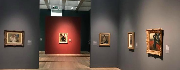
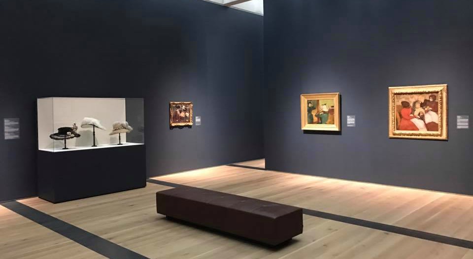
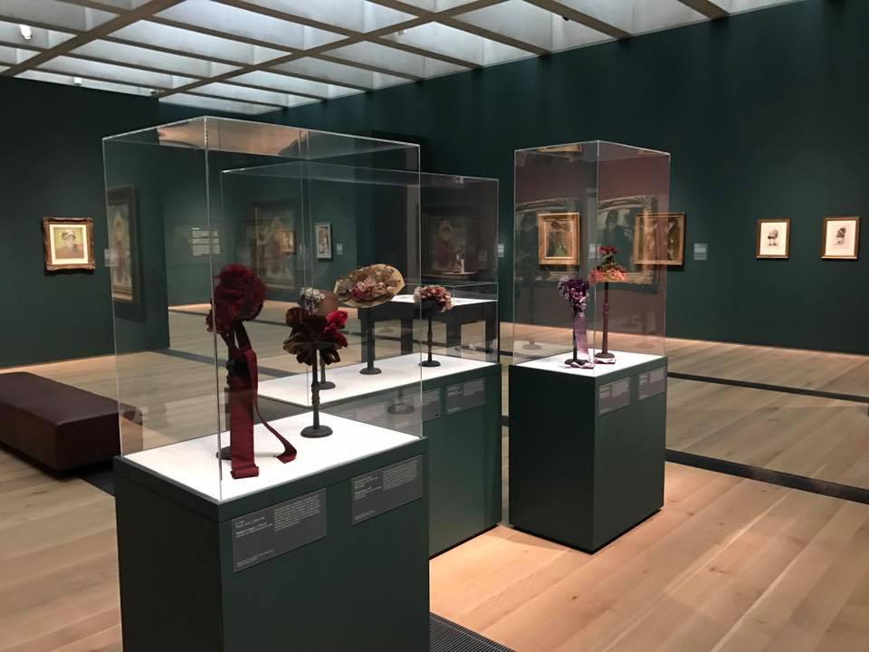
While I was in London recently (returning before the latest terror attack, thank God), I stopped in at the National Gallery to see its marvelous exhibition, Michelangelo & Sebastiano, which–for the first time, apparently–united the work of these two artists. Michelangelo helped Sebastiano immensely, giving him ideas and even drawings, at least partly to win him over to his side and keep him away from the circle of arch-rival Raphael.

As have other museums, the National Gallery has loaded its website with explanatory material–a few films are here, for example, and an illustrated “In Focus” article is here.

But there was also something I had not seen before. As I entered the exhibition, which cost £16.00 for adult admission (and less for seniors, students, etc.), I was handed a thick booklet. It contained all wall texts and all picture labels, noting which ones had an audio component as well, plus a floor plan, a chronology and a few other end items, like events and museum information.

Brilliant! No longer was everyone bunched up reading the texts and jockeying to get a look at the labels, especially useful during crowded times or at very popular objects. And it’s a little keepsake. I found myself taking notes on the paintings I liked, or didn’t. See for yourself here, in a PDF of the M&S label booklet. (Click twice-first on the link and then on the booklet’s picture.)

The NG, the press office said, “tends to” print these for big exhibitions but not always. It should, and I wish other museums would follow suit.

Over at the Tate Modern, I visited the Giacometti and Wolfgang Tillmans exhibitions–also paid entry–where I was given smaller booklets containing just the wall texts. No label texts–but that’s probably because the labels were simply titles and dates. Less useful, but still better than nothing.

How much could these cost, I asked a knowledgeable museum person in NYC–“not much,” he said. They should be in reach for museums.

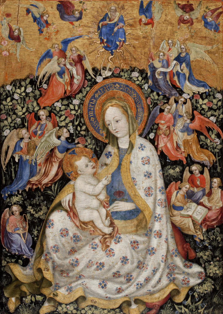
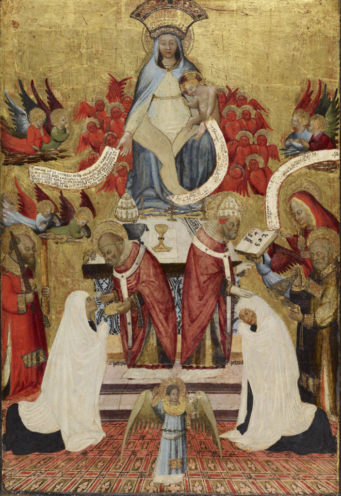
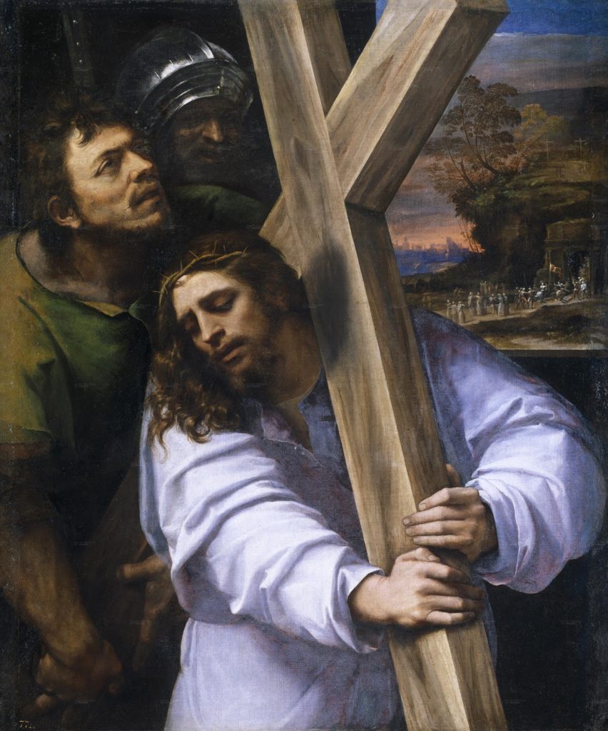
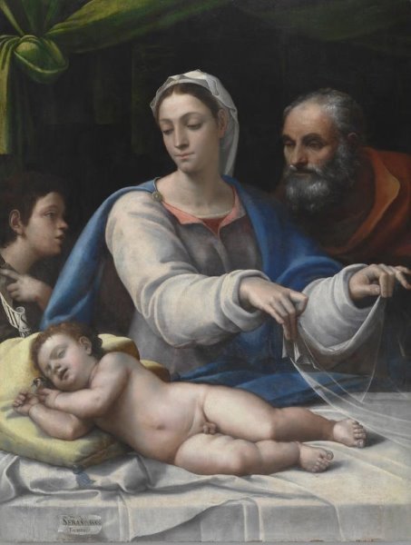
Since you all know Michelangelo’s talents, I’m posting two paintings by Sebastiano–Christ Carrying the Cross and The Holy Family with St. John the Baptist.

Finally, here’s a good review of the exhibit in Hyperalleric. It’s on view through June 25.

UPDATE: On a recent visit to the Virginia Museum of Fine Arts in Richmond, I discovered that it, too, handed out brochures of the checklist to all visitors to its Yves Saint Laurent: The Perfection of Style special exhibition. Kudos.


NY Historical Society’s Renovation Opens a Debate

Is more always better? Is it better when it comes to seeing art and artifacts? That’s the question I’ve been pondering since last week, when the New-York Historical Society* opened its new fourth floor. The renovated and recast floor includes a dazzling, two-level display of 100 Tiffany lamps (at left) and a gallery whose exhibitions will focus on women’s history, as produced by the new Center for Women’s History.

The floor, whose renewal was led by Louise Mirrer (below right), NYHS president. also houses the NYHS’s permanent collection galleries–the part of the museum known as the Henry Luce III Center for the Study of American Culture. From the press release:

…The striking space increases public access and engagement with treasures from New-York Historical’s holdings to illuminate aspects of New York and American history….

The North Gallery—a grand double-height expanse of the floor—features 15 themed niches with a variety of artifacts and artworks that illustrate aspects of urban life through generations, contrasted with six soaring vertical cases that feature dense presentations of objects. Objects relating to themes of recreation, the port of New York, Hudson River School artists, slavery in New York, and 9/11, among other topics, will be on view. The central corridor of the North Gallery features 10 historical artifacts that chart key moments in history, including a copper globe (1542) detailing Giovanni da Verrazzano’s exploration of the New York area; a draft wheel used in the lottery that sparked the Draft Riots in Civil War-torn New York in July 1863, one of the worst urban riots in American history; and a silver subway controller handle used by Mayor George McClellan to drive the first subway car on its maiden voyage from City Hall in 1904.

The Hall of American Silver will showcase a display of silver and jewelry by the New York retailer Tiffany & Co.—including the monumental punch bowl presented by five-and-dime magnate Frank W. Woolworth to architect Cass Gilbert upon the opening of the Woolworth Building in 1913—as well as highlights of the Museum’s collection of early American silver.

All good, and all true. But as my colleague James Panero pointed out in his review of the new space in The Wall Street Journal:

…tens of thousands of objects that had been on permanent view—treasures that have defined and described local history—have been taken down, with many of them shipped offsite to storage in New Jersey….

The society has chosen to destroy its fourth-floor display of “visible storage”—the unmediated assembly of its trove of objects—which had made a majority of its collection of 70,000 objects publicly available. Known as the Henry Luce III Center for the Study of American Culture, this award-winning, floor-wide installation, completed in 2000, was a place to become lost in the rich material of New York’s history….only a fraction of the collection [is] left on view.

Also true. Which raises my question, is more always better, or is the idea of open storage still as attractive as it once was?

Panero notes that “A truly radical approach to museum presentation, visible storage emerged in the 1970s as an effort to open museum collections to a broader public.” It became even more popular around the time of NYHS’s 2000 installation, as recounted in a 2001 article in The New York Times. It described the trend, saying that the NYHS installation followed the Met:

The first example in New York opened in 1988 on the mezzanine of the American Wing at the Metropolitan Museum of Art, where the Henry R. Luce Study Center for the Study of American Art keeps 18,312 objects on display, or roughly 80 percent of the Met’s collection of American art and decorative objects. (The rest is on regular exhibition in the American Wing or is away on loan.)

The Luce foundation also funded open storage galleries at the Brooklyn Museum and the Smithsonian American Art Museum.

Even in 2001, though, some people were beginning to question the value of open storage–which seemed geared more toward the experts who know what they’re looking at than at the general public. People were wowed by the sheer volume of things, true, but they did not necessarily actually look at them individually. If the average amount of time spent in curated galleries has now shrunk to two or three seconds per object, what must it be per item in open storage rooms? My experience at the Met and the Brooklyn is too minimal to make a judgment, but I have rarely seen someone spend a lot of time in either.

People do often want to know what’s in museum storerooms; they think museums are hiding riches beyond compare, whereas in truth many museums own a lot of items that have not stood up to the passage of time. But once the public sees the rooms for themselves, is their attention held? Might a smaller, more selective array actually serve the public better now? Sad as it is, fewer people read long articles now than before, and younger generations especially feed on Twitter and other bite-size bits of information.

I don’t know the answer to my question, but I suspect more museum-goers need “mediation” with the objects these days.

At the NYHS, there is another hope, though–if the themes/objects are indeed rotated more frequently, at least every two years, we may have the best of both worlds. Right now, museums simply need to get more people into their permanent collection galleries; let the NYHS try it this way and see what happens.

Photo Credit: Courtesy of NYHS (bottom)

*I consult to a foundation that supports the NYHS


Max Hollein, Monet And Baseball

When baseball fans go to a game, they usually come prepared: they know the players, their records and their statistics. They know all about batting order strategy. The same for, say, horse-racing–even more so, because good bettors study the odds.

But when people go to art museums, they often know nothing in advance–at least nothing very specific about the art and artists they are going to see.

That, at least, is the position of Max Hollein, the director of the Fine Arts Museums of San Francisco, whom I visited recently when I was in the city.

So for a current exhibition, Monet: The Early Years, Hollein set out to create an online guide that visitors could read before going to the exhibition–and enjoy it more because they were better informed. I tend to agree.

The guide, called a Digital Story, is accessible on the Legion’s homepage and on the exhibition’s page, and is introduced with the words “Prepare for a visit with this interactive look into the exhibition.”

It’s very good and I encourage you to look at it. Among its chapters are “Contending with Convention,” “Monet and the Sea,” “Political Unrest,” “Training Your Eye: Color,” and so on. In certain sections, one can listen to more from the curators, Esther Bell and George Shackelford. In other places, one is invited click for further information or to “Look closer.”

In the final chapter, the guides brings it home to the local audience, saying, “Throughout this period one thing remained a constant—Monet’s avid preference for working directly from nature. Taking advantage of the stunning trails that meander through Lands End, the area surrounding the Legion of Honor, provides an immediate opportunity to gain insights into the artist’s experience and process.” Then it provides a link to a map of trails in the area.

I was in San Francisco in early March, and at the time–about two weeks since the show’s opening–some 60% of the visitors had clicked on the Digital Story–a very good result. The museum helped in one way: people who buy tickets are sent a link to the Digital Story–they can access the material for onsite preparation. About 50% of users are accessing it through a mobile phone or tablet.

The museum also printed–for those who do not want to spend $50 on the catalog or $30 for the softcover version–a 40-page booklet about the exhibition, pictured above. Also a great idea.

Photo Credit: Courtesy of FAMSF

It’s A Matter of Taste-And Touch And…

If three, as the old saying goes, makes a trend, the museum world is past that and into institutionalizing the idea of multi-sensory exhibitions. I still would call it a “mini-trend,” though–one that I wrote about for The New York Times in its annual Museums section, published in print today.

My article, headlined Drinking In the Art: Museums Offer a Growing Banquet for the Senses, includes these summary paragraphs:

Museums usually aim to offer a feast for the eyes, but [the Detroit Institute of Art] had much more in mind for “Bitter|Sweet: Coffee, Tea & Chocolate,” which just closed at the institute. Officials, who used art objects to illustrate how the introduction of those beverages to Europe in the 16th century from Africa, Asia and the Americas changed social and consumption patterns, wanted the exhibition to be a banquet for all five senses.

After giving a few more examples, I added the rationale:

“We’re interested in multisensory exhibitions because people come to a museum not just with their eyes but with their whole bodies,” said Swarupa Anila, head of interpretation at the Detroit Institute. She labeled them an “experiment.”

You can read the rest on the NYT site via the link above.

I could have added a few more examples: when the Musee d’Orsay exhibited Impressionism and Fashion a few years ago, I’m told it grouped all of the outdoor scenes in a large gallery at the end, with AstroTurf and chirping bird sounds. I don’t recall that when I saw it at the Metropolitan Museum. Also, I understand that the Nelson-Atkins Museum of Art, when presenting Luxury: Treasures of the Roman Empire last year, incorporated “a smelling station for visitors to sniff the different scents of Roman perfumes, and a digital interactive …allow[ing] visitors to virtually “try on” different hairstyles that were all the rage in ancient Rome.”

These ideas can be hokey, and too many of them would be awful. But every now and then, when the subject demands it, I think multi-sensory exhibitions, done properly, can be interesting. I agree with what Virginia Brilliant, curator at the Ringling Museum, told me: “There’s only so much a curator can say — sometimes you just have to experience an object.” A great example, at the Ringling, during “A Feast for the Senses: Art and Experience in Medieval Europe,” visitors can view medieval manuscripts and hear the very music being played as they do.

But I also agree with what Gary Tinterow, director of the Museum of Fine Arts in Houston, told me:

“Any human being can respond to great works of art,” said Gary Tinterow, director of the Museum of Fine Arts, Houston, speaking not about those specific exhibitions but the phenomenon in general. “We do not need intermediaries. We can augment the experience for children. For adults, I believe it isn’t necessary.”

I hope museums, with this trend, act judiciously. And since I cannot post a sound, smell, touch or taste opportunity, I will simply illustrate this with a few works of art from the Medieval show, which originated at the Walters Art Museum. They illustrate touch and taste, at least.

Photo Credits: Courtesy of the Walters and the Ringling Museums

Paint, Hats and Degas–Really?

Today the Saint Louis Art Museum opened a new exhibition called Degas, Impressionism and the Paris Millinery Trade. On the surface, it sounds like one of those cooked-up theses, a mix of fashion with art, to lure people who generally don’t visit art museums into the galleries. A gimmick.

Well, probably not. I have not seen the show, but I have paged through the catalog and I’ve seen some installations shots, posted here. Let’s start there. The pictures were provided by Simon Kelly, the SLAM curator.

I love them! I think the installation is very theatrical, largely because of the dark wall colors and the striped floors. And the lighting, of course. Young people, I’ve been told, like this kind of dramatic showcase, so maybe this will help attract them. For me, it’s simply that the colors show off the paintings beautifully. (I know others disagree, but to each his own.)

Simon tells me that the dark shade is “hale navy, the lighter blue gray is Ashland slate. …There’s also a gallery with Tarrytown green and two accent walls in chestnut (a warm red).” I looked them up and they are all Benjamin Moore paint colors. I’m posting shots here, with all four colors:

Now, about the exhibition: I’d like to see it. The catalogue contains some pretty great pictures–and far from all of them are by Degas. That was a surprise, given the title. The introductory essay does say that Degas explored the millinery theme “with an exceptional intensity” and says the show has “reunited for the first time …all of his millinery paintings” plus some pastels. But it also showcases works by Renoir, Cassatt, Manet, Morisot, Tissot and others.

No question, the cover picture–owned by the Art Institute of Chicago–The Millinery Shop–looks like the star. Here it is.

Photo Credits: Simon Kelly for the gallery shots and the Art Institute of Chicago for the last picture.


« Previous Page
Next Page »

Primary Sidebar

About Judith H. Dobrzynski

Now an independent journalist, I've worked as a reporter in the culture and business sections of The New York Times, and been the editor of the Sunday business section and deputy business editor there as well as a senior editor of Business Week and the managing editor of CNBC, the cable TV

About Real Clear Arts

This blog is about culture in America as seen through my lens, which is informed and colored by years of reporting not only on the arts and humanities, but also on business, philanthropy, science, government and other subjects. I may break news, but more likely I will comment, provide

Archives