• Skip to main content
  • Skip to primary sidebar
  • Home
  • About
    • Real Clear Arts
    • Judith H. Dobrzynski
    • Contact
  • ArtsJournal
  • AJBlogs

Real Clear Arts

Judith H. Dobrzynski on Culture

Museums

A Closer Look At Max Hollein, New Director in San Francisco

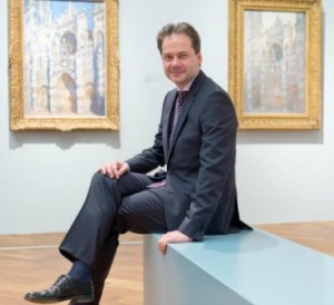
Yesterday the trustees of the Fine Arts Museums of San Francisco announced that they had selected Max Hollein, currently director of the Städel Museum in Frankfurt, as their new chief. I’d say that was a good move, based on what I know about Hollein. I’ve have only one long in-person discussion with him, plus over the years a few email exchanges. But Hollein has left plenty of other clues about his museums philosophy and there’s much on the record about his tenure in Frankfurt.

MHolleinOne way to get to know him is to look at this video posted on You Tube last week. In it, he talks about the Städel, its place in a Frankfurt that wanted to up its cultural appeal, its program of adding contemporary art to the museum’s collections, its support from private donors (an experience many European directors who might want to come to the U.S. lack), its use of the web and educational gaming, etc.

In one spot (c. 7 min.), he talks about the Liebieghaus, which is part of his current domain. A collection of 5,000 years of sculpture, Hollein says something very important indicates he understands that museums have, and should continue to have, distinct personalities and offer distinct experience.

That bodes well for him in San Francisco. Well, anywhere. Let’s hope the FAMSF directors let him do this job, instead of trying to do it for him (FAMSF is certainly know for an intrusive board).

Beyond the video, there is this excellent interview Hollein did in 2014 with Deutsch Well. At the time, I quoted this passage, still relevant:

I think the job of a museum director is, on the one hand, to define the programmatic identity of the institution, while on the other hand also to make sure that the museum has the potential to develop and evolve – when it comes to the program and the collection as well as the financial circumstances and the culture of support that is directly linked to that. From the beginning on I saw that as one of the main tasks, and I hope I accomplished that to a certain degree.

The interview goes on to talk about different strategies for different circumstances in different places–which he echoed in the more recent video.

And then the German interviewer asked him about attracting young audiences, a question that often brings out the worst in some museum directors. Not Hollein, who said:

The most important realization certainly is that our audience is not a single unit. On the contrary, it’s a very heterogenic group with a different knowledge and expectations when it comes to visiting a museum. If you want to try to appeal to certain parts of the audience more, then you have to develop specific communication initiatives for them, meaning you have to differentiate, or as you would say in economic terms, diversify.

I wish him the best in San Francisco.

Photo Credit: Deutschlandfunk

“Unfinished” Business: Reflections As the Met Breuer Opens to Public

In my experience, whenever a critic writes a review, some observations have to be left out. There’s no room; they don’t fit thematically without great, leaping transitions, or some other reason intrudes. Maybe they are fleeting thoughts, worth sharing in conversation but not meant for a written review. Those tidbits are what I plan to focus on here, in my first reaction to the Unfinished exhibition organized by the Metropolitan Museum of Art* (a name I use on purpose on first reference, lest we forget what “The Met” actually represents) for its first foray at the Met Breuer.

Later this week, the public will be allowed in–so it’s time to post what I think.

I’ve now seen Unfinished twice, and Jan_van_Eyck_-_St_Barbara_-_WGA07617I concur, for the most part, with many of the early reviews. Unfinished: Thoughts Left Visible is unquestionably more interesting on the third floor of the building, where works from the 15th through the early 20th centuries are installed. (At least that is what the wall label says. See below for the actuality.) The fourth floor, where modern and contemporary works are on display, starts out strong with wonderful paintings by Picasso and Cezanne, among others, but degenerates largely because most of the works there are not unfinished, as the Met’s own signage indicates.

Here’s what I think, in random order:

  • The Unfinished theme–which I initially thought was a good one–turns out to be lacking, for two reasons. If the Met, with its intellectual and monetary resources, could not pull it off, then it probably could not be done. Second, while many works on display are feasts for the eye, the Unfinished theme invites viewers to look at them for the wrong reason, thus making the exhibit into a bit of a game.
  • Still, Unfinished is definitely worth a visit: the loans are spectacular. They include van Eyck’s Saint Barbara (above left) and Leonardo’s drawing Head and Shoulders of a Woman, both masterpieces, as well as many other masterpieces.
  • If, as I’ve read (but not checked against a checklist), some two-thirds of the exhibition is borrowed–an impressive proportion–that means about a third of the works here reside at the Met. I would guess that many, of not most, are rarely if ever on view. Yet many are fascinating. Go see them before they are returned to storage.
  • CorotFor example, the Met owns many works by Manet (I can’t tell you how many, because the museum’s new website’s collection search function is not working properly; it’s giving me Tissots, Degas and others among the Manets) and I therefore wonder if The Funeral, an unfinished painting from c. 1867, thought to depict Baudelaire’s funeral, is usually on view. (If it is, it’s overshadowed by his finished works.) At the Met Breuer, the label says that it was still in Manet’s studio at the time of his death 15 years after the event. It was donated by Catherine Lorillard Wolfe, much of whose collection has been deaccessioned over the years, if my memory serves.
  • Some works on view have very interesting stories behind them. A beautiful Corot (above right), for example–Boatman Among the Reeds–is a finished painting, with Corot’s trademark “tiny flecks of colored paint [that] appear to float above the fictive space of the picture,” says the label. But, it continues, critics warned viewers not to get “too close” to Corot’s paintings–“nothing is finished, nothing is carried through…Keep your distance.”
  • An even better example is Titian’s Portrait of a Lady and Her Daughter. Titian left it (at left below) unfinished in his studio, and after his death “the painting was altered by someone in the studio to depict Tobias and the archangel Raphael (at right below)…only in the second half of the 20th century was the underlying tender but incomplete image of the mother and child revealed.”

Titian

  • NotTitian
  • The Met’s mix of chronological and thematic display here is confusing…and not worthy of the Met. The introductory label, for example, says clearly that the 3rd floor is not contemporary art. But there in a corner section are works by not only Lucien Freud but also Elizabeth Peyton. Why? It’s a section about portraiture.
  • The room devoted to Turner holds some terrific works called of “complex and ambiguous status” in the wall label. No one knows what Turner planned next for them. But these few works made me really sad that I did not see the Tate’s late Turner exhibition in 2014-15.
  • Criticisms aside, some paintings here clearly show how an artist worked, what they painted first, how they sketched or did preparatory sketches, etc. See below. That’s a worthy goal.

UnfinishedPortraits

  • I know some people at the Met have been dismayed by the negative criticism, and some have told me “you have to read the catalogue.” Sorry, that doesn’t hold water. Back in 2011, Gary Tinterow–then still at the Met, now director of the Museum of Fine Arts in Houston–commented on a different blog post here: “At a large museum like the Metropolitan, fewer than 5% of the visitors to an exhibition will buy the catalogue; typically only 2-3% at a popular exhibition (more than 250,000) will leave with the catalogue in hand.” I am guessing that is still the case. Curators cannot program to the 2 to 5%; they must get their message across to most of the public.
  • My biggest takeaway is disheartening: the Met had much time to work on this show and it still slipped short of the mark people expect from the Met. How will it be able to program the Breuer space given the shorter time frame it will have going forward? Already, some shows planned for Fifth Avenue–I’ve been told but have not verified–are being moved to the Met Breuer. The Met’s modern and contemporary department has already grown in size, while other departments have not. I’d like the Met to succeed on Madison Avenue, but right now I’m a bit skeptical.


The Met versus The Met–At Least People Care

I am, of course, talking about the Metropolitan Museum* and the Metropolitan Opera. Since I last posted, on the Met Museum’s new logo, many people have weighed in both here and on other sites as well as to me personally. The naysayers have been more vocal, if not more numerous (that is hard to tell).

A couple are worth sharing, starting with one that wonders about plagiarism. Well, there’s nothing new under the sun, but just take a look at the rendering of
“Met” in these two pictures:

MMAcrop

MetOperacrop


On the left we have the opera–an old libretto; on the right, the museum.

Look a little similar? For this the Met Museum paid millions–the number $3 million has been cited to me by several people, inside and outside the museum, but the museum has told me that is too high. I simply don’t know.

Now, it’s true that the millions will cover the design of the whole rebranding campaign, not just the new logo.

The Wall Street Journal‘s article on this, published Friday, engendered a couple of trenchant comments. Here’s one I like, edited (boldface mine):

The former logo was superior, especially so because of its homage to da Vinci and thus artistic tradition. The new Macy’s logo is merely OK. And it scares those of us who fear an eventual Brooklynization of the great institution. I’m referring to the somewhat recent morphing  of the Brooklyn Museum into a landfill of modernistic/contemporary junk.

The justification of the new mark, that it represents a more inclusive welcome to the masses, is nonsense….

That a red color was chosen  because it “embodies passion and vitality…across time and culture” should have added  “and Madison Avenue” to make it more accurate. Is the store on the 1st floor going to be made bigger?…

Here’s another:

Not an art major, but one thing that bugs me is the lack of a serif on the ‘E’ in MET.  How to explain it, like the ‘M’ is pulling down the ‘E’.  I see the problem there, but don’t know how to fix it.

Over at Vulture, where Justin Davidson broke the story, there was this comment:

I am not a designer, but I have eyes and the semblance of a soul and this is atrocious. In fact, I am calling it an act of hostility. It’s the equivalent of a bride forcing her bridesmaid into an ugly frock.

And another:

Abject design failure. Why bother changing such a great, iconic logo? As other commenters mentioned, with all the artists in residence and in the NY/NYC area, this is what they came up with? Yuck.

And then of course there was this:

The words do not yet exist to properly describe how infinitely abhorrent this wretched thing is. Perhaps one day, centuries into the future, the people of earth will unite in an effort to properly define this abomination so that the generations proceeding may right the wrongs of their ancestors and see to it this never happens again.

So, right, let’s all relax. The Met is not happy about the controversy, but it should be happy that people care so much.

*I consult to a foundation that supports the Met.


The Met’s New Logo

It’s a disaster, as I predicted here last June in “The Met’s Coming Rebranding: A Puzzlement.” In fact, it’s worse than I had heard. Justin Davidson posted this image on New York magazine’s Vulture site earlier today. Ugh.

17-met-logo-new.w529.h352

Davidson nailed it:

The whole ensemble looks like a red double-decker bus that has stopped short, shoving the passengers into each other’s backs. Worse, the entire top half of the new logo consists of the word the.

MetLogoWhy anyone thinks that is better than the Metropolitan Museum’s* old logo is beyond me.

Now I will go away and try to think of something deeper to say about this huge mistake. In the meantime, please go to my 2015 post on the subject, which tries to provide Tom Campbell’s rationale, shaky though it is.

For a museum, one has to ask: does anybody there have an eye?

*I consult to a museum that supports the Met.

Hunger For Art: Time To Spread It Around?

It’s no secret that the museums in major cities that grew up in the late 19th and early 20th centuries–New York, Detroit, Cleveland, Boston, Philadelpia, etc.–generally have great collections, not all of which are ever on view.  Then there are cities, large but newer and never rich, that lack a basic art museum of note. Fresno, whose Fresno Metropolitan Museum of Art and Science closed in 2010, is one of them–the 34th largest incorporated city in the U.S. This is a situation on which I’ve commented before.

Frida%20on%20White%20Bench,%20New%20York%20(1)So some news that is both heartening and disheartening at the same time: Reports say that a new exhibition at the Fresno Art Museum (not related to the closed institution), Frida Kahlo: Through the Lens of Nickolas Muray, was jammed to the rafters, with an SRO crowd for a gallery talk and panel discussion. This made headlines in more than one news outlet.

The other day, the Fresno Bee carried this item:

The Dec. 20 article in The Bee, only a few paragraphs long, wasn’t breaking news – just a reminder of a coming attraction. The Fresno Art Museum already had announced months before it would be opening a January touring show featuring a collection of memorable photographs of Frida Kahlo.

But the brief story, which accompanied a longer piece about the museum’s annual woman artist of the year, exploded on fresnobee.com. In one day it racked up more than 600 Facebook shares and 15,000 hits online to become that Sunday’s best-read story of the day. In the following weeks it has continued to attract online attention that far exceeds most local arts stories….

…“People are actually calling in and asking if there are tickets to buy in advance for the show,” says museum director Michele Ellis Pracy. “That’s never happened for us before.”

That’s heartening. But the Fresno museum, per its website, owns no actual works by Kahlo. None are in this show–just photographs of her.

The Bee credited the excitement about the exhibition to Kahlo. “an artistic sensation who continues to cross into pop-culture territory in a strong way.”

That’s no doubt true. Yet if people come out for photos of the artist, imagine the crowd that might show up to view her work.

Then, perhaps, the crowds would see for themselves why she is “an artistic sensation.” They might even start looking at more art, more paintings.

I realize that the Fresno museum probably didn’t ask to borrow any paintings–already this exhibition was costly for a small museum.

Long-term, though, it behooves the art world to spread enthusiasm about great art. Possibly that would mean partnerships between large and small museums, or creating “sister” museums, like sister cities, who could lend something that may be sitting, at times, in its storerooms.

Photo Credit: via the Fresno Bee


« Previous Page
Next Page »

Primary Sidebar

About Judith H. Dobrzynski

Now an independent journalist, I've worked as a reporter in the culture and business sections of The New York Times, and been the editor of the Sunday business section and deputy business editor there as well as a senior editor of Business Week and the managing editor of CNBC, the cable TV

About Real Clear Arts

This blog is about culture in America as seen through my lens, which is informed and colored by years of reporting not only on the arts and humanities, but also on business, philanthropy, science, government and other subjects. I may break news, but more likely I will comment, provide

Archives