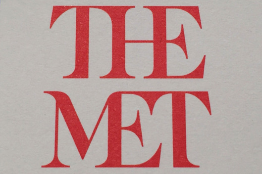
It’s a disaster, as I predicted here last June in “The Met’s Coming Rebranding: A Puzzlement.” In fact, it’s worse than I had heard. Justin Davidson posted this image on New York magazine’s Vulture site earlier today. Ugh.
Davidson nailed it:
The whole ensemble looks like a red double-decker bus that has stopped short, shoving the passengers into each other’s backs. Worse, the entire top half of the new logo consists of the word the.
 Why anyone thinks that is better than the Metropolitan Museum’s* old logo is beyond me.
Now I will go away and try to think of something deeper to say about this huge mistake. In the meantime, please go to my 2015 post on the subject, which tries to provide Tom Campbell’s rationale, shaky though it is.
For a museum, one has to ask: does anybody there have an eye?
*I consult to a museum that supports the Met.

