• Skip to main content
  • Skip to primary sidebar
  • Home
  • About
    • Real Clear Arts
    • Judith H. Dobrzynski
    • Contact
  • ArtsJournal
  • AJBlogs

Real Clear Arts

Judith H. Dobrzynski on Culture

Exhibitions

Giving Hedda Sterne Another Chance

Hedda Sterne is not a name you hear very often, so I was pleased last spring when I learned that the Amon Carter Museum of American Art was giving her a solo exhibition. It would be a small one, and of lithographs, not paintings, but still I wanted to see it. We’re in a moment when female artists are getting a bit more museum exposure, and I wondered about her.

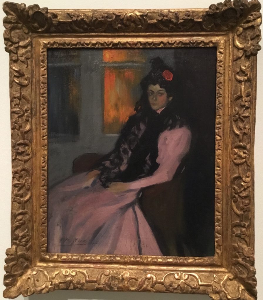
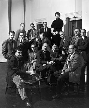
At one time Sterne was prominent–mostly, though, she was prominent now for having appeared in Life magazine’s photo of The Irascibles–the only woman among the artists in the photo, all of whom had signed a letter to the president of the Metropolitan Museum of Art in May, 1950. As she once explained, she arrived at the staged session late, after photographer Nina Leen had placed everyone, so Sterne was put up on a table, standing, on the right, sticking up “like a feather.” (Several others, male and female, had signed the letter, but were not in the photo.)

But, according to hearsay, Sterne was the only woman because she invited herself when her husband, Saul Steinberg, was called to be in the photo.

For more information about that letter–and the exhibition in question–you might read a fascinating account by Robert Beverly Hale, then associate curator of American Painting and Sculpture. It’s online on the Met’s website. Here’s an excerpt:

On May 20, 1950, an open letter signed by eighteen painters and ten sculptors was received by the Museum. It stated in substance that they “rejected the monster national exhibition” to be held at the Metropolitan, that the juries chosen were too conservative to admit a just proportion of advanced art. It called upon all the advanced artists in the country to boycott the exhibition.

This letter, which appeared on the front page of The New York Times, stirred up a spirited controversy. On June 12 the Museum received an open letter signed by seventy-five artists expressing confidence in the integrity of the juries appointed, saying that it seemed unfair to attack the juries before they had met and announced their verdicts.

As an aside, it’s interesting to note some artists who were in that exhibition: Ivan Albright, Andrew Wyeth, Everett Spruce and Mark Tobey are among them.

But back to Sterne: She later blamed the photo for causing her trouble with male artists, but she wanted the attention. Even though she hung around with the art crowd, including Duchamps and Mondrian at first and’, later, the guys at the Cedar Tavern, she still, early on, felt that she would be better off signing her work only with a “H,” to disguise her gender.

That soon ended, but there’s no question that her connection with Steinberg aided her.

For me, Sterne’s work is uneven. She experimented a lot–working in Surrealism, abstraction (both geometric and biomorphic), representation, portraiture. But she never developed a particular signature style or niche.

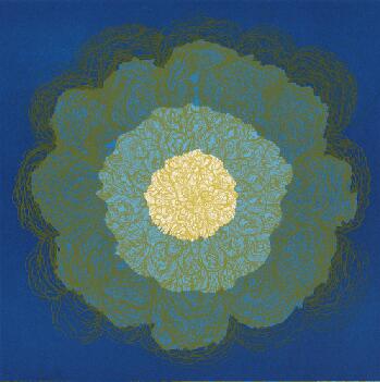
The works on view at the Amon Carter are from two series (plus four miscellaneous prints)–Metaphores and Metamorphoses and The Vertical Horizontals–that she made in 1967. I reviewed the exhibition for The Wall Street Journal, published in yesterday’s paper.

The prints are engaging, interesting–a window on her thinking, her working out process. But they didn’t leave me asking for more. I have seen her very good painting at the Tate, and a few others. The Met plans to put one of her paintings in Epic Abstraction, coming this fall–if it is the one in the museum’s permanent collection, I don’t believe it’s normally on view.

And so, despite this wide-ranging look at Sterne’s work, I had to conclude–for the show and for her in general:

“Hedda Sterne: Printed Variations” is a small, attractive show displaying themes that she also explored in painting. It leaves her where she will probably remain in art history, closer to the periphery than the center.

Photo Credits: Courtesy of Nina Leen/Time Life Pictures Gallery/Getty Images (top right); Metaphores and Metamorphoses VII, bottom left, courtesy of The Hedda Sterne Foundation.

Sargent With A Local Twist And Double Narrative

The Art Institute of Chicago’s major summer exhibition, John Singer Sargent and Chicago’s Gilded Age, is probably a crowd-pleaser–though I haven’t checked the numbers. Sargent is usually a big draw–I remember when, to cite one example, the show of his watercolors at the Brooklyn Museum outdrew a large show of El Anatsui, which was a surprise given Brooklyn’s predilection for contemporary art (in which, I’d say, El Anatsui is a rock star).

But Sargent has been exhibited so many times–except in Chicago, where decades had passed since his last exhibition. What to do that’s different? If you are Art Institute curator Annelise K. Madsen, you find a local angle. She decided to organize an exhibit of works by Sargent that had been exhibited in Chicago, owned by Chicagoans, or portrayed Chicagoans. It was a good idea, I thought.

Then she went a step further and married that with a narrative about the desire of locals to make Chicago’s cultural scene match its industrial prominence, and to set Sargent in that scene among his artist friends and rivals.

Not a bad idea, on first thought–though for me, it didn’t quite work. I was in Chicago several weeks ago to review it for The Wall Street Journal, and my piece was published in today’s print paper, headlined, Dazzling Art With a City Connection. 

It’s a good show, as I wrote:

With this exhibition arranged thematically rather than chronologically, visitors see Sargent in the round, one facet at a time. The need for a Chicago connection, however, prevents it from being a true retrospective, as many of his best paintings, like “Carnation, Lily, Lily, Rose” (1885-86), have no such link and are thus absent.

That was still ok, as the exhibit is “full of visual pleasures.”  For me, the bigger issue was Madsen’s decision to add in works by Sargent’s friends and rivals.

…— Claude Monet, Giovanni Boldini, James McNeill Whistler, Anders Zorn, Dennis Miller Bunker and Walter Gay, among them. Hung both interspersed with Sargents and in a gallery of their own—constituting a third of the paintings on view—they often serve the Chicago-rising narrative, but seem like interlopers. The “Sargentesque” ones can be confusing. Less—or none—might have been more.

Maybe that is a real problem for all double-narrative exhibits. There aren’t that many to begin with. and maybe there’s a reason for that.

Let me be clear, though: the exhibit is still very much worth seeing–as the two works, Portrait of a Boy and The Loggia, Vizcaya, pasted here indicate, Up top is a picture I took of three ladies studying La Carmencita. Who could ask for more?


YBAs of the 19th Century

You will recall the hubbub created in London (and elsewhere) by the Young British Artists in the late 1980s and ’90s–led by Damien Hirst and including Tracey Emin, Sarah Lucas, Gary Hume, Fiona Rae, and Steve Park, among others, they rebelled against the art world’s customs. Their 19th Century counterparts were, of course, the Pre-Raphaelite Brotherhood, led by Dante Gabriel Rossetti, William Holman Hunt and John Everett Millais. They too spurned art of their times, but instead of looking forward they looked back to the Old masters for inspiration.

What’s new about that? Nothing, really, except that for the first time a museum–the Legion of Honor of the Fine Arts Museums of San Francisco–has in a major way lined up works by Pre-Raphaelites with works by Old Masters like Botticelli, van Eyck, Memling, Veronese and Raphael himself.

It’s a well-done show, which I reviewed in a piece published in today’s Wall Street Journal, headlined Truth and Beauty…Understanding a Complex Aesthetic. But to me, the point of the show is not the literal comparisons between works, which are many, but rather the many contradictions and paradoxes in the gospel espoused by the Brotherhood. Here’s the key excerpt:

Intent on creating something novel, they nevertheless looked back to myth and medieval literature for subject matter or sometimes simply invented nostalgic scenes, filling their paintings with symbols and hoping they would be read like books. They believed in observing nature but sometimes depicted it in unnatural colors and flattened surfaces. In tune with their name, they sought to return to the practices of artists who preceded Raphael (1483-1520), but they actually esteemed him, giving him a place on their list of “Immortals” along with Michelangelo, Fra Angelico and Leonardo da Vinci. It was the saccharine, postured images of Raphael’s followers that riled the Brotherhood, yet they sometimes made sweet, overripe paintings themselves; and they eventually came to emulate the lush, stirring works of many Italians who came after Raphael, like Veronese.

I don’t know how the YBAs will fare in the years to come, but the PRB, we know, are kind of niche artists today. Some people love them; most people who call themselves art aficionados don’t love them–many actively dislike them. There’s probably a lesson there about looking backward to make something new–that’s rarely done in a way that lasts. It wasn’t long after the PRB formed that French artists staged their own rebellion against the academy, but they came up with Impressionism, and later Fauvism, and Cubism, and…well, you know how that story continues.

The PRB, I think, ended up influencing the world of design more than the world of art.

Once again, under the influence of Max Hollein–former FAMSF director and soon-to-be Met director–the Legion of Honor has created a “digital story” about the exhibition that is meant to be read before attending, but certainly can be read after or by those who are not able to go to the show. Here’s the link.(I hope the Met, which already has many excellent digital offerings, will start creating something similar for its many special exhibitions.)

If you’re curious, there’s an “in-depth” portion of the museum’s website also devoted to the exhibition (with more pictures). The WSJ has more paintings on its website too. Above right is Millais’s Mariana and at left is a somewhat strange but intriguing work by John Roddam Spencer Stanhope called Robin of Modern Times, from the collection of Gordon and Ann Getty. Below is Stanhope’s Love and the Maiden.


Want a Spanish Art Surprise? There’s One In San Antonio

So you think you know Spanish art? You’ve been to the Prado and the Hispanic Society, etc., etc. and you’re pretty familiar with it. Unless, of course, you are a real expert in the Spanish art, an exhibit at the San Antonio Museum of Art should suggest otherwise.

To cel­e­brate San An­to­nio’s found­ing 300 years ago as a north­ern ad­min­is­tra­tive out­post of New Spain, the San An­to­nio Mu­seum of Art recently opened an exhibition called “Spain: 500 Years of Spanish Painting from the Museums of Madrid.” The goal: exposed the glory of Spanish painting to residents of a city whose art mu­se­ums lack a col­lec­tion of his­tor­i­cal Span­ish art.

Katie Lu­ber, the mu­se­um’s di­rec­tor, and William Rudolph, its chief cu­ra­tor, went to Spain hoping  to bor­row art from the reign of Fer­di­nand and Is­abella all the way to 20th century mod­ernism. They wangled 34 paintings and they borrowed nine more from U.S.museums.

As I wrote in a review for The Wall Street Journal published last week:

What were they think­ing? No list that small—from de­vo­tional works, por­traits and still lifes to genre paint­ings and land­scapes—could ful­fill the am­bi­tion of that ti­tle. Yet with paint­ings by mas­ters like Goya, El Greco and Pi­casso, this re­mark­able show gives San An­to­ni­ans a strong fla­vor of Spain’s artis­tic tra­di­tions and man­ages, more­over, to show­case su­perb works by sev­eral painters who are lit­tle known any­where in the U.S.

You can read more about my thoughts on the show on the WSJ website (search for my name) or on my website, to which I link on this page.

But for me, the best part of the show was not great works from the main museums; rather, it was lesser-known works from lesser-known museums—such as the Museum of Romanticism, which owns Luis de Madrazo y Kuntz’s wonderful ‘The Young Marchioness of Roncali’ and ‘Alfonsito Cabral with a Puro’ by his father, Manuel Cabral y Aguado Bejarado.

Both are pasted here.

I’ve also pasted a few more art works from the show below by, from top to bottom, Antonio Maria Esquivel, an unknown 15th Century Hispano-Flemish artist, Juan de Peralta, Juan de Nalda, Ramon Casas I Carbo and Picasso. Wonderful, aren’t they?

Color Wins The Day At the Cooper-Hewitt

At the PeclersParis station

Saturated: The Allure and Science of Color, now on view, is exactly the kind of exhibition I expect and like to see from the Cooper Hewitt, National Design Museum–which, frankly, came as a bit of a surprise. Since the Cooper Hewitt reopened in 2014 after a three-year renovation,  it has been a bit of a disappointment to me. Too much technology that didn’t work, too much attention to interactivity rather than on design objects, too much play for my tastes. That said, it was popular, at least at first.

Shimmer table

But I did not give up on the Cooper Hewitt and Saturated was reason enough by description to bring me back. It’s all drawn from permanent collections of the Smithsonian–and that’s a good thing. The Cooper Hewitt, part of the Smithsonian, has many worthy objects in its collection, far more than can be displayed in its limited space (In 2016, it launched a digital database of more than 200,000 objects.) and some are getting a good showing in this exhibit. Even more important, the other source of material for Saturated is the Smithsonian Libraries system, a network of 21 libraries. Together, they own more than two million books, 40,000 of which are “rare,” plus 10,000 manuscripts. (More information is here on the Fact Sheet.) It claims to be the world’s largest library system.

But back to Saturated, which attempts to “reveal how designers apply the theories of the world’s greatest color thinkers to bring order and excitement to the visual world,” and how “color perception has captivated artists, designers, scientists and philosophers.” The museum sets up this “elusive, subjective complex phenomenon” with these words:

Color is an objective, quantifiable, physical phenomenon, the reflection of certain wavelengths of light off the surface of different materials. But color is also a subjective, personal experience, different for every person and deeply intertwined with language and memory.

I reviewed this short history of color in 190 objects for The Wall Street Journal in a piece headlined Vibrant From Any Angle and published last week (while I was away). I found the exhibit to be enlightening and visually engaging, with objects dating from the 3rd to 5th Century B.C. to 2014, from a cobalt blue flask created in Syria to a 1704 book by Isaac Newton to an ’80s Joffrey Ballet poster to Peony, a wall hanging made by a digital printer and a Shimmer table made possible by nanotechnology.

Designed by David Tisdale

You can read my review here or on my personal website. And, here are two fascinating tidbits I could not squeeze into the review:

  • In 1856, William Henry Perkin “accidentally created the first synthetic dye from coal tar” –at age 18. He was searching for a treatment for malaria but instead got a brilliant purple dye; it caused the color industry to “explode,” because previously color came from insects, animals, plants, minerals, and other natural sources.
  • And there’s a book, Theoretical and Practical Treatise of Textile Printing, which George Seurat cited as influential in the development of pointillism.

You just never the impact of what you do.

So go see Saturated if you’re in NYC.

Photos: Matt Flynn © Smithsonian Institution

« Previous Page
Next Page »

Primary Sidebar

About Judith H. Dobrzynski

Now an independent journalist, I've worked as a reporter in the culture and business sections of The New York Times, and been the editor of the Sunday business section and deputy business editor there as well as a senior editor of Business Week and the managing editor of CNBC, the cable TV

About Real Clear Arts

This blog is about culture in America as seen through my lens, which is informed and colored by years of reporting not only on the arts and humanities, but also on business, philanthropy, science, government and other subjects. I may break news, but more likely I will comment, provide

Archives