• Skip to main content
  • Skip to primary sidebar
  • Home
  • About
    • Real Clear Arts
    • Judith H. Dobrzynski
    • Contact
  • ArtsJournal
  • AJBlogs

Real Clear Arts

Judith H. Dobrzynski on Culture

Exhibitions

Get Thee to Cleveland For a Great Show

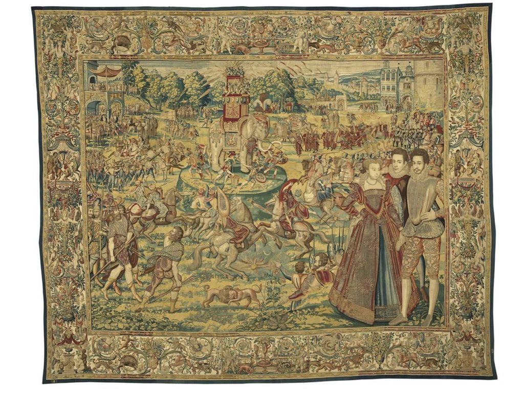
Lucky Cleveland! Since Nov. 18, residents and visitors to the Cleveland Museum of Art have been able to see six tapestries, woven in the mid 1570s, that have been under wraps, locked away, almost ever since then. For some 100 years, at least, they’ve been in the store rooms of the Uffizi Galery and before that in the Palazzo Vecchio Medici store rooms.
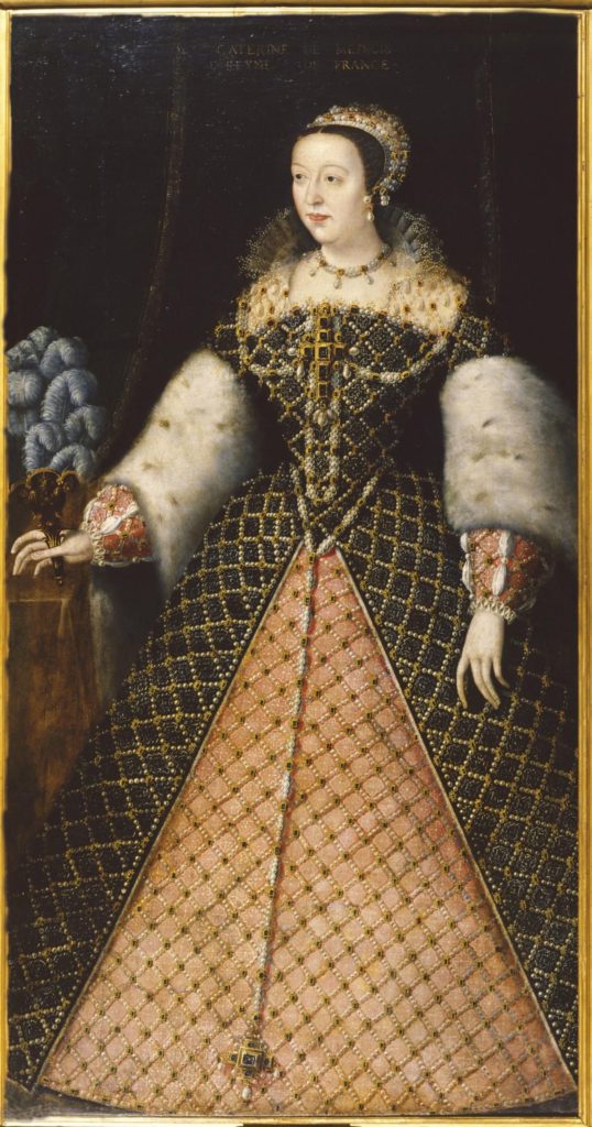
Catherine de’ Medici

They are the Valois tapestries, commissioned by Catherine de’ Medici after her husband, Francois I, died and left her queen mother and regent (for a while). Catherine, of course, knew how to use art to project power–and the weavings commemorate the court festivals she staged to project the power of France’s ruling family.  Over the years, they had faded, been damaged by bugs, and tarnished–they’re laden with gold and silver threads–by time.

But in recent years, the American-based Friends of the Uffizi Gallery (sister to the Italian organization) stepped in to fund the conservation of the  tapestries. When they (well, six of eight) were ready to be shown, Cleveland director William Griswold asked Uffizi director Eike Schmidt for them, and he got them. The Cleveland museum gathered related art works–such as hard-stone objects collected by Catherine and portraits of her, her son Henri II, and other paintings–and mounted an exhibition called Renaissance Splendor: Catherine de’ Medici’s Valois Tapestries.

I reviewed the exhibition for The Wall Street Journal, and it was published in yesterday’s paper. Here are a few excerpts:

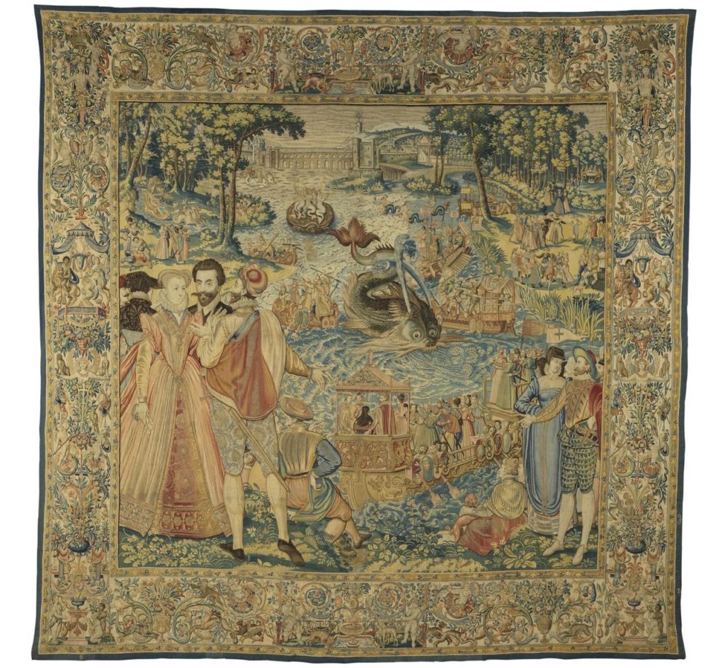
In each one, life-size kings, princes, princesses and courtiers occupy a corner of the foreground. Based on drawings by court portraitist François Clouet and artists in his circle, many of these characters make eye contact with the viewer. It’s as if they are inviting visitors into the grand scenes taking place behind them, which use drawings by Antoine Caron and written records of the “magnificences” as inspiration.

So…In “Whale,” a marvelous mechanical sea monster, with unlikely spouts, a pug nose and whiskers more suited to a catfish, noses up to a barge where a tiny Catherine, dressed in black widow’s garb, is watching the show. And in “Elephant,” soldiers secure the mechanical animal, festooned with feathers, which carries a crowd of clamoring soldiers at war with a group below….

…the tapestries are busy with charming details that will draw in even casual visitors. To name just a few: the cute château in “Fontainebleau” set amid make-believe mountains; the sun-kissed allée in “Polish Ambassadors”; the amusing mermaids afloat on a turtle in “Whale.” The borders, meanwhile, are beautifully laden flowers and plants, interspersed with fish, monkeys, deer and other animals—even a tiny snail in the lower border of “Tournament.”

I’ll post a two of them here (from the CMA)–“Whale” and “Elephant” and hope you will see the show if you can.

Art Reviews–Or Observations–That Go Beyond

People regularly complain that art criticism displays an off-putting insider-y tone, complete with jargon–but that’s not what I am about to talk about here. I’m going to mention a few display touches and the like that I notice, when they are good, at exhibitions that I review but rarely–for space reasons–have the opportunity to write about.

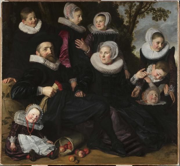
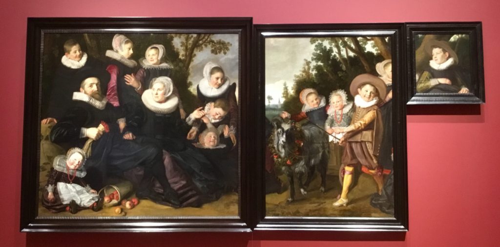
The most recent case was at the Toledo Museum of Art, which I visited to see Frans Hals Portraits: A Family Reunion. My review of that exhibit, which reunites three paintings (one purchase by the Toledo museum in 2011, at left) that were split from one canvas by the end of the 18th century, was published in the Oct. 22 issue of The Wall Street Journal. Here are a key paragraphs explaining the show.

Then the discoveries, presented here for the first time, began. Belgian conservators—cleaning their painting for this exhibition—discovered the presence of about half of a girl on the far right of their canvas who had been painted over. Adding to the excitement, her lace collar matched a fragment visible in “Head of a Boy,” cementing his presence as part of this family portrait. Cleaning also revealed two hems on the left of the Belgian work that complete the dresses of two girls on the right of the Toledo painting—leaving no doubt that these paintings were all once part of a whole [see first picture below].

…Hung here so that each work occupies the same place it would have in the intact work, the paintings show the great portraitist at his best. Rather than depict the sitters looking at the viewer—only three of the 14 figures stare out, one being the obviously proud patriarch—Hals creates a lively scene of merry faces, twinkling eyes, and dynamic hand gestures that signal family interactions….he deploys a more controlled style of brushwork than the thick, bold strokes that made many of his portraits famous, but it’s never stilted.

…The three fragments account for 12 children, but what of the other two, both girls? They must have occupied the lost, lower-right corner. In Toledo, a freestanding panel illustrates an educated possibility: a sitting girl with a youngster on her lap [see bottom picture].

Other artworks by Hals and a few others, plus a few Dutch decorative art objects, form the core of this exhibition.

However, Toledo has also given visitors two other galleries that “wrap” the core–one interrogating the meaning of family with other family-related artworks from the museum’s permanent collection and the other other, a family activity room inviting visitors to reflect on the meaning of family. Both were superfluous for me, but maybe I’m not the target audience.

Further, they didn’t really detract from the core because of those touches I referenced above. Here are some of them:

  • The Hals and the other Dutch art was installed in galleries painted a deep red (the beating heart!), picking up small touches in some of Hals’s paintings; while the “wraps” were installed in white galleries.
  • As visitors come around a corner from the first “wrap” gallery, they get a glimpse–but just a glimpse– of the reconstructed painting at the center.
  • Other, equally appropriate sight lines in the core exhibit.
  • There are no didactics on the wall where the reconstructed painting (that is–the three paintings, aligned as one work) hangs.
  • A nice long bench sits before the reconstructed painting–for contemplation–with nothing between you and the art.
  • The didactics–which explain much of what I have excerpted from y review–are mounted on a long, freestanding panel behind the bench. There you’ll find information covering these topics: bringing the pieces back together; possible explanations for why it was cut apart; the secrets new research revealed; the Van Campen family; a proposed reconstruction.

Occasionally, I do get a chance to mention such things–as I did in July, with my review of Spain: 500 Years of Spanish Painting From the Museums of Madrid at the San Antonio Museum of Art–briefly. Then, I wrote “the curators accomplished a lot with 43 paintings, which are hung with great care for sightlines, echoes and engaging juxtapositions.”

Did everyone notice these (and there were probably others) niceties? It’s doubtful–but I believe that museum-goers appreciate them intuitively. And we appreciate them.

I hope you will read my review to learn about the fascinating origin story for the Toledo exhibit.

Photo Credits: Top and bottom, Toledo Museum of Art; middle, me


Rembrandt: Master Market Manipulator

Rembrandt: Painter as Printmaker, which opened Sept. 16 at the Denver Art Museum, showcases the known glories of his work—but with an eye-opening twist. It displays Rembrandt a master market manipulator, as well as a great artist.

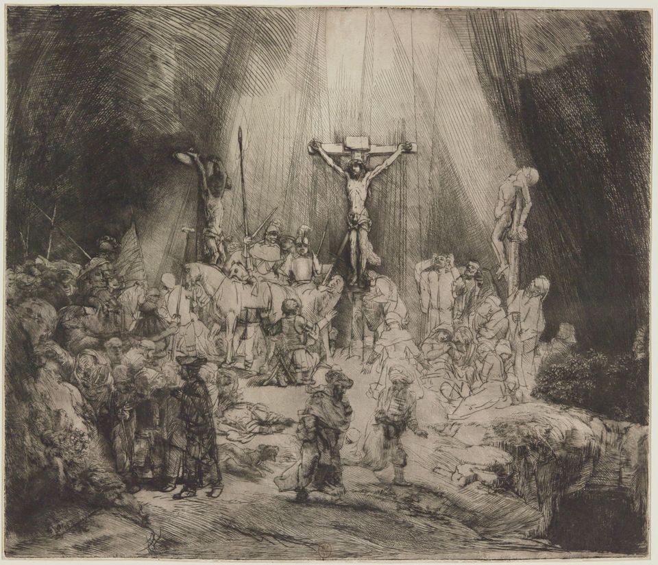
The Three Crosses

We know, but rarely acknowledge in exhibitions, that many great artists were good at business too. Certainly, Renoir and Martin Johnson Heade, to name two on opposite sides of the Atlantic and in different time periods, churned out paintings they knew they could sell, often to tourists. So, for that matter, did Canaletto.

And Rembrandt, we know, painted some of those self-portraits as “calling cards” to demonstrate his skills in that genre to prospective portrait commissioners.

The exhibition in Denver goes deeper. With its display of nearly 110 prints, 17 drawings and five paintings–spanning his biblical, portrait, allegory, still life, landscape and genre subjects–curators Timothy Standring and Jaco Rutgers set out to show how Rembrandt manipulated the market for his prints.

“Rembrandt intentionally made rarities for his admiring collectors who sought out rare states,” Standring said. That is, in creating his etchings, Rembrandt refined his copper-plate designs in small steps, known as “states,” that were seemingly unnecessary or at least not aligned with common practice among other artists of the the time. They generally use these early versions as a “status report” on the composition.

Because he needed the money (evidenced by his 1656 bankruptcy declaration) and knew that his collectors wanted rarities, which sold for high prices, Rembrandt purposely many more versions of his images. (About those rarities, Rembrandt was already known as a more innovative printmaker than his contemporaries, frequently experimenting with different inks and papers.)

You can read about some specific examples–such as The Jewish Bride and The Three Crosses in a little piece I wrote on this for The Art Newspaper, published in the September issue. There you’ll find some of the very impressive lenders to the exhibit as well.

The scholarship behind this exhibition, which will not travel, stems largely from Rutger’s research as co-editor of the new catalogue raisonné of Rembrandt’s etchings, which was completed in 2014.


Surprising (But Short) Chapter of Georgia O’Keeffe’s Life

Several days ago, I went to the New York Botanical Garden to see its summer exhibition, Georgia O’Keeffe: Visions of Hawai‘i. It included several paintings I knew nothing about. And, as I soon discovered, from talking with friends and posts on Facebook and Instagram, neither did many other art-lovers.

This isn’t all that surprising when you consider that the paintings haven’t been shown (for the most part) in New York since 1940.

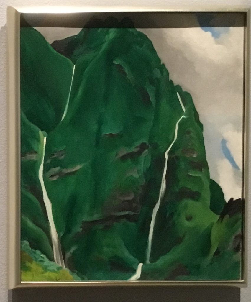
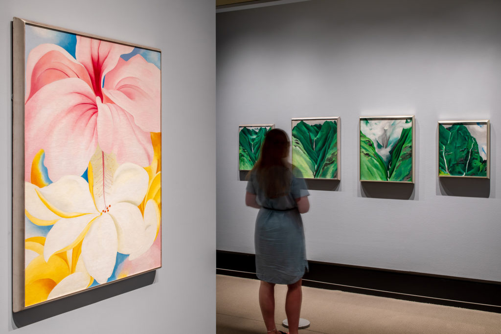
O’Keeffe, as the exhibition relates, visited Hawaii in 1939, traveling there on a commission from a Hawaiian Pineapple Company. which was planning to use her work in a promotional campaign. She spent nine weeks on Oahu, Maui, Kauai and the Big Island, making several paintings of mountains, waterfalls, plants and flowers. Some are on view through Oct. 28 at the NYBG and, if you’re nearby, worth the trip.

However, I must add, this is not a museum show. All told, there’s only a small gallery with perhaps 15 paintings. The rest of the show provides information about plants and the Hawaiian ecology, outlines her time there, shows her work in advertisements, and exposes visitors to plants and flowers she might have encountered while in Hawaii. This part, to me, is less successful than the reconstruction of Frida Kahlo’s garden there in 2015, which attracted a record-setting attendance of more than 500,000.

But that’s ok–the reason to go is simply that most of the paintings on view are borrowed from the Honolulu Museum of Art or from private collections. They may not pass this way again anytime soon.

I’ve posted two samples (mine photos), and a gallery shot (courtesy of NYBG).


Superlative Numbers At the Met. But Crazy Ones Too

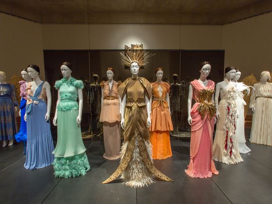
Superlatives are in. Last week, the Metropolitan Museum of Art issued a press release saying it had welcomed its one-millionth visitor to its special Costume Institute exhibition, Heavenly Bodies: Fashion and the Catholic Imagination–proclaiming it, weeks before the show closes, “the Costume Institute’s most attended show ever and The Met’s third overall most attended” exhibit.

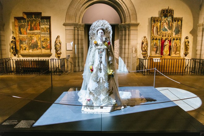
Really? Truth is, we can’t be sure of that. Because of the complex installation, which inserted costumes into the permanent collection galleries of Byzantine Art, Medieval Art (below right), parts of the Lehman wing (left) and the Cloisters, actual numbers are nearly impossible to compute. How can the Met tell if someone who walks through the Byzantine corridors is merely on his or her way to the American wing, say, and perhaps just glancing–or not even that–at the costumes above? Also, with the exhibit spread out in three locations–there’s also the Costume Institute galleries on the Met’s lower floor–how can the museum ensure that it’s not double- or triple-counting people?

I’d heard informally from some Met insiders that the museum was using a formula developed by its research department, and when I asked the Met about the numbers, Nancy Chilton in the press office confirmed that:

This three-part exhibition required that our Research Department develop a formula to measure visitor levels through several means.

But that’s all the museum would reveal officially. As I understand it, though, the museum is counting people at locations in the exhibit that are not passages to other places (which is pretty hard on the main floor of 1000 Fifth Ave.), using visitor surveys at the Cloisters and the Costume Institute galleries to make sure people are not double-counted, and analyzing these numbers in the context of overall attendance. Voila–one million. last Thursday. The Met thinks this number is not only valid but also conservative.

It may be–but as an exact number it lacks a certain credulity.

I don’t blame the Met for the rampant tendency among some museums (not to mention other forms of entertainment and edification) to trumpet numbers, but I do wish it was more transparent about its process of arriving at a number. (let’s leave aside the issue of the length of exhibitions, which complicates matters even more, as a long exhibit will generally draw more visitors than a short one.)

Museums get into the “largest,” “biggest,” “most” syndrome for a mix of reasons, and marketing is one of them–with museums these days competing with so many other activities, it’s easier to get attention with superlatives. For parts of the public, the use of superlatives also stoke “the fear of missing out.” And therefore they get visitors to come.

Press for Heavenly Bodies had already gone that route, noting early on that this was “the biggest exhibit the Costume Institute of the Metropolitan Museum has ever held,” to cite one example, and in Thursday’s press release saying that “Heavenly Bodies…is the largest exhibition that either The Costume Institute or The Met has ever mounted, covering 60,000 square feet in 25 galleries.”

That claim is also problematic. How is the Met counting the gallery space? All of the Byzantine galleries? All of the Medieval court? Tell us, please–when you write the press release. (And, to cite another recent example at the Met, the press release for the Michelangelo exhibit noted that it “will bring together the largest group of original drawings by Michelangelo ever assembled for public display”).

I measure exhibition success by numbers, too–because I like others are interested in getting more people into museums to look at art. But always there’s a part of me that says to treat the numbers with caution. Unless special exhibitions are entirely ticketed–and most are not, given that members sometimes pass in with their membership cards, to cite one issue–attendance numbers have to be taken with a grain of salt.

Also, as Heavenly Bodies demonstrates, there’s no consistency across museums in counting–it’s not using that formula for other special exhibitions.

Twenty years ago, I wrote an article about some of these issues. One passage read:

Nearly every sizable museum looks at weekly [attendance] figures. Some, from big institutions like the Metropolitan to smaller ones like the Portland Museum of Art in Oregon, track the numbers daily. Many keep a running year-to-date count. The daily report of the Metropolitan, which considers itself the most sophisticated people counter among museums, includes the day’s weather and the weather of a year before, to gauge the outside competition. It also tracks the effects of media coverage, advertising and other variables, which it declines to disclose.

The article went on to relate various counting methods, including guards with clickers. More recently, I know one museum that wanted to try heat maps, and applied for federal funding to install devices to measure heat within its exhibitions, which of course rises with more people in the gallery. (I do not think that happened in any sustained way.)

Heavenly Bodies remains on view until Oct. 8–which will undoubtedly boost its numbers and possibly its ranking in the Met’s league table. The last major costume show there, China: Through the Looking Glass, attracted 815,992 visitors, but it was on view only from May 7, 2015 to September 7, 2015. And that was an extension from the original plan–three weeks were added to the end of its very popular run.

Each time the Costume Institute edges up in those statistics, it gains more ammunition for taking over other parts of the museum, which it has been doing for a number of years now. And that is not, in my view, a happy thing.


Next Page »

Primary Sidebar

About Judith H. Dobrzynski

Now an independent journalist, I've worked as a reporter in the culture and business sections of The New York Times, and been the editor of the Sunday business section and deputy business editor there as well as a senior editor of Business Week and the managing editor of CNBC, the cable TV

About Real Clear Arts

This blog is about culture in America as seen through my lens, which is informed and colored by years of reporting not only on the arts and humanities, but also on business, philanthropy, science, government and other subjects. I may break news, but more likely I will comment, provide

Archives