• Skip to main content
  • Skip to primary sidebar
  • Home
  • About
    • Real Clear Arts
    • Judith H. Dobrzynski
    • Contact
  • ArtsJournal
  • AJBlogs

Real Clear Arts

Judith H. Dobrzynski on Culture

Uncategorized

Bravo: Even the Whimsy At A Few Museums Is About Art

nb1
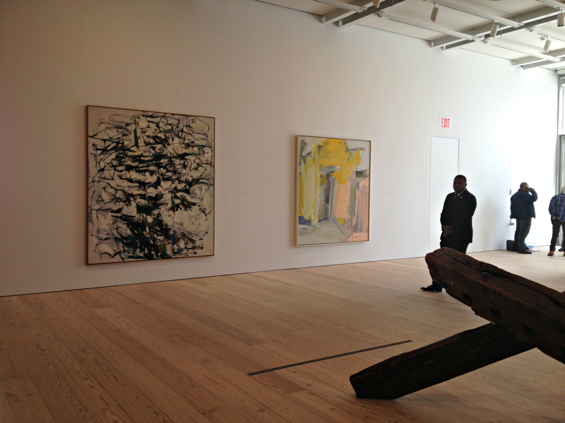
I love it when that’s so. I was reminded of this at the new Whitney last week. I had been meaning to return to the subject since I visited the New Britain Museum of American Art several weeks ago to review the Otis Kaye exhibition for The Wall Street Journal.

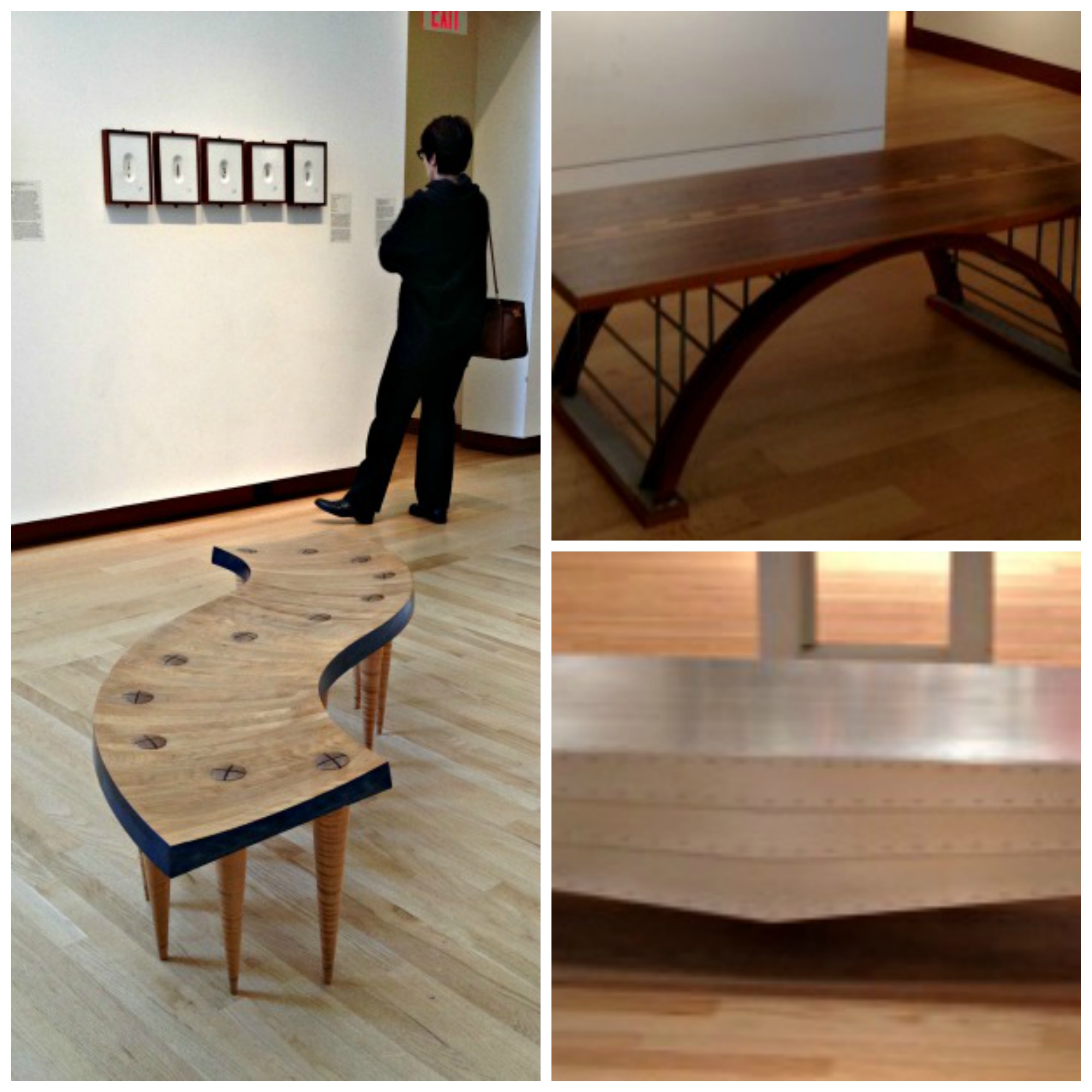
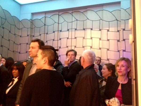
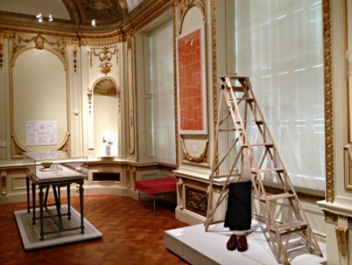
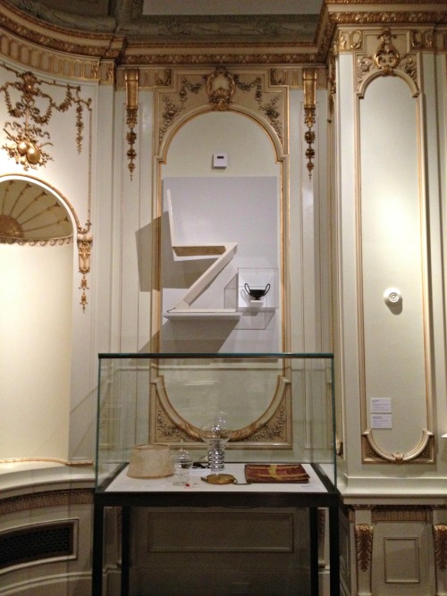
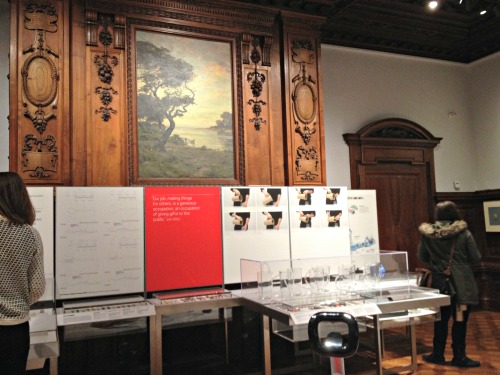
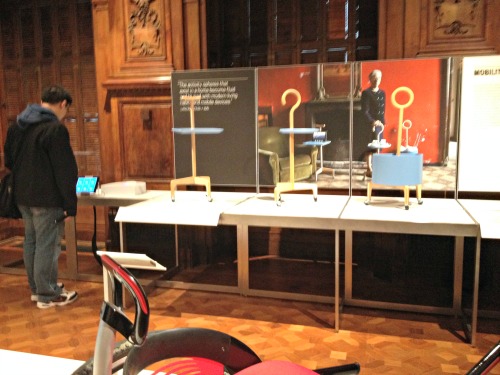
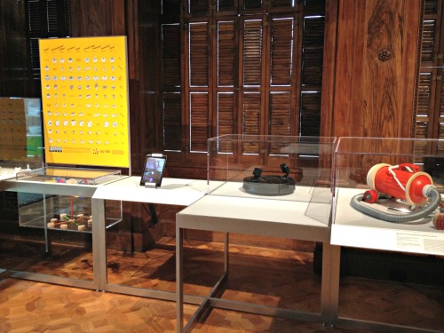
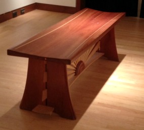
There, the museum seating is not just any seating; it’s a collection of benches bought by the museum from contemporary artists. At the Whitney, as you may have read, the elevators are design by Richard Artschwager (one pictured below, at bottom_.

All of this signals that art is not just an object to hang on a wall, position on a floor or project on a screen. Rather, art nb5
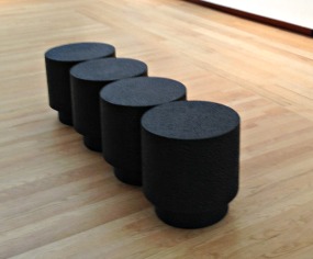
can be part–should be part–of everyday life. I praised the Smith College Museum of Art in 2012 for hiring artists to design its bathrooms and mentioned the NBMAA for its seating. But I didn’t have pictures, and now I do.

I’ve pasted them here, along with a couple of the Whitney elevators.

A little apology, though, because in mid-March, I wrote on RCA: “There’s another reason to like the NBMAA (which I’ve both criticized and praised in the past) and I’ll be back with pictures of that reason in the next day or so.”

I apologize–it has been more than a month.

And another apology: although the museum plan lists the artists of the benches, I have misplaced mine and can’t tell who designed these beautiful and varied works.

nb2

NBCollage

W10

First Thoughts On the New Whitney

W7After visiting the new Whitney Museum twice, for a total of about five hours, I’ve come to some tentative conclusions–first and foremost, that it’s a successful building for art, which always be the prime goal of an art museum. I went into this blog’s archives to see what I thought when I first saw the plans–in 2011, at the groundbreaking ceremony. I recall a lot of negativity at the time, but I disagreed:

…I may rue this day, but I’m going out on a limb regarding the architecture: Piano’s design, based on the drawings and sketches I’ve seen, looks pretty good (though that clunky model Piano is holding at right gives me pause) for the display of art. I have disliked many of his more recent museum projects…But the Whitney is looking better. I’m not talking about the outside; this is about how the art will look…

I don’t rue the day. I stand by what I said then. I also said the outside of the building looked pretty clunky in the models–and it does in person, too. Never mind. I care more about the inside, and I couldn’t find a flaw during my two visits. Congratulations to the Whitney.

And that is just the start. Here are more first takes:

  • The gallery spaces are varied, beautiful, flexible, some high-ceilinged (and some not), and absolutely great showcases for art. They are painted white, ink blue, grey and more white–appropriately for the art. More than one person I spoke with made comments along the lines of, “if only MoMA had a building like this.” Indeed.
  • Flow between and among the galleries is excellent; no one is going to wonder which way to go, ask “have I been in this gallery before?” or get lost.
  • The permanent collection installation, America is Hard to See, is dazzling. With about 600 works, it’s not too much–each piece has room to breath. And the installation is well-paced–some galleries showcase just a few works and at the other extreme, there are a few walls hung salon-style.
  • For the most part, the choices are excellent: a mix of the very familiar, the must-haves, the under-appreciated. (I do wonder, however, about the absence of Helen Frankenthaler in particular–her Flood and Orange Mood, both in the collection, are wonderful pictures–and I could quibble with the choice of, say, a gigantic Lee Krasner).
  • There are plenty of power walls. And unexpected walls. Among them are those with two pictures by Edward Hopper; two by Marsden Hartley; two separate walls with five each by Jacob Lawrence; one of 1930s anti-lynching prints; one of woodblocks by Chiura Obata,  and–too many more to mention.
  • There are many more works on view by women and minority artists than is typical in almost any museum you can name, but never once did I feel, “oh, that’s a politically correct choice.” The integration (choice of words intended) works well.
  • So, too, is the mix of painting, sculpture, prints, photographs and new media. It felt natural–and right.
  • The labels were well-written, mostly lacking jargon, and never heavy-handed about themes; that lack of heavy-handedness is true throughout, even when the theme is overtly political.
  • The views from the terraces are spectacular. They contained art, too.

One oddity: it does seem a little funny that an “Introductory Gallery” (pictured at top) containing Robert Henri’s great portrait of Gertrude Vanderbilt Whitney, John Sloan’s Backyards, Greenwich Village, and other works from the Whitney’s early days are downstairs, off the lobby, while the main installation starts on the eighth floor. The gallery is the right size and shape, though–and someone told me that it will be accessible free because of its position. If true, that’s something good. It’s adjacent to Untitled, the restaurant, so perhaps people will wander in to the museum from the restaurant.

While I was there, I told Donna De Salvo, the chief curator, that the installation was so good that the museum should leave it up for year, not take it down beginning in September as planned. She said that at least one other person had told her the same thing. Unfortunately, it has to be dismantled, to make room for two scheduled exhibits. So, I advise, make a real effort to see the Whitney between now and Labor Day.

I’ve posted some gallery shots below:

W4

W1W6W5

W3

W9W10

The Shocking Cooper Hewitt

Many curtain-raisers for and reviews of the newly renovated and reconceived Cooper Hewitt National Design Museum have focused on its use of technology to make the museum interactive, participatory and therefore supposedly of more interest to young generations who are not satisfied with just looking.

One recent Saturday, I finally made it to this new incarnation to see for myself. I didn’t mind the interactive technology. I liked much of it. Some of it was fun to play with. At one station, I designed a lovely outdoor sculpture. I did not get a chance to try the much vaunted pens,  which “enables every visitor to collect objects from around the galleries and create their own designs on interactive tables. At the end of a visit the Pen is returned and all the objects collected or designed by the visitor are accessible online through a unique web address printed on every ticket. These can be shared online and stored for later use in subsequent visits.”

For a reason that was never truly explained to me, the ticket office was not able to print out a ticket for me and I was just waved in, penless.

But, no, it’s the not the technology that’s wrong with this museum.

The new Cooper Hewitt has two huge problems, however. First, the renovation misuses and disrespects its historic building, erected between 1899 and 1902. On the museum’s website, it declares otherwise, saying ” transformation of the Carnegie Mansion into a 21st-century museum respects the spirit and character of the landmark building…restoring key elements to their original grandeur while providing much-needed upgrades to lighting and signage, more flexibility to reduce installation time and better accommodate object handling and above all enhanced public access on every level.”

How does that description square with these photos I took, which place ugly display cases in awkward places and frequently obscures those historic elements?

photo 3

photo 2

CH3

CH4

CH5

First question: does this strike you as good design? It is a design museum, after all. And second, what’s the designers’and managers’ definition of respect?

I’ll deal with the second big problem at the Cooper Hewitt another time.

Photo Credits: © Judith H. Dobrzynski

International Pop, World Pop, And Don’t Forget German Pop

In today’s Arts & Leisure section of The New York Times,  the Walker Art Center’s new International Pop exhibit gets a good curtain-raiser. Randy Kennedy makes its case “not only that Pop was sprouting in countless homegrown versions around the world but also that the term itself has become too narrow to encompass the revolution in thinking it represented for a generation of artists.” Pop was not, in other words, just an American invention with “a British offshoot.”

world-goes-popAnd this is the year, it seems, for that subject–the article also mentions the Tate’s upcoming exhibit, The World Goes Pop, which opens in September. Self-described by the museum, it is:

a groundbreaking exhibition revealing how artists around the world engaged with the spirit of Pop, from Latin America to Asia, and from Europe to the Middle East. At Tate Modern from17 September 2015, the show will explode the traditional story of Pop art and show how different cultures contributed, re-thought and responded to the movement. Around 200 works from the 1960s and 1970s will be brought together, including many which have never been exhibited in the UK before.

Someone, I hope, will review them both–as they were curated separately–to see the differences in, well, taste, and storyline. They share some artists, surely, such as Ushio Shinohara, whose Doll Festival is shown above, from the Tate show. You can see an excellent slide show drawn from the Walker’s view on the Times site.

Let me add one more “international” Pop exhibition that, in fact, began last November and closed in February.  (Because of its premise, I had it in mind to mention it here months ago, but let it slip.) Schirn Kunstalle Frankfurt presented German Pop, billed as:

In Great Britain and the United States, the 1960s brought forth a cultural movement that would have an impact worldwide [and] … universal claim to popularity…Artists such as Christa Dichgans, Sigmar Polke, Manfred Kuttner, Konrad Klapheck, and Peter Roehr developed a specifically West German version of Pop Art that went beyond mere “coca-colonization.” They examined the banalities of everyday life in Germany, ironizing its narrow-minded tastes and typically German “gemütlichkeit.” As a kind of archeological investigation of the 1960s and early 1970s, the exhibition at the SCHIRN will take a closer look at the artistic activities that constituted “German Pop.” Broadening the focus to encompass far more than just the chief protagonists, it will surprise the visitors with many a new (re-)discovery. The Pop principle will here be revisited with an eye to the new realistic art production situated in a realm between entertainment and mass culture, and light will be shed on West German Pop as an expression of dissociation from a no-longer-unencumbered middle-class aesthetic.

The Frankfurt show also shares some artists with the Walker’s, such as Thomas Bayrle, and probably with the Tate’s too, though I don’t have a checklist.

So pop is in the air at museums, and also avidly desired by collectors these days. One wonders which game first.

Photo Credit: Courtesy of the Tate

Another Opening, Another…

BolgerDI’m not talking about “Kiss Me, Kate” or another show. I’m talking about art museum directorships. Doreen Bolger, director of the Baltimore Museum of Art (pictured at right), just announced that she is retiring, effective June 15. That’s not much notice.

On March 19, Michael Conforti (at left) announced that he’d be retiring on Aug. 31 after 20 years as director of the Clark Art Institute.

MConfortiUp and down the East coast, at least, major directorships are open: the Museum of Fine Arts in Boston, the Morgan Library and Museum, the Brooklyn Museum, the Isabella Stewart Garner Museum, the Harvard Art Museums, the High Museum, the Wadsworth Atheneum, the museum at the New-York Historical Society, and several museums in Miami.

Then there’s the big hole at the Detroit Institute of Arts–not East coast, but still.

Have I left others out? Probably. This happens from time to time–a great number of turnovers at the top in the museum world. It’s always worth asking why. This time, most departees are of retirement age and many have recently completed expansions or other building projects.

But with museums in turmoil–worried about funding, desperately (and sometimes stupidly) seeking young audiences, trying to generate buzz instead of scholarship, etc.– these next few years, with new people at the top, are going to be momentous for art museums. I hope the boards choose well, but based on what I hear from some of them, I have doubts.

Just last night, I was chatting with a trustee of a regional museum in the South. He was dismayed by the direction the museum was going and the lowering of standards at the institution, whose leadership is stable and not about to turn over (or so it seems). “Have you spoken up?” I asked. No, he said, shaking his head. Too much headwind.

But how could he know? Maybe other trustees were worried too, but afraid to speak up.

It seems we have governance problems all over the place, with some boards trying to call the tune even on curatorial matters and other becoming rubber stamps.


« Previous Page
Next Page »

Primary Sidebar

About Judith H. Dobrzynski

Now an independent journalist, I've worked as a reporter in the culture and business sections of The New York Times, and been the editor of the Sunday business section and deputy business editor there as well as a senior editor of Business Week and the managing editor of CNBC, the cable TV

About Real Clear Arts

This blog is about culture in America as seen through my lens, which is informed and colored by years of reporting not only on the arts and humanities, but also on business, philanthropy, science, government and other subjects. I may break news, but more likely I will comment, provide

Archives