• Skip to main content
  • Skip to primary sidebar
  • Home
  • About
    • Real Clear Arts
    • Judith H. Dobrzynski
    • Contact
  • ArtsJournal
  • AJBlogs

Real Clear Arts

Judith H. Dobrzynski on Culture

Technology

Don’t Regret Missing “Civilisation” — Not Anymore

KClarke'sCivilisationI never saw Civilisation. But I — and you — can easily access it now on a free website, along with 492 other documentaries about art, and hundreds more about science, history, war, Britain, America and so on.

The site is called DocuWatch, and I have no idea how new or old it is. It was called to my attention today by a Facebook friend, and — considering the snow that is paralyzing much of the Northeast corridor and some other parts of the country, it seemed like to perfect time to share it with RCA readers. Maybe you’ll have Wednesday off.

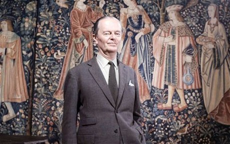
The landmark BBC series, Kenneth Clark’s Civilisation, which was aired in Britain in 1969  (I don’t know when it ran in the U.S.), is there in 13 episodes (It was remastered in HD in 2011). So is an 18-part art history series, a 36-part series on Italian Renaissance artists, 24 episodes on Impressionism, plus a different series on eight Impressionist artists, two on Hitler’s museum, 10 Sister Wendy’s, Robert Hughes’s The Shock of the New, Who the *$&% Is Jackson Pollock? and much more.

Hundreds of hours of free programming about art! 

Smithsonian Launches A 3D “Exploration” Initiative

Let’s catch up on a little news from the Smithsonian, announced in mid-November, but which got very little attention. That’s when it revealed the “Smithsonian X 3D Collection” and “state-of-the-art 3-D explorer.”  Essentially, this device makes use of new 3D scanning and printing technology, with an eye toward making much more of its gigantic collection accessible to schools, researchers and the public at large.

Lincoln'sLifeMaskIn the release,

Günter Waibel, the director of the Institution’s Digitization Program Office [said], “The Smithsonian X 3D explorer and the initial objects we scanned are the first step in showing how this technology will transform the work of the Smithsonian and other museums and research institutions.”

Already, the Smithsonian has scanned “the Wright Flyer,” which “allows users to explore the fine details of the artifact, providing a window into the Wright’s inventive genius and understanding of the principles of flight;”  a whale fossil, part of a super nova, and most relevant here, the Freer-Sackler’s “Cosmic Buddha.” The Smithsonian notes that such low-relief compositions are usually studied with rubbings of black ink on white paper, — but “3-D scanning, used with a wide variety of imaging techniques, can give even more clarity to the designs.”

Another example is Lincoln’s Life Mask, at left, which is in the collection of the National Portrait Gallery.

More details here.

This is part of the trend for museums to become more interactive — which is fine for science, natural history and various other kinds of museums but, I think, tricky for art museums.

3D scanning is unquestionably growing in popularity and declining i costs. But if museums have trouble with photography, and many still do, how are they going to handle this?

The Washington Post carried an AP story on the new Smithsonian venture, available here.

 Photo Credit: Courtesy of the Smithsonian Institution, via the AP

At The Met, Textiles And Technology = Bad Match

TextilesLet me say from the outset that the Metropolitan Museum’s* Interwoven Globe: The Worldwide Textile Trade, 1500–1800 — billed as “the first major exhibition to explore the international transmittal of design from the sixteenth to the early nineteenth century through the medium of textiles” — is a wonderful exhibition. The items — costumes, bedcovers, hangings, vestments, fragments — number 134 and, to me at least, they seem beautifully chosen. And the gallery design, with rich wall colors and varied displays, is suitably theatrical, roomy and well-paced. That’s one gallery, at left. that provides a peek at what I’m talking about.

There’s just one problem — it’s a small but it’s symptomatic.

FrenchMApInside the first gallery, there’s a large display screen that shows the trade routes of Portugal, Great Britain, France, the Netherlands and Spain, 1500-1800. Trouble is, the routes are animated, so they pop up as little dots emanating from each country, one at a time. Never does the viewer see all five countries’ routes on the same screen. Equally poor, visitors have to wait for each country, sequentially — spending more time than it’s worth, given the tiny amount of information they receive.

Have a look at this photo, at right (apologies for the angle), which shows the French routes.

BookMapNow take a look at the photo below it — it’s the inside cover of the exhibition catalogue.

Which gives you more information, faster? The book map, of course.

I am not against all technology in the galleries. I’ve praised some uses of it, such as here. But the addition of technology for technology’s sake strikes me as inane.

If the target of this map — and there was one of similarly low value in the museum’s Silla: Korea’s Golden Kingdom show — if those elusive young people brought up on technology, surely these are inadequate. Could the Met really think that young people would be excited by such simple, low-value animation?

By contrast, here’s a good use of technology — not in the galleries, but on the web. Click on this link, and you will be able to see 134 objects in the textiles exhibition. Now’s that wonderful technology.

Let’s nip the other kind in the bud, before it gets too common.


Choose Your Tools To Explore Gothic Ivories

17d20289d38b439ba782f81924575093d0cb2aafYou never know what will catch fire. A couple of years ago, the Cloisters of the Metropolitan Museum had a little sensation on its hands when it displayed a set of the Lewis chessmen. Attendance soared.

It was, probably, the little figures not the ivory they were made of that drew interest, but I thought of them when I learned recently about a project at the Courtauld Institute in London — in a task begun in 2008, it’s cataloging all known ivory sculptures made made in Western Europe ca. 1200-ca. 1530, as well as neo-Gothic pieces, and the other day it added 700 pieces to the online database. This created a mini-storm of interest.

Plus, some Scandinavian institutions recently joined the project, which already has a long list of collaborators. And the British Library just added two 14th century manuscripts embedded with ivory, one at right.

6a00d8341c464853ef019affe20b74970c-500wiThe project has its own website called Gothic Ivories, which went live in 2010; here are the people involved.

If this sounds like a throwback, compared to yesterday’s post on MoMA’s new Audio+, in a way it’s not. Gothic Ivories has interesting exploratory tools, too, though different ones — e.g., one that lets users compare four images at once, on the same screen. Registered users can also store their images, engage in forums, save their searches, etc. Casual visitors can view some sets of images created by other users, etc.

Above, at left, is one of the items in the database, known as the Kremsmünster diptych. Go to that page, and you’ll find much more information.

The site has a news section where it posts notice of exhibitions and publications.

There are many of these fascinating sites — when searched to see what had been written about the ivories, I found something comparing the site to the British Library’s Catalogue of Illuminated Manuscripts.

I also found a whole raft of sites about the Middle Ages, far too many to single out any here.

Happy browsing the the ivories.

Photo Credit: © Stift Kremsmünster, Kunstsammlungen (top)

MoMA’s New Audio+ Guide: I Like It

Today, the Museum of Modern Art announced a new “mobile platform” and I tried out this new-generation audio guide. It’s called Audio+ — since it involves video too and, best of all, the ability to save and share selected information.

MoMA_Audio+_MSeck_067_300-res_cc-300x200Introduced to visitors in Beta mode (which continues) in stages beginning last July 3, these devices — modified (or programmed) iPods Touch devices — replace the museum’s handheld audio wands.

Here’s how it works, my experience shows: You take the iPod on a lanyard and hang it around your neck. Then you take earphones, put them on, plug them into the iPod, and you’re off. Touch the screen for an introduction to the exhibition or permanent collection — I went to the American Modern: Hopper to O’Keeffe exhibition, as instructed by the press office (which held a session on digital initiatives). You can stop it at any time, or you can plug in the number of selected works to hear something about it (just like an audioguide) and — here’s the new part — you can take pictures with the iPod touch. The device automatically saves the audio you listened to, the pictures you took, etc. and — here’s the best part — the device lets you email your tour to your own email address. So when you get home, you have an email with the subject line “Hi, I went to MoMA and…”

detail_52E634C6-B621-4D41-A98E-988CBDC4878AOpen it to get to “My Path,” which is a compendium of the videos you viewed and the photos you took (one of mine is at right). You can listen again to the audio bits you heard, and so on. The email reads:

Thank you for visiting The Museum of Modern Art. We hope your visit was an inspiring one and that you enjoyed using MoMA Audio+, our new mobile guide. Here is the link to your saved personal path:

LINK

You can also stay up to date on all that MoMA has to offer by signing up for E-News.

We look forward to seeing you at MoMA again soon.

“My Path” comes with a little dashboard for your visit, which includes how many works you looked at (actually, listened to — I looked at many more than were recorded), what years they covered, what mediums, and so on — versus the number that you could have looked at. “My Path” for me said I explored just three paintings (not true, but those are the three listened to guides for) made in the 1920s. I took 12 photos (including some labels, because I wanted to know the dates/names/donors, etc.).

The museum now has 2,000 of them available for visitors, who average 9,000 a day at MoMA, but officials there said there haven’t been any real problems with scarcity (people simply wait for returns, I guess). And since July 3, MoMA says (in a press release):

…more than 160,000 visitors have taken advantage of its numerous features, taking and sharing more than 700,000 photos and accessing and sharing their saved personal paths. Antenna International provides the mobile guide operation, including staffing, device distribution, and audio production.

As MoMA said, this is still in beta. There are kinks. But it does seem to me to be an improvement on anything else I’ve used at museums (NB: I have not tried Gallery One at the Cleveland Museum of Art, which had not yet gone live when I was last there). Normally — unless I know absolutely nothing about an exhibition — I don’t take an audioguide. But I can envision myself using this device, because I can send home what I did and use it again later.

I like it.

Photo Credits: Courtesy of MoMA (top) 


« Previous Page
Next Page »

Primary Sidebar

About Judith H. Dobrzynski

Now an independent journalist, I've worked as a reporter in the culture and business sections of The New York Times, and been the editor of the Sunday business section and deputy business editor there as well as a senior editor of Business Week and the managing editor of CNBC, the cable TV

About Real Clear Arts

This blog is about culture in America as seen through my lens, which is informed and colored by years of reporting not only on the arts and humanities, but also on business, philanthropy, science, government and other subjects. I may break news, but more likely I will comment, provide

Archives