• Skip to main content
  • Skip to primary sidebar
  • Home
  • About
    • Real Clear Arts
    • Judith H. Dobrzynski
    • Contact
  • ArtsJournal
  • AJBlogs

Real Clear Arts

Judith H. Dobrzynski on Culture

Museums

The Brooklyn, The Whitney…Oh My! (Or, While I Was Away…)

Donna de SalvoI didn’t actually post here at RCA that I would be away for about a week around the Memorial Day weekend, so I am sure that it looked as if I was perhaps speechless last week when major announcements came out from the Brooklyn Museum* and the Whitney Museum. I was simply AWOL–in Spain, actually, taking advantage of the strong dollar.

I had a marvelous time viewing art in Madrid and nearby towns, and one visit is pertinent to those two aforementioned announcements.

Not the Brooklyn release, which named Anne Pasternak as successor to director Arnold Lehman, who is departing late this summer. Her appointment came as a surprise to me, but not a shock. I was sure that the trustees would pick a woman–the search committee was led by three women and Brooklyn’s chair, Elizabeth Sackler, has been a vocal supporter of women artists (her named space/program at the museum is devoted to feminist art). Pasternak has a strong record at Creative Time, which she has led for the past 20+ years. She has drawbacks, most notably the lack of museum management experience. But Brooklyn does have a long-time deputy director for operations plus many veteran curators.

There’s also her main focus on contemporary art, though I am told that she has a strong interest in Medieval and Renaissance art. too. Brooklyn, need anyone require reminding, is a universal museum. She must signal early that she embraces and cares about its entire collection, imho.

PrendergastI am sure that Pasternak knows that we’ll all be watching her moves very closely.

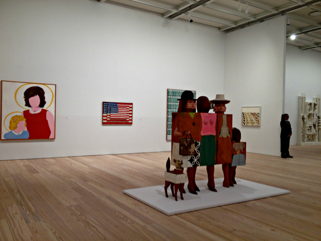
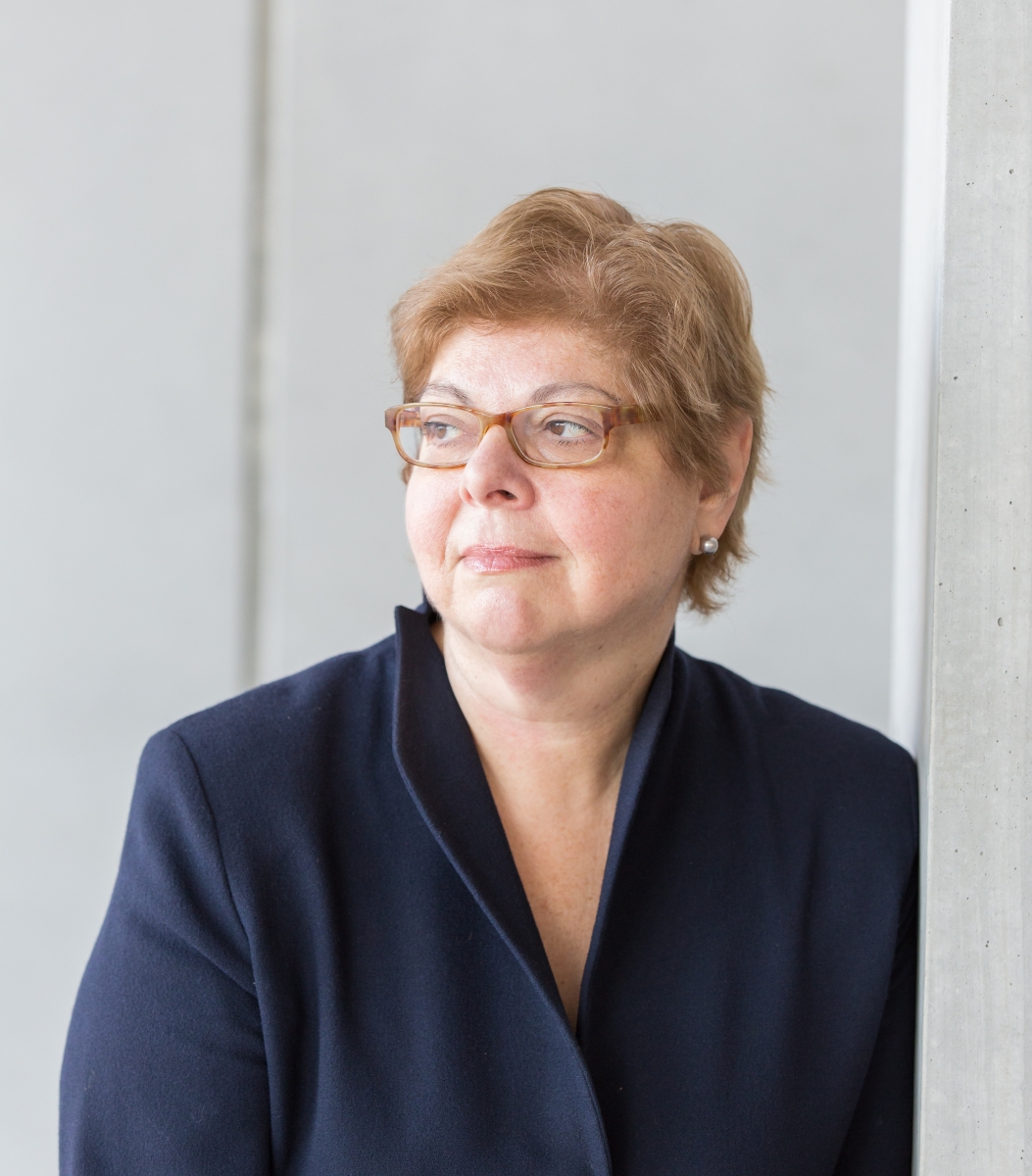
But my trip reminded me that the promotion of Donna De Salvo (above) to deputy director for international initiatives and senior curator at the Whitney, from chief curator and deputy director for programs, is also worth watching. Having just returned from Spain, I’ve not talked to a soul about this one–it may be that she was simply bumped upstairs to make room for Scott Rothkopf to get the chief curator’s post (her former job). I hope not.

The reason: De Salvo is supposed to gin up international partnerships and my many travels, including this one, always remind me that American art needs a bigger presence overseas. Sure, everyone knows Andy Warhol and more recently, because of either high prices paid for their works or their shock art, many people know Jeff Koons, Mark Rothko, Jackson Pollock (perhaps) and a few others. But Europeans and Asians still have little exposure to the breadth of American art.

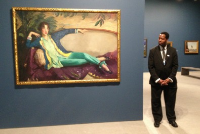
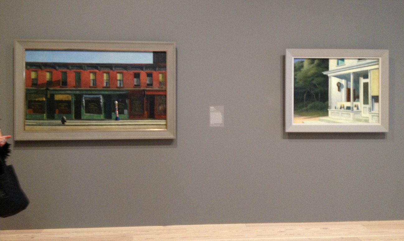
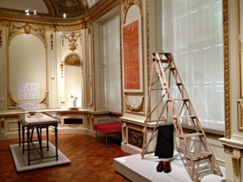
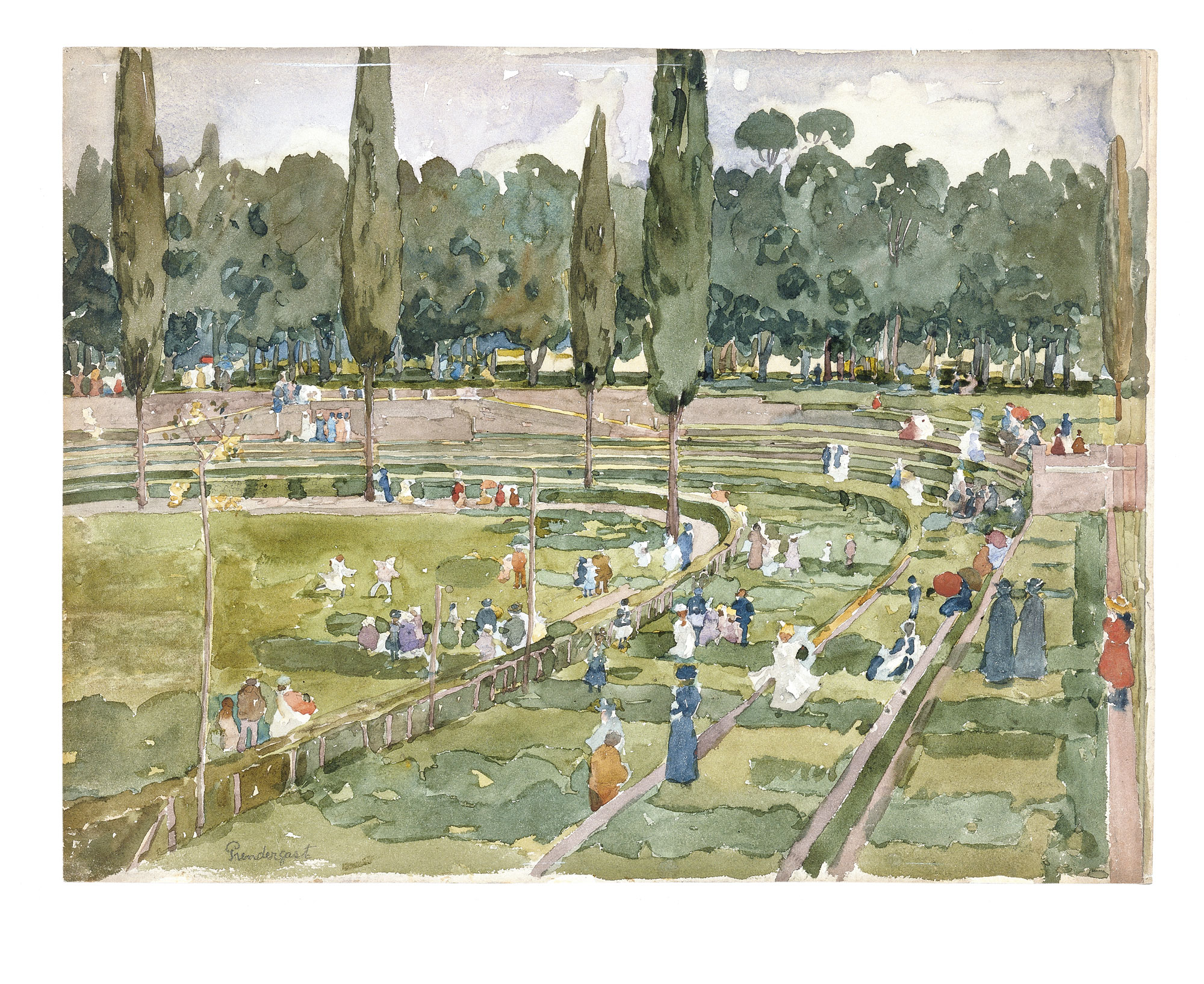
In Spain, the Thyssen Bornemisza Museum has the strongest, biggest collection of American art. (It includes six Homers, four Hoppers, plus works by Church, Cole, O’Keeffe, Still, Sloan, Prendergast (as above) etc. etc.) At least that’s what my art historians have told me (which backs up my own experiences). It has even have the strongest American collection outside of the U.S., period.

I don’t know how De Salvo views her job–looks to me as if she can create it. But I would hope that she helps organize partnerships that sends our works overseas to provide a more complete picture of what American art actually is.

Photo Credits: Courtesy of the Whitney (top) and the Thyssen Bornemisza (bottom)

Something Good To Say About MoMA

MoMAAlz5_photoJasonBrownrigg-300x200You hear so much about museums seeking out young audiences, the audiences of the future. It’s tiresome, actually, and that quest ignores another giant portion of the country’s population–seniors. Seniors make up nearly 15 percent of the U.S. population and that’s nothing to ignore. So I was glad to learn recently of a new program at, of all places, the Museum of Modern Art, which has been a big target of criticism of late, mostly because of the Bjork exhibit and the tear-down of the folk art museum building, but also just in general.

On May 1, MoMA took new aim of its own, in recognition that older audiences are desirable, too. It created a program called “Prime Time” for New Yorkers aged 65 and up. Prime Time, which began with free admission for seniors (plus a “variety of interactive drop-in activities throughout the Museum”) on May 9, will offer “an array of gallery conversations, film screenings, online courses, and more, designed to enhance cultural participation and provide opportunities for older adults to engage with modern and contemporary art.” Seniors will also get 25% off their membership renewals during May. Details are here.

May is, in case you were wondering, “Older Americans Month,” according to the U.S. Department of Health and Human Services. The theme for 2015 is “Get Into the Act.”

MoMA’s “Prime Time” initiative recognizes that museums are social places and it extends its own capacious space to senior for socializing and learning at the same time–a very big need. In all the years I’ve been covering museums, I think only one or two other press releases that I’ve received from museums specifically about senior programs.

So far, alas, MoMA is short on details about the future of this initiative, but we’ll be watching.

Photo Credit: Courtesy of MoMA

Bravo: Even the Whimsy At A Few Museums Is About Art

nb1I love it when that’s so. I was reminded of this at the new Whitney last week. I had been meaning to return to the subject since I visited the New Britain Museum of American Art several weeks ago to review the Otis Kaye exhibition for The Wall Street Journal.

There, the museum seating is not just any seating; it’s a collection of benches bought by the museum from contemporary artists. At the Whitney, as you may have read, the elevators are design by Richard Artschwager (one pictured below, at bottom_.

All of this signals that art is not just an object to hang on a wall, position on a floor or project on a screen. Rather, art nb5can be part–should be part–of everyday life. I praised the Smith College Museum of Art in 2012 for hiring artists to design its bathrooms and mentioned the NBMAA for its seating. But I didn’t have pictures, and now I do.

I’ve pasted them here, along with a couple of the Whitney elevators.

A little apology, though, because in mid-March, I wrote on RCA: “There’s another reason to like the NBMAA (which I’ve both criticized and praised in the past) and I’ll be back with pictures of that reason in the next day or so.”

I apologize–it has been more than a month.

And another apology: although the museum plan lists the artists of the benches, I have misplaced mine and can’t tell who designed these beautiful and varied works.

nb2

NBCollage

W10

First Thoughts On the New Whitney

W7After visiting the new Whitney Museum twice, for a total of about five hours, I’ve come to some tentative conclusions–first and foremost, that it’s a successful building for art, which always be the prime goal of an art museum. I went into this blog’s archives to see what I thought when I first saw the plans–in 2011, at the groundbreaking ceremony. I recall a lot of negativity at the time, but I disagreed:

…I may rue this day, but I’m going out on a limb regarding the architecture: Piano’s design, based on the drawings and sketches I’ve seen, looks pretty good (though that clunky model Piano is holding at right gives me pause) for the display of art. I have disliked many of his more recent museum projects…But the Whitney is looking better. I’m not talking about the outside; this is about how the art will look…

I don’t rue the day. I stand by what I said then. I also said the outside of the building looked pretty clunky in the models–and it does in person, too. Never mind. I care more about the inside, and I couldn’t find a flaw during my two visits. Congratulations to the Whitney.

And that is just the start. Here are more first takes:

  • The gallery spaces are varied, beautiful, flexible, some high-ceilinged (and some not), and absolutely great showcases for art. They are painted white, ink blue, grey and more white–appropriately for the art. More than one person I spoke with made comments along the lines of, “if only MoMA had a building like this.” Indeed.
  • Flow between and among the galleries is excellent; no one is going to wonder which way to go, ask “have I been in this gallery before?” or get lost.
  • The permanent collection installation, America is Hard to See, is dazzling. With about 600 works, it’s not too much–each piece has room to breath. And the installation is well-paced–some galleries showcase just a few works and at the other extreme, there are a few walls hung salon-style.
  • For the most part, the choices are excellent: a mix of the very familiar, the must-haves, the under-appreciated. (I do wonder, however, about the absence of Helen Frankenthaler in particular–her Flood and Orange Mood, both in the collection, are wonderful pictures–and I could quibble with the choice of, say, a gigantic Lee Krasner).
  • There are plenty of power walls. And unexpected walls. Among them are those with two pictures by Edward Hopper; two by Marsden Hartley; two separate walls with five each by Jacob Lawrence; one of 1930s anti-lynching prints; one of woodblocks by Chiura Obata,  and–too many more to mention.
  • There are many more works on view by women and minority artists than is typical in almost any museum you can name, but never once did I feel, “oh, that’s a politically correct choice.” The integration (choice of words intended) works well.
  • So, too, is the mix of painting, sculpture, prints, photographs and new media. It felt natural–and right.
  • The labels were well-written, mostly lacking jargon, and never heavy-handed about themes; that lack of heavy-handedness is true throughout, even when the theme is overtly political.
  • The views from the terraces are spectacular. They contained art, too.

One oddity: it does seem a little funny that an “Introductory Gallery” (pictured at top) containing Robert Henri’s great portrait of Gertrude Vanderbilt Whitney, John Sloan’s Backyards, Greenwich Village, and other works from the Whitney’s early days are downstairs, off the lobby, while the main installation starts on the eighth floor. The gallery is the right size and shape, though–and someone told me that it will be accessible free because of its position. If true, that’s something good. It’s adjacent to Untitled, the restaurant, so perhaps people will wander in to the museum from the restaurant.

While I was there, I told Donna De Salvo, the chief curator, that the installation was so good that the museum should leave it up for year, not take it down beginning in September as planned. She said that at least one other person had told her the same thing. Unfortunately, it has to be dismantled, to make room for two scheduled exhibits. So, I advise, make a real effort to see the Whitney between now and Labor Day.

I’ve posted some gallery shots below:

W4

W1W6W5

W3

W9W10

The Shocking Cooper Hewitt

Many curtain-raisers for and reviews of the newly renovated and reconceived Cooper Hewitt National Design Museum have focused on its use of technology to make the museum interactive, participatory and therefore supposedly of more interest to young generations who are not satisfied with just looking.

One recent Saturday, I finally made it to this new incarnation to see for myself. I didn’t mind the interactive technology. I liked much of it. Some of it was fun to play with. At one station, I designed a lovely outdoor sculpture. I did not get a chance to try the much vaunted pens,  which “enables every visitor to collect objects from around the galleries and create their own designs on interactive tables. At the end of a visit the Pen is returned and all the objects collected or designed by the visitor are accessible online through a unique web address printed on every ticket. These can be shared online and stored for later use in subsequent visits.”

For a reason that was never truly explained to me, the ticket office was not able to print out a ticket for me and I was just waved in, penless.

But, no, it’s the not the technology that’s wrong with this museum.

The new Cooper Hewitt has two huge problems, however. First, the renovation misuses and disrespects its historic building, erected between 1899 and 1902. On the museum’s website, it declares otherwise, saying ” transformation of the Carnegie Mansion into a 21st-century museum respects the spirit and character of the landmark building…restoring key elements to their original grandeur while providing much-needed upgrades to lighting and signage, more flexibility to reduce installation time and better accommodate object handling and above all enhanced public access on every level.”

How does that description square with these photos I took, which place ugly display cases in awkward places and frequently obscures those historic elements?

photo 3

photo 2

CH3

CH4

CH5

First question: does this strike you as good design? It is a design museum, after all. And second, what’s the designers’and managers’ definition of respect?

I’ll deal with the second big problem at the Cooper Hewitt another time.

Photo Credits: © Judith H. Dobrzynski

« Previous Page
Next Page »

Primary Sidebar

About Judith H. Dobrzynski

Now an independent journalist, I've worked as a reporter in the culture and business sections of The New York Times, and been the editor of the Sunday business section and deputy business editor there as well as a senior editor of Business Week and the managing editor of CNBC, the cable TV

About Real Clear Arts

This blog is about culture in America as seen through my lens, which is informed and colored by years of reporting not only on the arts and humanities, but also on business, philanthropy, science, government and other subjects. I may break news, but more likely I will comment, provide

Archives