• Skip to main content
  • Skip to primary sidebar
  • Home
  • About
    • Real Clear Arts
    • Judith H. Dobrzynski
    • Contact
  • ArtsJournal
  • AJBlogs

Real Clear Arts

Judith H. Dobrzynski on Culture

Exhibitions

A Delectable Selection of Native American Art, With Just One Problem

If you read my last post, about thematic exhibition cooperation among museums, you know I was in Santa Fe recently. But why was I in Santa Fe–that’s another story, one that resulted in a review published in The Wall Street Journal last Thursday. It was about an exhibition at the Wheelwright Museum of the American InVest1dian titled Connoisseurship and Good Pie: Ted Coe and Collecting Native Art.

I liked the contents of the exhibition: Coe, educated as an art historian of European art who once worked with the great Sir John Pope-Hennesy, trained his eye by traveling all over the country to see Indian art and visit with native American artists. He collected across all of North America, buying pieces from the 18th century to the 21st century. And he clearly had a good eye to begin with.

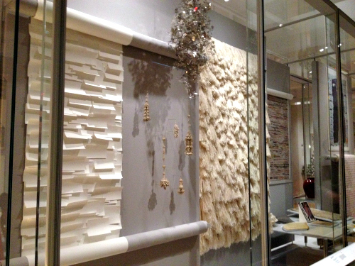
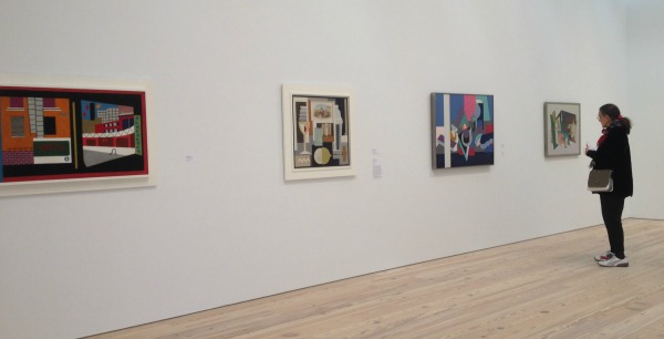
But this is a lesson in display, too. The organizers, including the Ralph T. Coe Foundation and the Wheelwright, didn’t do the material justice. I think the fault lies with both parties. For one, the space (nicely shaped as an eight-sided hogan) is pretty small for 200 objects. That meant there was no room for labels–other than tombstones–for any of the objects, even the very best and most rare objects. So visitors will (I hope) appreciate the aesthetics of the pieces but take away little knowledge about them.

Second, but less troubling, the placement of the art works seemed very arbitrary. After an introduction to Coe, the man, the curators organized the layout around three past exhibition themes, and followed that with a section on Coe’s long-standing friendship with a renowned artist (Joyce Growing Thunder Fogarty) and her family.  The objects, by and large, were not in those exhibitions and themes did not come through.

Pickett-Tail_Mocs
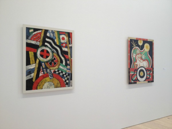
Finally, and this seemed very odd to me though I did not have room to deal with it in my review, that introduction to Coe included specimens he had collected of other so-called native, or primitive, art. So the first things a visitors sees is not the Native American art of the title, but rather art from India, Papua New Guinea, Japan, Ivory Coast, Benin, China, Zaire and the Solomon Islands.

Considering that Native Americans rightly take exception to having their art lumped in with categories that bear no relation, I found it odd that an exhibition devoted to a man that pushed so hard to have Indian art recognized for its aesthetics would start off on such a wrong foot.

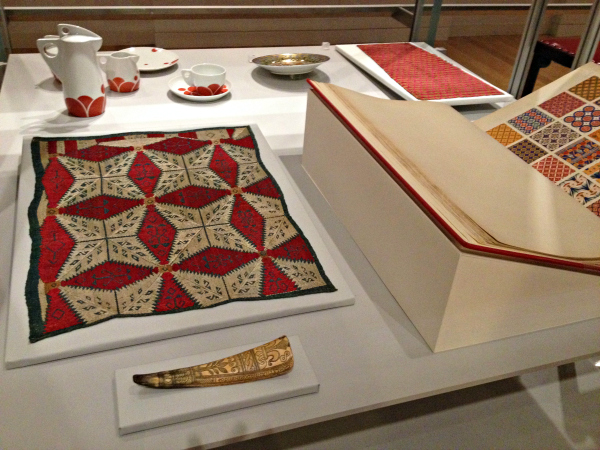
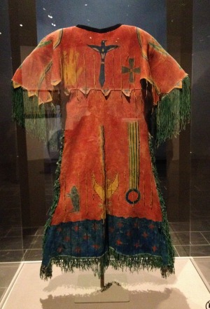
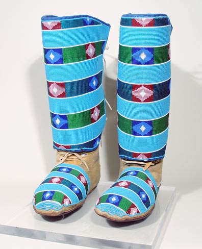
If you are in Santa Fe, my advice is simply to visit the Wheelwright and enjoy the show. Perhaps the two examples–above, an Omaha (attributed) child’s vest (c. 1880), probably intended for a boy chief, and at right, Crow Indian Maggie Pickett–Yellowtail (1894–1956)’s moccasins and leggings (c. 1945).

Here’s link to my review on my website and here’s one to the WSJ version (which I had to shorten).


The Shocking Cooper Hewitt, Part Two

CH1Aside from the maltreatment of its beautiful historic building, which I wrote about here nearly three weeks ago, something else is deeply wrong with the new incarnation of the Cooper Hewitt National Design Museum: the display and the contextualization of the objects in the displays simply don’t measure up to minimal standards. To be sure, visually they are often attractive. But frequently they are very dumbed down, witless and perhaps even misleading.

I think the museum’s leadership meant well; I really do. But I think they misjudged their task and perhaps their CH4audience. As last time, when I posted pictures of current displays within the historic rooms, I will let you judge for yourself.

Here are four wall labels (apologies for the tilted pictures–I shot them with my phone and sometimes it was difficult, given the other people in the galleries, to stand in place where I could get a direct shot) about elements of design. They set the scene for displays on the second floor.

They are not in the order in which the galleries proceed–but then again, the galleries can be entered, as I recall, from at least two points, so I don’t think the labels were necessarily intended to be read sequentially.

CH3The displays themselves are a jumble; the objects are not arranged
chronologically or relationally. I am guessing that the objects in the cases were chosen simply to illustrate a theme–to show many objects that have, for example, patterns. It’s all very simple.

For evidence of these simple thematic displays you can see the pictures at the bottom of this post.

I know museums of all stripes are dealing with visitors, particularly younger visitors, whose education is substandard. Many, many public schools–and some private ones, I’d bet–have meager offerings in art or design.

CH2But the definitions I’ve posted here don’t provide much enlightenment. Is “a vocabulary of repetition, reflection and rotation” a clear definition of “Pattern” or is it jargon? And btw, designers do not “create an infinite variety of patterns”–they merely have the potential to do so.

You, dear reader, can find your own examples of imprecise or misleading language in these labels.

As for the themes on view, yes, you can see texture–or pattern, line, etc.–in some displays. But what else do you learn when a 1604 engraved English shoehorn is placed near an 1886 book of patterns open to an “Egyptian” page? Or a 2007 poster hung next to an 18th century Greek cushion cover? I don’t know.

CHM2CHM3CHM5CHM1CHM7

First Thoughts On the New Whitney

W7After visiting the new Whitney Museum twice, for a total of about five hours, I’ve come to some tentative conclusions–first and foremost, that it’s a successful building for art, which always be the prime goal of an art museum. I went into this blog’s archives to see what I thought when I first saw the plans–in 2011, at the groundbreaking ceremony. I recall a lot of negativity at the time, but I disagreed:

…I may rue this day, but I’m going out on a limb regarding the architecture: Piano’s design, based on the drawings and sketches I’ve seen, looks pretty good (though that clunky model Piano is holding at right gives me pause) for the display of art. I have disliked many of his more recent museum projects…But the Whitney is looking better. I’m not talking about the outside; this is about how the art will look…

I don’t rue the day. I stand by what I said then. I also said the outside of the building looked pretty clunky in the models–and it does in person, too. Never mind. I care more about the inside, and I couldn’t find a flaw during my two visits. Congratulations to the Whitney.

And that is just the start. Here are more first takes:

  • The gallery spaces are varied, beautiful, flexible, some high-ceilinged (and some not), and absolutely great showcases for art. They are painted white, ink blue, grey and more white–appropriately for the art. More than one person I spoke with made comments along the lines of, “if only MoMA had a building like this.” Indeed.
  • Flow between and among the galleries is excellent; no one is going to wonder which way to go, ask “have I been in this gallery before?” or get lost.
  • The permanent collection installation, America is Hard to See, is dazzling. With about 600 works, it’s not too much–each piece has room to breath. And the installation is well-paced–some galleries showcase just a few works and at the other extreme, there are a few walls hung salon-style.
  • For the most part, the choices are excellent: a mix of the very familiar, the must-haves, the under-appreciated. (I do wonder, however, about the absence of Helen Frankenthaler in particular–her Flood and Orange Mood, both in the collection, are wonderful pictures–and I could quibble with the choice of, say, a gigantic Lee Krasner).
  • There are plenty of power walls. And unexpected walls. Among them are those with two pictures by Edward Hopper; two by Marsden Hartley; two separate walls with five each by Jacob Lawrence; one of 1930s anti-lynching prints; one of woodblocks by Chiura Obata,  and–too many more to mention.
  • There are many more works on view by women and minority artists than is typical in almost any museum you can name, but never once did I feel, “oh, that’s a politically correct choice.” The integration (choice of words intended) works well.
  • So, too, is the mix of painting, sculpture, prints, photographs and new media. It felt natural–and right.
  • The labels were well-written, mostly lacking jargon, and never heavy-handed about themes; that lack of heavy-handedness is true throughout, even when the theme is overtly political.
  • The views from the terraces are spectacular. They contained art, too.

One oddity: it does seem a little funny that an “Introductory Gallery” (pictured at top) containing Robert Henri’s great portrait of Gertrude Vanderbilt Whitney, John Sloan’s Backyards, Greenwich Village, and other works from the Whitney’s early days are downstairs, off the lobby, while the main installation starts on the eighth floor. The gallery is the right size and shape, though–and someone told me that it will be accessible free because of its position. If true, that’s something good. It’s adjacent to Untitled, the restaurant, so perhaps people will wander in to the museum from the restaurant.

While I was there, I told Donna De Salvo, the chief curator, that the installation was so good that the museum should leave it up for year, not take it down beginning in September as planned. She said that at least one other person had told her the same thing. Unfortunately, it has to be dismantled, to make room for two scheduled exhibits. So, I advise, make a real effort to see the Whitney between now and Labor Day.

I’ve posted some gallery shots below:

W4

W1W6W5

W3

W9W10

International Pop, World Pop, And Don’t Forget German Pop

In today’s Arts & Leisure section of The New York Times,  the Walker Art Center’s new International Pop exhibit gets a good curtain-raiser. Randy Kennedy makes its case “not only that Pop was sprouting in countless homegrown versions around the world but also that the term itself has become too narrow to encompass the revolution in thinking it represented for a generation of artists.” Pop was not, in other words, just an American invention with “a British offshoot.”

world-goes-popAnd this is the year, it seems, for that subject–the article also mentions the Tate’s upcoming exhibit, The World Goes Pop, which opens in September. Self-described by the museum, it is:

a groundbreaking exhibition revealing how artists around the world engaged with the spirit of Pop, from Latin America to Asia, and from Europe to the Middle East. At Tate Modern from17 September 2015, the show will explode the traditional story of Pop art and show how different cultures contributed, re-thought and responded to the movement. Around 200 works from the 1960s and 1970s will be brought together, including many which have never been exhibited in the UK before.

Someone, I hope, will review them both–as they were curated separately–to see the differences in, well, taste, and storyline. They share some artists, surely, such as Ushio Shinohara, whose Doll Festival is shown above, from the Tate show. You can see an excellent slide show drawn from the Walker’s view on the Times site.

Let me add one more “international” Pop exhibition that, in fact, began last November and closed in February.  (Because of its premise, I had it in mind to mention it here months ago, but let it slip.) Schirn Kunstalle Frankfurt presented German Pop, billed as:

In Great Britain and the United States, the 1960s brought forth a cultural movement that would have an impact worldwide [and] … universal claim to popularity…Artists such as Christa Dichgans, Sigmar Polke, Manfred Kuttner, Konrad Klapheck, and Peter Roehr developed a specifically West German version of Pop Art that went beyond mere “coca-colonization.” They examined the banalities of everyday life in Germany, ironizing its narrow-minded tastes and typically German “gemütlichkeit.” As a kind of archeological investigation of the 1960s and early 1970s, the exhibition at the SCHIRN will take a closer look at the artistic activities that constituted “German Pop.” Broadening the focus to encompass far more than just the chief protagonists, it will surprise the visitors with many a new (re-)discovery. The Pop principle will here be revisited with an eye to the new realistic art production situated in a realm between entertainment and mass culture, and light will be shed on West German Pop as an expression of dissociation from a no-longer-unencumbered middle-class aesthetic.

The Frankfurt show also shares some artists with the Walker’s, such as Thomas Bayrle, and probably with the Tate’s too, though I don’t have a checklist.

So pop is in the air at museums, and also avidly desired by collectors these days. One wonders which game first.

Photo Credit: Courtesy of the Tate

A Giant Step Forward At The Met

ghost danceWhen I visited The Plains Indians: Artists of Earth and Sky at the Metropolitan Museum on Saturday afternoon, I was prepared to be delighted–and I was, in more ways than one.

The Nelson-Atkins Museum, which co-curated the show with the Musee du Quai Branly in Paris, had primed me for how beautiful it was going to be, sending along the catalogue as evidence when the show opened in Kansas City last fall. At the Met, the exhibit lived up to my great expectations.

So many of these objects are stunningly beautiful.

But from the very first one in the Met’s installation, I noticed that something was different about this exhibit. For what I think is the first time in the museum’s history, the Met has labeled these works as by artists, rather that using what has become tradition in most art museum for Native American works–merely identifying the tribe from which the object comes.

ghost dance labelSo when you see the “ghost dance dress” at the top of this post, you will see in the label I have posted below that it was made by “Southern Arapaho artists” in Oklahoma. No, we do not know their names, but identifying the piece as by artists acknowledges it as a work of art, rather than an enthographic piece.

You may recall that I wrote a Page One Arts & Leisure section article about this for The New York Times in 2011, when the Denver Art Museum was leading the way.

The nut paragraph said:

Art museums have collected American Indian objects for decades, but, like natural history and anthropology museums, they have tended to treat them as ethnographic pieces, illustrative of a culture. Wall labels have generally steered clear even of the “anonymous” designation commonly used for Western artworks of unknown authorship and in cases where Indian artists left signature marks — as Chilkat weavers of the Pacific Northwest long have, for example — this evidence has often been ignored.

Later, the article read:

“Recognizing that Native American art was made by individuals, not tribes, and labeling it accordingly, is a practice that is long overdue,” said Dan L. Monroe, executive director of the Peabody Essex Museum in Salem, Mass., which has a large Indian collection and has made some attempts to identify individual artists since the mid-1990s.

MetNAPermAnd, explaining how Bill Holm, a pioneer in trying to identify the hand that created many anonymous Native American works was thinking about the problem:

Just as the creator of an altarpiece in the Uffizi Gallery in Florence is called the “Saint Cecilia Master,” the maker of a 19th-century Haida chief’s beautifully carved chair in the Field Museum in Chicago is the “Master of the Chicago Settee.”

In my 2011 article, I reported that many museums were not updating their collections to reflect this new trend because it costs a lot to make and install new labels. So, on Saturday, I went downstairs at the Met to see what was happening in its Native American galleries.

No change: In the case of wonderful items I show at right, five carry tribe labels–Arakara, Crow, Yangton, Teton and Brule Sioux. Only the tobacco bag is attributed to an artist, Joyce Growing Thunder Fogarty–and that is because it’s modern, dating to 1977, and we actually know the name of the maker.

And that, as I wrote, maybe a matter of costs.

MetNAPermLabelStill, I was so pleased with the Plains exhibit and the new labeling that when I ran into a friend that day at the Met, I told her about it. Her immediate response, which she walked back after I explained my enthusiasm for the change, was “political correctness.”

I don’t agree. I often call out political correctness when I see it (cf. the last two paragraphs here). To me, this is about recognizing something as an object worthy of being in an art museum, as an individual object of artistry by an artist or artisan, and not as a representation of a culture, just as Dan Monroe said above.

Here are links to my previous posts on this subject, here, here and here.

I know some people do not think that Native American utilitarian objects, such as the ghost dance dress or a shirt are art–largely because they are utilitarian. I do not want this post to start that argument again–no one will profit from restating positions that have been stated so many times before, to no avail. Let’s agree to disagree.

Photo Credits:  © Judith H. Dobrzynski


« Previous Page
Next Page »

Primary Sidebar

About Judith H. Dobrzynski

Now an independent journalist, I've worked as a reporter in the culture and business sections of The New York Times, and been the editor of the Sunday business section and deputy business editor there as well as a senior editor of Business Week and the managing editor of CNBC, the cable TV

About Real Clear Arts

This blog is about culture in America as seen through my lens, which is informed and colored by years of reporting not only on the arts and humanities, but also on business, philanthropy, science, government and other subjects. I may break news, but more likely I will comment, provide

Archives