• Skip to main content
  • Skip to primary sidebar
  • Home
  • About
    • Real Clear Arts
    • Judith H. Dobrzynski
    • Contact
  • ArtsJournal
  • AJBlogs

Real Clear Arts

Judith H. Dobrzynski on Culture

Exhibitions

“We All Paint in Delacroix’s Language”

Paul Cezanne said that. He also said that Delacroix’s palette was “the most beautiful” in France.

eugene-delacroix-leon-riesenerThat headline is the end of a short video made by the National Gallery in London; that sentence is the pitch to it. Delacroix and the Rise of Modern Art is currently on view at the NG, and one aspect of Delacroix’s impact on other artists and modern art stems from his theories on color.

So the NG asked Professor Paul Smith to made a video and explores Delacroix’s theories on color and how his approach had a profound influence on the artists associated with the rise of modern art. You can see it here.

It’s a good, no-frills video and I wonder if it would resonate here in the U.S. Yet I found it, and other NG videos to be more informative than some here in the U.S. Here, for example, is the introduction to the exhibition and here’s a “tour” of it.

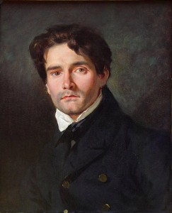
That’s Delacroix in a portrait by Léon Riesener at right.


Expanding Our Art Horizons

GuanabaraBayIn recent years, some museums have begun a push to build their collections in Latin American art and to show more of it in special exhibitions, too. Much of the emphasis has been on modern and contemporary works and/or Spanish Colonial works.

That’s why I was pleased to learn about and exhibition that goes, shall we say, in another direction–that is, pictures of the land, from the Artic to the southern tip of South America; paintings by 19th and early 20th century artists.

Organized by the Pinacoteca do Estado de São Paulo, the Art Gallery of Ontario and the Terra Foundation for American Art, Picturing the Americas, is currently on view at Crystal Bridges Museum in Bentonville, AR.  I recently visited it for The Wall Street Journal, which published my review in today’s paper under the headline Mapping Beauty Across the Americas.

Here’s an important thing to know about the show:

From its start, this exhibition indicates that it intends to illustrate how artists used landscapes to make statements, rather than how they created them or their relative artistic merits. The works—more than 100 paintings and works on paper from the 19th through the early 20th centuries—are presented as tools that forged or reinforced opinion about nationhood, cultural identity and the environment, natural and (later) built. They may be aesthetically pleasing, but they all contain messages, overt or subliminal.

Nothing wrong with that, of course.

And if the aim of an exhibition is to teach something, and not just please the eye or evoke emotion, then Picturing the Americas succeeds.  The works include many by artists that are not at all known in this country–yet should be. That’s Felix Emile Taunay’s “Guanabara Bay Seen From Snake Island”(1828) posted about.

Not every artist in the show is terrific, but… that’s no criterion for looking at their work, especially, as the above paragraph indicates, the works also served another function.

This is the exhibition’s only showing in the United States, and it comes down on Jan. 18.

Photo Credit: Courtesy of Crystal Bridges Museum

Unveiling Hammershoi, A Worthy Exhibition

view-of-jaegersborg-alle-hammershoi-art1115While I was away–I traveled to Jordan from Oct. 31 to Nov. 12, more about which another time–a lot happened in the art world, including the New York fall auction season. But before I go there, I want to share my review of an excellent exhibition at Scandinavia House in NYC. The show is titled Painting Tranquility: Masterworks by Vilhelm Hammershøi from SMK– The National Gallery of Denmark.  My review, published in The Wall Street Journal on Nov. 3, was headlined Mysteries of a Danish Painter in the print edition.

Hammershoi, as I wrote, was all about light and line, and:

Though he was clearly inspired by Dutch Golden Age artists—he has been called the Danish Vermeer—his works are quite different. With meticulous brush strokes, Hammershøi constructed atmosphere, ambiance, enigma, rather than real scenes or situations.

He’s probably not everyone’s painter, but I find Hammershoi easy to like. He makes most viewers think, wonder. I remember going to the monographic show of his work at the Guggenheim museum in 1998, and being intrigued. But his work is not well represented in American museums, at least the ones I frequent. Only occasionally have I seen a work of his for sale at auctions.

Interestingly, this show came about because the National Gallery of Denmark had planned a renovation. The timetable slowed down, and that won’t happen until next year, but the SMK honorably kept its lending promise.

Above is one of his small landscapes and below is one of his great interiors, both on view at Scandinavia House, which provided the pictures. Go, if you can.

VH-Interior

Denver’s Long-running And Contemporary Commitment to Native American Art

As I’ve mentioned here before, the Denver Art Museum has a long historical record of paying attention to Native American art and valuing it for aesthetic rather ethnographic reasons. That’s a big plus for me because it gives museum a specialty that cannot be seen at every museum–and differentiation among museums is a big attribute. But I’m not so sure that the DAM has been recognized for its efforts in contemporary Native American Art, which goes hand-in-hand with the historical collection.

3 - Indian and Rhinoceros (2)And that’s why I proposed an article on this to The New York Times; it will run in the Fine Arts & Exhibitions section to be published on Sunday. But, as is custom nowadays, some articles are being posted in advance online. My piece, headlined Denver Art Museum Strengthens Commitment to Native American Work on the web (the print headline will be different),  is there now. It outlines the museum’s programs–which include artists-in-residences, acquisitions and a lot of gallery space for this work. Here’s the nut:

At a time when many Native American artists still hold grievances against mainstream art museums, the Denver museum is proving itself to be different, winning favor from many, but not all, Indian artists and curators….

…“Our collection’s approach is to expand the recognition of contemporary art by American Indian artists; engage local, regional and national American Indian artists; and highlight the artistic mastery from the past,” said Christoph Heinrich, the museum’s director, “but always with an eye on ongoing creative tradition.”

The piece is pegged to a current exhibition, Super Indian: Fritz Scholder, 1967-1980, which will travel to the Phoenix Art Museum and to the Nerman Museum of Contemporary Art in Overland Park, Kansas. I didn’t love Scholder’s work on first sight, but it’s growing on me. Aside from this show, which I have seen only in jpegs and and in the catalog, I saw paintings by Scholder “in the flesh” on my recent trip to Santa Fe, in both the Museum of Contemporary Native Arts and the New Mexico Museum of Art. I did not have room to mention the museum’s recent acquisitions in this area, which include 25 Hopi and Navajo katsina figures, four Micmac quilled boxes (1825-1975), 12 contemporary ceramic works and a 2012 ink and tissue collage on paper by artist Rose B. Simpson (Santa Clara, b. 1983) titled Transparency Self Portrait. Nor did I mention that I’m not the only one who has been paying attention to these efforts at the DAM: Last year, First Tribal Lending, a subsidized loan agency for Indians, named the museum among the top five Native American museums—the only one not specifically an Indian or Western museum. And CNN Travel also listed it as the only general institution among the “best places to experience Native American culture.”
The Times has posted several good photos on the link above and I’ve put a few more on my website; above is Scholder’s Indian and Rhinoceros.

Photo Credit: Courtesy of the Denver Art Museum

A Good Show Spoiled

self-portrait-with-necklace-of-thornsWith the weather in New York still fine–and warmish–on Saturday, I ventured up to the New York Botanical Garden for FRIDA: Art, Garden, Life, one of the Garden’s hybrid exhibitions that combines plants and paintings. This one, much like the Garden’s 2012 exhibition titled Monet’s Garden, offers about a dozen works of art, exhibited in the library building. Many more specimens of the plants Kahlo grew at her home, Casa Azul, on the outskirts of Mexico City, are there in the Garden’s Conservatory. The show went on view on May 16 and remains there until Nov. 1.

The art star of the show is Self-Portrait with Thorn Necklace and Hummingbird, painted in 1940, perhaps followed by her portrait of Luther Burbank and a couple of still lifes. The stars of the gardens are too many to mention. Another nice touch: a desk of Kahlo’s paints and brushes.

I like these exhibitions, in part because gardens attract a different, if overlapping, crowd than art museums. Plus, the exhibits are small enough in the art category not to threaten museums. The NYBG clearly has no cards to play in the sense of being able to lend paintings, so it borrowings depend on good will.

But the show was spoiled by, of all things, the stanchions. The Garden’s gallery has, in part, insets along the walls and the stanchions sit on the edge of the inset. I could not see the drawings in one inset. They were, say, three feet away. Drawings are meant to be viewed closely. Maybe others could see them (the galleries were, of course, dim), but I couldn’t. I simply moved on.

The NYBG is far from the only place that ruins art experiences with aggressive stanchioning. Many museums erect these barriers. Sometimes, at a special loan exhibition, you can identify the ones that insist on stanchions.

I’ve asked many museum directors and curators about this, and I’ve been told that formulate their own policies for stanchions. Some have said that insurance companies sometimes require them–which doesn’t make much sense, because then why don’t all museums have to use them? At the Met, I was told recently by a high-ranking official, whether or not to use stanchions is the call of the department head.

I can hear you saying, they’re for safety–to protect the art. But haven’t we seen people fall over the stanchions and into the art? With few exceptions, perhaps where the art work is so popular that crowds are unmanageable, I can understand their use. But I wish museums would think a little harder about the barriers to looking that they create. And banish them.

A few pictures of them, followed by more NYBG pictures from Kahlo.

Kimbell1

Kimbell2

Met1

MetCara

MetCara3

MetCara2

Met4

I could keep going, but let’s go back to the NYBG:

photo 1

photo 2

« Previous Page
Next Page »

Primary Sidebar

About Judith H. Dobrzynski

Now an independent journalist, I've worked as a reporter in the culture and business sections of The New York Times, and been the editor of the Sunday business section and deputy business editor there as well as a senior editor of Business Week and the managing editor of CNBC, the cable TV

About Real Clear Arts

This blog is about culture in America as seen through my lens, which is informed and colored by years of reporting not only on the arts and humanities, but also on business, philanthropy, science, government and other subjects. I may break news, but more likely I will comment, provide

Archives