• Skip to main content
  • Skip to primary sidebar
  • Home
  • About
    • Real Clear Arts
    • Judith H. Dobrzynski
    • Contact
  • ArtsJournal
  • AJBlogs

Real Clear Arts

Judith H. Dobrzynski on Culture

Exhibitions

U.S. As Boiling Pot: “America After the Fall”

Think about American art in the 1930s. Does anything come to mind? Maybe the Regionalism of Thomas Hart Benton and Grant Wood. But there was so much more to the decade than that. For one thing, art was “subsidized” via the Works Progress Administration in the second half of the decade, probably creating a bigger volume and more artists than usual. These years were a hotpot of creativity in many modes, like social realism, surrealism and other modernist styles.

RoustaboutsYet this is an understudied and underexposed period. America After the Fall: Painting in the 1930s at the Art Institute of Chicago does some way toward redressing this, as I learned when I visited the exhibition earlier this month. I reviewed it, positively, in today’s Wall Street Journal, where my piece is headlined Bullish on Creativity. I’m sorry I didn’t get to Chicago sooner, because the exhibit runs only until Sept. 18. Then–another good sign for American art appreciation–it moves to L’Orangerie in Paris and then to the Royal Academy in London. It will be the first time, curator Judith Barter tells me, that Wood’s American Gothic leaves these shores.

I won’t summ up the exhibition for you; let me just set the stage and quote from the catalogue. Even as citizens’ faith in America was shaken, American artists strove to develop a national art.

The result was artistic sparring throughout the 1930s between those who wanted an American art based on realism and those who felt that abstraction was a universal language that pushed beyond nationalism. Many artists sought a new realist aesthetic language aimed at the people; others tried to express the inner world of dreams and imagination. Some used their work for social protest and to address politics; still others tried to create new forms of art and politics that could repair a democracy damaged by economic chaos.

self-portrait-LundebergIt must have been hard, then, for Barter to choose just 50 works of art. This show could have sprawled in an attempt to show everything. But I am so glad she did have the discipline to pick only what she thought was best. Not everything is to my taste, but the quality is very high–even though some works were pulled from museums’ storerooms.

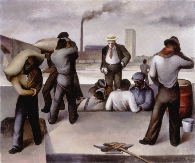
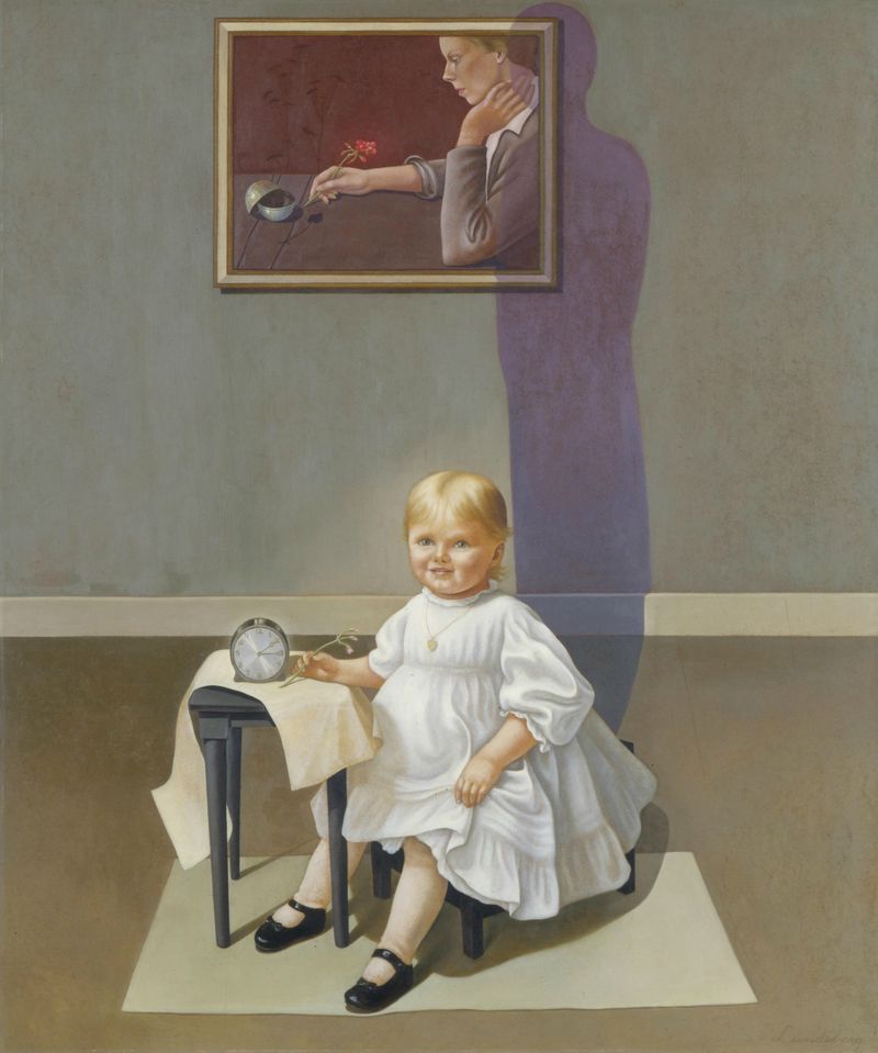
If you click on the WSJ link, you can see Aaron Douglas’s Aspiration. So let me post two works that are not well known, but which I liked a lot. Up top is Joe Jones’s Roustabouts, from 1934, and below is Helen Lundeberg’s Double Portrait of the Artist in Time, from 1935.

I can think of only one flaw, but I can’t attribute it to the curator, as I didn’t ask: There is music playing in the galleries. Woody Guthrie, for example. I like music; I like Guthrie. But I found it to be distracting and tried to blot it out. Let’s not have this mini-trend spread.


Rewind: Another Look at William Merritt Chase

1895_1_lDo we need to become reacquainted with William Merritt Chase? I’m afraid we do. Many people I come across know him as an Impressionist, though he was the last of The Ten to be admitted to the group, or as that painter of fish, because he believed that anything could be made beautiful on canvas and chose fish as one way to prove it.

But that’s all and that’s why I traveled to Washington several weeks ago to see William Merritt Chase: A Modern Master at the Phillips Collection (take a look at several images at that link; I’ve posted two others here). I liked it very much (kudos to curators Elsa Smithgall at the Phillips, Erica Hirshler at the MFA-Boston, Katherine Bourguignon at the Terra Foundation for American Art and Giovanna Ginex an independent curator working for the Fondazione Musei Civici di Venezia) and my review was published in today’s Wall Street Journal.

In the late 19th Century, the catalogue asserts, Case was, “next to Whistler, one of the most important personalities in American art.” Then he faded, as artists do, eclipsed by modernism. This exhibition, which will travel to the MFA in Boston after leaving Washington in September and then on to Venice, where Chase spent some time, is designed to bring him back.

chase_william_merrittWhen he died in 1916, The New York Times wrote an editorial–he was that big. After noting that he was appreciated by his own generation, the editorial went on to say that “the final estimate of his work” had yet to be determined, though undoubtedly it would be “high.” At the time, he was already viewed as an eclectic who could do many things well. His talent and industry had worked against him.

Carroll Beckwith, his friend, wrote in the next day (NYT-ChaseBeckwithLtr) to confirm his greatness. He concluded, “I predict that his works will grow greatly in value as I see few among us who will be able to take up the brush where he has laid it down.” When Chase died, the Metropolitan Museum of Art held a memorial exhibition of his paintings.

Today, Chase should be better known, I think. Here are a few quotes from the catalogue to remind us why:

…Chase was, and remains, the archetypal cosmopolitan artist, painting contemporary American life as lived by the growing leisure class in America in the late nineteenth century—and certainly the most New York City–centric artist of his day. In an address to the National Arts Club in 1910, he regretted that so many American painters chose to work abroad rather than in America, where he felt they were most needed.

…Chase believed that the artist’s job was simply to take the commonplace and make it interesting and beautiful—whether it be a pile of onions, a city park, or a sand dune.

“A wall should be treated as a canvas is,” he once said. “Real objects take the place of colors.” He imparted this sensibility to his paintings.

His work never wavered from its ties to the real world, even as it was being eclipsed by the developing currents of abstract art in the early twentieth century.

While was at the Phillips Collection–concurrent with a members’ preview–I stopped at a station the Phillips was using to better “engage” visitors. The museum had left postcards, each picturing a Chase painting, for visitors to record what they saw, thought, heard, etc. when they looked. If this encourages people to look more closely, I’m all for it. Here are copies of a few cards.

2016_08_08_12_46_540001

2016_08_08_12_47_580001

2016_08_08_12_48_290001


Courtesy of The Phillips Collection (bottom three)

An Exhibition Not to Be Missed, And One I’m Glad Is Over

ur-nammaIn New York, I visited several special exhibitions this past week. Let me mention two here.

The first, Founding Figures: Copper Sculpture from Ancient Mesopotamia, ca. 3300–2000 B.C., is at the Morgan Library and Museum until Aug. 21. Don’t miss it, if you live nearby. Lucky for me, I had a tour of it from the curator, Sidney Babcock, but this small show in the Morgan’s cube gallery has real appeal to anyone interested in ancient art and the development of art, period.

It’s hard to get attention for small shows in New York, and this one did not receive the reviews or media coverage it deserved. It’s built around a figure of King Ur-Nama, ca. 2112–2094 B.C., that was purchased by Morgan (detail at left, but if you go to the link above, you can see not just the whole figure but a rotating picture of him) and borrows some works of the period from the Metropolitan Museum and other lenders, including a couple private collectors who are unlikely to lend these pieces again anytime soon.

IMG_5784-Just ten little works, including a couple of cylinder seals, can make a big impression. I’m posting two pictures of two of the other figures.

The first, at right, dates to 3300 to 3100 B.C. and is thought to be a male priest. It’s one of the oldest surviving cast-copper sculptures from Mesopotamia. Just look at the muscular chest, the asymetrical posture and, if you can see it, the foot tucked under his body.

Below him is a man balancing a box on his head, dated c. 2900 – 2600 B.C. He is traveling down a ramp, perhaps, and you can just see him trying to maintain his balance and his erect posture.

The exhibit I’m glad is gone is Martin Creed: The Back Door at the Park Avenue Armory. I had seen one of his balloon works, at the Cleveland Museum of Art, some years back, and I know he won the Turner Prize. I wanted to see more for myself, especially since this show won loads of publicity. ARTNews wrote of it, “against all odds, his deadpan Duchampian strategies spill over into profundity.” The magazine called him triumphant.

IMG_5790-I’ll say. The exhibition, despite positive reviews, is one of the worst I’ve ever seen.  Trying to explain it, The New York Times said:

…viewers will encounter films of people vomiting and of people defecating, along with a piano that opens and slams shut, an array of metronomes ticking at different speeds, and a room whose lights go on and off at one-second intervals. All are outpourings from Mr. Creed’s psyche, a delicate but highly tuned instrument beset by odd compulsions and Freudian obsessions.

The Armory gave him its entire first floor, including the historic rooms.

But what a disappointment. I didn’t find any of the many parts moving, or exhilarating, or even entertaining. I found it to be provocative without originality (a video of a penis and another of a female breast?) and, far from “compelling,” to quote Nicholas Serota, I found it tedious.

In the NYT article, Creed said: “I feel bad to say I’m an artist, because I don’t really know what art is…I would say I’m a person who tries to do things and work in a field that is commonly known as art. I try and do things because I find life is difficult and I want to make it better. More bearable.”

I agree with the first half of that quote, but I find the second half hard to believe.


Diane Arbus, The Met and “The Envelope”

BreuerArbus2Maybe it was the heat, or the humidity. Maybe it was the artist–Diane Arbus, and the fact that diane arbus: in the beginning is focused on her eaerly works, with more than two-thirds of the works on view never before shown.

Whatever the reason, the Met Breuer* was packed when I visited on Sunday afternoon. To all those reasons above, add another one for me: I wanted to see the exhibition design, which is unusual if not unique. It’s the work of  Brian Butterfield, a Senior Exhibition Designer at the Met since 2014. Seems to me that he was a very good hire. He also designed Kongo: Power and Majesty, also a beautiful installation.

The Arbus show is a forest of free-standing pillars, each one mounted with one photograph on each side (see photos). This eliminates the all-over-gray, this-looks-boring effect of an exhibition of small, black-amd-white photos, which these are. People can wander through, stopping where they like–there’s no particular preferred order. There’s no beginning, middle, end. I liked it.

BreuerArbus-studyI liked it for another reason, too: As museums attempt to draw new audiences, some have changed the context of art in a way that takes away, instead of enhances, the art. This design doesn’t do that. You know what you are there to see, to focus on. Some art folks I know have asked me why I and other critics remark on “the envelope,” when it’s what’s inside that counts. But the envelope is not neutral. It creates an atmosphere, needless to say. It should never distract, and the very successful, to me, Arbus design doesn’t.

It was interesting to note two other things: the room set aside for perusing the Arbus catalogue was completely full. Also, Unfinished, the inaugural special exhibition that has not fared well with critics or the public, wasn’t empty, but wasn’t quite a full as Arbus either. (For me, any opportunity to see that van Eyck, Leonardo, some Turners, Rembrandts, etc. so close at hand is a big bonus.)

I was reminded of this issue in another artistic discipline on Monday night, when I attended IlluminatedHeart816“The Illuminated Heart” at Lincoln Center’s Mostly Mozart festival. The concert showcased wonderful singers performing Mozart arias, one after another, on stage, with no set changes. The “envelope” here was designed by British director Netia Jones–and brilliantly. She used video projections (all simple and many gorgeous) to enhance the music, never distracting from it (a rendering, above). They were humorous at times, and always appropriate.

Both pieces offer a lesson, an example, to other museums and other arts organizations.

*I consult to a foundation that supports the Met.


Is This A Portrait If I Say So? A Gutsy Exhibition

But enough about the Met, for the time being at least. Let’s let a little dust settle there. Can we talk about art for a day?

ThisIsAPortraitSpecifically, I want to commend the Bowdoin College Museum of Art for its current exhibition, This Is a Portrait If I Say So: Identity in American Art, 1912 to Today, which I’ve reviewed in tomorrow’s Wall Street Journal. It is billed as “more than 60 abstract, symbolic, and conceptual portraits across a wide range of media–reexamining over a century of portraiture and inspiring new ways to see ourselves and others.” The exhibition may be introduced with splashy red walls, but the labels–many of those for individual works run to more than 200 words–use words like “non-mimetic.” This is not for low-brows.

Given the push for crowd-pleasing exhibitions these days, it was a gutsy show to present. True, college museums are in better position to resist the pressure to present dumbed-down shows, but they are not immune to trends.

It was also a bit risky because, as I write in my review, much of the art in the show is not visually attractive, though it may be interesting. The intellectual content of some works is high, while others are humorous and some are even (to me) pranks. They employ symbols, everyday objects, typography and–later in the show–a lot of technology. Many, as Anne Goodyear, the co-curator who is also co-director of the Bowdoin Museum, told me, are “friendly representations, or teasing ones…done in the spirit of fun and friendship.”

Green-GreyAbstractionThe roster of artists in the show is impressive. They include Duchamp, Man Ray, Picabia. Eleanor Antin, O’Keeffe, Dine, Yoko Ono, Ross Bleckner, Roni Horn–the list goes on.

Specifically, you can see Marden Hartley’s Portrait of his German lover, Karl von Freyburg, and Antin’s Carolee Schneemann, which consists of jar of honey, a velvet-draped easel and a full-length mirror, and Rirkrit Tiravanija’s Untitled 2008-2011 (the Map of the Land of Feeling I-III), a set of three mixed media scrolls that capture his movements around the world via his passport pages. Tom Friedman’s “Untitled” looks like an abstract color field painting—horizontal stripes—but is actually a rearrangement of the pixels in a digital portrait of himself. With nothing conventionally identifiable, the work mysteriously seems to be the opposite of a portrait. And is O’Keeffe’s Green-Grey Abstraction (right) a portrait, and of whom?

There is a problem for the casual visitor: To assess the success of some works, you have to know something about them and art-world networks. Or you have to be willing to learn. To get the most of out this exhibition, you have to work a little. But you will learn.

Photo Credit: Courtesy of the Bowdoin College Museum of Art  


« Previous Page
Next Page »

Primary Sidebar

About Judith H. Dobrzynski

Now an independent journalist, I've worked as a reporter in the culture and business sections of The New York Times, and been the editor of the Sunday business section and deputy business editor there as well as a senior editor of Business Week and the managing editor of CNBC, the cable TV

About Real Clear Arts

This blog is about culture in America as seen through my lens, which is informed and colored by years of reporting not only on the arts and humanities, but also on business, philanthropy, science, government and other subjects. I may break news, but more likely I will comment, provide

Archives