
 Maybe it was the heat, or the humidity. Maybe it was the artist–Diane Arbus, and the fact that diane arbus: in the beginning is focused on her eaerly works, with more than two-thirds of the works on view never before shown.
Whatever the reason, the Met Breuer* was packed when I visited on Sunday afternoon. To all those reasons above, add another one for me: I wanted to see the exhibition design, which is unusual if not unique. It’s the work of Brian Butterfield, a Senior Exhibition Designer at the Met since 2014. Seems to me that he was a very good hire. He also designed Kongo: Power and Majesty, also a beautiful installation.
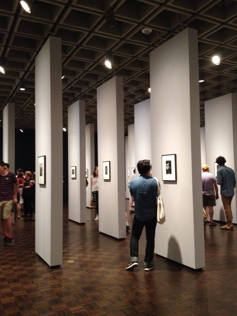
The Arbus show is a forest of free-standing pillars, each one mounted with one photograph on each side (see photos). This eliminates the all-over-gray, this-looks-boring effect of an exhibition of small, black-amd-white photos, which these are. People can wander through, stopping where they like–there’s no particular preferred order. There’s no beginning, middle, end. I liked it.
 I liked it for another reason, too: As museums attempt to draw new audiences, some have changed the context of art in a way that takes away, instead of enhances, the art. This design doesn’t do that. You know what you are there to see, to focus on. Some art folks I know have asked me why I and other critics remark on “the envelope,” when it’s what’s inside that counts. But the envelope is not neutral. It creates an atmosphere, needless to say. It should never distract, and the very successful, to me, Arbus design doesn’t.
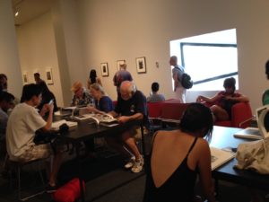
It was interesting to note two other things: the room set aside for perusing the Arbus catalogue was completely full. Also, Unfinished, the inaugural special exhibition that has not fared well with critics or the public, wasn’t empty, but wasn’t quite a full as Arbus either. (For me, any opportunity to see that van Eyck, Leonardo, some Turners, Rembrandts, etc. so close at hand is a big bonus.)
I was reminded of this issue in another artistic discipline on Monday night, when I attended 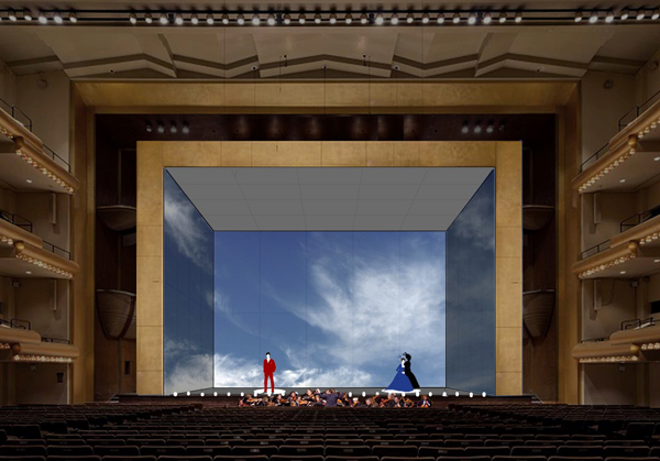 “The Illuminated Heart” at Lincoln Center’s Mostly Mozart festival. The concert showcased wonderful singers performing Mozart arias, one after another, on stage, with no set changes. The “envelope” here was designed by British director Netia Jones–and brilliantly. She used video projections (all simple and many gorgeous) to enhance the music, never distracting from it (a rendering, above). They were humorous at times, and always appropriate.
Both pieces offer a lesson, an example, to other museums and other arts organizations.
*I consult to a foundation that supports the Met.