• Skip to main content
  • Skip to primary sidebar
  • Home
  • About
    • Real Clear Arts
    • Judith H. Dobrzynski
    • Contact
  • ArtsJournal
  • AJBlogs

Real Clear Arts

Judith H. Dobrzynski on Culture

Curatorial Matters

Chronological Installations: Will The Tate Turn The Tide?

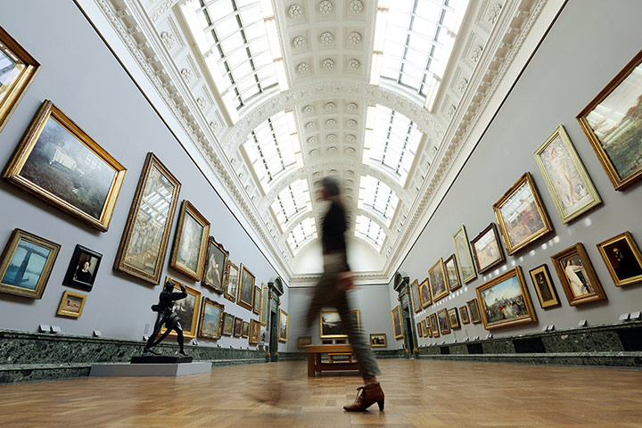
For some time now, many museums have been reinstalling their permanent collections in new ways, moving away from a chronological progression to more thematic placements. Supposedly, thematic hangings are easier for visitors to understand — at least that’s the usual explanation for them.

Visitors walk through the new galleriesNow we have the Tate reversing course. Beginning today,

…visitors can experience the national collection of British art in a continuous chronological display – a walk through time from the 1500s to the present day. BP Walk through British Art will comprise around 500 artworks over a newly configured sequence of over 20 galleries. The displays include works by major artists such as Francis Bacon, John Constable, William Hogarth, Thomas Gainsborough, George Stubbs, J.M.W. Turner, Gwen John, Stanley Spencer, L.S. Lowry, John Everett Millais, Bridget Riley, Damien Hirst, David Hockney, and Rachel Whiteread.

Brother, do I hate that “BP Walk through…” credit line, but that’s another post. Oh yeah, and another.

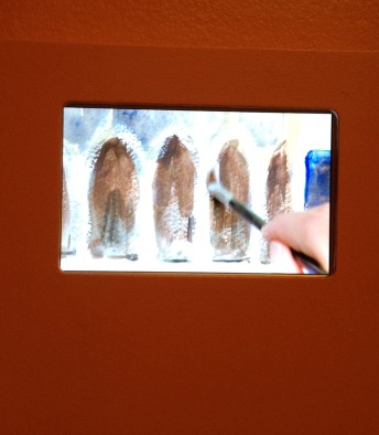
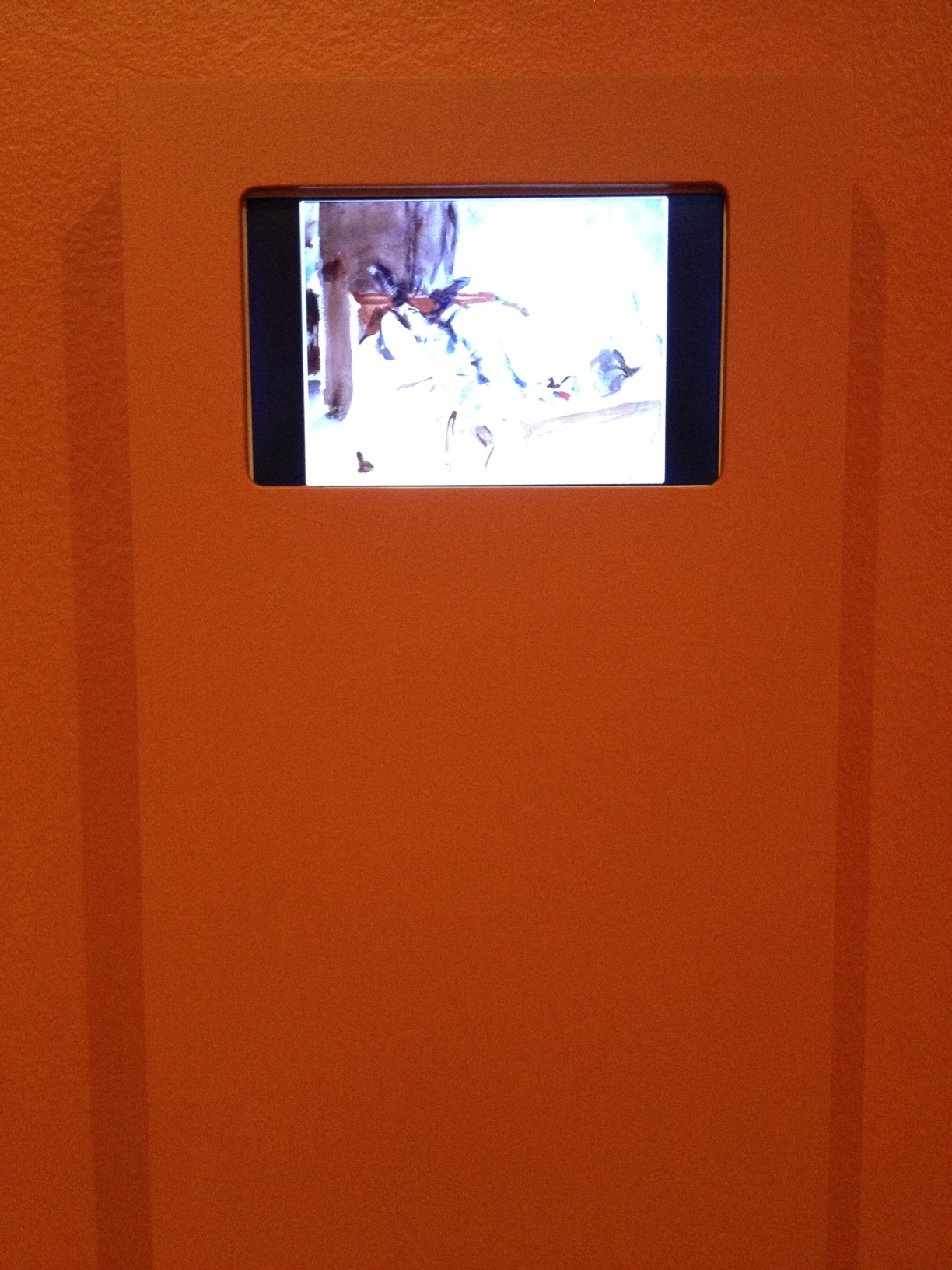
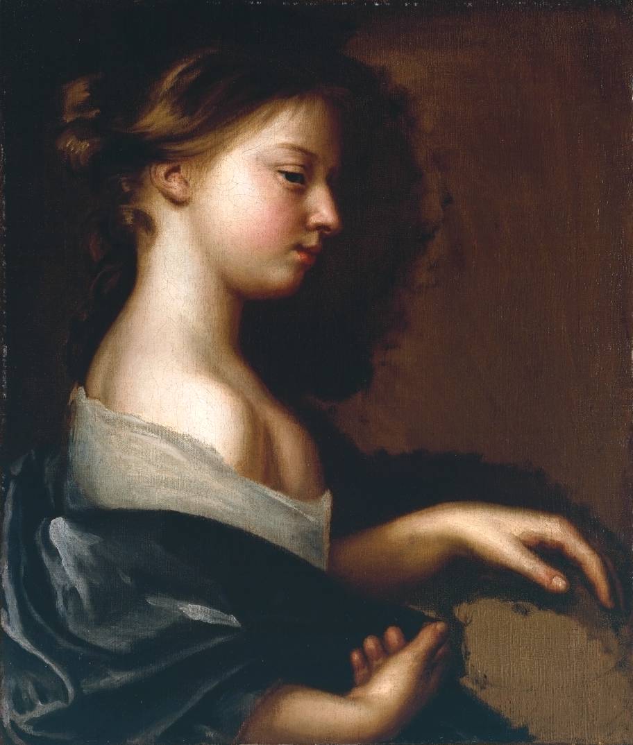
The Tate (I know it doesn’t use the article, but I do…) has also devoted new rooms to William Blake and Henry Moore, joining the Clore galleries that display the works of J.M.W. Turner, and now, Constable, too. It has also hung works by England’s first female professional  painter, Mary Beale, including the portrait posted here, in an attempt to show more women artists.

Portrait of a Young Girl circa 1681 by Mary Beale 1633-1699But it’s the rehang that is of interest.  Since 2000, the Tate Britain has mixed artists and periods in its galleries. The upside is this new approach (see this slide show), as the Tate, puts it:

The new chronological approach offers a fresh perspective highlighting surprising juxtapositions of art created within a few years of each other but rarely associated. An early Gainsborough landscape hangs side by side with Hogarth’s satires. The frolicking female nudes of Alma Tadema’s A Favourite Custom 1909, the epitome of Victorian revivalism, are seen next to Walter Sickert’s gritty modernist icon La Hollandaise 1906. Often separated when hung by movement or genre, the chronological presentation allows a more neutral view of the range of art being produced at any one historical moment to emerge.

Here’s more in the press release.

The Guardian rather approves. So does Richard Dorment in The Telegraph: “The permanent galleries have been rethought and re-modelled in a way that at last allows us to see the richness and variety of a national collection that in recent years has been lost to view….it is gloriously, satisfyingly, reactionary.” And the Times of London, though only subscribers can see past the first paragraph.

Might this signal a trend? I think I hope so.

Photo Credits: Courtesy of The Guardian (top); the Tate (bottom)


Peer Review: The Best Exhibitions and Publications of 2012

Praise from peers is often the most meaningful, as long as it’s not politicized; that’s why I pay attention to the awards for excellence awarded each year by the Association of Art Museum Curators. The other day, that organization gave the blue ribbon to 11 exhibitions, catalogues and articles from 2012.

InventingAbstractionOne exhibition “swept” in that it won two of the 11: Inventing Abstraction, 1910-1925: How A Radical Idea Changed Modern Art, which was organized by Leah Dickerman with Masha Chlenova at The Museum of Modern Art, won in the Outstanding Thematic Exhibition and Outstanding Thematic Exhibition Catalogue categories.

The three other exhibition awards went to:

  • Judith Mann and Babette Bohn, curators for the Saint Louis Art Museum, for Federico Barocci: Renaissance Master, in the Outstanding Monographic or Retrospective Exhibition category.
  • Charles W. Haxthausen, curator at Williams College Museum of Art, for his Sol LeWitt: The Well-Tempered Grid show in the Outstanding Exhibition in a University Museum category.
  • ExtravagentInventionsYaëlle Biro, curator for the Metropolitan Museum, the nation’s largest art museum, in the Outstanding Small Exhibition (based on square footage: no more than 2,000 square feet) award for her African Art, New York, and the Avant-Garde. That’s a bit ironic, but it demonstrates that even small fish in big ponds can thrive and win notice.

Another Met curator, Wolfram Koeppe, won the award for best monographic catalogue for his Extravagant Inventions: The Princely Furniture of the Roentgens, published by the Met for his exhibition there last year (which was terrific).


Audubon'sAviaryThe other winner, in the Outstanding Permanent Collection catalogue niche, went to Roberta J.M. Olson with contributions by Marjorie Shelley and Alexandra Mazzitelli, at the New-York Historical Society for their Audubon’s Aviary: The Original Watercolors for “The Birds of America”.

Finally, Jon L. Seydl, of the Cleveland Museum of Art won for best catalogue essay, “The Last Days of Pompeii,” in the catalogue of that name by Victoria Gardner Coates, Kenneth Lapatin, Jon L. Seydl, et al.

The curators association also awarded three honorable mentions, which are listed here, along with the winners.


Is This A Way To Run A Museum? What We Can Learn From Cincinnati

Yesterday I attended the American Federation of Arts’s panel titled “Art Museum Blockbusters: Myths, Facts, and Their Future.” But I don’t want to talk about blockbusters here, at least not today. I’m going to zero in on some comments made by one of the panelists, Aaron Betsky, director (for now) of the Cincinnati Art Museum (none of them are related to blockbusters, as the session wandered away from its original purpose at various times).

GWood-DaughtersI”m singling out Betsky not because of the recent news, or because of what he has done in the past, which I’ve both praised and panned here, but because he said a lot of interesting things yesterday that I’d like to share, comment on, and agree or disagree (with my thumb).


  • The Cincinnati Museum used to be free, except for special exhibitions — a not uncommon practice. But, Betsky said, no one went to the special exhibitions — in contrast with most museum patterns. So he made everything inside the museum free, and began to charge for parking ($4). Seems like a fine idea to me, without repercussions for the museum or art-viewing. Can other museums that charge for special exhibitions learn something? Thumbs up.
  • During lean times, Betsky slashed the exhibition budget by 50%, and asked curators to do shows costing about $200,000 or occasionally $300,000. He reasoned that “how you get people in the door” is by programming and social activity and so “that’s where you spend your money, not on the shows.” Take a look yourself at the results. Then notice that the list does not include “The Amazing American Circus Poster,” Feb. 26-July 10, 2011, or Wedded Perfection: Two Centuries of Wedding Gowns in 2010. I wonder why not. Thumbs down.
  • The Cincinnati Museum has what Betsky called Grant Wood’s second most important painting, Daughters of the Revolution (shown here). He recently called Douglas Druick, director of the Art Institute of Chicago, which owns Wood’s best painting, American Gothic, to propose a share. The two-painting exhibition (there may be additional, related material, I’m not sure) will go on view in both museums. How many times have I written here, and elsewhere, praising these small, focused shows? Thumbs up.
  • Betsky said the wall labels for an exhibition should not say “this is the most important artist” or “one of the most important artists” or usue whatever workings — he criticized MoMA, where the panel took place, and said the Cincinnati museum did it too. Why not? It’s not a museum’s place to make a judgment like that. He says museums can use words like “most influential,” which can be demonstrated. Glenn Lowry, MoMA’s director, strenuously objected, saying that museum should not have to remain neutral on an artist, and I agree, strongly. Betsky himself said that meta-studies show that the first reason people visit museums is to learn something. A museum can assert whatever it wants, and those who want to agree can agree, and those not, not. Either way, they are learning. They may even learn more if they disagree than if they agree. Thumbs down.

Interestingly, Betsky — I believe, from my notes, but will await the video from AFA — used the words “second most important” for that Grant Wood painting!

Photo Credit: Courtesy of the Cincinnati Art Museum


What Color Is That Gallery? The Spring Show As Trailblazer

blackThe Spring Show at the Park Avenue Armory, which started today, is a new event in the art calendar. This is its third edition, as fair organizers like to term their annual events. It is a mixed offering — mixed in the goods on offer (paintings, furniture, silver, jewelry, flags, artifacts, etc. etc.), mixed in quality, mixed in the geographical home of the dealers, and so on. At the opening preview reception last night, I found plenty of things to enjoy and admire, as well as some that were easy to bypass.

redArt snobs who pass it up are missing something, and so are museum people. True, they won’t find many museum-quality items on offer. But they will find something else: Spring Show galleries provide a laboratory for the color of their walls. Not since Thelma Golden hung Bob Thompson’s paintings on bright yellow walls at the Whitney in 1998 have I seen such an eye-opening display. (OK, there was the Brooklyn Museum’s experiment with neon colors for its American art galleries, but I didn’t and don’t like those. But the beige walls in the Metropolitan Museum’s American paintings galleries are just as awful.)

greenSince then, we’ve seen museums expand their use of colored walls — as I mentioned in my last post, the Brooklyn very successfully used melon walls for its current Sargent exhibition, and I’ve noticed marvelous shades of blue, olive, deep purple, gold, etc. etc. in many museums. Even in contemporary art exhibitions, white walls are not the required uniform anymore.

What did I see last night? Black. Turquoise. Deep Green. Bright red.

I took pictures, some posted here, but they don’t do the job as well as I’d have liked. Exposure was difficult because the dealers put spotlights on their offerings.

multi2But you will get the drift.

Turquoise
Ain’t it grand? And worth experimenting with?


multi1


Photo Credits:  © Judith H. Dobrzynski

Teaching Technique In The Galleries

SargentGalleryHaving written about the exhibition of John Singer Sargent’s watercolors at the Brooklyn Museum before it opened, I was curious to see it in the flesh. I went over the weekend, and am happy to say that it lives up to expectations. One surprise — the color of the walls behind the artworks, which was melon, verging on orange. But not the neon orange the Brooklyn Museum has used in its American art galleries. Rather, it’s a soft orange that you might find in a posh apartment on Park Ave. You can get a sense of it in my picture, at left.

SargentTech2You can also see that the exhibition was quite crowded, which I was also pleased to see. Interestingly, it was more crowded than the El Anatsui exhibition, which also got rave reviews, including one from me on this blog. I was surprised, but the only conclusion I can draw is that Sargent has bigger name recognition. (In case you missed the news last week, the Brooklyn has acquired Black Block — which I show on the link above along with Red Block, which is owned by Eli Broad).

In my March piece on Sargent, I wrote:

In Brooklyn, the museum engaged a watercolorist to demonstrate six of Sargent’s watercolor techniques, including wax resist and scraping, in videos that will be shown on small monitors in the galleries.

Those videos were another item on my list of things to check in on. Were they obtrusive? Were people watching?

The answer to the first question is no, definitely not. The videos are quite small — maybe 6 by 4 inches, but I didn’t measure –and they are embedded in the wall, next to the painting they are illuminating. The mounting stand out from the wall by just an inch or so. They are also interesting, though they do take a little patience — the artist paints in real time, without being speeded up in post-production. I think they work.

I’ve posted a couple of examples here — the first, at top right, is drybrush painting. I did not see the wax-resist video, but one was out-of-order while I was there. Or maybe I just missed it. Those below show how the videos look in the galleries.

SargentTech1

SargentTech3

Photo Credits:  © Judith H. Dobrzynski


« Previous Page
Next Page »

Primary Sidebar

About Judith H. Dobrzynski

Now an independent journalist, I've worked as a reporter in the culture and business sections of The New York Times, and been the editor of the Sunday business section and deputy business editor there as well as a senior editor of Business Week and the managing editor of CNBC, the cable TV

About Real Clear Arts

This blog is about culture in America as seen through my lens, which is informed and colored by years of reporting not only on the arts and humanities, but also on business, philanthropy, science, government and other subjects. I may break news, but more likely I will comment, provide

Archives