
 The Whitney Museum debuted its newly redesigned website today, with new technology and new features, like a background that changes from white to black as day changes to night, plus a series of commissioned internet art projects.
I’m not tech-knowledgeable enough to pronounce on those advancements, but I do like several features, including:
- Each day, the museum’s hours are posted on the home page — they change with the day, so I don’t have to click “visit” to find that basic information.
- Events of the day are on the home page.
- The permanent collection is there — with acess by artist, by decade collected, by artists’ birth decade. Only about 400 works are shown, for now — which is not enough — but the images are high quality. And you can browse them separately, too.
- The commissioned works “appear on every page of whitney.org for ten to thirty seconds at sunset and sunrise in New York City.” I didn’t catch that today, but there’s time as each will last on the site for three to four months. As Christiane Paul, the Whitney’s adjunct curator of new media, said in the press release: “What distinguishes these projects is that they use whitney.org as their habitat, disrupting, replacing, or engaging with the museum website as an information environment. This form of engagement captures the core of artistic practice on the Internet, the intervention in existing online spaces.”
- The first one is called Untitled Landscape #5, by ecoarttech, a collaborative founded in 2005 by artists Cary Peppermint and Christine Nadir. It consists of “fluctuating, glowing orbs of light that disrupt the ‘digital landscape.’ The size and speed of the orbs will vary based on the number of visitors to the site since the previous sunrise (for sunset) or sunset (for sunrise); higher visitation results in larger, slower-moving orbs.”
- There’s audio and video — but the home page doesn’t take forever to load (like MoMA’s, which I avoid if possible, both because it takes so long time to appear and because it’s hard to navigate. I have heard, grapevine, that the museum knows this and is redesigning its redesign. Say it’s so, Glenn…).
- There’s the usual feature nowadays for registering, saving your own collection, etc.
- The conservation section, listed on the home page (bravo for that!), is thick with information.
- Ditto the research page.
- The navigation stays right there on the left all the time, so there’s no need to return to the home page all the time.
- There’s a “press” button on the home page! Need I tell you home many arts groups make finding press information/contacts difficult?
Kinks are bound to exist, but I haven’t found them yet. Bottom line: Adam Weinberg, the Whitney’s director, says the redesign involved nearly every department in the museum — great, because it doesn’t at all look as if it has been designed by committee.
Here’s the link to the press release, which has more information — including details on a wiki feature.
![]()

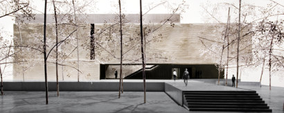 The Styll museum, which was given some 2,400 works by his widow, Patricia, was stalled by the financial crisis. Prudently, its leaders decided not to start construction until they had raised at least $25 million of the budget, plus $5 million for a fledgling endowment. And they asked for a redesign: