• Skip to main content
  • Skip to primary sidebar
  • Home
  • About
    • Real Clear Arts
    • Judith H. Dobrzynski
    • Contact
  • ArtsJournal
  • AJBlogs

Real Clear Arts

Judith H. Dobrzynski on Culture

Uncategorized

Rembrandt: Master Market Manipulator

Rembrandt: Painter as Printmaker, which opened Sept. 16 at the Denver Art Museum, showcases the known glories of his work—but with an eye-opening twist. It displays Rembrandt a master market manipulator, as well as a great artist.

The Three Crosses

We know, but rarely acknowledge in exhibitions, that many great artists were good at business too. Certainly, Renoir and Martin Johnson Heade, to name two on opposite sides of the Atlantic and in different time periods, churned out paintings they knew they could sell, often to tourists. So, for that matter, did Canaletto.

And Rembrandt, we know, painted some of those self-portraits as “calling cards” to demonstrate his skills in that genre to prospective portrait commissioners.

The exhibition in Denver goes deeper. With its display of nearly 110 prints, 17 drawings and five paintings–spanning his biblical, portrait, allegory, still life, landscape and genre subjects–curators Timothy Standring and Jaco Rutgers set out to show how Rembrandt manipulated the market for his prints.

“Rembrandt intentionally made rarities for his admiring collectors who sought out rare states,” Standring said. That is, in creating his etchings, Rembrandt refined his copper-plate designs in small steps, known as “states,” that were seemingly unnecessary or at least not aligned with common practice among other artists of the the time. They generally use these early versions as a “status report” on the composition.

Because he needed the money (evidenced by his 1656 bankruptcy declaration) and knew that his collectors wanted rarities, which sold for high prices, Rembrandt purposely many more versions of his images. (About those rarities, Rembrandt was already known as a more innovative printmaker than his contemporaries, frequently experimenting with different inks and papers.)

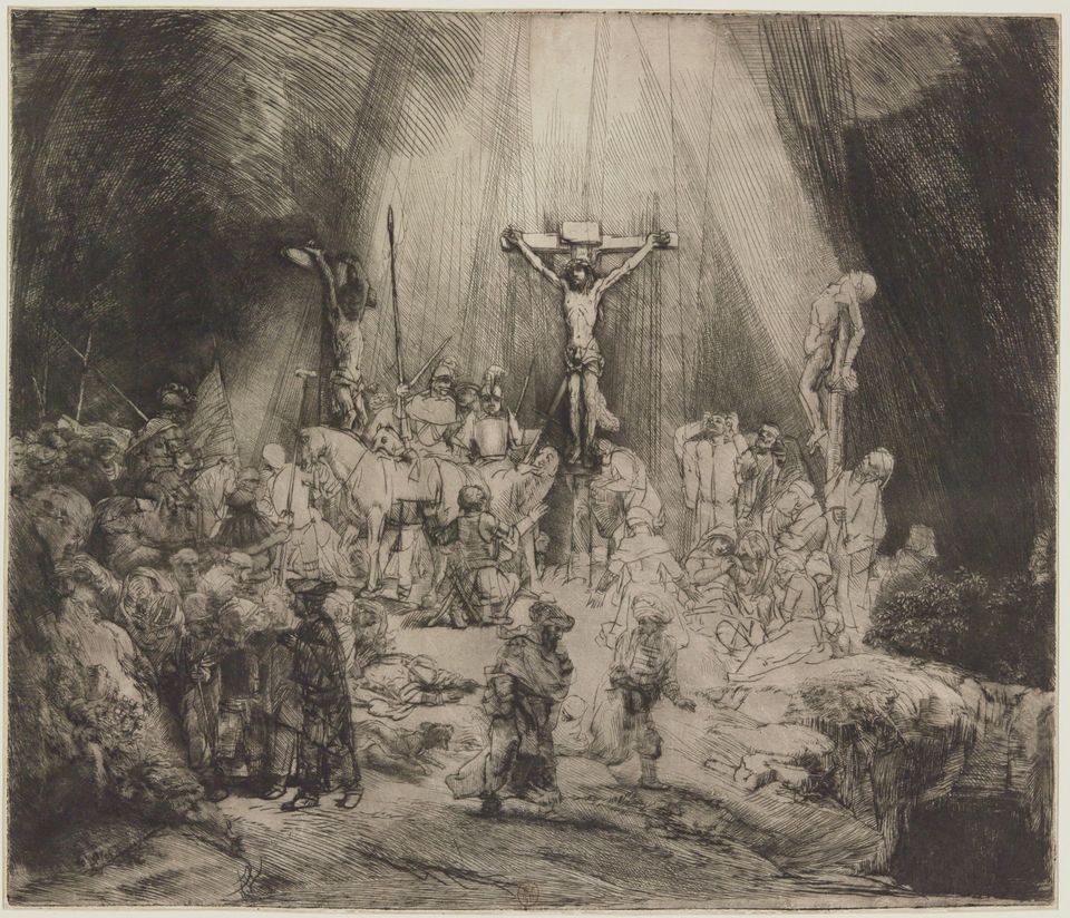
You can read about some specific examples–such as The Jewish Bride and The Three Crosses in a little piece I wrote on this for The Art Newspaper, published in the September issue. There you’ll find some of the very impressive lenders to the exhibit as well.

The scholarship behind this exhibition, which will not travel, stems largely from Rutger’s research as co-editor of the new catalogue raisonné of Rembrandt’s etchings, which was completed in 2014.


Surprising (But Short) Chapter of Georgia O’Keeffe’s Life

Several days ago, I went to the New York Botanical Garden to see its summer exhibition, Georgia O’Keeffe: Visions of Hawai‘i. It included several paintings I knew nothing about. And, as I soon discovered, from talking with friends and posts on Facebook and Instagram, neither did many other art-lovers.

This isn’t all that surprising when you consider that the paintings haven’t been shown (for the most part) in New York since 1940.

O’Keeffe, as the exhibition relates, visited Hawaii in 1939, traveling there on a commission from a Hawaiian Pineapple Company. which was planning to use her work in a promotional campaign. She spent nine weeks on Oahu, Maui, Kauai and the Big Island, making several paintings of mountains, waterfalls, plants and flowers. Some are on view through Oct. 28 at the NYBG and, if you’re nearby, worth the trip.

However, I must add, this is not a museum show. All told, there’s only a small gallery with perhaps 15 paintings. The rest of the show provides information about plants and the Hawaiian ecology, outlines her time there, shows her work in advertisements, and exposes visitors to plants and flowers she might have encountered while in Hawaii. This part, to me, is less successful than the reconstruction of Frida Kahlo’s garden there in 2015, which attracted a record-setting attendance of more than 500,000.

But that’s ok–the reason to go is simply that most of the paintings on view are borrowed from the Honolulu Museum of Art or from private collections. They may not pass this way again anytime soon.

I’ve posted two samples (mine photos), and a gallery shot (courtesy of NYBG).


Superlative Numbers At the Met. But Crazy Ones Too

Superlatives are in. Last week, the Metropolitan Museum of Art issued a press release saying it had welcomed its one-millionth visitor to its special Costume Institute exhibition, Heavenly Bodies: Fashion and the Catholic Imagination–proclaiming it, weeks before the show closes, “the Costume Institute’s most attended show ever and The Met’s third overall most attended” exhibit.

Really? Truth is, we can’t be sure of that. Because of the complex installation, which inserted costumes into the permanent collection galleries of Byzantine Art, Medieval Art (below right), parts of the Lehman wing (left) and the Cloisters, actual numbers are nearly impossible to compute. How can the Met tell if someone who walks through the Byzantine corridors is merely on his or her way to the American wing, say, and perhaps just glancing–or not even that–at the costumes above? Also, with the exhibit spread out in three locations–there’s also the Costume Institute galleries on the Met’s lower floor–how can the museum ensure that it’s not double- or triple-counting people?

I’d heard informally from some Met insiders that the museum was using a formula developed by its research department, and when I asked the Met about the numbers, Nancy Chilton in the press office confirmed that:

This three-part exhibition required that our Research Department develop a formula to measure visitor levels through several means.

But that’s all the museum would reveal officially. As I understand it, though, the museum is counting people at locations in the exhibit that are not passages to other places (which is pretty hard on the main floor of 1000 Fifth Ave.), using visitor surveys at the Cloisters and the Costume Institute galleries to make sure people are not double-counted, and analyzing these numbers in the context of overall attendance. Voila–one million. last Thursday. The Met thinks this number is not only valid but also conservative.

It may be–but as an exact number it lacks a certain credulity.

I don’t blame the Met for the rampant tendency among some museums (not to mention other forms of entertainment and edification) to trumpet numbers, but I do wish it was more transparent about its process of arriving at a number. (let’s leave aside the issue of the length of exhibitions, which complicates matters even more, as a long exhibit will generally draw more visitors than a short one.)

Museums get into the “largest,” “biggest,” “most” syndrome for a mix of reasons, and marketing is one of them–with museums these days competing with so many other activities, it’s easier to get attention with superlatives. For parts of the public, the use of superlatives also stoke “the fear of missing out.” And therefore they get visitors to come.

Press for Heavenly Bodies had already gone that route, noting early on that this was “the biggest exhibit the Costume Institute of the Metropolitan Museum has ever held,” to cite one example, and in Thursday’s press release saying that “Heavenly Bodies…is the largest exhibition that either The Costume Institute or The Met has ever mounted, covering 60,000 square feet in 25 galleries.”

That claim is also problematic. How is the Met counting the gallery space? All of the Byzantine galleries? All of the Medieval court? Tell us, please–when you write the press release. (And, to cite another recent example at the Met, the press release for the Michelangelo exhibit noted that it “will bring together the largest group of original drawings by Michelangelo ever assembled for public display”).

I measure exhibition success by numbers, too–because I like others are interested in getting more people into museums to look at art. But always there’s a part of me that says to treat the numbers with caution. Unless special exhibitions are entirely ticketed–and most are not, given that members sometimes pass in with their membership cards, to cite one issue–attendance numbers have to be taken with a grain of salt.

Also, as Heavenly Bodies demonstrates, there’s no consistency across museums in counting–it’s not using that formula for other special exhibitions.

Twenty years ago, I wrote an article about some of these issues. One passage read:

Nearly every sizable museum looks at weekly [attendance] figures. Some, from big institutions like the Metropolitan to smaller ones like the Portland Museum of Art in Oregon, track the numbers daily. Many keep a running year-to-date count. The daily report of the Metropolitan, which considers itself the most sophisticated people counter among museums, includes the day’s weather and the weather of a year before, to gauge the outside competition. It also tracks the effects of media coverage, advertising and other variables, which it declines to disclose.

The article went on to relate various counting methods, including guards with clickers. More recently, I know one museum that wanted to try heat maps, and applied for federal funding to install devices to measure heat within its exhibitions, which of course rises with more people in the gallery. (I do not think that happened in any sustained way.)

Heavenly Bodies remains on view until Oct. 8–which will undoubtedly boost its numbers and possibly its ranking in the Met’s league table. The last major costume show there, China: Through the Looking Glass, attracted 815,992 visitors, but it was on view only from May 7, 2015 to September 7, 2015. And that was an extension from the original plan–three weeks were added to the end of its very popular run.

Each time the Costume Institute edges up in those statistics, it gains more ammunition for taking over other parts of the museum, which it has been doing for a number of years now. And that is not, in my view, a happy thing.


Giving Hedda Sterne Another Chance

Hedda Sterne is not a name you hear very often, so I was pleased last spring when I learned that the Amon Carter Museum of American Art was giving her a solo exhibition. It would be a small one, and of lithographs, not paintings, but still I wanted to see it. We’re in a moment when female artists are getting a bit more museum exposure, and I wondered about her.

At one time Sterne was prominent–mostly, though, she was prominent now for having appeared in Life magazine’s photo of The Irascibles–the only woman among the artists in the photo, all of whom had signed a letter to the president of the Metropolitan Museum of Art in May, 1950. As she once explained, she arrived at the staged session late, after photographer Nina Leen had placed everyone, so Sterne was put up on a table, standing, on the right, sticking up “like a feather.” (Several others, male and female, had signed the letter, but were not in the photo.)

But, according to hearsay, Sterne was the only woman because she invited herself when her husband, Saul Steinberg, was called to be in the photo.

For more information about that letter–and the exhibition in question–you might read a fascinating account by Robert Beverly Hale, then associate curator of American Painting and Sculpture. It’s online on the Met’s website. Here’s an excerpt:

On May 20, 1950, an open letter signed by eighteen painters and ten sculptors was received by the Museum. It stated in substance that they “rejected the monster national exhibition” to be held at the Metropolitan, that the juries chosen were too conservative to admit a just proportion of advanced art. It called upon all the advanced artists in the country to boycott the exhibition.

This letter, which appeared on the front page of The New York Times, stirred up a spirited controversy. On June 12 the Museum received an open letter signed by seventy-five artists expressing confidence in the integrity of the juries appointed, saying that it seemed unfair to attack the juries before they had met and announced their verdicts.

As an aside, it’s interesting to note some artists who were in that exhibition: Ivan Albright, Andrew Wyeth, Everett Spruce and Mark Tobey are among them.

But back to Sterne: She later blamed the photo for causing her trouble with male artists, but she wanted the attention. Even though she hung around with the art crowd, including Duchamps and Mondrian at first and’, later, the guys at the Cedar Tavern, she still, early on, felt that she would be better off signing her work only with a “H,” to disguise her gender.

That soon ended, but there’s no question that her connection with Steinberg aided her.

For me, Sterne’s work is uneven. She experimented a lot–working in Surrealism, abstraction (both geometric and biomorphic), representation, portraiture. But she never developed a particular signature style or niche.

The works on view at the Amon Carter are from two series (plus four miscellaneous prints)–Metaphores and Metamorphoses and The Vertical Horizontals–that she made in 1967. I reviewed the exhibition for The Wall Street Journal, published in yesterday’s paper.

The prints are engaging, interesting–a window on her thinking, her working out process. But they didn’t leave me asking for more. I have seen her very good painting at the Tate, and a few others. The Met plans to put one of her paintings in Epic Abstraction, coming this fall–if it is the one in the museum’s permanent collection, I don’t believe it’s normally on view.

And so, despite this wide-ranging look at Sterne’s work, I had to conclude–for the show and for her in general:

“Hedda Sterne: Printed Variations” is a small, attractive show displaying themes that she also explored in painting. It leaves her where she will probably remain in art history, closer to the periphery than the center.

Photo Credits: Courtesy of Nina Leen/Time Life Pictures Gallery/Getty Images (top right); Metaphores and Metamorphoses VII, bottom left, courtesy of The Hedda Sterne Foundation.

Sargent With A Local Twist And Double Narrative

The Art Institute of Chicago’s major summer exhibition, John Singer Sargent and Chicago’s Gilded Age, is probably a crowd-pleaser–though I haven’t checked the numbers. Sargent is usually a big draw–I remember when, to cite one example, the show of his watercolors at the Brooklyn Museum outdrew a large show of El Anatsui, which was a surprise given Brooklyn’s predilection for contemporary art (in which, I’d say, El Anatsui is a rock star).

But Sargent has been exhibited so many times–except in Chicago, where decades had passed since his last exhibition. What to do that’s different? If you are Art Institute curator Annelise K. Madsen, you find a local angle. She decided to organize an exhibit of works by Sargent that had been exhibited in Chicago, owned by Chicagoans, or portrayed Chicagoans. It was a good idea, I thought.

Then she went a step further and married that with a narrative about the desire of locals to make Chicago’s cultural scene match its industrial prominence, and to set Sargent in that scene among his artist friends and rivals.

Not a bad idea, on first thought–though for me, it didn’t quite work. I was in Chicago several weeks ago to review it for The Wall Street Journal, and my piece was published in today’s print paper, headlined, Dazzling Art With a City Connection. 

It’s a good show, as I wrote:

With this exhibition arranged thematically rather than chronologically, visitors see Sargent in the round, one facet at a time. The need for a Chicago connection, however, prevents it from being a true retrospective, as many of his best paintings, like “Carnation, Lily, Lily, Rose” (1885-86), have no such link and are thus absent.

That was still ok, as the exhibit is “full of visual pleasures.”  For me, the bigger issue was Madsen’s decision to add in works by Sargent’s friends and rivals.

…— Claude Monet, Giovanni Boldini, James McNeill Whistler, Anders Zorn, Dennis Miller Bunker and Walter Gay, among them. Hung both interspersed with Sargents and in a gallery of their own—constituting a third of the paintings on view—they often serve the Chicago-rising narrative, but seem like interlopers. The “Sargentesque” ones can be confusing. Less—or none—might have been more.

Maybe that is a real problem for all double-narrative exhibits. There aren’t that many to begin with. and maybe there’s a reason for that.

Let me be clear, though: the exhibit is still very much worth seeing–as the two works, Portrait of a Boy and The Loggia, Vizcaya, pasted here indicate, Up top is a picture I took of three ladies studying La Carmencita. Who could ask for more?


« Previous Page
Next Page »

Primary Sidebar

About Judith H. Dobrzynski

Now an independent journalist, I've worked as a reporter in the culture and business sections of The New York Times, and been the editor of the Sunday business section and deputy business editor there as well as a senior editor of Business Week and the managing editor of CNBC, the cable TV

About Real Clear Arts

This blog is about culture in America as seen through my lens, which is informed and colored by years of reporting not only on the arts and humanities, but also on business, philanthropy, science, government and other subjects. I may break news, but more likely I will comment, provide

Archives