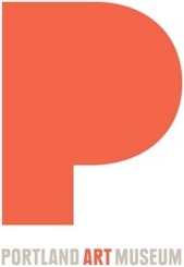
Heaven knows, many museums are struggling with their identities nowadays. Some don’t even know what they are or want to be, it sometimes seems to me.
I got to thinking about this again when I read an article about the Portland Art Museum in Oregon, which is about to adopt a new logo as part of a rebranding effort.

 So let’s just look at the two.
Can you tell which one says that the museum is more artsy, less corporate? More bold, more open, less authoritative?
Yes, you can, actually. The museum told The Oregonian that the logo on the right above was more appropriate for its recent past, when it was raising money in capital campaigns and engaged in mounting big, blockbuster exhibitions.
Ziba, which developed the new logo, on the left, thinks its creation resembles an Ellsworth Kelly abstract work, and is more contemporary than the old one. You can read more about why it thinks that way, as well as the process Ziba used here in The Oregonian and in the press release here.
But if the commenters to the article are any guide, PAM has its work cut out. They are, at the moment, almost all negative. “Is the Portland Art Museum – PREGNANT?” one asked. Others questioned the spending of $50,000 for this, which — while much less than full price — isn’t “pro bono” as mentioned in the article.
What this mostly says to me is that people don’t like change, no matter what they say. So museums — or any institutions, for that matter — need to be really clear about their reasons for changing. And motives. A change from the past isn’t enough; there ought to be a positive reason, too.
Photo Credits: Courtesy of the Portland Art Museum
