
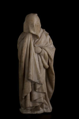
When I last posted about the wonderful Mourners exhibition, it was starting its seven-city tour at the Metropolitan Museum of Art,* and I raved not only about the exhibition but also about the website. The figures will soon be on view at the St. Louis Art Museum (see entire exhibition schedule here), more about which soon.
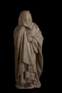 This is about the web. I was so entranced by The Mourners site, which offers visitors a chance to rotate “digital high-resolution, multi-perspective, and stereo 3D photography of these masterpieces,” that I contacted the webside designer/art director, Rory Matthews, who is based in Britain. I was not surprised to learn that I had seen — and been impressed with — his work before: It was an interactive site for the Cleveland Museum of Art called “Museum Attic,” in conjunction with an arts-and-crafts movement exhibition in 2005. It’s no longer available, but I remembered it being fun to explore. So you may want to check out the other projects listed on Rory’s site; he even has the Queen’s royal warrant, btw.
Rory agreed to do a Five Questions with me.
 Here goes:
1) What is the biggest, or most common, mistake museums have made in their overall web presence?
Most museums are highly sophisticated in their awareness of how to use the web these days, so the big problems of the past, such as using the site to reflect internal hierarchies rather than taking a visitor point of view, have largely disappeared. In this more mature era the biggest problem I see is almost a product of the richness of the content available online. Often there is so much content in a museum site that it is simply overwhelming and hard to navigate, especially to a first time visitor. Bearing in mind that many visitors do not come in through the “front door” of the home page, but rather via search engine results, establishing a clear sense of where you are throughout the site is essential.
2) Not counting your own projects, what are your favorite museum websites and why?
I admire the Smithsonian (http://www.si.edu/) for its scope and richness, and the level of attention and thought that they put into their web presence. I also admire the work of SFMOMA (http://www.sfmoma.org/), where consistently over many years they have pushed new technologies to help their visitors understand and interpret modern art.
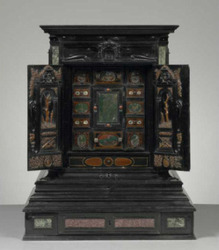
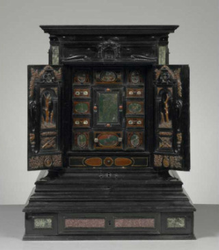
3) What do you think of the new “augmented reality” site at the Getty, and what’s the outlook for things like that in the future?
This “Augmented Reality” feature from the Getty invites the viewer to print off a simple “target” and then to offer it up to their webcam after loading one of two web pages. The program then locks on to the target and presents a realistically rendered and image-mapped 3D model of the Augsburg Display Cabinet – a “Cabinet of Curiosities” from 17th Century Germany [picture below]. (I am very familiar with this object having made a very modest interactive presentation of it some years ago!)
By manipulating the paper target (rotating and tilting it) the viewer can rotate and tilt the object model. A certain amount of zooming can also be achieved by moving the target nearer to or father from the webcam.
I found this to be an interesting and successful experiment on the following levels.
 The feature uses (relatively) very accessible and low cost technology (webcam and printer) to achieve a high tech experience at home or school
 - It was easy to set up with clear and minimal instructions, and an inviting explanatory video
- “Handling” the object via the manipulation of a piece of paper creates a compelling effect, which feels intriguingly disconnected from the computer – even when you understand how it works.
Some obvious limitations are that:
- you only have one kind of control – spatial orientation
- other kinds of interaction (e.g. the animated opening and closing) therefore have to be hard-wired to the spatial movement
- the image resolution is quite low
- it is tricky to get a good view of the screen while keeping the target in the the line of sight of a built in webcam – probably better with a stand alone model
The feature is engaging and fun, but I feel that the engagement is currently more on a game-like level (learning how to control the object and enjoying this) rather than learning much about the work of art.
In terms of the future, I feel this is a fascinating taster of things to come, rather than a model for how they will actually be implemented on a wide scale. But it provides much food for thought.
This particular object is especially well-suited to a modeled, animated, deconstructive treatment. A virtual exploration of a less mechanically complex work of art would demand much higher resolution, and almost certainly a photographic rather than a modeled treatment, in order to give a satisfactory experience.
Overall a very worthwhile experiment – thanks and congratulations to the Getty Museum’s Collection Information & Access department for putting it out there.
4) How can museums improve their websites to turn people from web-browsers to museum-goers?
Connections between the website and what’s going on digitally in the museum are to be encouraged – so physical visitors can send stuff home or out to friends from the museum, and web visitors can be inspired to plan for a visit. One of the most interesting current challenges for museums is to stay tuned in to developments in, for example, social networking and to look for appropriate ways to use the likes of Facebook, Twitter and YouTube to build their web presence and reach broader audiences. But all of this should be driven by the museum’s content and mission – not by the technology.
5) You also design in-gallery touch installations, which some people think are a danger, in that visitors will stop to use them, but not look hard at the objects — do you have a response to that?
I understand why curators and other museum professionals have reservations about putting interactives in-gallery. Despite increasingly sophisticated technologies being available, the use of sound, for example, is always challenging because it can be intrusive. But, that said, my experience has always been that well-designed interactive installations actually encourage people to look at the objects. There is no substitute for looking at the real thing but – to take a simple example – if the object in question is a rare book you will, no doubt, see only one real double-page spread in the gallery. This is for the obvious reasons that it needs to be protected in a case and, even if this could be avoided, handling the pages would be out of the question. A discreet interactive nearby can show you every page, allow you to magnify any tiny detail, provide you with notes about the page you are looking at and, where applicable, a translation.
My starting point is always to consider what cannot be experienced by looking at the actual object as displayed, and to offer the visitor access to those hidden aspects. So, for example, I have been able to work with curators to reveal hidden views, secret compartments, moving parts and mechanisms, sounds, x-rays, infra-red and pre- and post-restoration imaging of works of art. All of which must surely increase the chances that a visitor will give the object on display a second, more informed, look – or perhaps introduce them for the first time to an object they would otherwise have overlooked.
—
BTW, The Mourners website will have new features, just not yet. Meantime, the team is making an in-gallery interactive for the St. Louis installation.
*A consulting client supports the Met.