Critical Difference: April 2010 Archives
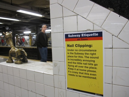
Or a contender, anyway. It's in the subway at 14th Street and Eighth Avenue, disguised as an official Metropolitan Transportation Authority notice -- except that the MTA generally doesn't do numbered screen prints. Artist Jason Shelowitz does.
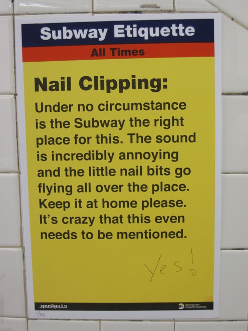
On this poster, evidently part of a campaign he's waging (of which I knew nothing until I saw the sign this evening and burst out laughing), Shelowitz has replaced the customary MTA logo, in the lower right-hand corner, with one for the MEA; the "E," of course, stands for "etiquette."
His etiquette rant may not be in the official style of the MTA, but it's definitely in the style of a conductor or two. It will have a lot of people who've been creeped out by their fellow subway riders saying, "Hear, hear." Or, as someone's already scrawled on this poster: "Yes!"
It was the kind of spring day, sun-kissed and warm, when frigid winter seemed vanquished, yet the fetid New York City summer felt safely far off. Flowers were bursting out, early, all over town.


As frequently happens when hibernation comes to an end, a craving to eat something healthy and green developed. Off I went then, down West 13th Street to Integral Yoga Natural Foods, with no suspicion that poetry was waiting to ambush me.
But there beneath the strawberries, just above the honey tangerines, dangled a text as romantic as the day: William Blake's "The Tyger," printed and laminated like the signs around it, and spattered with water droplets from the automatic misters.

Verse, lurking amid the greenery! As a spirit-lifting surprise, it was astonishingly potent. Curious and smiling, I accosted the first employee I saw, in a neighboring aisle, to ask what it was doing there. The man said he didn't know; he hadn't seen it yet, but he guessed his boss had put it up: a variation on the cartoon characters that sometimes decorate notices there. A couple of minutes later, he walked over to read it. "William Blake," he murmured, though the sign didn't say so.
I wandered off, cheerful, and burbled to the cashier that there was poetry in the produce section. "Does it have something to do with produce?" she asked. A reasonable question. That the answer is no -- that the poem is simply there, not there to sell us blueberries -- has nearly everything to do with its power to jolt us gently into joy.
"I don't want to sound self-important on behalf of my colleagues, but we feel that in the scheme of things -- coverage of the arts in the UK -- we are doing something of genuine value. We are aiming to provide overnight reviews which people can read before anything they'll find in any of the print media. And those reviews will almost always be longer and more in-depth. And in the case of one or two of the online counterparts of rival newspapers, they will be better subbed and edited and have way fewer typos. (Which sort of matters to us.)"
That's Jasper Rees of The Arts Desk, a new, "professionally produced arts critical website" launched by a London collective of accomplished arts journalists after the Daily Telegraph halved its arts budget. In a Q&A with me on ARTicles, Rees discusses the site and how a non-hierarchical arts publication works.
