Artopia: November 2006 Archives
Brice Marden
? 2006 Brice Marden/Artists Rights Society (ARS), New York FULL CAPTIONS REQUIRED BY THE MUSEUM OF MODERN ART
Return I
1964-1965
Oil on canvas
50 1/4 x 68 1/4" (127.6 x 173.4 cm)
The Museum of Modern Art, Fractional and promised gift of Kathy and Richard S. Fuld, Jr.
Pulling Down the Shade
The word is out. Brice Marden is the one.
I am not sure that his elegant retrospective at MoMA -- now we know what those sixth-floor rooms were for -- proves conclusively that he has saved abstract painting, but it sure looks like it. And it looks like a great deal of "baaaad" painting will finally have to bite the dust. Certain critics (and curators and collectors too) in the '80s thought that painting could be saved by forgetting about boring old abstract art. We were on an anti-minimalist jag. Fake expressionism reared its head. Stupid was smart.
Looking back, Marden's debut paintings now seem radical, although at the time I thought them conservative. Times change. I think these days we have a hunger for abstract painting. I know I do. And, I hasten to add, this is not a retreat from the world, no matter how many reasons there may be for such a retreat. It may be that we have reached image-overload. And our brains need a rest from Pop Art Redux. Our eyes need something deeper, richer, and -- dare I say it? -- more spiritual to take a look at, to explore.
There are two Mardens.
Marden's first period comprises monochromes that could be mistaken for minimalism. There's a thin band of splashed and speckled canvas at the bottom edge as if to prove that the monochromatic field above is made of oil and beeswax (the latter a sly reference to Jasper Johns and also a way of assuring a flat matte surface). The specks of paint also prove that the undifferentiated expanse above is indeed handmade -- how old-fashioned -- and that a lot of layers of slightly different hues went into the highly finished results.
This is also to show that we are looking at color(s) on canvas and not something that's color through and through. The ground is canvas and not a plank. The color is applied and not solid, for then it would not quite be a painting anymore, would it? This bottom edge is not much of a format or signature, but because it suggests the unfinished, the little strip of canvas lets the picture breathe a bit. It also recalls Barnett Newman's much more heroic/dramatic use of the vertical strip, stripe, or zip, albeit vertical, just as the monochromism references Rauschenberg's all-white paintings, and, once Marden gets to using panels, Ellsworth Kelly's occasional -- but not quite signature -- juxtapositions of monochromatic panels.
Once when I was interviewing Willem de Kooning, Newman came up. Using a joke he had undoubtedly employed many times before, de Kooning put his two fists together, thumbs up, in front of his nose and the opened them up and back again, to equate Newman's zip with the opening and closing of an elevator door. Likewise you could -- but I never would do such a thing -- pull down an imaginary window shade almost, but not quite all the way down to an imaginary windowsill to indicate Marden's device.
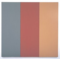
Brice Marden
For Pearl
1970
Oil and beeswax on canvas
Three panels, overall 96 x 98 1/4" (243.8 x 249.6 cm)
Private Collection
? 2006 Brice Marden/Artists Rights Society (ARS), New YorkWhat Color Is It?
But if you only see the window ledge and the monochromaticism then Marden's paintings will not look very original, will only seal the flavor of the historicism of the contemporary. But from the beginning I sensed something original going on in spite of the references. Aggressive diffidence? Well, not exactly.
I saw color as his originality and that all else merely foregrounded this rare gift. The single-panel monochromes remain the purest evidence of this, for when he begins to multiply panels and thereby juxtaposes two or more colors, we are back in composition, in push-and-pull of the coloristic and perhaps of the purest sort, as in Joseph Albers and his contrasting squares, not that I have anything against Albers.
Here's a surprise, in terms of the monochromes (and even the multiple panels). As a colorist Marden is closest to Ad Reinhardt. Reinhardt a colorist? Look again. Look harder. Each square is a different black and is a kind of eyedropper alchemy.
In a not unrelated way, you stand in front of a Marden monochrome and you wonder what the color really is. Slate? But it's a yellowish, rosy slate. It may be "green" but it is an invented green, neither moss nor grass, but with purples in it and a peculiar haze. You cannot describe the colors at all! Using scents (musky-daisy-shoe) or sound (humming-lolling-whisking) won't quite work either. The colors do not describe, they are. Marden has been going about inventing colors that no one has ever thought of before or seen. They might be the shadows of other colors. The shadow of a rose, the shadow of a stone, the shadow of a cloud moving across a lawn in September at two o'clock, at a certain latitude, longitude, elevation, degree of moisture in the air.
Harold Rosenberg and others in the '50s used to rail against color illustrations, claiming they so distorted the colors of the originals that black and white or even nothing at all was to be preferred.
Even with high-resolution images, what do you lose?
Scale: an six by six inch square of gray/green is very different from the original five-foot original. Also compromised: texture, thickness of support, reflections of light sources.
Proof: choose paint by a paint-chip; paint your wall, then weep. Paint one wall green and another orange, and weep even harder. Paint all the walls the same off-white and see them change during the day with the light--the wall opposite the windows, very different from the walls opposite the door. And how different that white is under artificial light and then artificial light of different sorts. What is the real color? Do we need to replicate the light in the artist's studio when and where the painting was made?
In defense of realist painting vis ᠶis conceptual art, I used to say that there are many more things in the world than there are ideas. In defense of Marden's monochromes, I would now say that there are many more colors than ideas.
To paraphrase Brillat-Savarin, who said that the discovery of a new dish does more for human happiness than the discovery of a new star, I'd propose that the discovery of a new color is as important as either.
Think of William Henry Perkin's 1856 discovery of mauve.
Marden Two
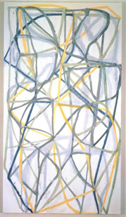
Brice Marden
Couplet IV
1988-89
Oil on linen
9' x 60" (274.3 x 152.4 cm)
The Museum of Modern Art, Fractional and promised gift of Kathy and Richard S. Fuld, Jr. ? 2006 Brice Marden/Artists Rights Society (ARS), New York
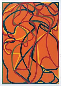
And then something happens. Marden begins to break into squiggles. I don't quite see how this relates to his announced interest in Chinese calligraphy and scholar's rocks. Let us just say that they look like spaghetti or maps of the paths that five characters might take in one of those intertwining plot-point movies that started with Robert Altman (who must have been reading Victor Hugo or listening to soap operas when he was a boy). The colors now are brighter. They worm around on monochromatic grounds and have a sassier effect. Cheerful? Can worms be cheerful? It is as if Marden has combined smudged versions of Valerie Jaudon's Islamic interlacings and Dan Christiansen's spray-paint loops. And, certainly in his wonderful works on paper, Jackson Pollock. Finally some of the squiggles are more open and you can't help thinking of very late de Koonings.And as we move through time the trails get cleaner, neater.
Brice Marden 6 Red Rock 1,000-2002
Oil on linen,07 x 75" (271.8 x 190.5 cm)
Robert and Jane Meyerhoff Collection, Phoenix, Maryland
? 2006 Brice Marden/Artists Rights Society (ARS), New YorkMarden's change to Marden Two in the '90s was in some ways equivalent to Philip Guston's change in the early '70s from Abstract Expressionism (sometimes identified as Abstract Impressionism in his case) to the cartoonism of Guston Two. You can't keep repeating yourself forever. Figuration always lurked in the A.E. or A. I. Guston, but the cartoony political statements of the late style either thrilled or irked his fans. I think I fall into the latter camp. Marden, however, has not gone figurative or political. But the contrast between the two periods now seen at MoMA makes it look like he might as well have gone figurative. There is so much more to look at and the paint doesn't exactly stick to the surface.
One theory of evolution has it that changes take place in sudden leaps not in the smooth increments of old-fashioned textbook diagrams. Guston and later Marden seem to mirror this sudden leap in art, not that a higher or less of degree of abstraction is better or worse, not that art evolves. The nature of the times is the nature of art's natural selection. New times require new art, but the struggle against boredom is as important as everything else.
Marden has recapitulated the march to total abstraction in reverse. He began with the blank canvas; multiplied the blanks, and then added spaghetti. I like the spaghetti, and the paintings are certainly easier to reproduce. The monochromes you have to see in person. Marden Two is exploring depth and motion. We are looking at a dance rather than a trance.
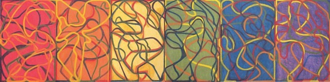
Brice Marden
The Propitious Garden of Plane Image, Third Version
(Photographed unfinished in May 2006)
2000-2006
Oil on linen
Six panels, overall 72 x 288" (182.9 x 731.5 cm)
Collection the artist. Courtesy Matthew Marks Gallery, New York
? 2006 Brice Marden/Artists Rights Society (ARS), New YorkFor an Automatic Artopia Alert when new entries are posted: perreault@aol.com