


Tim Bavington can see the strip from his studio, which is part of what he likes about Las Vegas. Aside from the cheap space, cheap shrimp cocktails and free parking, he likes the neon at dusk. Dusk is the magic hour, when the signs smeared against the sky fight the dark.
The first time he saw Vegas he was 14, visiting his father after the divorce, leaving the airport in a Cadillac. From a bleak London neighborhood, Bavington rode into the culture of flash American Etch-A-Sketch.
He’d grown up drawing. Drawing is as natural to him as brushing his teeth or turning on the telly. By the time he met Jeremy Gilbert-Rolfe, Bavington was making good money working on The Simpsons, drawing everything but the animations. (Pick up a Simpsons’ calendar or comic book from the ’90s, chances are pretty good you’re looking at his work.)
Abstraction intrigued him. He followed Dave Hickey‘s advice and enrolled in graduate school in Las Vegas, where Hickey was on the faculty. Hickey isn’t for everybody, but for Bavington, he was key to a wider world.
As a painter, he especially admires abstraction from the ’60s, first, Bridget Riley, but also Gene Davis and Kenneth Noland. They were all improvisers from the jazz tradition, but Bavington is not only a planner, he’s rock ‘n’ roll to his boots. When he gets to jazz, it’s through rock, as in, John Coltrane from Jimi Hendrix.
Admiration of elders is a necessary first step, locating an artist in a particular territory, but as Lester Young told the teenage drummer Max Roach, “You can’t join the throng till you write your own song.”
Currently at Greg Kucera, a survey of Bavington’s terrain: echoes of Ed Ruscha, but in color, not language.
IT’S GOOD (TO BE FREE), 2008 Synthetic polymer on canvas 54 x 72 inches
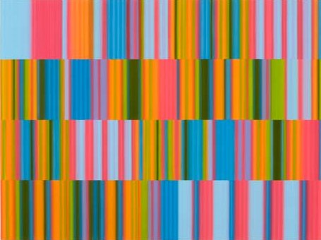 Using synthetic paints, his colors have a digital glow. Their edges are vague, as if their focus
needs adjusting. In their shimmer is a kinder, gentler version of his ’60s forerunners. Some of his stripes are based on
commercial bar codes writ large and radiant. Others relate to music. But
instead of the metaphoric music/art tradition of early 20th-century
modernists such as Kandinsky, Bavington’s in sync with a wised-up
literalism.
He matches the 12 tones of a musical scale with 12 tones from the color
wheel, assigning each note a particular color, the bandwidth of
each stripe determined by the length of each note with a musical
sequence.
OUT OF TIME, OUT OF TUNE (FRETBOARD), 2010
Synthetic polymer on canvas
12 x 112.5 inches
 Much has been made of Bavington’s methods – the match between color and sound a deadpan echo of Kandinsky’s early 20th Century efforts to paint music. His success is not in his self-assigned marching orders, however, but in the march itself. His colors are candy, but they have the toughness of black and white.
Lester Young also warned Max Roach about being a “repeater pencil.” Bavington, like Roach way before him, is in no danger of that. His strategies are elastic, with his latest work resembling some sort of merger between Gene Davis and Uta Barth, veering back to Rothko.
JUMP ON IT, 2010
Synthetic polymer on canvas
24 x 24 inches
 Through Oct. 2.
 And I thought of the video tribute to
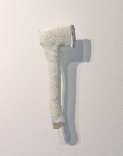
 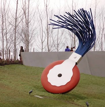 Cook and Bishop are too young to have used or even seen a typewriter eraser. By the time they were old enough to correct a text, they let their pudgy fingers do the walking and press delete…To somebody who has never seen the original model, Claes Oldenburg’s eraser looks like an odd abstraction, maybe an orange wheel attached to a beat-up broom. (

 Yoko Ono,
 From Gala,
  From
From  From EllenL, Todd Simeone’s Record Cover in a Flash (Air Supply), 2006
 From Jill, Dave Muller’s
 From Netherzone,


 Detail:
 Reducing men’s ties to knots (even floral knots), is (however sweetly) an emasculation of the male. Glowen’s insistence on the feminine, however, is less a critique of the male than a celebration of a certain kind of woman who is anonymous inside a female sphere: the career-waitress at a cheap diner, the divorcee who picks up her morning paper wearing pom-poms on her slippers, the hat check girl at the roller rink. Be they ever so humble, they dress up.
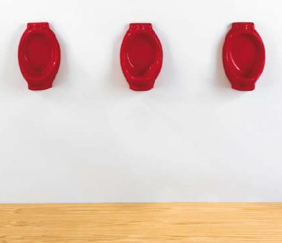 or Sherrie Levine,
  Glowen has more in common with Nancy Drew –
  Surrounded by fake flowers and wearing glitter eyeliner, girly-girls don’t care what you think. Feminists didn’t embrace the type until transvestites had, which means that in these bodies of work, Drew and Glowen derive not from female sources, but male ones.
 I have high hopes for
 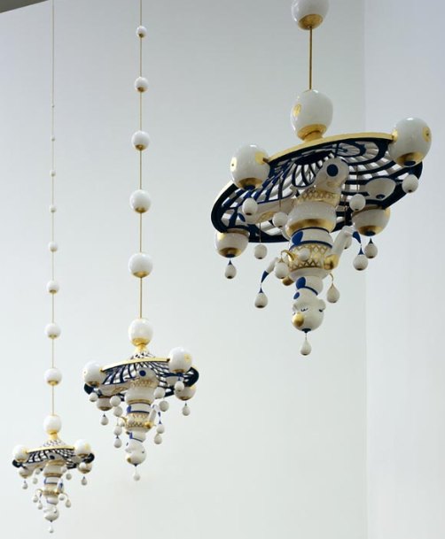 Warashina:
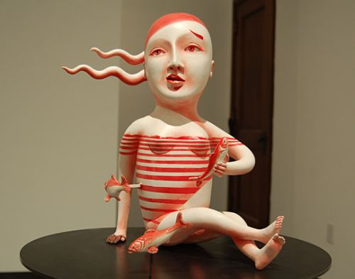 Takamori:
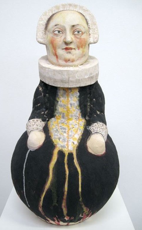
 Thomas Moran did his best work at Yellowstone National Park. He’s a large part of the reason we have national parks. In Venice in 1908, however, he turned in a poor imitation of Turner.
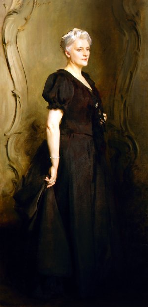
 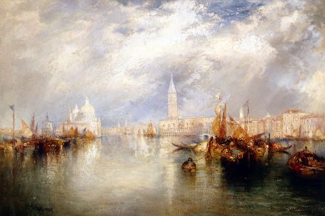 Greathouse adored the Russian expatriate Nicolai Ivanovich Fechin. I imagine she had her pick of that market. Below, Lady in Pink (Portrait of Natalia
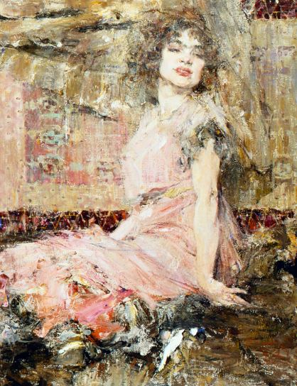 Onward to another Greathouse tick: