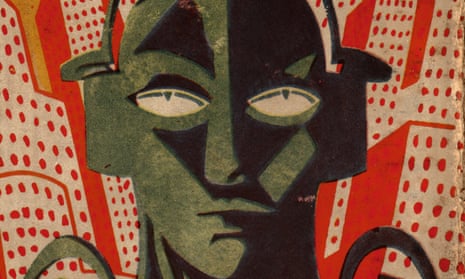
When the essayist and caricaturist Sir Max Beerbohm learned in 1949 that there was to be an exhibition of dust jacket designs at London’s Victoria & Albert Museum, he drolly observed that he wouldn’t be attending, as he only needed to call in at any bookshop to witness the “internecine warfare between the innumerable latest volumes, almost all of them violently vying with one another for one’s attention, fiercely striving to outdo the rest in crudity of design and of colour.” He went on to liken the experience to visiting the parrot house in the Zoological Gardens, “save that there one can at least stop one’s ears with one’s fingers”.
Yet the mid-century years saw many excellent artists turn to the art of dust jacket design, including John Piper, Edward Bawden and John Minton in the UK, and Ben Shahn and NC Wyeth in the United States. The decades from 1920 to 1970 seem to best cover the full flowering of this art form, when publishers first recognised the potential of the jacket as a “poster” rather than a purely functional wrapper. Dust jackets over this time mirrored the changing movements of art deco, post war neo-romanticism, kitchen-sink realism and 60s psychedelia.
With a background as an artist and illustrator, I have occasionally been fortunate enough to be commissioned to design dust jackets myself. In The Illustrated Dust Jacket 1920-1970 I have selected designs by more than 50 artists, mostly from the UK and the US. Many of the books reproduced come from my own bookshelves: I am not a collector in the true sense but over the years I have acquired books from charity shops and second-hand bookshops (sadly now all but gone from our high streets). Selecting artists is a daunting task in which unforgivable omissions are an occupational hazard. As well as the more respected artists, I have a particular affection for many of the “jobbing” illustrators: those who are less well known but whose work was always of a high standard and who had long careers as commercial artists, such as Robert Micklewright, Heather Standring and, in the US, Arthur Hawkins Jr. Hawkins’s son Gill, a sculptor, told me that the proprietor of a New Jersey bookstore once told him: “I bought more bad mysteries because your dad’s covers were so good!”
For the writer, however, the first sight of the cover design adorning their latest publication can be traumatic. As Jhumpa Lahiri confesses in her essay, The Clothing of Books: “The right cover is like a beautiful coat, elegant and warm, wrapping my words as they travel through the world, on their way to keep an appointment with my readers. The wrong cover is cumbersome, suffocating. Or it is like a too-light sweater: inadequate.” Ernest Hemingway was less diplomatic in his response to the heraldic figure composition on the jacket for A Farewell to Arms, designed by Cleonike (“Cleon”) Damianakes in 1929: “I cannot admire the awful legs on that woman or the gigantic belly muscles [on the man],” he wrote to his editor.
A few years ago, in my capacity as an illustration tutor, I was regularly asked to speak at conferences whose themes were variously related to the death of the paper book. Picturebook apps were going to replace the physical children’s book. A succession of steep graphs would appear on screen, showing ski-slope decline in book-buying and precipitously climbing e-reader sales. Books needed to become more beautiful to compete. And, happily, it seems that appreciation of the physical, aesthetic properties of the book has in recent years returned: in 2016 ebook sales of consumer titles fell by 17% while total physical sales rose by 8%.
Designed as objects of desire, books now demand to be picked up and touched: jackets are embossed, debossed, spot-laminated and printed on beautiful papers. The jackets are adorned with the work of many our finest contemporary artists and print-makers, such as Mark Hearld, Carry Akroyd, Jeff Fisher and Bill Bragg. Our bookshops are once again filled with, if not squawking parrots, beautifully plumed songbirds.

Comments (…)
Sign in or create your Guardian account to join the discussion