
 I smiled when I read this article in the Daily Nebraskan, and so thought I’d share it with you. Especially since I read the headline thinking something bad might be happening. It read:Â Great Plains Art Museum redesign aims to improve visibility, and the story began:
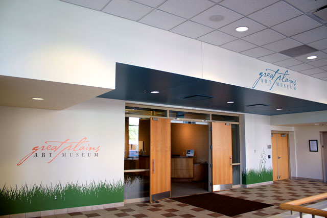
The Great Plains Art Museum was renovated over the summer in hopes of attracting more visitors and is now showing off its new design.
“We basically wanted to figure out a way to stand out from the other buildings in the area,†said Katie Nieland, publications specialist for the Center for Great Plains Studies. “Hopefully, as people are passing by, they will see it.†…It received a paint job and a new logo, with prairie grass embellishing the walls and windows.”
But the photo illustrating the article eliminated my fears — what sounded as if it might be kitschy is actually quite attractive (to me).
It’s not formal or classic in any way; but it suits the area.
Jon Humiston, the creative director for the University of Nebraska-Lincoln’s Office of University Communications who designed the look, told the newspaper that he wanted to link the grass near the sidewalk to the museum, that the colors were chosen to recall a prairie sunset, and that the words “Great Plains depict the lines of the horizon, streams and trails of the Midwest.”
The museum focuses on art of the Great Plains, and gets a small number of visitors. Will this help? I hope so.
Photo Credit: Courtesy of the Daily Nebraskan